


.svg)
Every design, no matter how complex, is built from a core set of visual elements: point, line, shape, form, color, texture, and space. These elements work together to create everything you see, from simple icons to intricate interfaces. Understanding how each element functions gives you precise control over your compositions. You can guide the eye, establish hierarchy, create contrast, and evoke emotion by combining these building blocks intentionally. Understanding what each element is and how it functions gives you the foundation to analyze any design and make intentional choices in your own work.
What's a design element?
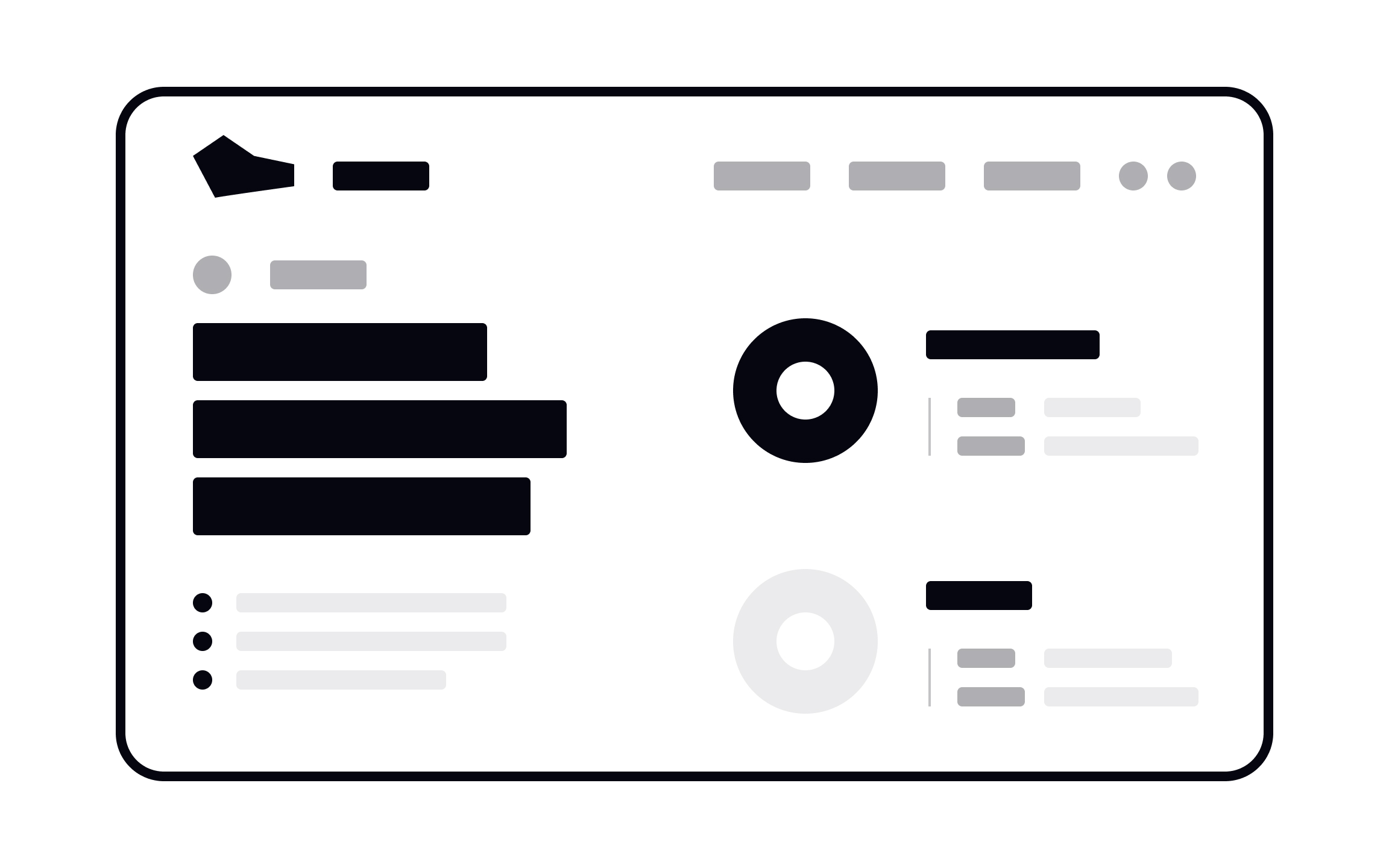
Design elements are the basic building blocks used to create any visual composition. They include dots, lines, planes, volume, shape, negative space, value, and color. Every design you see, whether it's an icon, a button, a full interface, or a poster, is made by combining these elements.
Points and dots
A dot marks a single point in space. In math, a point has no size; it's just a location. In design, we visualize points as dots to direct attention, create emphasis, or build simple UI patterns.
Dots can stand alone or combine to form other elements. A line is just a series of dots connected together. At the component level, dots appear in icons like the kebab menu (three vertical dots). In compositions, dots work as status indicators. For example, a green dot showing someone is online, or a dot marking a selected radio button.
Lines
A line connects two points. Lines can be straight, curved, dashed, or dotted, and they form the basis of more complex shapes like circles, squares, and triangles. At the component level, lines create outlined icons, like the bookmark or comment icons you see in apps. In compositions, lines divide content, structure layouts, direct the eye, and frame information. A single line can separate a header from body content or guide users through a page.
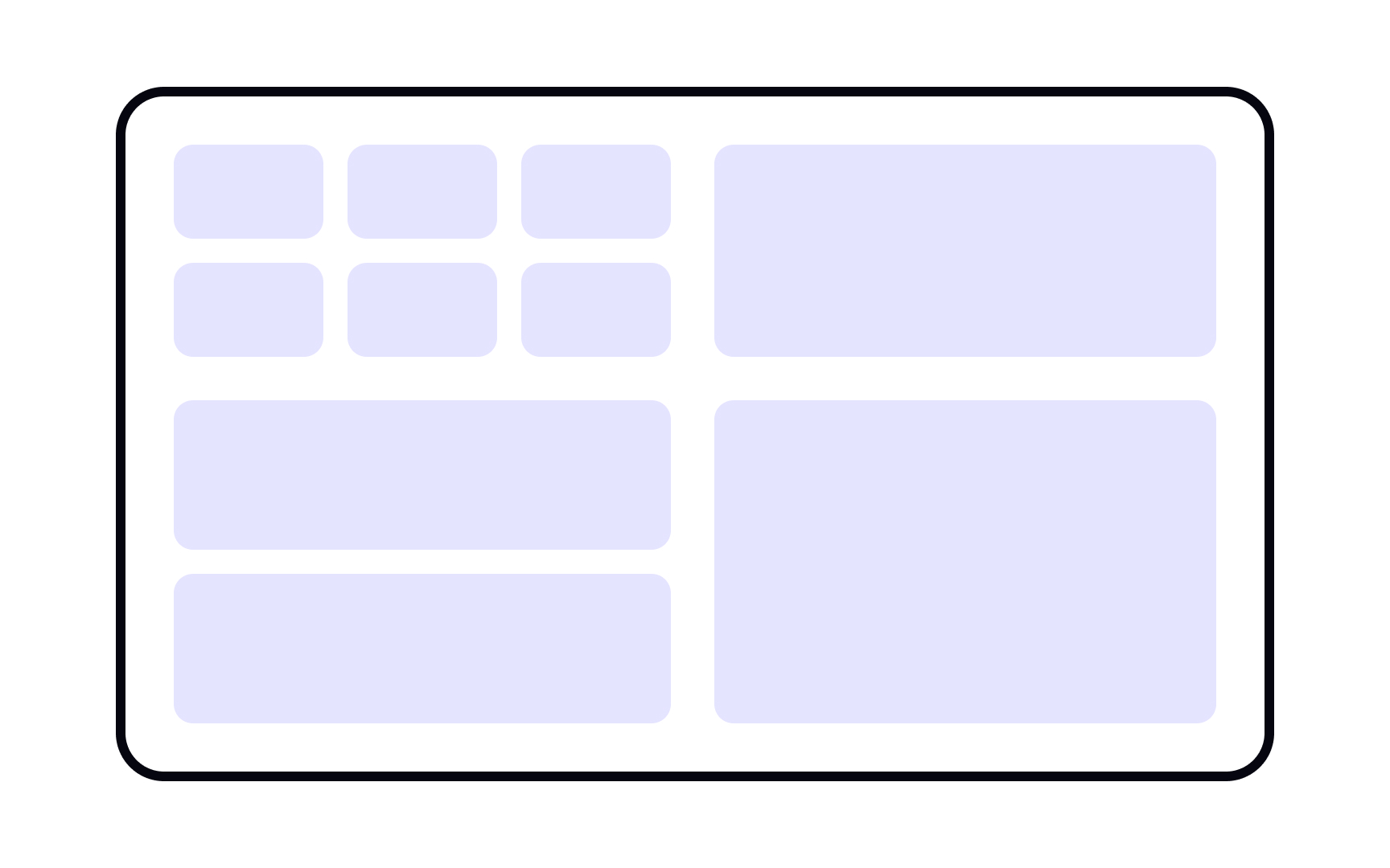
Planes
A plane is a flat, enclosed area created by lines, color, or texture. Planes can take any shape including rectangles, circles, organic blobs. At the component level, planes appear as solid icons, buttons, and cards. Solid shapes are often faster to recognize than outlines because they resemble physical objects. In compositions, planes group related content, separate unrelated information, and add visual interest through color and shape combinations.
Volume
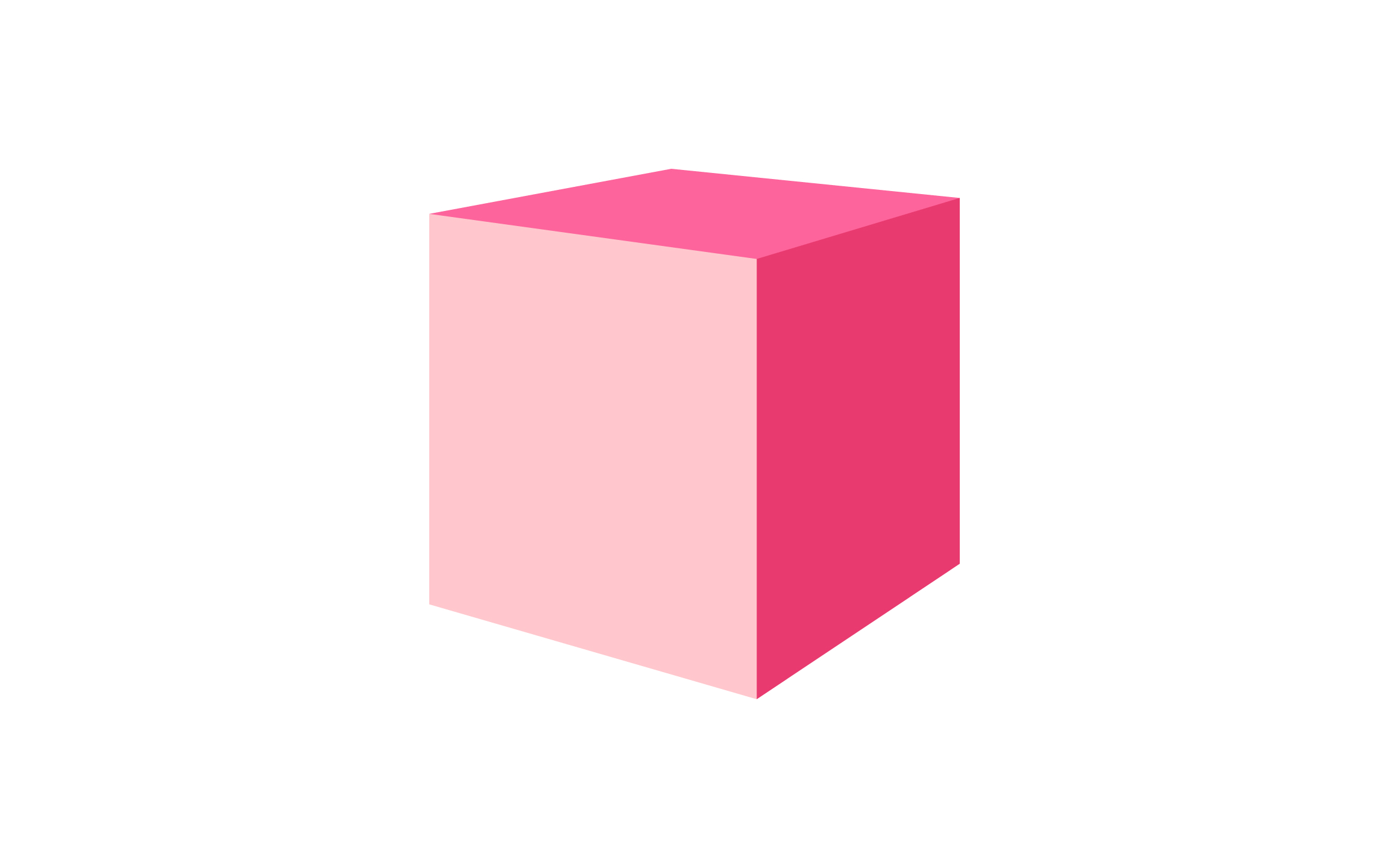
Volume adds a third dimension of depth to flat elements. It’s what turns a circle into a sphere, a square into a cube. At the component level, volume makes buttons feel pressable through shadows, highlights, and angles. In compositions, 3D elements add visual interest and can create a futuristic or whimsical feel. Use volume sparingly, as too many 3D shapes can overwhelm a design.
Shape
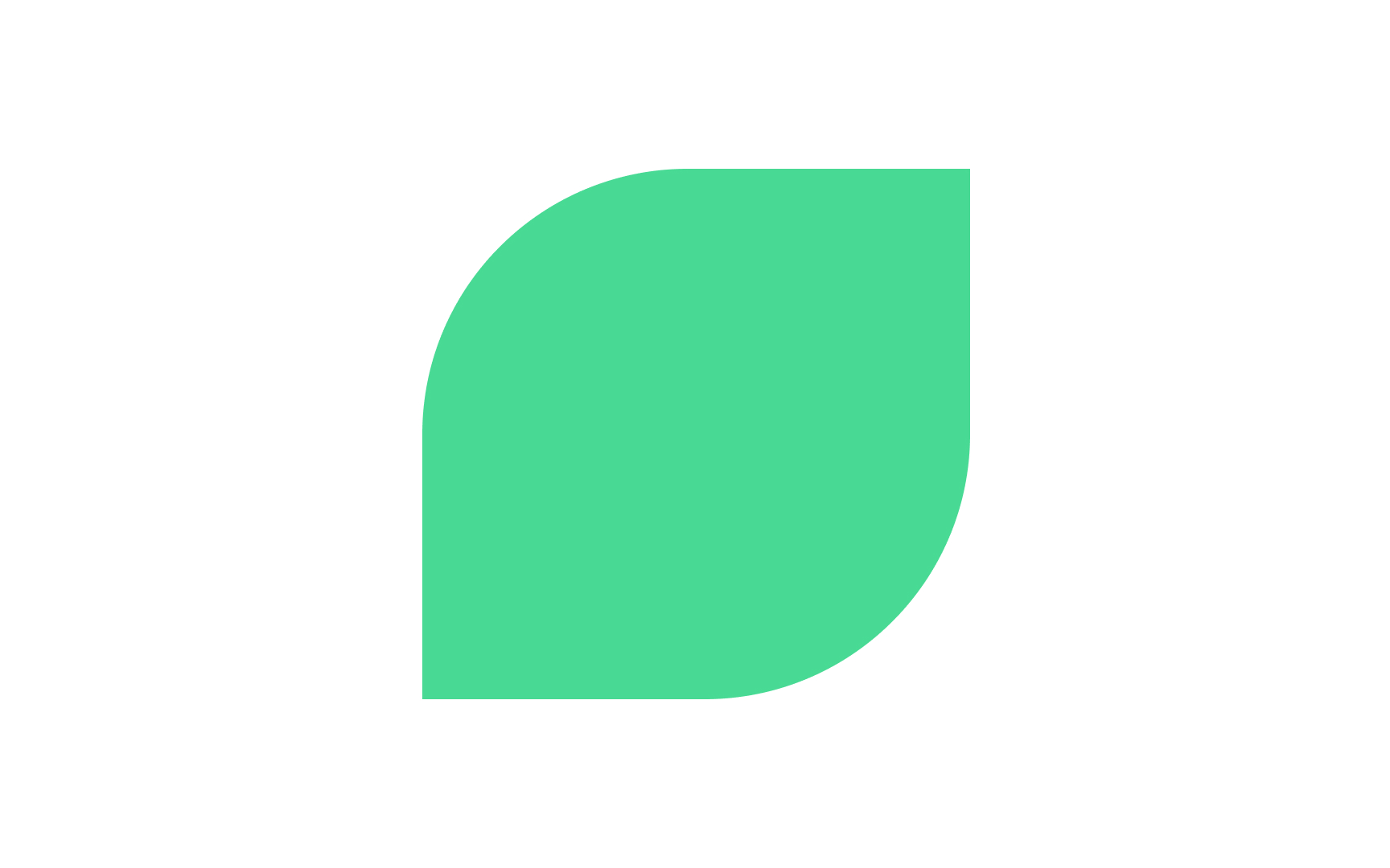
Shapes are enclosed areas defined by boundaries. They fall into two categories: geometric (circles, squares, triangles) and organic (irregular, freeform shapes found in nature).
Geometric shapes feel structured, stable, and familiar and are common in UI components like buttons and cards. Organic shapes feel natural, approachable, and dynamic and are often used in illustrations and branding. Combining both types creates visual contrast and keeps designs from feeling rigid or chaotic.
Negative/white space
Negative space (also called white space) is the empty area around and between elements. It's not just blank space, but an active design element that shapes how users perceive your composition.
Negative space creates breathing room, improves readability, and directs focus. Tight spacing feels dense and urgent. Generous spacing feels calm and premium. Skilled designers use negative space to create hidden shapes, guide the eye, and establish hierarchy without adding more elements.
Color
Color is one of the most powerful design elements. It communicates mood, creates hierarchy, guides attention, and triggers emotional responses.
Color has 3 properties:
- Hue (the color itself, such as red, blue, yellow)
- Saturation (intensity)
- Value (lightness or darkness)
In UI design, color differentiates interactive elements, indicates status (red for errors, green for success), and reinforces brand identity. Use color with intention, since too many colors create chaos, while a limited palette feels cohesive.
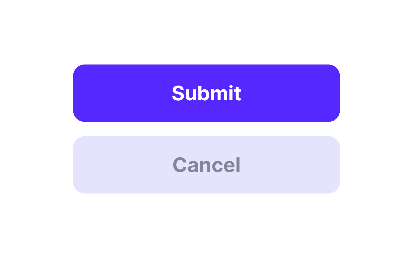
Value
Value refers to how light or dark an element is, regardless of its color. A range of values, from pure white to pure black, creates contrast, depth, and visual hierarchy.
High contrast (dark against light) draws attention and improves readability. Low contrast creates subtlety and softness. Value helps establish which elements are primary, secondary, or background. Before adding color, check that your design works in grayscale. If the value contrast is strong, the hierarchy will be clear.
Texture

Texture is the surface quality of an element or how it would feel if you could touch it. In digital design, texture is visual rather than physical, but it still communicates tactile sensations like rough, smooth, grainy, or soft.
Texture adds depth and richness to flat designs. It can make elements feel organic and handmade or sleek and polished. Use subtle textures in backgrounds to add visual interest without distracting from content. Patterns, gradients, noise, and photographic textures all create different effects. Rough textures feel raw and edgy, smooth textures feel modern and clean.


