

In digital products, errors are inevitable. They occur when a user makes an incorrect input, when a system encounters technical limitations, or when external conditions, such as poor connectivity,interfere with processes. While errors can never be eliminated completely, how a product anticipates, communicates, and recovers from them defines the user experience. Products that handle errors poorly create frustration and abandonment, while thoughtful error design builds trust and resilience.
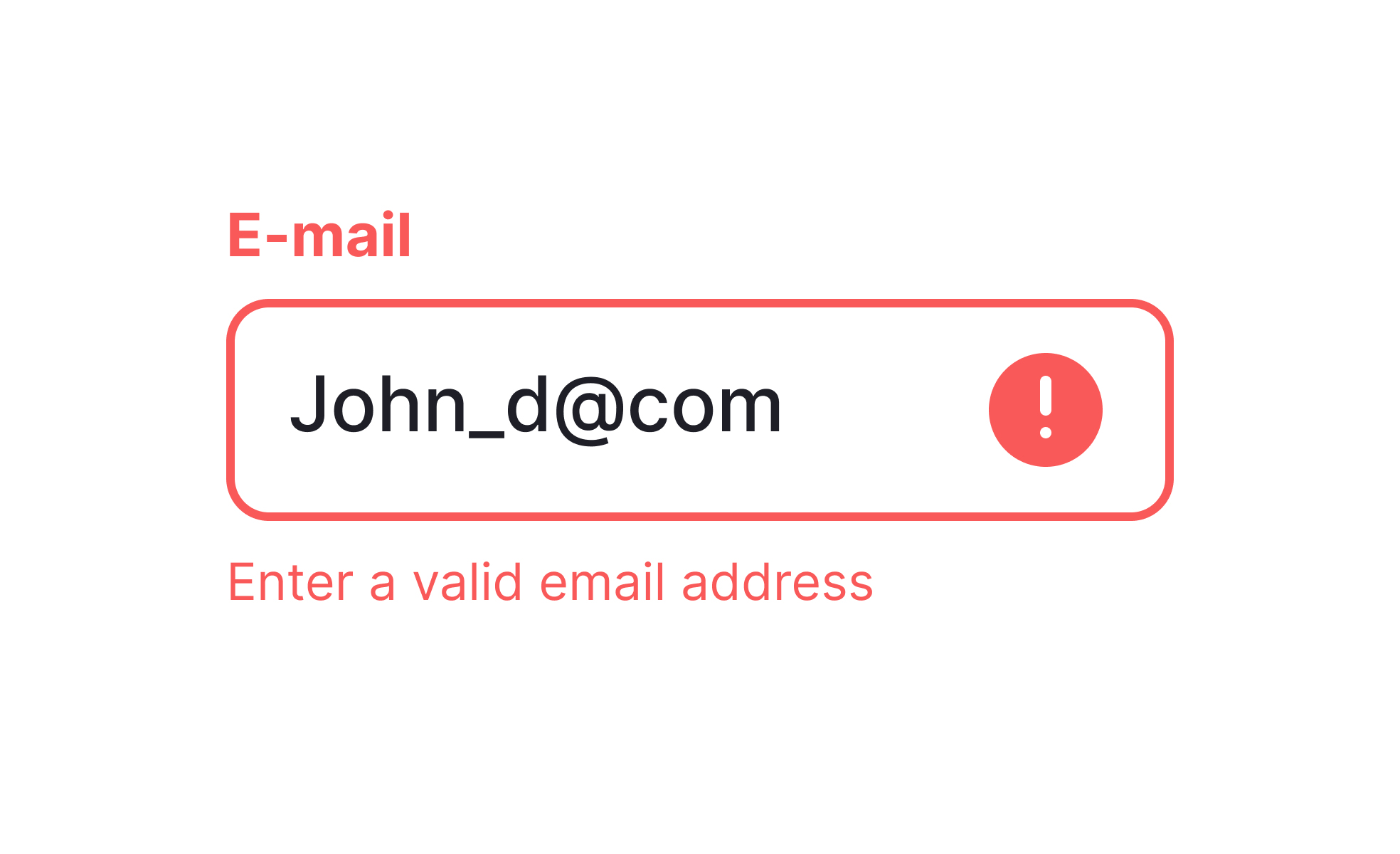
For UX designers, the priority is clarity. Error messages must be specific, actionable, and written in plain language. Vague prompts such as “Something went wrong” leave users confused. In contrast, “Your password must include at least eight characters” provides direction for resolution. Designers also rely on visual cues, like highlighting invalid fields or pairing text with icons, to make issues easy to spot.
From the perspective of product managers, errors are both a liability and a source of insight. Frequent system or usability errors generate support costs and damage reputation, but they also reveal weak points in design or process. Monitoring error logs and support tickets helps PMs identify recurring friction. When addressed systematically, these insights lead to measurable improvements in satisfaction and retention.
Real-world examples show the benefits of thoughtful error handling. Gmail warns users when they type “attached” in the body of an email but forget to include an attachment, preventing a common mistake before it causes frustration. Stripe’s payment forms validate information in real time, ensuring errors are caught and corrected quickly before a transaction fails. These proactive measures reduce frustration and build confidence in the product.
Errors can also shape perception of brand quality. Products that handle failure gracefully, through supportive language, helpful suggestions, and quick recovery, signal reliability. Users recognize that even when things go wrong, they are guided back on track. In this way, error design becomes not just a functional concern but a competitive differentiator.
Learn more about this in the Prevent Errors from the Start Exercise, taken from the Showing Input Error Lesson, a part of the UX Design Patterns with Checklist Design Course.
Key Takeaways
- Errors stem from user input, system limitations, or external conditions.
- Clear, actionable error messages reduce confusion.
- Product managers analyze error patterns to improve strategy.
- Real-world practices like Gmail and Stripe show prevention and clarity in action.


