


.svg)
Errors happen in every form, on every product, every day. Users mistype email addresses, skip required fields, and submit information in the wrong format. That is not a failure of the user, it is a reality of how people interact with interfaces under real conditions.
What separates a well-designed error state from a poorly designed one is not just whether the error is visible. It is whether the error is useful. An error message that says "invalid input" tells users nothing. One that says "your email address needs an @ symbol" tells them exactly what to fix.
Good error design also depends on timing. Inline validation that catches issues as users type feels helpful. Errors that only appear after form submission can feel like a trap. Knowing when and how to surface feedback is as important as knowing what to say.
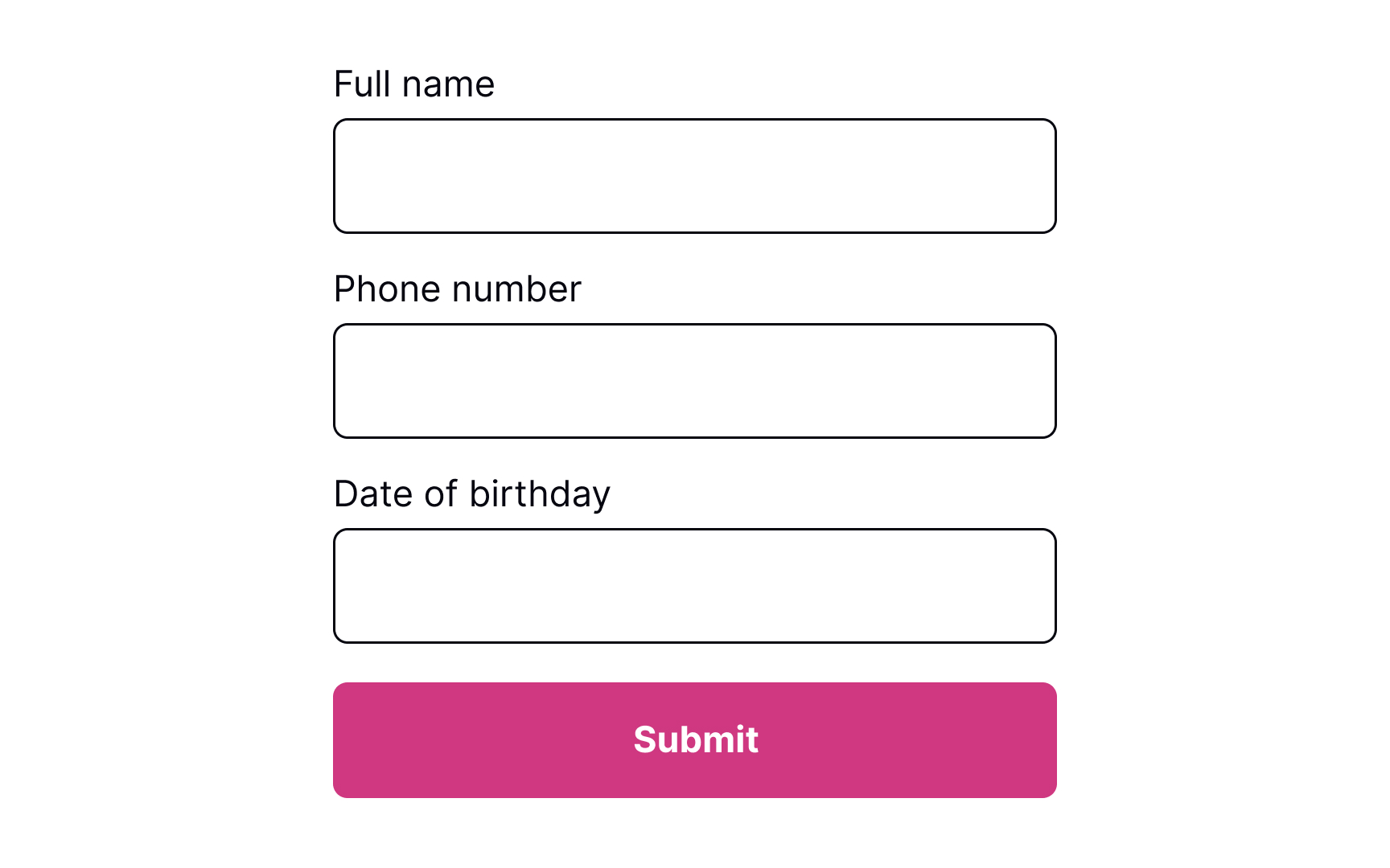
Prevent errors from the start


In the ideal world, users never make mistakes and complete tasks successfully every time. Unfortunately, in the real world, systems can be confusing, users may get distracted or lose attention, and errors happen.
Error-prevention strategies for inputs include:
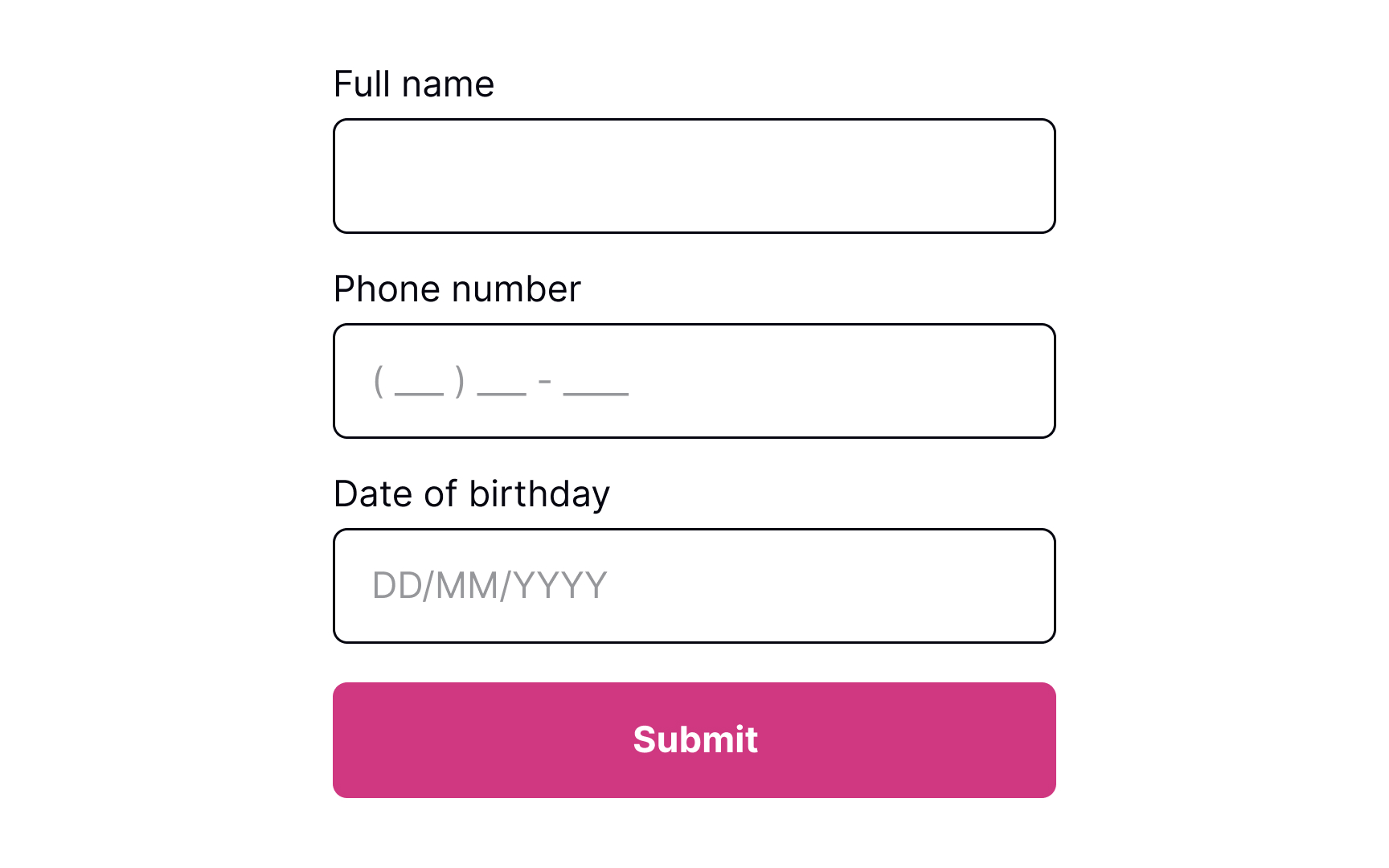
- Using constraints: Constraints prevent users from typing a wrong input by setting boundaries. For example, inputs asking for users' phone numbers or banking card numbers should show a numeric keyboard only.
- Using forgiving formats: Rather than forcing users to type in a format desired for your system, allow them to type in a way that's convenient to them. Then, format their input while users are typing and add necessary spaces, parentheses, or hyphens, removing letters if it's a phone number input, for example.
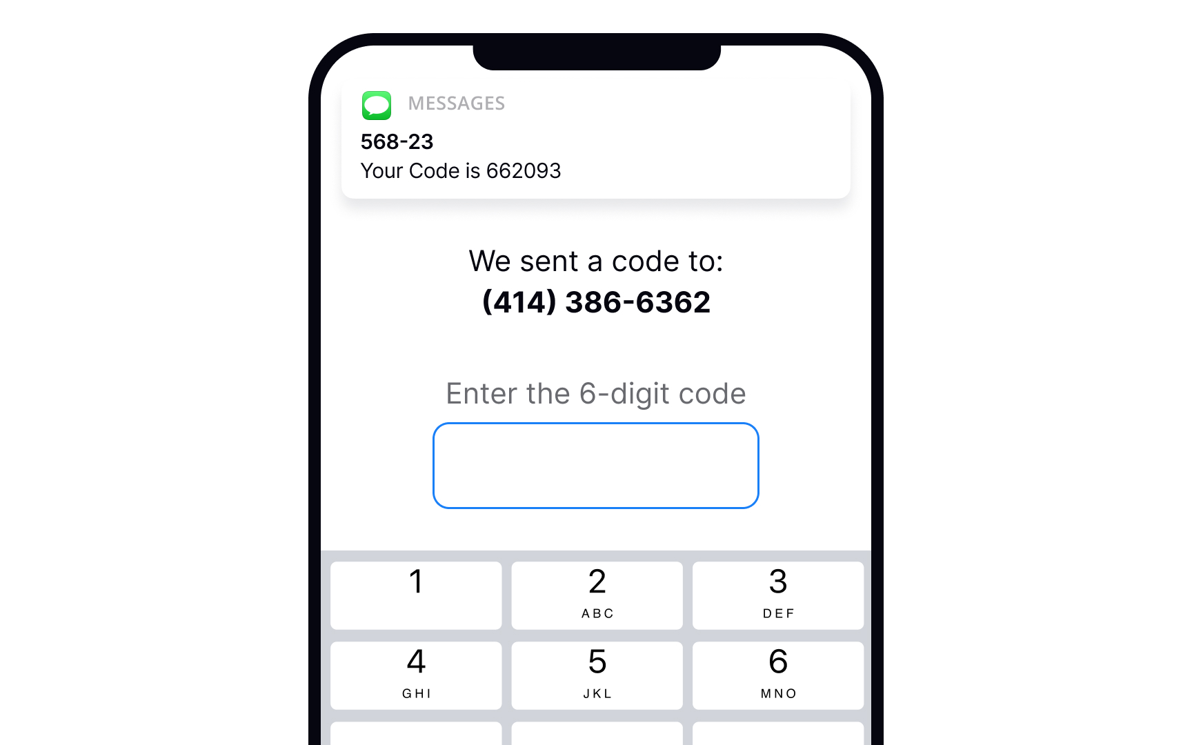
- Reducing cognitive load: Don't force users to keep too many things in mind. For example, it's a good practice to detect the SMS passcode from their messages and display it above the keyboard. This way, users don't need to switch between screens and strain their memory.[1]
- Providing clear instructions: Users don't like reading and prefer skimming information. So make sure labels, tooltips, and form instructions are concise and straight to the point.
Keep the input in default state
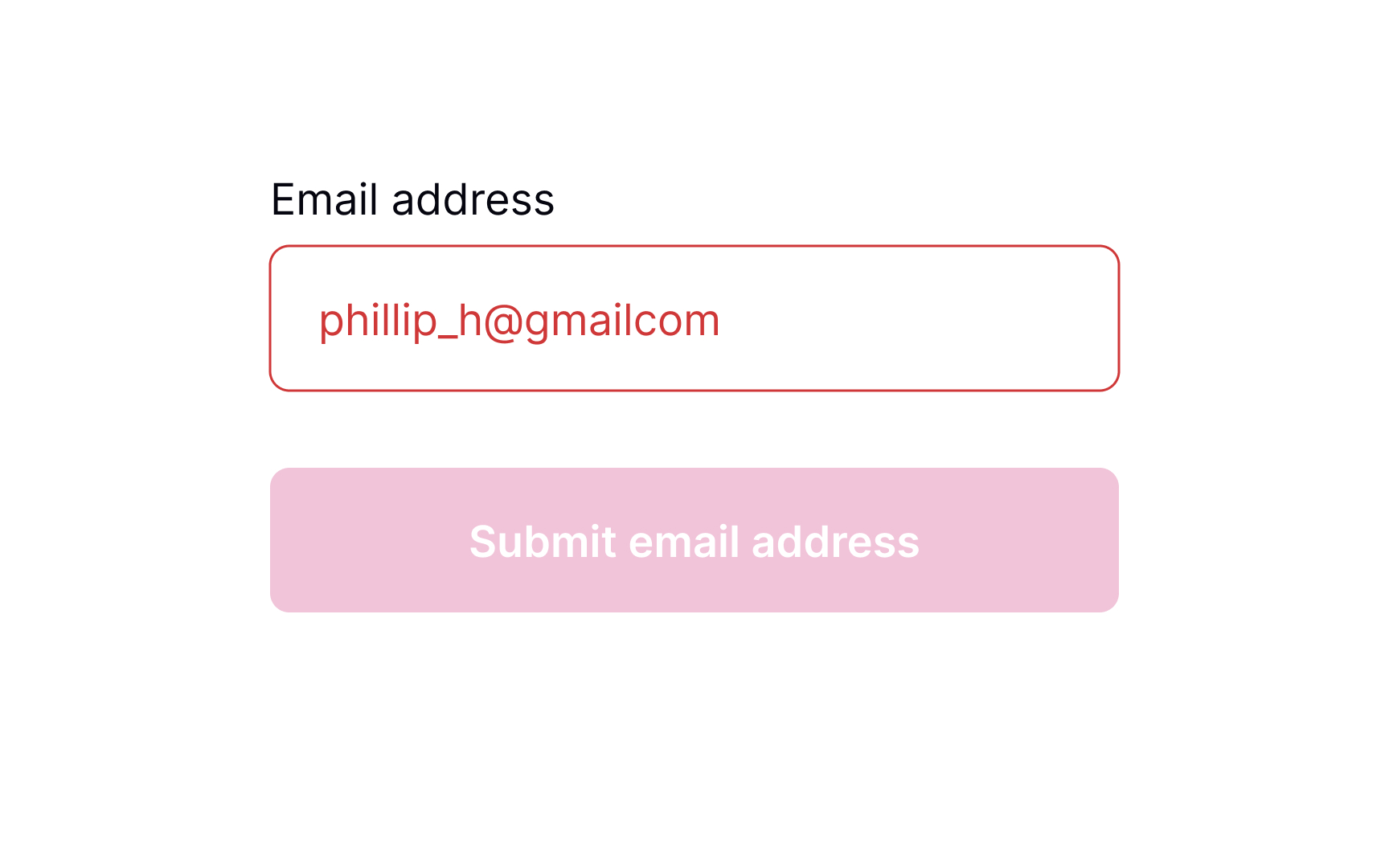
Error inputs should be easy to notice — this supports Nielsen's "visibility of system status" heuristic. However, users should notice them only after they enter any data. Ideally, input validation should happen inline. It means the input should be checked for errors only after users enter information and can afford to focus away from the input.
Pro Tip! Use inline validation to indicate successful entries. It'll remove any second-guessing that users may have to do when filling in a complex form with multiple inputs.
Allow users to enter information
While users are filling out a form, they may want to edit some information and go back to previous fields. Let them type without interruption and don't check for errors until users finish making changes and shift their focus from the input. Otherwise, you might distract users and make them doubt whether they've already made a mistake.
Inline validation makes sense for complex inputs such as new passwords, as it helps prevent guessing or double-checking whether the information they entered meets the requirements.[2]
Provide input masks to avoid errors
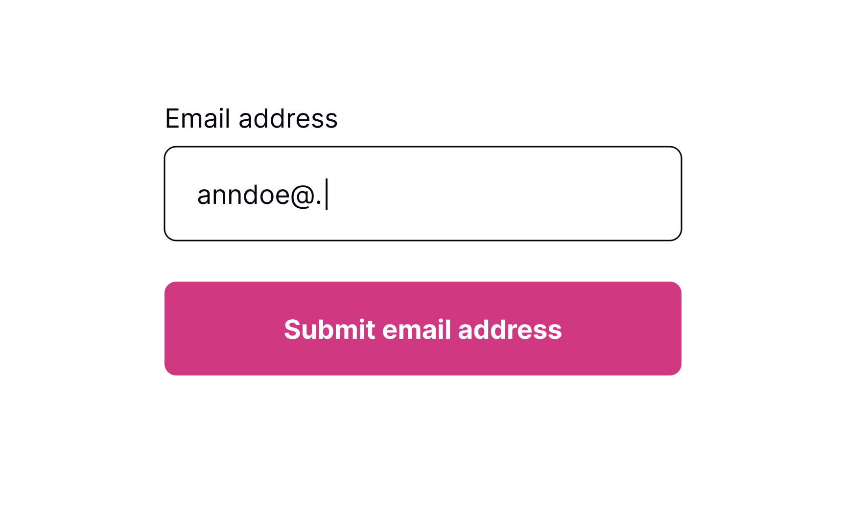
Placeholders are supposed to clarify what information users need to enter and increase the form completion speed. Unfortunately, many people confuse placeholders with real data filled in by default.
Plus, if placeholders substitute labels, they disappear after users place the cursor in the input. If they get distracted at this time, they will need to shift their focus away from the input to display the placeholder text again.[3] If placeholders are so tricky, how can we use them to help users prevent errors?
Input masks are an excellent solution when formatting matters (for things like phone numbers or dates). Besides displaying the desired input format, they also automatically apply it to users' input as they type. This tool reduces cognitive load and confusion, so users don't need to worry and double-check if they have typed everything correctly.
Signal error after loss of focus
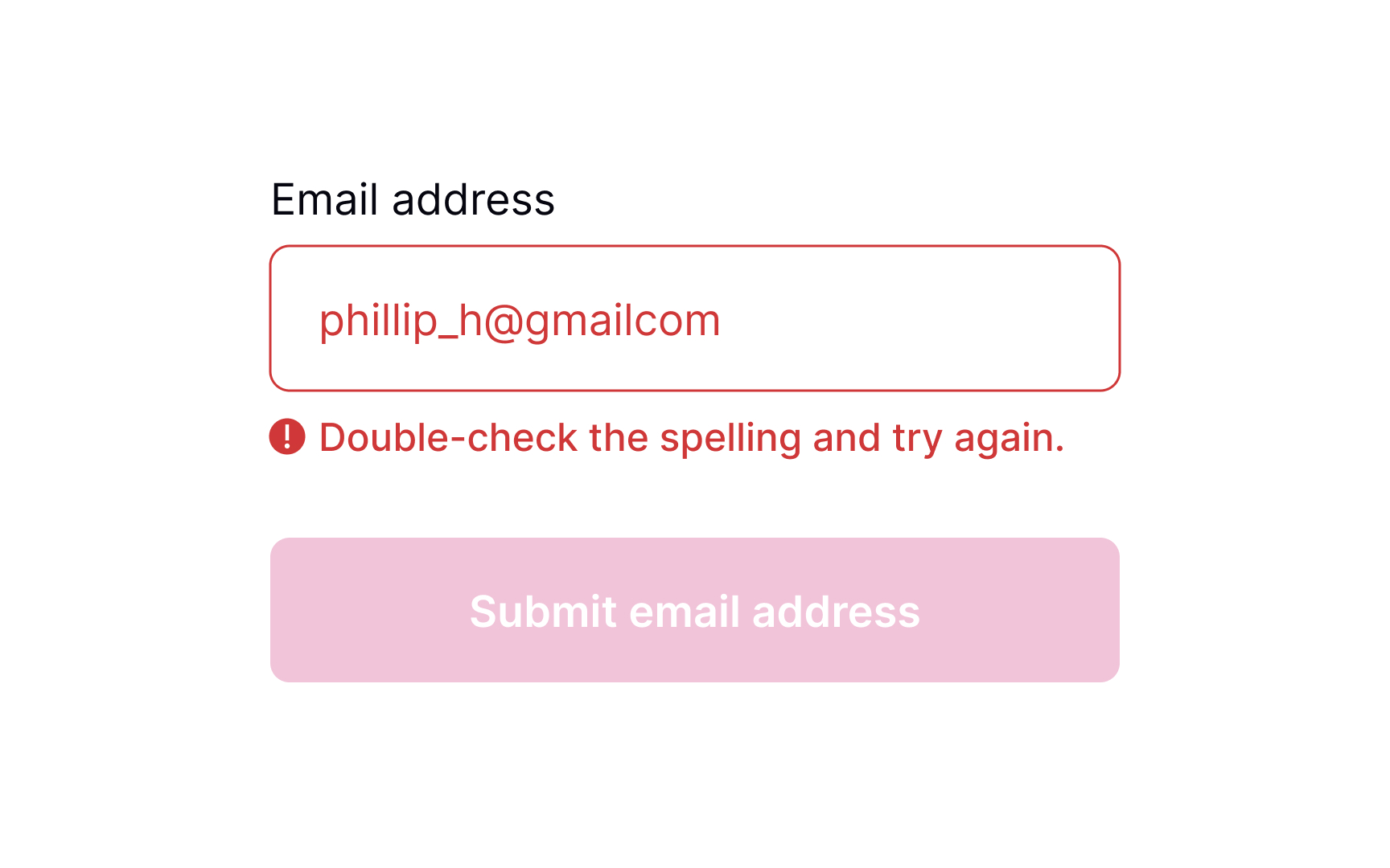
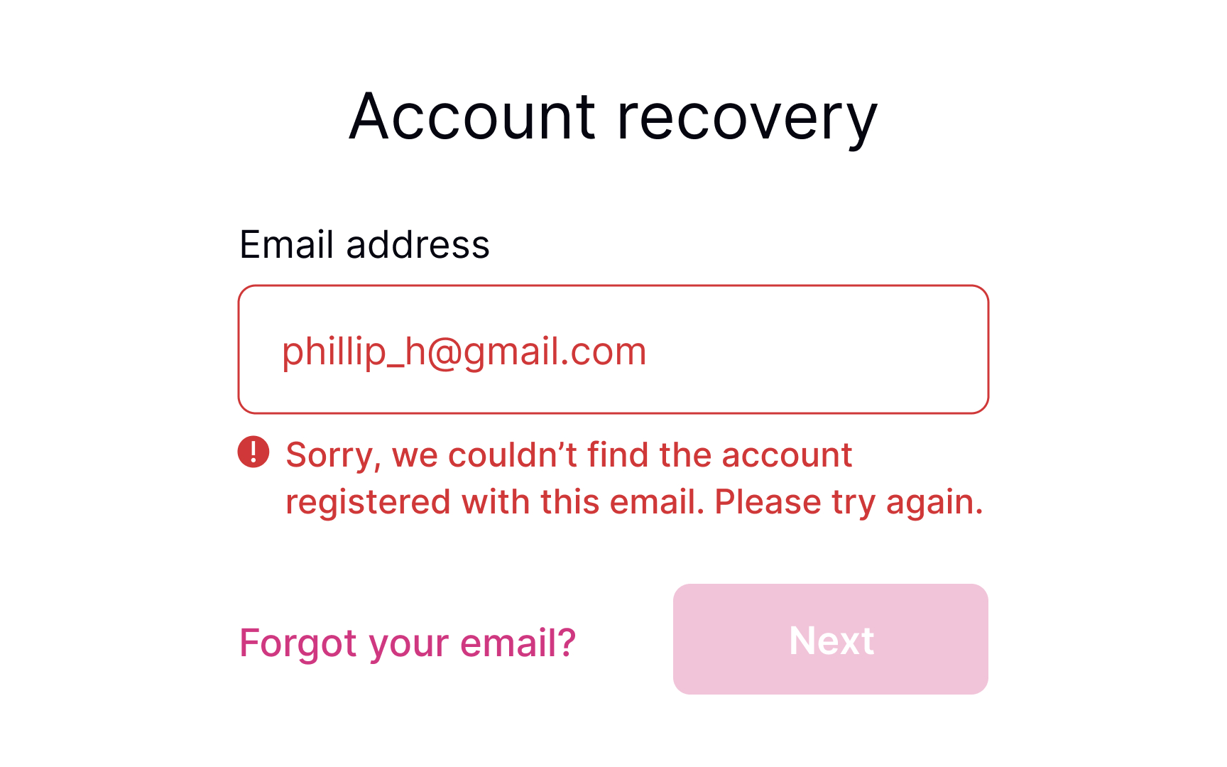
Once users move away from the input field by selecting another element or removing the cursor, the system can begin validating the input. In case an error occurs, display a message next to the input and explain how users can correct it. Make sure the message is clear and polite and provides straightforward instructions using plain language.
Pro Tip! From an accessibility viewpoint, it's important to accompany the error message with an icon indicating an error.
Meaningful error messages
Even if you take all measures to prevent input errors, users will make them anyway. Providing meaningful error messages reassures users that mistakes happen and that it isn't the end of the world.
- Use plain language: Get rid of technical jargon and passive voices, which may confuse users.
- Keep the message short: Users don't like to read, and in the face of a stressful environment, they are even less likely to read something longer than 1-2 sentences. A study by the American Press Institute shows that users are more likely to understand the whole piece of information only if the sentence contains no more than 8 words.[4]
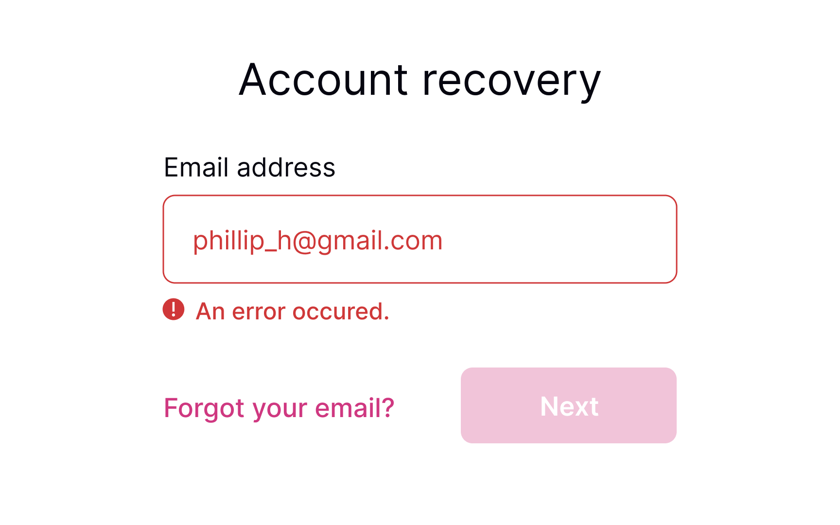
- Be precise: Avoid ambiguous phrases like "an error occurred," as they don't help users identify the root cause. Tell them which input contains the error and what they are expected to enter in order to solve it.
- Be polite: Avoid blaming users or making them feel stupid. Focus on fixing the problem and building trust and loyalty.
Keep the error state visible till fixed
Keeping the error state visible while the user is making corrections is important because:
- It maintains context about what needs to be fixed
- Users don't have to remember what the error was
- It provides immediate feedback as they work toward a solution
- It prevents confusion about whether the error has actually been resolved
The field should only return to its default or success state when the input actually becomes valid, not just when the user starts typing again. For example, if a password is too short, the error state and message should persist until the password reaches the minimum length requirement.
The only visual change during user input should be real-time validation feedback, like checkmarks appearing next to requirements as they're met.
References
- Preventing User Errors: Avoiding Unconscious Slips | Nielsen Norman Group
- How to Report Errors in Forms: 10 Design Guidelines | Nielsen Norman Group
- Placeholders in Form Fields Are Harmful | Nielsen Norman Group
- How to Make Your Copy More Readable: Make Sentences Shorter – PRsay


