Illustration
Get 25% off unlimited learning for an entire year.
00d : 00h : 00m : 00s
Upgrade now
Illustration
Get 50% off unlimited learning!
00d : 00h : 00m : 00s
Upgrade now
Uxcel blog logo
It’s pronounced
“you excel”
Uxcel blog logo
Courses & Paths
Catalog
Courses

Over 50 interactive courses

Career paths

Fast-track your product career

Professional certifications

Get certified. Stand out.

More
Skill assessments

Measure & benchmark your skills

Project briefs

Complete real-world exercises

Lessons

Bite-sized learning for any skill

Live workshops

Live sessions by leading experts

Not sure where to start?

Find your skill level fast & get personalized learning plan

Not sure where to start?
Resources
Resources
Blog

Articles on career growth

Glossary

Browse key product terms

About us

Learn about team & mission

Community & programs
Learner stories

Meet our learners

Team stories

How teams grow with us

Uxcel rankings

Discover the top product pros

.
Instructors program

Teach, inspire & earn

Mentors program

Grow as a product leader

Universities & non-profits

Supporting worthy causes

See what’s new on Uxcel

View changelog
Pricing
For Individuals
For Teams
For Teams
Product
PricingCoursesAssessmentsProfessional certificationsUX learning experiencePM learning experienceFor Teams
Resources

Mobile app

App StoreGoogle Play
Blog
Community
Learner storiesUpcoming events
Log InStart for free
Go to app
<- Glossary
/
Inputs

Inputs

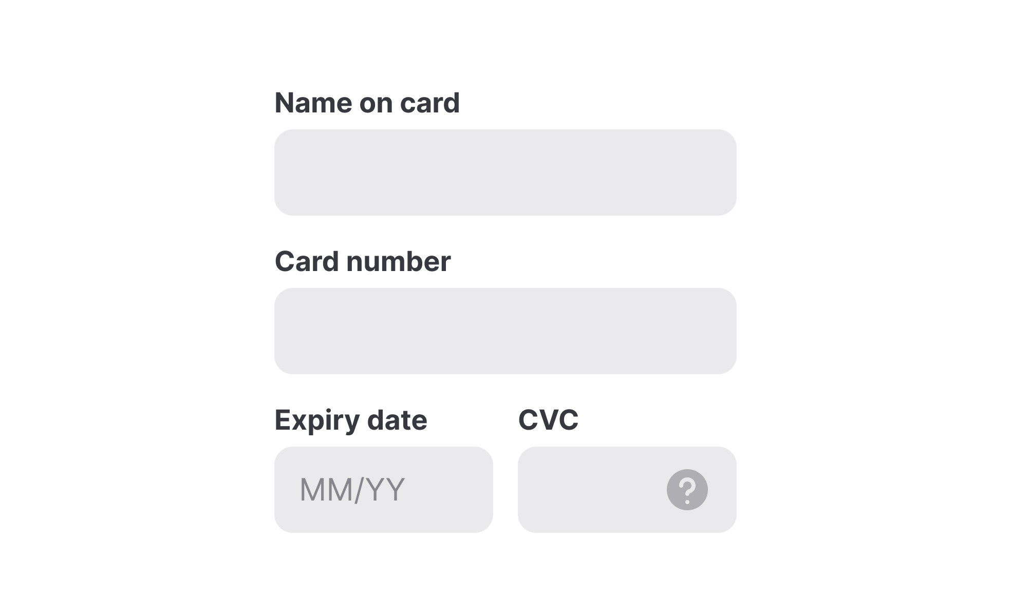
Inputs are interactive elements or controls through which users provide information or perform actions within a digital interface. They include various types of form fields, checkboxes, radio buttons, dropdown menus, sliders, buttons, and other interactive elements.

Time to read
136
learning resources

Share

Facebook
Copied
LinkedinFacebookX

Summarize with AI

Chat GPTClaudeGeminiPerplexity
Contents
Text Link
Recommended resources
FAQs
Inputs

Recommended resources

Courses

View all
Icon

New

Core UI Components
Learn how to design buttons, forms, cards, and other core UI components, and understand the reasoning and best practices behind their usage in every project
Rating
4.8
Icon
7
Icon
Intermediate

October 19, 2020

Career paths

View all
No items found.

Lessons

View all
Showing Input Error
Showing Input Error

from

Everyday UX Flows by Checklist Design

course

Errors happen in every form, on every product, every day. Users mistype email addresses, skip required fields, and submit information in the wrong format.
Icon
5

m read

Icon
7
exercises
Designing for Tablets

from

Mobile Design

course

Tablet design occupies a unique space between mobile and desktop interfaces, demanding thoughtful consideration of touch targets, screen orientations, and...
Icon
7

m read

Icon
8
exercises

Frequently Asked Questions

What is an input?

Input fields (or just "inputs") allow users to provide information to a system, process, or program. It comes in many forms, such as text, numbers, images, audio, or video. Usually, users provide inputs through a keyboard or mouse, by touching the screen, pronouncing voice commands, or uploading a file.

Text inputs are most common and typically appear in forms and dialogs. Explore the intricacies of designing text inputs with the Input Best Practices lesson from our UI Components I course.

What are the best practices for input design?

Systems use inputs for collecting information about users, and knowing the best practices for input design reduces the risk of failing this task. The most common best practices for input design include:

  • Simplicity: Inputs should be simple and intuitive to understand and use, with clear instructions and labels.
  • Accessibility: Inputs should have enough contrast and be easily reached via a keyboard.
  • Minimum user effort: Whenever possible, use autocomplete or provide pre-populated options to minimize effort and cognitive load.
  • Appropriate input types: Choose the most appropriate input type for the data being collected, such as a date picker for date inputs, or a slider for numerical inputs.
  • Relevant feedback: Provide immediate feedback to users and indicate whether an input is active or disabled or whether the input was successful or contains errors.

For more best practices explore the Inputs Best Practices lesson within the UI Components I course.

What are the input states in UI design?

In UI design, input states provide feedback to users and communicate to users how to interact with an input and whether this interaction is successful.

Input states include:

  • Enabled: An enabled state signals to users that an element is ready to be interacted with.
  • Disabled: A disabled state indicates that an input cannot be interacted with.
  • Hover: A hover state provides a visual indication that users move the mouse cursor over an input.
  • Focused: A focused state appears when users activate an input with a click or tap. It indicates the input’s readiness.
  • Error: An error state indicates the input contains an error such as an invalid format or value that is outside the acceptable range.
  • Success: This state indicates that the data has been validated and is ready for submission or collection.
What are input types?

Input types vary depending on the data type required and accepted by an input in a form. The most common input types include text, password, number, email, or file.

Learn in-demand UX, PM & AI skills

Join 500,000+ professionals learning about User Experience (UX) Design on Uxcel

Get started

Related topics

Tabs
Links
FAB
Dividers
Notifications
Inputs
Headers
Radio Buttons
Hamburger Menu
Menus components

Join 500,000+ product professionals leveling up with Uxcel

Interactive learning built for busy professionals. Advance your UX design or product management career in just 5 minutes a day.
Icon

Over 50 courses

Icon

Professional certiications

Icon

Live events & more

Get startedLearn more
Stars

Successfully transforming people’s careers & lives

Thousands of professionals started or levelled up their careers with Uxcel — whether switching roles, getting promoted, or landing a new job.
4.8
Trustpilot rating

Over 200 reviews on

Trustpilot
View Wall of Love
Photo

With Uxcel, I've gained so much confidence talking with clients.

Blake Feldman
Product Designer · 15+ years in design
Photo

Uxcel helped me level up from a junior to a senior designer

Chieri Wada
UX/UI Designer · 8+ years in design
Photo

Uxcel really helped me during my career change.

Ryan Blackwell
UX Designer & Writer · 5+ years in design
Photo

Uxcel is in my browser favorites, I use it for a ton of stuff.

Matt Salik
UX designer · 20+ years in design
Photo

Love the certifications, love the price. Thumbs up Uxcel.

Phil Campbell
Information Architect · 1 year in design
Company logoCompany logoCompany logoCompany logoCompany logoCompany logoCompany logoCompany logoCompany logoCompany logoCompany logoCompany logo

Ready to bring your skills to the next level?

Get started
Uxcel logo white

Ask about Uxcel

Chat GPTClaudeGeminiPerplexity
  • About Us
  • Changelog
  • Help Center

Products

  • Courses
  • Career paths
  • Professional certifications
  • Lessons
  • Skill assessments
  • Project briefs
  • Pricing

Community

  • Upcoming live workshops
  • Learner stories
  • Uxcel rankings
  • Certified professionals
  • Career Impact
    report
  • Wall of love

Resources

  • Why Uxcel?
  • Blog
  • Glossary
  • Instructors program
  • Mentors program
  • Universities & non-profits program
  • Communities program

For Business

  • Uxcel for Teams
  • Business pricing
  • Customer stories
  • Book a demo
  • State of AI in product teams
    report

Popular Courses

  • UX design courses
  • Product management courses
  • AI courses
  • UX Design Foundations
  • Accessibility foundations
  • Product discovery
  • AI Fundamentals for UX
  • Product analytics
  • View all

More

  • Modern Skill Stack
    podcast
  • Gift membership
  • Partnerships
  • Affiliate program
  • Privacy Policy
  • Terms of Service
  • Cookie Policy
  • License
© 2026 Uxcel, Inc. All rights reserved.
We use cookies 🍪 to analyze our site and deliver personalized content. By clicking “Agree”, you content to our Cookie Policy. You may change your settings at any time.
AgreeCookie Settings
Cookie Settings 🍪
We use cookies to remember your login details, provide a secure log-in experience, collect statistics to optimize site functionality, and deliver content and advertising tailored to your interests. You can view detailed descriptions of the types of cookies we use in our Cookie Policy.

Click “Agree” to accept all cookies or “Decline” to allow only necessary cookies. You may change your preferences at any time by clicking the ”Cookies“ link in the footer of the page.
DeclineAgree
Close
🍪 Cookies Preferences