

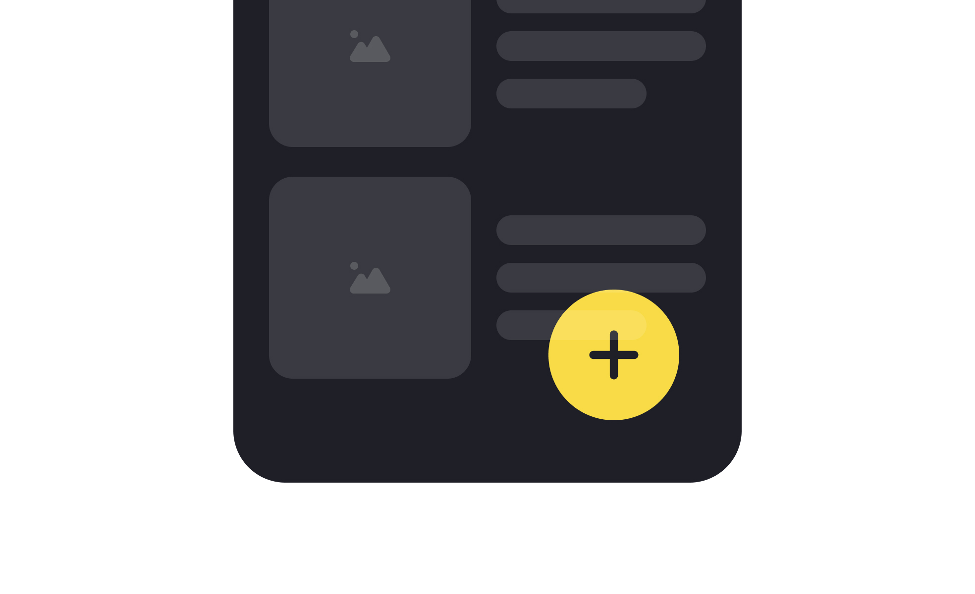
A Floating Action Button, often abbreviated as FAB, is a circular interface element that hovers above content and promotes a primary action. Popularized by Google’s Material Design system, the FAB is now widely used in mobile and web applications to give users a consistent entry point for high-value actions. It is designed to be visually distinct, usually through placement, color, and shape, so that users can recognize its purpose instantly.
In UX design, FABs simplify navigation by drawing attention to one core action per screen. They reduce decision-making by making the next step obvious, which improves efficiency and task completion. A clear example is Gmail’s FAB on mobile, which allows users to compose a new email instantly. Its visibility ensures that the most important function is always within reach, supporting a smoother workflow.
Accessibility is an essential consideration when designing FABs. Their placement must account for reachability, especially on mobile screens, where thumb comfort zones determine usability. Color contrast must be sufficient to support visibility for users with visual impairments. Labels or tooltips also ensure that the FAB’s purpose is clear, both for screen readers and for users unfamiliar with the iconography.
Real-world use cases demonstrate the adaptability of FABs. In Google Maps, the FAB provides quick access to directions, the app’s primary function. In task management apps like Todoist, it creates new tasks, aligning with the product’s main purpose. These examples show how FABs work best when tied directly to the most common or most valuable action a user will take.
Designing with FABs requires restraint. Overuse or adding multiple FABs to a single screen reduces their impact, creating confusion rather than clarity. When implemented correctly, they provide consistency and focus. When implemented poorly, they clutter the interface and undermine usability. Careful testing ensures that FABs truly support user priorities rather than simply highlighting business interests.
Learn more about this in the Floating Action Button (FAB) Exercise, taken from the Common UI Button Styles Lesson, a part of the UI Components I Course.
Key Takeaways
- FABs highlight the most important action on a screen.
- UX designers use them to improve clarity and task completion.
- Accessibility requires proper placement, color contrast, and labels.
- Examples include Gmail, Google Maps, and productivity apps.
- Overuse or unclear purpose reduces effectiveness.


