

What is a placeholder?
A placeholder is a piece of temporary content that holds space or communicates intent before real content is available. The term covers two related but distinct uses.
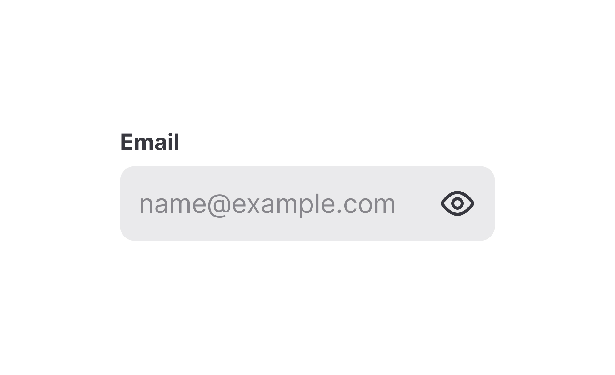
In forms and input fields, a placeholder is the hint text that appears inside a field before a user types anything. It typically describes what the field expects: "Enter your email address," "DD/MM/YYYY," or "Search by topic or keyword." The text disappears as soon as the user begins typing.
In design workflows, placeholders are the stand-in elements that fill a layout before final assets are ready. These might be grey rectangles where images will go, blocks of dummy text to simulate paragraph lengths, or simple shapes representing UI components not yet designed. Their purpose is to let a team evaluate the structure and proportion of a layout without waiting for real content.
Both uses serve the same underlying goal: maintaining enough fidelity to communicate clearly without requiring complete, final material at a stage where it doesn't yet exist.
What are placeholders used for in forms?
In form design, placeholders serve as contextual hints. They help users understand what a field is asking for, particularly when the expected format or type of input isn't obvious from the field label alone.
A date field labelled "Date of birth" is clearer with a placeholder showing the expected format: "DD/MM/YYYY" or "MM/DD/YYYY" depending on the locale. A search bar placeholder like "Search products, categories, or brands" communicates the scope of what can be searched, which may not be obvious to a first-time user.
The key limitation is that placeholder text disappears the moment a user starts typing. This means the hint is only available before any input has been entered. Users who pause mid-entry, make an error, or need to check the format must either clear the field to see the placeholder again or rely on memory. For complex formats or fields with specific requirements, this creates a real usability risk.
This is why placeholder text should never be the sole mechanism for communicating a field's requirements. Persistent labels positioned above or beside the field ensure that instructions remain visible throughout the entire input process, not just at the start of it.
What is the difference between a placeholder and a label?
Labels and placeholders serve related but distinct functions, and conflating them is one of the most common form design mistakes.
A label is the permanent identifier for a form field. It names what the field is asking for and remains visible at all times, including after the user has entered content. It's typically positioned above or beside the field.
A placeholder is a temporary hint placed inside the field itself. It describes the expected input, gives an example, or shows a format. It disappears once the user begins typing.
Using a placeholder as a label, putting the field's name inside the field with no external label, creates a significant usability problem. As soon as the user starts typing, the label disappears, leaving the user with no persistent reference to what they were filling in. This is particularly problematic in longer forms where a user might need to pause, go back, or review their entries. It also creates accessibility issues: screen readers and autofill tools handle placeholder text differently from labels, and relying on placeholders alone can make forms unusable for some users.
The correct approach is to use both: a persistent label that names the field, and a placeholder inside the field that provides supplemental guidance about format or example content.
How are placeholders used in design and development workflows?
Outside of forms, placeholder is used to describe the stand-in content that fills a design during the stages before final assets exist.
In wireframes and low-fidelity mockups, placeholder boxes represent images, illustrations, or media that haven't been created yet. Lorem ipsum text, the traditional typesetting stand-in, has been used for centuries to simulate the visual weight of body text without requiring real copy. These placeholders allow designers to evaluate layout, spacing, and proportion before final content is available.
In higher-fidelity prototypes, more specific placeholders are sometimes used: realistic but fictitious names, representative product images, or approximate copy that approximates the final content's length and structure. The goal is to get the layout behaving as it will in production, so that usability testing reflects real conditions rather than a stripped-down skeleton.
Developers also use placeholder data when building and testing interfaces before a product's real data is available. Seed data, mock APIs, and dummy records let teams evaluate interface behavior, loading states, and error handling without waiting for a live backend to be fully functional.
What accessibility considerations apply to placeholders?
Placeholder text in forms carries several accessibility concerns that are worth addressing explicitly.
Contrast is the most immediate issue. Browsers render placeholder text in a lighter color than regular input text to visually signal that it's hint content rather than user input. This lower contrast can make placeholder text difficult to read for users with low vision, even if the rest of the form's text meets accessibility standards. Teams building accessible forms need to check that placeholder text meets minimum contrast ratios even at its subdued styling.
The disappearing behavior also creates cognitive challenges for users with memory difficulties or attention-related conditions. If a format requirement or important hint was only communicated through a placeholder, those users may lose access to it mid-task.
Screen readers handle placeholder text inconsistently across browsers and assistive technology combinations. Some announce it as part of the field's accessible name; others don't. Relying on placeholder text to convey critical information about a field's purpose can result in that information being entirely absent for screen reader users. ARIA labels and persistent visible labels are the reliable way to ensure the field's purpose is accessible to everyone.


