

What is a toggle switch?
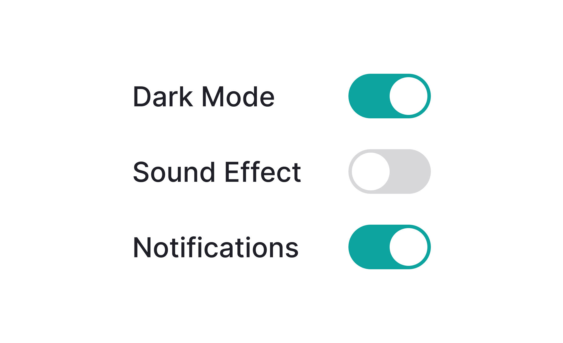
A toggle switch is a binary UI control: it has exactly two states and switching between them takes one action. In its visual form, it typically resembles a physical switch or slider that moves between two positions. When in the "on" or enabled state, the knob or indicator sits to the right, usually with a color that signals activation (often green or the product's primary color). In the "off" or disabled state, the knob sits to the left, in a neutral or grey treatment.
The toggle switch's physical analogy is intentional. Physical light switches and hardware toggles are among the most universally understood controls in everyday life. Digital toggle switches borrow that affordance, using the sliding motion to communicate that a feature is being switched on or off in a way that a checkbox or dropdown does not.
Toggle switches are used most frequently in settings screens, preference panels, account configuration, notification management, and feature flags. Any context where a user needs to enable or disable something immediately and independently is a good candidate for a toggle.
When should a toggle switch be used instead of a checkbox?
This is the most commonly asked question about toggle switches, and the distinction is more functional than visual.
Toggles imply immediacy. The convention they establish is: "changing this control changes the system state right now, without any additional confirmation." A user who toggles dark mode expects the screen to switch immediately. A user who toggles email notifications expects that setting to take effect immediately. If the interface requires the user to click Save or Submit after making the toggle change, it violates the toggle's implied contract and should use a checkbox instead.
Checkboxes imply submission. They're designed for forms where the user makes multiple selections and then confirms them all at once with a submit action. Checkboxes in a form that's submitted together are the right choice. Checkboxes as standalone controls for immediate on/off actions are technically functional but feel inconsistent with user expectations built from platform conventions.
The rule of thumb: if the state change takes effect the moment the user interacts with the control, use a toggle. If the state change is part of a form that's submitted later, use a checkbox.
How should toggle states be communicated clearly?
Ambiguity about which state a toggle is currently in is one of the most common usability failures in toggle design.
- Color is the most common differentiator: a green or primary-color fill signals on, a grey fill signals off. Color alone is insufficient for accessibility, but it provides immediate visual cue for the majority of users.
- Position supports color: the knob to the right typically means on, knob to the left means off. This convention is consistent enough across platforms that users generally understand it, but it's still worth reinforcing with the other signals.
- Labels reduce the most ambiguity. A text label adjacent to the toggle that changes between "On" and "Off" (or "Enabled" and "Disabled") removes any guesswork about the current state. Some designs place static labels on both sides of the toggle: "Off" to the left and "On" to the right, so the knob always points toward the active state label. Both approaches work; the former is more compact and common on mobile.
- One common mistake is labeling the toggle action rather than the state. A toggle labeled "Enable dark mode" that sits in the off position is ambiguous: is dark mode currently enabled, or will clicking this enable it? Labeling the feature ("Dark mode") with the toggle communicating the state is clearer than labeling the action.
What accessibility requirements apply to toggle switches?
Toggle switches are a custom component in most implementations, which means they don't inherit the native browser accessibility of standard HTML inputs. This makes explicit accessibility implementation necessary.
- The toggle button must have an accessible name that tells screen reader users what it controls. This is typically the label text adjacent to the toggle, associated programmatically via
aria-labeloraria-labelledby. - The current state must be communicated programmatically. Using
role="switch"witharia-checked="true"oraria-checked="false"allows screen readers to announce both the control's role and its current state. Without this, a screen reader user hears "button" when focusing the toggle, with no information about whether it's currently on or off. - Keyboard interaction follows the button pattern: Tab or Shift+Tab moves focus to and from the toggle, and Space or Enter activates it. Many toggle implementations accidentally support only Space or only Enter; both should work.
- Touch target size must meet minimums: 44x44 points on iOS and 48x48dp on Android. The toggle's visual element is often smaller than this, and padding must extend the interactive area to meet the minimum.
- Color contrast must be checked between the knob and the track in both states, not just the "on" state that typically uses a brand color. The "off" state grey track against a white background often fails WCAG contrast requirements if not checked explicitly.


