

What is a UI component?
A UI component (short for user interface component) is a reusable, self-contained element that makes up part of a digital interface. Think buttons, text fields, navigation menus, modal dialogs, cards, checkboxes, dropdowns, and accordions. Each one handles a specific job, carries its own visual style, and behaves consistently no matter where it appears in a product.
That consistency is what matters most. A button component doesn't just look the same every time. It responds the same way too: hover states, focus states, disabled states, and click behavior all follow the same rules. You define those rules once, then use the component everywhere.
UI components are the foundational layer of any modern design system. They sit between the raw design tokens (colors, spacing values, typography scales) and the full pages users actually see.
What are the different types of UI components?
UI components fall into 4 broad categories based on what they do:
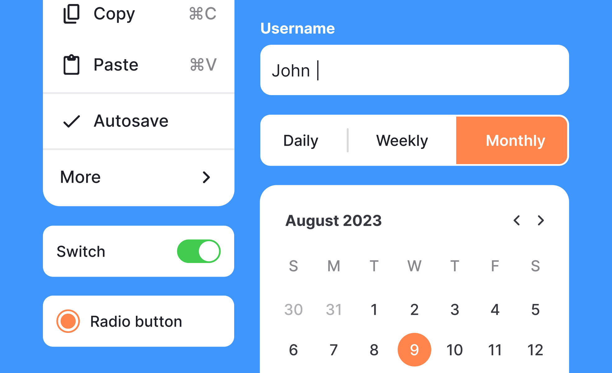
- Input components collect information from users. Text fields, password inputs, checkboxes, radio buttons, sliders, date pickers, and file upload areas all live here. They need clear labels, helpful placeholder text, meaningful error messages, and accessible keyboard behavior.
- Output components display information back to users. Labels, badges, progress bars, tooltips, notifications, alerts, and data tables are all examples. Their job is communicating something clearly and without confusion.
- Navigation components help users move through a product. Tabs, breadcrumbs, pagination, sidebars, bottom navigation bars, and steppers fall into this group. Good navigation components give users a reliable sense of where they are and where they can go next.
- Container components organize and group other elements. Cards, modals, drawers, panels, accordions, and carousels wrap content and create structure. They often handle layout logic, managing how their child elements arrange and reflow across screen sizes.
Many real-world components combine categories. A modal dialog is a container, but it usually holds input or output components alongside action buttons. The categories describe primary function, not strict boundaries.
What makes a UI component reusable?
A component earns the "reusable" label when it can appear in different contexts without modification, or with only light configuration. 3 properties make this possible.
- Encapsulation: The component contains everything it needs to function: its own markup structure, styling rules, and behavior logic. It doesn't depend on the page it lives on to style it or tell it how to behave.
- Configurability: A good component accepts properties that let you adapt it without rebuilding it. A button might accept a variant (primary, secondary, destructive), a size (small, medium, large), and a disabled state. One component, many uses.
- Clear scope: Reusable components do one thing well. A card handles the layout and visual treatment of a piece of content. It doesn't also handle the API call that fetches that content, or the modal that opens when you click it. Tight scope makes components easier to test, update, and maintain over time.
How do UI components relate to design systems?
You can't talk about UI components for long without design systems coming up. That's because components are the heart of every mature design system.
A design system is the set of decisions, documentation, and tools that help a team build consistent products. It includes design tokens (variables for colors, spacing, and typography), usage guidelines, accessibility standards, and the component library itself.
The component library is the collection of pre-built, documented UI components that teams pull from when building new screens and features. Well-maintained libraries include components in every state they might appear: default, hover, focus, active, disabled, loading, error, and success. They document when to use a component and when not to.
Teams at companies like Google (Material Design), Atlassian, IBM (Carbon), and Shopify (Polaris) have made their design systems public. These are useful references, but most mature product teams build their own systems tailored to their specific brand, constraints, and tech stack.
What is Atomic Design, and how does it relate to components?
Brad Frost's Atomic Design methodology is one of the most widely used frameworks for thinking about how components fit together.
It describes interfaces as hierarchies of increasingly complex elements. Atoms are the smallest units: a single icon, a label, a color. Molecules combine atoms into simple functional groups, like a search field made up of an input, a button, and a label. Organisms are more complex UI sections built from molecules, like a navigation header combining a logo, search field, and a set of links.
In this model, what most people call a "UI component" sits at the molecule and organism levels. Components are more complex and self-contained than individual atoms, but more reusable and modular than full page layouts. Atomic Design gives teams a shared vocabulary for discussing where a component sits in the hierarchy and how it should be scoped.
What happens to products that don't use a component system?
Picture a team of five designers and eight developers building a product over 18 months. Without a shared component system, every designer recreates the same button slightly differently. Every developer writes slightly different code for the same input field. After a year, the product has six versions of the primary button, four versions of the form error state, and nobody quite agrees on which one is correct.
This isn't hypothetical. It's the default mode for most teams that skip systematic component work. The result is inconsistency users feel even if they can't name it, maintenance costs that compound with every new feature, and handoff friction between design and engineering that slows everything down.
A well-structured component system fixes all three. Design changes are made once and propagate everywhere. Developers and designers share a common vocabulary. And new screens can be assembled from existing components rather than rebuilt from scratch each time.
How is AI changing the way teams work with components?
AI tools are now deeply embedded in how teams create and manage components. According to Figma's 2025 AI report, 78% of designers and developers believe AI boosts their work efficiency, and much of that comes from AI-assisted component work: generating first drafts of UI patterns, surfacing missing component states, finding duplicate components in large libraries, and connecting design components to production code.
Figma's MCP server, released in beta in late 2025, lets AI coding tools pull context directly from a team's design system. When an AI agent generates code with design system context, it can reuse existing components and patterns, apply design tokens automatically, and give developers higher-quality starting code. Teams using these integrated workflows are seeing a reduction in time developers spend translating design specs into component code.
The teams that get the most from these tools are those with well-structured, well-named component libraries. AI amplifies good component architecture. It doesn't replace the judgment needed to create it.
How do components improve design-to-development handoff?
One of the less obvious benefits of UI components is what they do for the relationship between design and engineering.
When designers and developers share a component vocabulary, conversations get cleaner and faster. Instead of a designer handing over a mockup and a developer trying to figure out what "the card with the shadow" means in code, both sides point to the same component by name. The designer says "use the ProductCard component in its featured variant." The developer knows exactly what that means.
This shared language reduces implementation errors and speeds up review cycles. When a developer builds using the agreed component system, a designer reviewing their work can quickly check whether the right components were used correctly, rather than pixel-checking every element from scratch.

.svg)


