

TL;DR
- Empty areas that separate design elements.
- Improves clarity, readability, and focus.
- Balances content density in layouts.
- Guides user attention toward key actions.
Definition
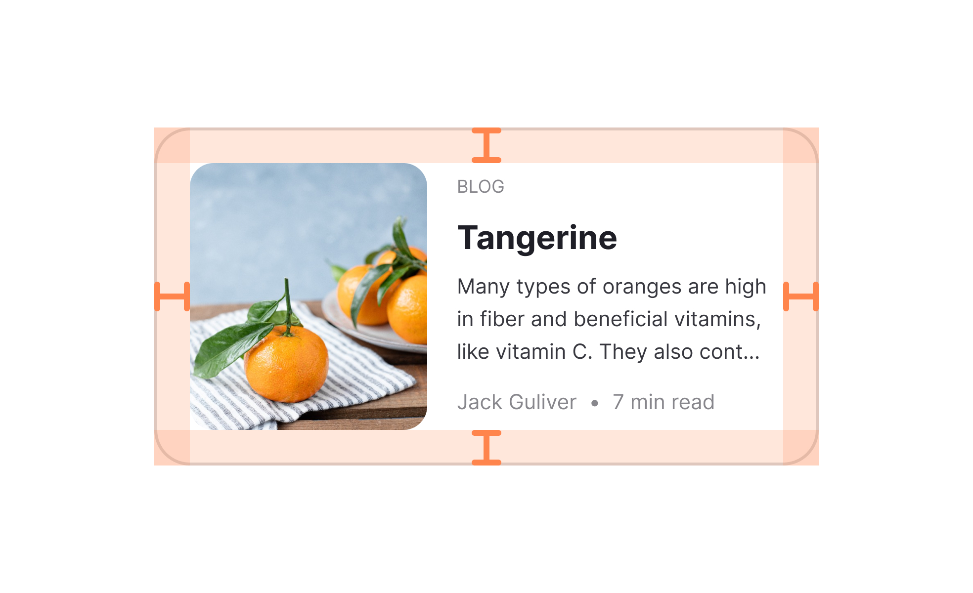
White space is the portion of a design that is left unmarked or empty, serving to separate elements, reduce clutter, and provide visual breathing room that enhances usability and aesthetics.
Detailed Overview
White space is one of the most powerful tools in design because it influences how users perceive, navigate, and engage with content. It is not “wasted space” but an intentional design choice that gives structure and clarity to layouts. By carefully balancing filled and unfilled areas, designers create compositions that feel organized, approachable, and easy to use.
A frequent question is how white space impacts readability. Text surrounded by sufficient space is easier to scan and comprehend than text crammed into tight blocks. Generous line spacing, padding, and margins reduce eye strain and help users process content more effectively. This principle applies to both digital interfaces and print design.
Another common query involves white space and user attention. By reducing clutter, designers can guide focus toward important elements like calls to action or navigation. For example, an e-commerce site might surround a “Buy Now” button with generous space, making it stand out clearly against surrounding content. White space becomes a visual cue that directs priority.
Teams also ask how white space relates to branding. A luxury brand might use expansive space to convey sophistication and calm, while a news site might balance dense content blocks with subtle spacing for readability. In both cases, white space communicates tone and reinforces identity without the use of words.
Accessibility is closely tied to white space. Proper spacing improves readability for users with visual or cognitive challenges. Crowded layouts can overwhelm or confuse, while balanced space creates clear separation between interactive elements. This is especially important on mobile devices, where touch targets need breathing room for accurate selection.
Finally, white space supports overall usability by creating rhythm and flow. Consistent spacing across screens or pages builds familiarity, reducing cognitive effort.
Learn more about this in the White Space Exercise, taken from the Basics of Design Composition Lesson, a part of the Design Terminology Course.


