

What is a grid system?
A grid system is the invisible scaffold behind most well-organized interfaces. It divides a screen into a defined number of columns, rows, and gutters, giving designers a consistent framework for deciding where elements should be placed and how they should relate to each other spatially.
Grids don't dictate what a design looks like. They establish the underlying logic that keeps things aligned, balanced, and consistent. A button, a heading, a card, and a navigation bar placed on a grid share the same underlying spatial rules, which is why interfaces built on grids tend to feel coherent even when they contain a wide variety of content types.
The concept has deep roots in print design. Newspapers, books, and magazines have used column grids for centuries to organize dense content into readable, scannable structures. Digital design inherited and extended these conventions, and the shift to responsive design made grid systems more important, not less, because layouts now have to work across an enormous range of screen sizes simultaneously.
What are the main types of grid systems?
Different design contexts call for different grid structures, and most design systems define the type of grid appropriate for each surface.
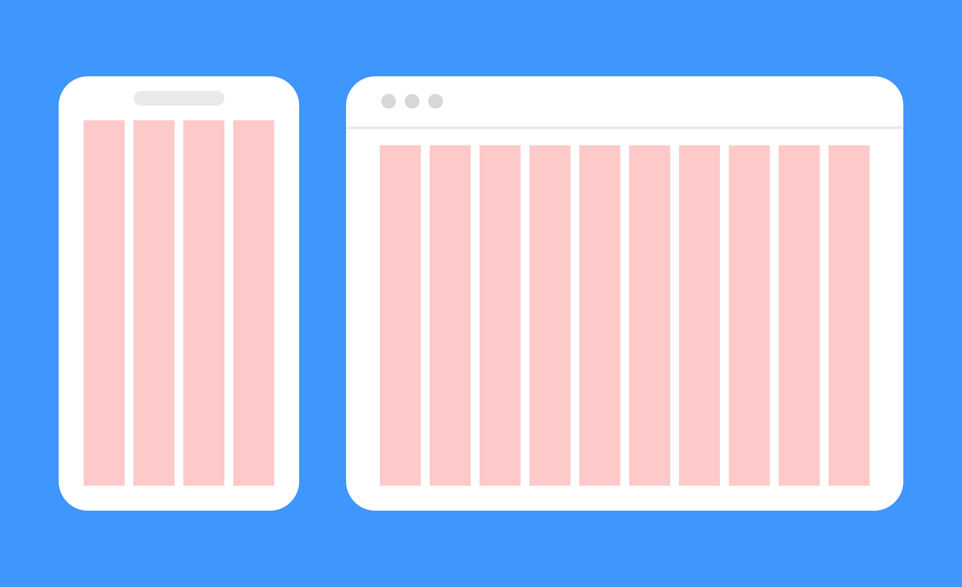
- Column grids are the most common in UI design. They divide the screen horizontally into a fixed number of equal-width columns with gutters between them. Twelve-column grids are a widely used standard because twelve divides evenly into halves, thirds, quarters, and sixths, giving designers a flexible range of layout options within a single framework. Bootstrap, one of the most widely adopted front-end frameworks, is built on a twelve-column system. Material Design, Google's design system, similarly defines column grids as a foundation for spacing and alignment across Android, web, and cross-platform applications.
- Modular grids add rows to a column structure, creating a grid of cells. These are useful for layouts with highly varied content types, like dashboards or feeds, where both horizontal and vertical placement decisions matter.
- Baseline grids define the vertical rhythm of typography by establishing a consistent line height unit that text and spacing measurements align to. They're less visible in finished interfaces but are foundational for typographic consistency.
- Hierarchical grids are irregular and custom-built for specific content needs rather than derived from a standard column count. Editorial layouts and marketing pages often use them to create deliberate visual contrast and emphasis.
Why do grid systems matter for usability and collaboration?
A grid's usability value comes from predictability. When elements across a product share the same underlying spatial rules, users unconsciously learn where to look for things. Navigation, headings, and content areas appear in expected positions. This reduces the cognitive work of navigating an unfamiliar screen because the structure feels familiar even if the content doesn't.
Grids also significantly improve collaboration between designers and developers. Without a shared spatial framework, translating a visual design into code requires the developer to make constant judgment calls about spacing, alignment, and sizing. With a grid, those decisions are already systematized. Designers specify positions in terms of the grid, developers implement in terms of the same grid, and the result is a much closer match between design intent and built output.
Design systems rely on grids to enforce consistency at scale. When a product is built by many designers working across many screens, a shared grid system ensures that new screens feel native to the product rather than visually disconnected from it.
How do grids support responsive design?
Responsive design requires layouts to adapt across a continuous range of screen widths, and grids are the primary mechanism for making that adaptation predictable and systematic.
A responsive grid defines how columns should behave at different breakpoints: how many columns are visible, how wide they are, and how they stack or reflow as screens get smaller. A twelve-column desktop layout might become an eight-column tablet layout and a four-column or single-column mobile layout, with the same content reordering itself predictably at each breakpoint.
This means designers only need to define behavior at a set of breakpoints rather than creating separate fixed designs for every possible device size. The grid handles the transition logic, and developers implement that logic in CSS using the same breakpoint definitions the design is built on.
How have grid systems evolved lately?
Grid systems have become more sophisticated and flexible as the environments they need to support have grown more complex.
CSS Grid Layout, now widely supported across browsers, has given developers a native implementation of two-dimensional grid structures that was previously only achievable through frameworks. This has narrowed the gap between design-tool grids and production code, making it easier to implement complex grid-based layouts accurately without workarounds.
The rise of AI-assisted layout tools has introduced a new dynamic. Tools like Figma Make, Uizard, and Google Stitch can generate layout compositions automatically from text prompts. These tools typically generate grid-compliant layouts by default, which means that AI-generated starting points tend to be structurally sound. However, they also tend to converge on familiar column configurations, and a designer's judgment is still required to decide whether the generated grid structure actually serves the content and the user's needs.
Design systems have also pushed grids toward greater codification. Rather than defining a grid as a visual guide in a design file, teams now increasingly define grids as tokens and variables that feed directly into component systems and code. A change to the base column width or gutter size propagates automatically across every component built on that grid, reducing the manual work of maintaining consistency at scale.


