

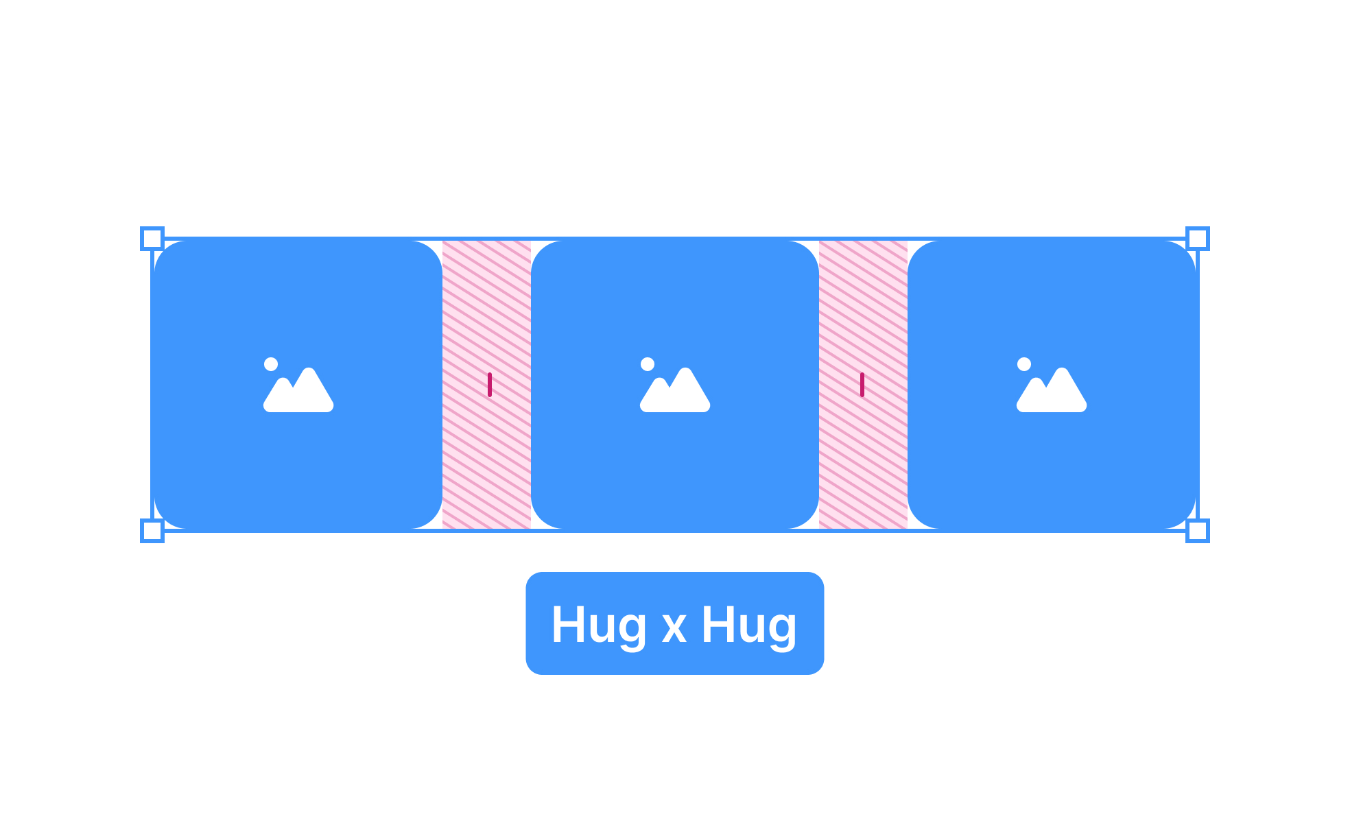
Auto Layout is a feature widely used in design tools like Figma and Sketch to create flexible and dynamic user interfaces. It allows designers to define rules for how elements should behave within a frame, ensuring that components adjust automatically when resized or when content changes. This reduces manual alignment and speeds up workflow while maintaining consistency.
In UX/UI design, Auto Layout plays a critical role in responsiveness. A button, for example, should expand as text length changes or adjust padding automatically to remain visually balanced. Without Auto Layout, designers must manually update elements, which introduces errors and slows production. With Auto Layout, small tweaks cascade across components, preserving uniformity.
Real-world examples show its impact. Designers at companies like Slack and Airbnb rely on Auto Layout to maintain consistent patterns across evolving products. When Slack introduced new features in its sidebar, Auto Layout helped ensure that additional elements fit harmoniously without disrupting the existing design structure. This illustrates how Auto Layout supports both speed and quality.
Collaboration also benefits from Auto Layout. Developers receive more accurate specifications since design components mirror how code behaves in a responsive environment. This reduces miscommunication and shortens the gap between design intent and implementation. Teams working with design systems find Auto Layout indispensable for keeping reusable components aligned and predictable.
From an accessibility standpoint, Auto Layout contributes by keeping designs consistent and predictable. Users with cognitive or visual challenges benefit when buttons, text fields, and icons follow logical alignment and spacing rules. Consistency reduces cognitive load, making products easier to navigate and interact with.
Attention to detail within Auto Layout is essential. Designers must set clear padding, spacing, and alignment rules. Poorly defined constraints can lead to broken layouts or unexpected resizing, which frustrates both users and developers. Mastering Auto Layout requires understanding hierarchy, nesting, and constraints to create systems that scale gracefully.
Learn more about this in the Layout Fundamentals & Spacing Lesson, a part of the Apple HIG Course.
Key Takeaways
- Auto Layout defines responsive rules for elements in design tools.
- Supports scalability across devices, languages, and screen sizes.
- Improves collaboration by aligning design with development behavior.
- Enhances accessibility through predictable, consistent layouts.
- Reduces design debt and speeds up iteration.

.svg)


