

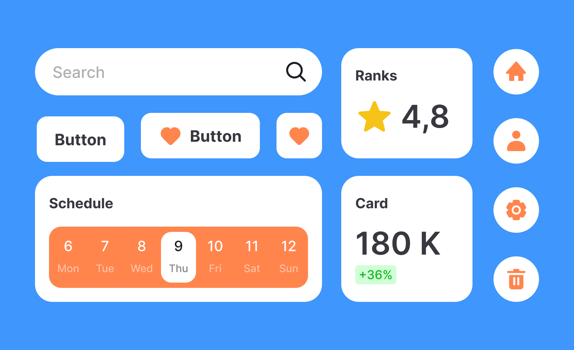
What is UI Design Element?
A UI element is an individual interactive or visual component within an interface that enables users to perform actions, view information, or navigate a product.
Detailed Overview
UI elements are the fundamental parts that make up digital interfaces. Each element, whether a button, input field, menu, or slider, contributes to the way users interact with a product. These small pieces combine to form complete user experiences, much like how letters and words form sentences and paragraphs in written communication.
A frequent question is what separates a UI element from larger structures. UI elements are the smallest functional components, while UI patterns and components represent combinations of elements working together. For instance, a search bar might include an input field (element) and a magnifying glass icon (element), together forming a component.
Another common query is how UI elements influence usability. Clear and consistent elements reduce the learning curve for users. A familiar play icon signals media controls, while a trash bin icon signals deletion. Misuse or inconsistency in elements leads to confusion and erodes trust. Good design leverages shared conventions to make interactions predictable and intuitive.
Teams often ask about how UI elements scale within design systems. Elements are defined with rules for size, color, spacing, and behavior so that they remain consistent across products. This consistency ensures not only visual harmony but also functional reliability. For example, a button should behave the same way across every screen, regardless of context.
Accessibility plays a crucial role as well. UI elements must be designed to meet size and contrast standards, support keyboard navigation, and include semantic labels for screen readers. An inaccessible button or form field can lock users out of critical product functionality, highlighting the importance of accessible design at the element level.
Finally, UI elements evolve with technology and cultural shifts. Early interfaces relied on skeuomorphic elements that mimicked real objects, while modern products lean toward minimalistic flat or material designs. With trends like voice and gesture interfaces, the definition of UI elements continues to expand, adapting to new modes of interaction.
Learn more about this in the Intro to Design Elements Lesson, a part of the Design Composition Course.

.svg)


