

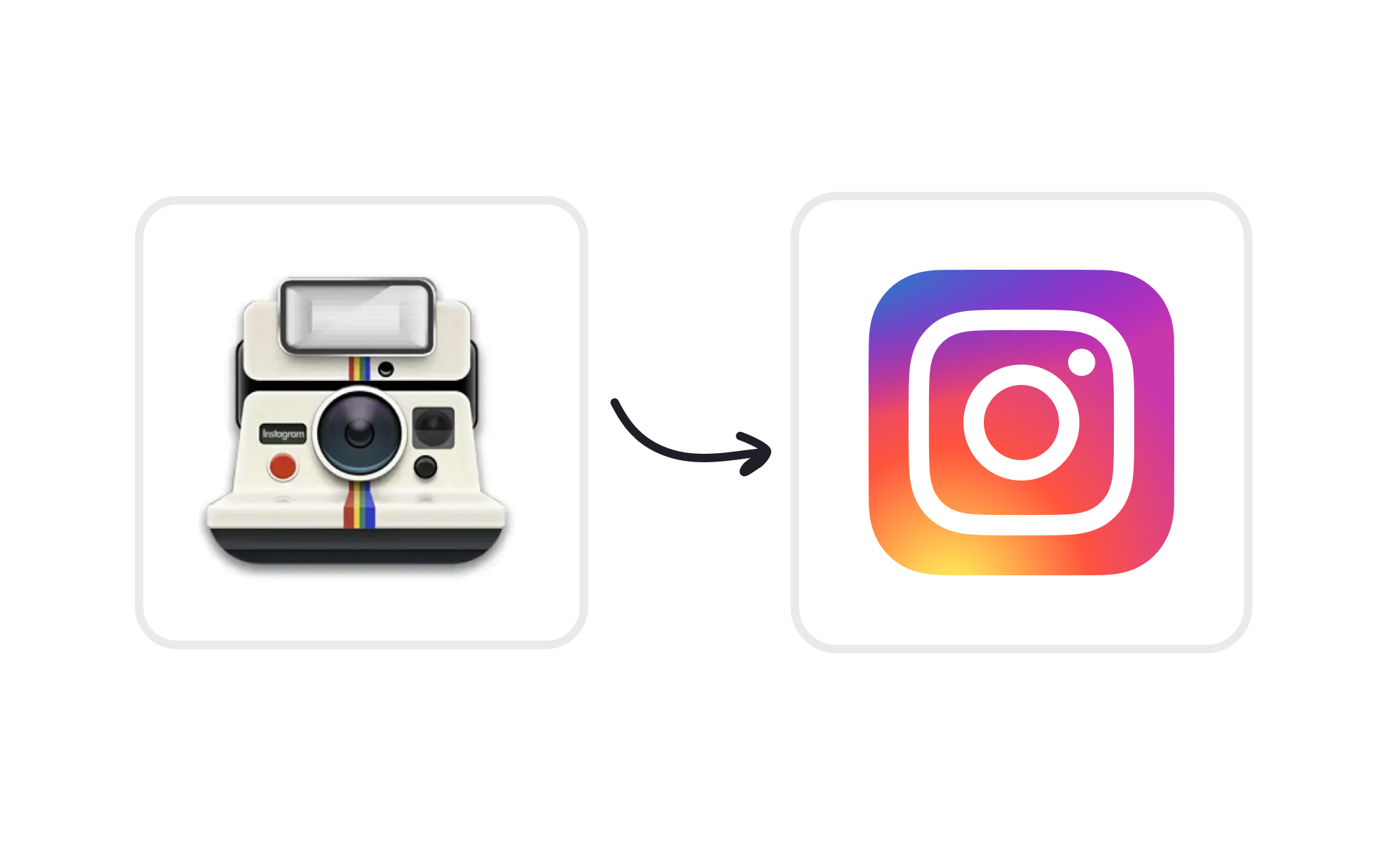
Flat design is a visual style that prioritizes simplicity, functionality, and clarity by avoiding decorative elements like gradients, 3D effects, or heavy shadows. Emerging in the early 2010s and popularized by Microsoft’s Metro design language and later Apple’s iOS 7, flat design represented a cultural shift toward digital minimalism. It aligned digital experiences with the need for clean, efficient communication across diverse devices and screen sizes.
In UX design, flat design reduces cognitive load by stripping away visual clutter. Interfaces rely on typography, spacing, and bold color palettes to guide user attention rather than skeuomorphic textures or ornamental details. The philosophy is that content and functionality should stand out, not decorative embellishments. Designers favor flat layouts for clarity, focusing users on tasks rather than visuals.
Product managers appreciate flat design for its scalability and efficiency. A flat interface is easier to adapt across devices and operating systems, making it a practical choice in multi-platform environments. Development is often faster since rendering heavy visual effects is unnecessary, lowering complexity and resource demands. These efficiency gains support quicker iteration cycles and reduced costs.
However, flat design has been criticized for reducing affordance, the visual cues that signal interactivity. Buttons without shadows or borders may not look clickable, leaving users uncertain about how to proceed. To address this, many teams shifted toward “flat 2.0,” a hybrid style that retains flat aesthetics while reintroducing subtle cues like shadows, layering, or motion to clarify interaction. This evolution balances simplicity with usability.
Accessibility in flat design requires thoughtful execution. Strong contrast ratios, clear labeling, and consistent iconography ensure that interfaces remain legible for all users. Without careful attention, minimalistic visuals risk creating ambiguity for individuals with cognitive or visual impairments. By prioritizing accessibility alongside aesthetics, flat design can achieve both clarity and inclusivity.
Learnn more about this in the Flat Design Exercise, taken from the Common Design Concepts Lesson, a part of the Design Terminology Course.
Key Takeaways
- Flat design removes decorative 3D effects in favor of simplicity.
- UX benefits from clarity and reduced visual noise.
- PMs value scalability and reduced development complexity.
- Affordance challenges led to hybrid “flat 2.0” approaches.
- Accessibility requires strong contrast and consistent cues.
- Real-world systems like Material Design embody its evolution.


