A UX case study is a sort of detailed overview of a designer’s work, often built into a structured UX design credential program. A case study describes the designer’s qualities, approach, and problem-solving skills, providing insight into their unique perspective. They are often part of a UX designer’s portfolio and showcase the designer’s skill in managing tasks and problems alongside a clear UX designer career overview. From a recruiter’s perspective, such a UX portfolio shows the skill, insights, knowledge, and talent of the designer, as well as their ability to handle complex projects and deliver high-quality solutions.
Therefore, UX case studies play an important role in the recruitment and demand for designers. A case study often focuses on the designer’s specialized skills, approach, or main area of expertise, helping recruiters understand the key strengths and targeted aspects addressed in the designer’s work.
Introduction to User Experience
User experience (UX) is at the heart of every successful digital product, shaping how users interact with and perceive a system, service, or application. For UX designers, the ultimate goal is to create experiences that are not only usable and accessible but also engaging and satisfying. Achieving this requires a deep understanding of user needs, behaviors, and motivations—insights that are uncovered through thorough user research and the development of detailed user personas.
The UX design process is inherently user-centered, focusing on creating solutions that address real problems and enhance usability. By prioritizing user engagement and continuously refining their approach, designers can ensure that their products are intuitive and enjoyable to use. A strong user experience not only increases user satisfaction and loyalty but also drives business success by aligning product outcomes with organizational goals. In today’s competitive landscape, investing in UX is essential for any business looking to create meaningful, lasting connections with its users.
The Role of a UX Designer
A UX designer plays a pivotal role in shaping how users interact with digital products. Their primary responsibility is to bridge the gap between user needs and business goals, ensuring that every solution delivers value to both. UX designers collaborate closely with product managers, product designers, developers, and stakeholders to translate complex requirements into intuitive, user-friendly designs.
Throughout the design process, UX designers rely on a variety of tools and techniques—such as wireframing, prototyping, and usability testing—to bring their ideas to life and validate their effectiveness. Their work demands a strong understanding of human behavior, technology, and the principles of usability. Effective UX designers are skilled communicators, able to articulate design concepts and advocate for the user at every stage of product development. By focusing on creating solutions that are both functional and delightful, UX designers help businesses achieve their objectives while delivering exceptional user experiences.
Understanding the UX Design Process
The UX design process is a structured approach that guides UX designers in creating products that truly resonate with users. It begins with comprehensive user research, where designers gather data through interviews, surveys, and usability testing to uncover user needs, pain points, and behaviors. This research forms the foundation for creating user personas—detailed profiles that represent key segments of the target audience and help designers empathize with real users.
With a clear understanding of the user, the next step is to define the problem statement, outlining the specific challenge the project aims to address. The design process then moves into ideation, where designers brainstorm and develop creative ideas and concepts. These ideas are brought to life through prototyping, allowing for early testing and refinement based on user feedback. Usability testing ensures that the final design is intuitive and effective before it is implemented and launched. Throughout each phase, UX designers work closely with stakeholders to ensure that the product aligns with business goals and delivers measurable value. This iterative process is key to creating solutions that not only meet user needs but also drive business success.
Design Process and Problem Solving
At its core, the design process is about problem solving — built on solid UX design foundations — identifying challenges and crafting solutions that improve the user experience. UX designers use methodologies like design thinking and human-centered design to approach problems with empathy and creativity. These approaches encourage designers to deeply understand user needs, generate a wide range of ideas, and rapidly prototype and test potential solutions.
Problem solving in UX design is an iterative journey. Designers must be open to feedback, willing to experiment, and ready to refine their solutions based on real user input. By continuously identifying areas for improvement and addressing challenges head-on, UX designers can create products that are not only visually pleasing but also highly functional and efficient. This commitment to understanding, prototyping, and refining ensures that the end result truly meets the needs of users and supports the broader goals of the business.
What Makes a Powerful Case Study
Building a UX case study includes showing the design process through compelling stories. They will use plain language to demonstrate how they handled key design issues, offering a comprehensive view of their process. Well done case studies often include:
- A problem statement and solutions with real applications.
- Relevant numbers, data, or testimonials to demonstrate the work and efforts.
- A story that directly connects the problem to the solution.
- Success metrics to measure the impact of the design.
A powerful case study also demonstrates the achievement of a better user experience as a key outcome.
Any competent UX professional will know that creating a stunning UX case study is about the little details, and should cover the creation of digital products or experiences from concept to execution.
Why most case studies never get read
You've studied what makes powerful case studies. Problem statements. Compelling narratives. Success metrics that prove impact. The theory's clear.
Building one alone? Different story.
Most designers write for weeks with zero feedback until it's too late. You publish your portfolio without first checking how to craft a perfect UX portfolio, send applications, wait. Nothing happens. Maybe someone finally tells you what didn't work six months later, after you've already lost that job opportunity. Can't rewind and fix a case study that's been reviewed and rejected.
The standard move is asking another designer for notes. They'll flag visual inconsistencies or suggest tightening your research section. That helps your craft. Doesn't help you understand if a recruiter skimming 50 portfolios at 2 AM will actually stop on yours. Your designer friend isn't the hiring manager who needs to see measurable business impact in the first three paragraphs or they move on.
Caseoowl fills that specific gap. It's an AI platform built for getting audience-targeted feedback before anyone real sees your work. Upload your project notes and it structures a case study based on who you're actually trying to reach. Targeting agency roles? You get different guidance than if you're going after in-house product positions. Building a presentation for executives? Completely different emphasis on what matters.
The audience simulation part is what makes it useful. Before you publish anything, you can run your case study through a "hiring manager perspective" or "stakeholder perspective" simulation. It might flag things like "your problem statement is too vague" or "you never actually quantified the business outcome." Strategic feedback on what your specific audience cares about, not generic design critique.
Guided builders help when you're facing a blank Figma file wondering where to even start. Upload messy notes from your last project. Get a structured outline in maybe 10 minutes. The AI works more like a thinking partner than a template. Keeps your voice authentic while helping you figure out what deserves the spotlight and whether your story will actually land with your intended reader.
This isn't about having AI write your case study. It's about getting informed direction while you can still act on it. Before the application goes out. Before you present to stakeholders. So your case studies actually demonstrate those powerful elements you read about, clear problem statements and measurable impact and compelling narratives, instead of just talking about them in theory.
Ever wonder why solid work gets ignored in portfolios? Or watch stakeholders zone out during your presentation because you misjudged what they needed to hear? That disconnect between what you think matters and what your audience actually cares about is what Caseoowl addresses. You get confidence that your case study communicates your design process the way you intended. While there's still time to adjust before anyone makes a decision about your work.
14 Best UX Case Studies for Designers
The best way to understand what a good case study looks like is to go over other examples. Each of these UX case studies is a great example of how to effectively present design solutions and outcomes. Each case study shows a designer’s insights, basic skills, and other designers’ lessons learned through their experience.
These case studies are often featured in ux portfolios to showcase a designer's skills, process, and approach. In many cases, the success of these projects is also a testament to the collaborative efforts of the team involved.
1. X8 Guild Gaming Community Platform
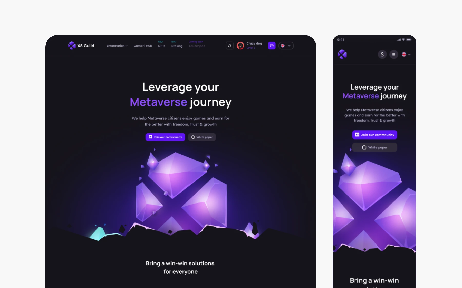
UX designer Le Khoa was tasked with creating a platform that connects gamers, investors, and NFT enthusiasts, helping them learn, earn, and build within the metaverse. The challenge was designing an experience that could serve multiple user types with very different goals, from scholars tracking gameplay earnings to investors exploring opportunities.
The design process began with establishing a clear product vision, followed by identifying specific use cases for each user group. A comprehensive style guide was developed early on, featuring vibrant purples as primary tones with turquoise and blue accents to create a dynamic, gaming-forward aesthetic. The sitemap and user flows were carefully mapped to ensure intuitive navigation, right from account creation and wallet linking to quest completion and rewards tracking.
The final platform includes tailored dashboards for different user types. General users can register, complete daily tasks, earn tokens, and level up to unlock rewards. The Scholar-Gamer Dashboard offers gamers detailed tracking of their progress, earnings, and game-specific statistics, enabling them to manage gaming scholarships more effectively. The quest system offers daily, game, and investment quests to keep users engaged while advancing through the platform.
Key Learnings from X8 Guild
X8 Guild’s case study demonstrates how to design for a multi-sided platform with distinct user personas. Its strength lies in establishing a clear visual identity and information architecture before diving into individual features. Gradually moving from product vision to use cases to detailed flows ensures that each user type has a dedicated experience without fragmenting the overall platform.
2. Eiyo Limited Edition Landing Page
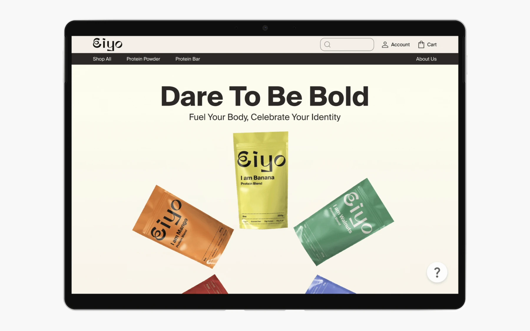
This case study follows the design of a landing page for Eiyo, a nutrition brand launching a limited edition series of protein powder and energy bars for Pride Month. The initiative featured eight uniquely coloured packages, each representing a different aspect of the LGBTQ+ community. The designer Ayako Matsuo drew inspiration from the Philadelphia Pride flag, which includes black and brown stripes to represent people of colour within the community, a choice shaped by their personal experience as an Asian individual who has lived as a minority abroad.
The project began with concept development and user persona creation to understand the diverse audience. The design work spanned logo creation, package design, and the landing page itself. The final design balanced visual appeal with informative content, spotlighting the campaign's values and significance. Prototyping in Figma allowed the designer to test animations and interactive features before finalising the experience.
Key Learnings from Eiyo
Eiyo stands out for its clear connection between personal values and design decisions. The designer articulates why specific choices were made, right from colour inspiration to gender-neutral logo design, giving the work a meaningful foundation. It's a useful reference for designers working on campaign-based or cause-driven projects, showing how to weave impactful storytelling into visual design while maintaining broad audience appeal.
3. Media Portal for a Bank

This case study by Anna Tikhonova documents the design of a media portal integrated within a banking app. The goal was to create a content platform that goes beyond traditional banking functions to offer articles, podcasts, courses, books, and games to increase user engagement and drive client acquisition. The designer identified that modern banking apps have evolved into lifestyle portals, yet competitors lacked inclusive reading options like font settings and background colour adjustments, and few offered AI-powered features.
The research phase was extensive, with in-depth interviews and polls validated over assumptions about user behaviour. The designer also conducted competitor analysis across banking apps and media portals, and mapped detailed user flows across four access levels, from visitor to premium client. This helped refine the final design that features a gamified rewards system with tokens that can be redeemed for bank products, monthly learning goals users can set themselves, achievement badges, smartwatch integration for reading reminders, and accessibility options, including adjustable fonts and background colours. Another highlight is the list of AI-powered features that let users shorten articles or convert them to audio.
Key Learnings from Banking Media Portal
This is a great example of a case study demonstrating rigorous, research-backed design. The volume of data builds credibility and shows how assumptions were validated before implementation. The competitive analysis clearly identifies market gaps (accessibility, AI features) that the design then addresses directly. It's a strong example of how to present a complex, feature-rich product while maintaining a clear narrative thread from research insight to design solution.
4. Promo.com web editor

For this video-creation platform, UX designer Sascha was brought on to revamp v2.0, adding new features that could work alongside the existing UX design. The point was to work on interface details that would help create a user friendly platform, and that users could find simple enough to use.
User personas mapped by the UX designer revealed the most common confusion to be the process of inserting particular features into the video, such as subtitles. The designer's goal, therefore, was to create a platform with improved editor controls.
The designer then used a common text-editor layout to include top and side navigation bars that made it easy to access and implement text editing.
Key Learnings from Promo.com
This case study focuses on addressing a particular problem that customers were currently facing. Its main theme is to show a problem, and how the product designer addressed this problem. Its strength points include:
- clearly highlighting the problem (i.e. inaccessible and limited video-text editor options)
- conduction research to understand the nature of the problem and the kind of solutions customers want
- implementing research insights into the redesign to create a platform that actively served customer needs
5. Productivity tracker app
The main concept behind this UX case study is to address a pre-existing problem through the design of the app. Immediately from the start, the study highlights a common pain point among users: that of a lack of productivity due to device usage.
This UX case study example addressed some of the main problems within existing productivity apps including: a poor UI and UX that made navigation difficult, a poorly-built information architecture, and limited functions on the mobile application. Mapping user flows was essential to improving navigation and usability, ensuring users could easily accomplish their tasks. Collaboration with a developer during the app's design and implementation helped translate design solutions into a functional product.
Key Learnings from the Productivity app case study
The case study highlights the simple design process that was then used to build the app. Wireframes were created, a moldboard developed, and finally, individual pages of the app were designed in line with the initial goals.
6. Postmates Unlimited
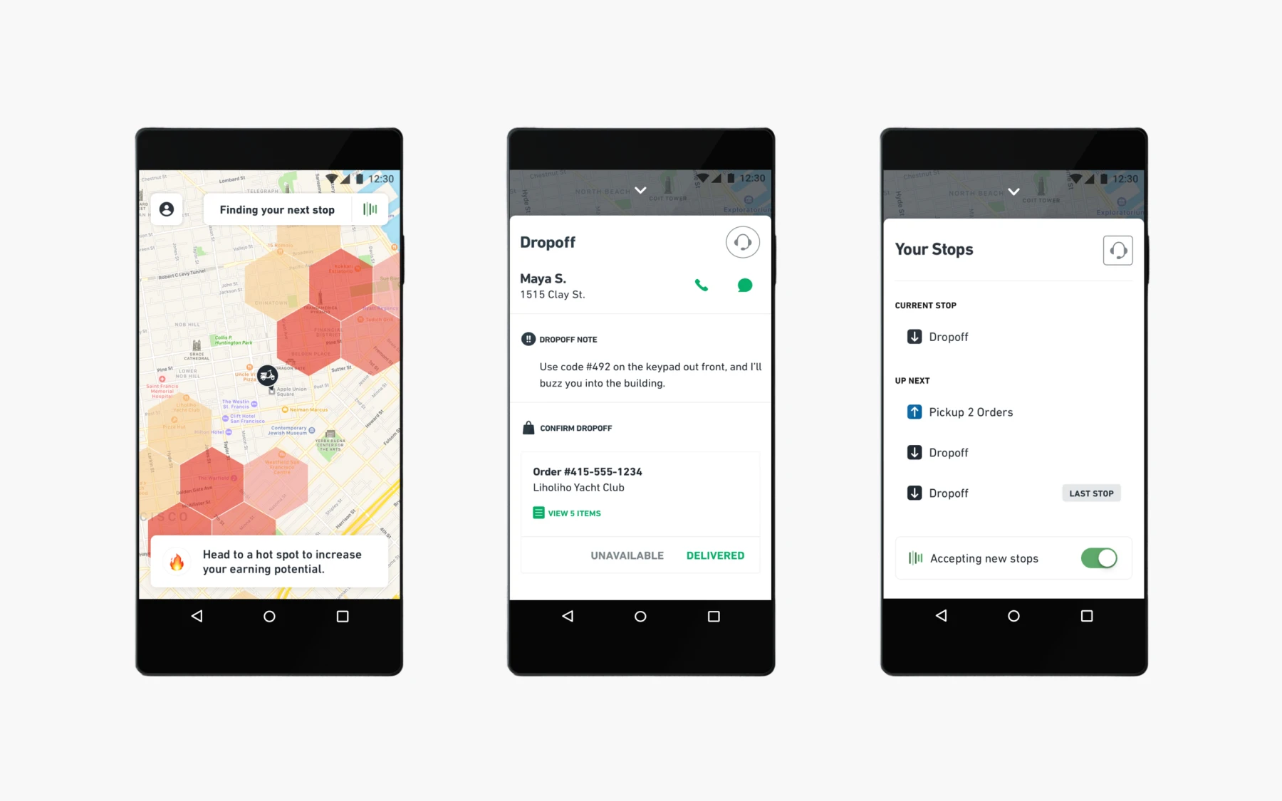
This case study clearly identifies the improvements made to the Postmates app in a simple overview before jumping into greater detail. The redesign goal, which it achieved, was to improve the experience and other interface details of the app.
The problems identified included:
- usability that led to high support ticket volume.
- technical app infrastructure issues that prevented scalability.
- lack of efficient product management, such as batching orders.
The product manager played a key role in the redesign process, ensuring detailed focus on reporting enhancements and driving impactful results across the project.
A UX research course can help understand the kind of research needed for a case study. The app redesign involved bringing couriers in and running usability testing on improvements. The final model, therefore, had input from real users on what worked and what caused issues. The redesign helped save time and resources for both users and the business by streamlining processes and reducing support needs.
Key Learnings from Postmates
The Postmates redesign works as a great UX case study for the simple way it approaches problem-solving. Following an overview of the work, it addresses the problems faced by users of the app. It then establishes research processes and highlights how changes were made to reduce these issues.
7. TV Guide

Addressing the fragmentation of content across channels, this case study sought to redesign how people consume media. The key problems identified included:
- the overabundance of content across various TV and streaming platforms
- the difficulty in discovering and managing content across all platforms
This fragmentation presents significant challenges for the media industry in delivering seamless user experiences.
To deliver on the key goals of content personalization, smart recommendations, and offering cross-platform content search, the design process included conducting interviews, surveys, and checking customer reviews. Redesigns of similar platforms have successfully addressed these industry challenges by improving navigation and user engagement.
The design of TV Guide enables users to get custom recommendations sourced from friends’ and family’s watchlists.
Key Learnings from TV Guide
Like previous UX design case studies, this one tackled the issue head-on. Describing the research process, it goes into detail regarding the approach used by the UX designers to create the app. It takes readers on a journey, from identifying pain points, to testing solutions, and implementing the final version.
8. The FlexBox Inspector

Designer Victoria discusses how she developed the investigator tool for the Mozilla Firefox browser. Surveys into understanding the problems with the existing CSS Flexbox tool revealed a need for a user-friendly design. Interviews with a senior designer and other designers helped developers understand the features design-focused tools ought to have. A feature analysis revealed what most users look for in such tools. The creation of the tool involved several key stages, including research, concept development, and designing an innovative user experience.
The final result of the development process was a design that incorporated several new features, including:
- a new layout
- color-coded design
- multiple entry points to make workflow management efficient
The tool was built from scratch, allowing for a fully customized solution tailored to user needs.
Key Learnings from the Flexbox
This UX design case study starts with a clear goal, then addresses multiple user needs. It clearly defines the design process behind each feature developed by the time, and the reasoning for including that feature. To give a complete picture, it also discusses why certain features or processes were excluded.
9. The Current State of Checkouts

This Baymard UX design case study looks into the checkout process in over 70 e-commerce websites. Through competitive analysis, it isolates problem points in the UX design, which, if addressed, could improve the customer’s checkout process and create a sense of ease and satisfaction for users.
The study found at least 31 common issues that were easily preventable. The study was designed and conducted on a large scale, over 12 years, to incorporate changing design patterns into the review.
Including such case studies in portfolios can demonstrate a designer's problem-solving skills and ability to create a cohesive sense of user experience.
Recommendations based on findings include:
- prominent guest checkout option
- simple password requirements
- specific delivery period
- price comparison tool for shipping vs store pickup
Key Learnings from Checkout Case Study
Each identified issue is backed up by data and research to highlight its importance. Further research backs up each recommendation made within the case study, with usability testing to support the idea. As far as UX case studies go, this one provides practical insight into an existing, widely used e-commerce feature, and offers practical solutions.
10. New York Times App
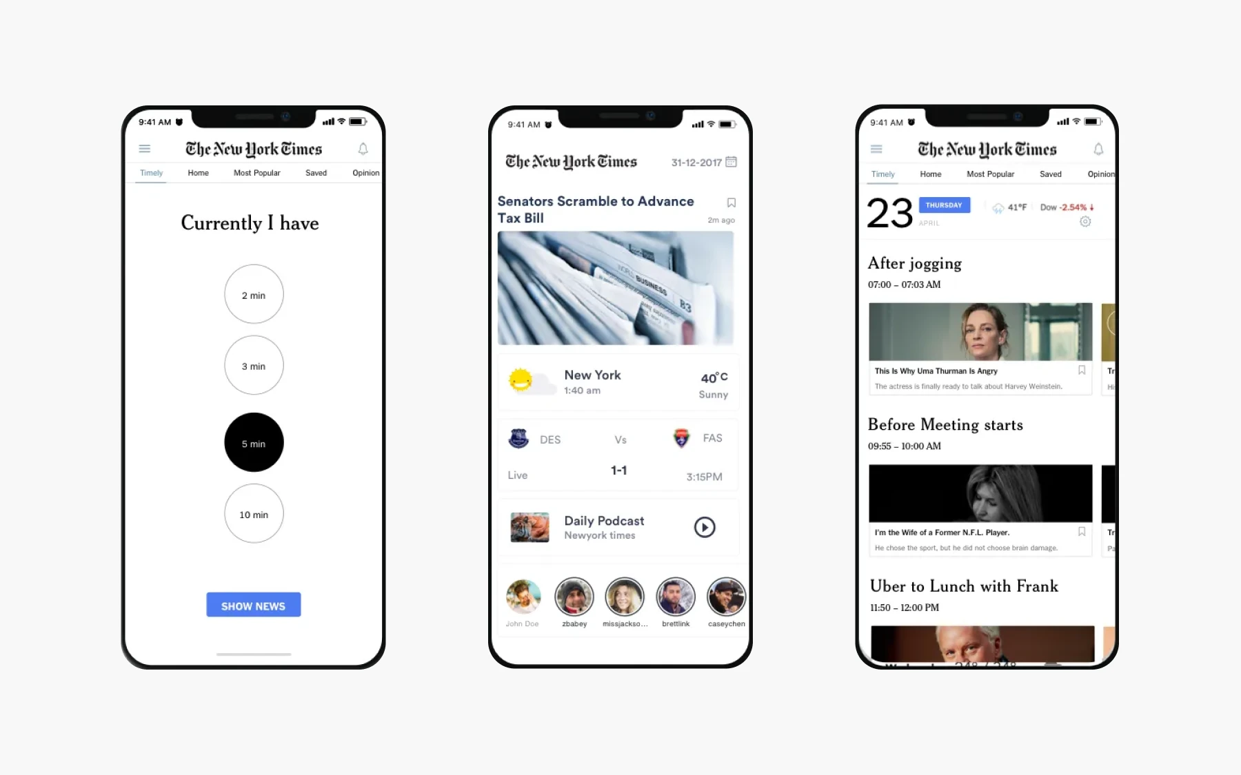
Using a creative illustration website, the designers proposed a landing page feature “Timely” that could counter the problems faced by the NYT app. A product designer on the team played a key role in shaping the user experience and visual direction of the project. Its major issues included too much irrelevant content, low usage, and undesirable coverage of content.
The goal behind Timely was to improve user incentives, build long-term loyalty, and encourage reading. Design mapping for the app covered:
- identifying the problem
- understanding audience needs
- creating wireframes
- designing and prototyping
The end result was an app that could help readers get notifications regarding news of interest at convenient moments (at breakfast, before bed). The team went the extra mile to ensure the app met user needs and expectations. This encouraged interaction and improved readability with short-form articles.
Key Learnings from NYT App
The UX case study proposes a problem solution that works with an existing information architecture, instead adding custom graphics to the mobile app. It leads from a simple problem statement to discuss the project that could address these issues without changing was customers already loved.
11. Fitbit
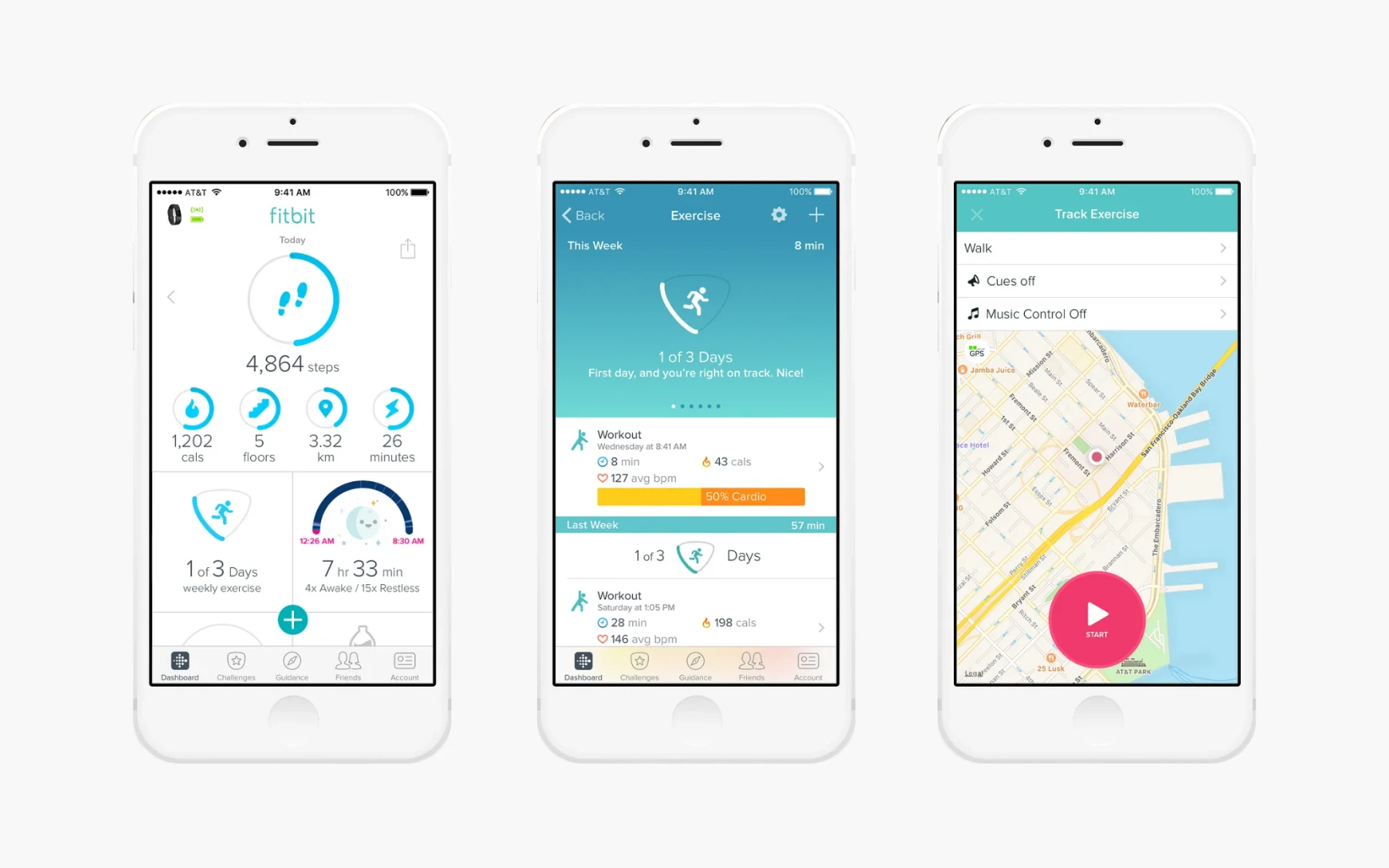
UX case studies focused on redesign include the FitBit redesign, which started off by understanding personas and what users expect from a fitness tracker. Developing use cases and personas, Guerilla usability testing was employed to assess pain points. The creation of new features and user experiences was an integral part of the redesign process, ensuring that innovative solutions addressed user needs.
These pain points were then ranked based on their importance to users and to app performance. They were addressed through:
- Highlighting essential parts and features of the app
- Changing easily missed icons to more recognizable icons
- relabelling tracking options to guide users better to its usage
Key Learnings from Fitbit
While the case study maps user experiences and offers solutions, it does not begin with an intensive research-based approach. The prototype is successful in testing, but problem factors are not identified with research-based statistics, meaning key factors could have been ignored.
12. Rating System UX
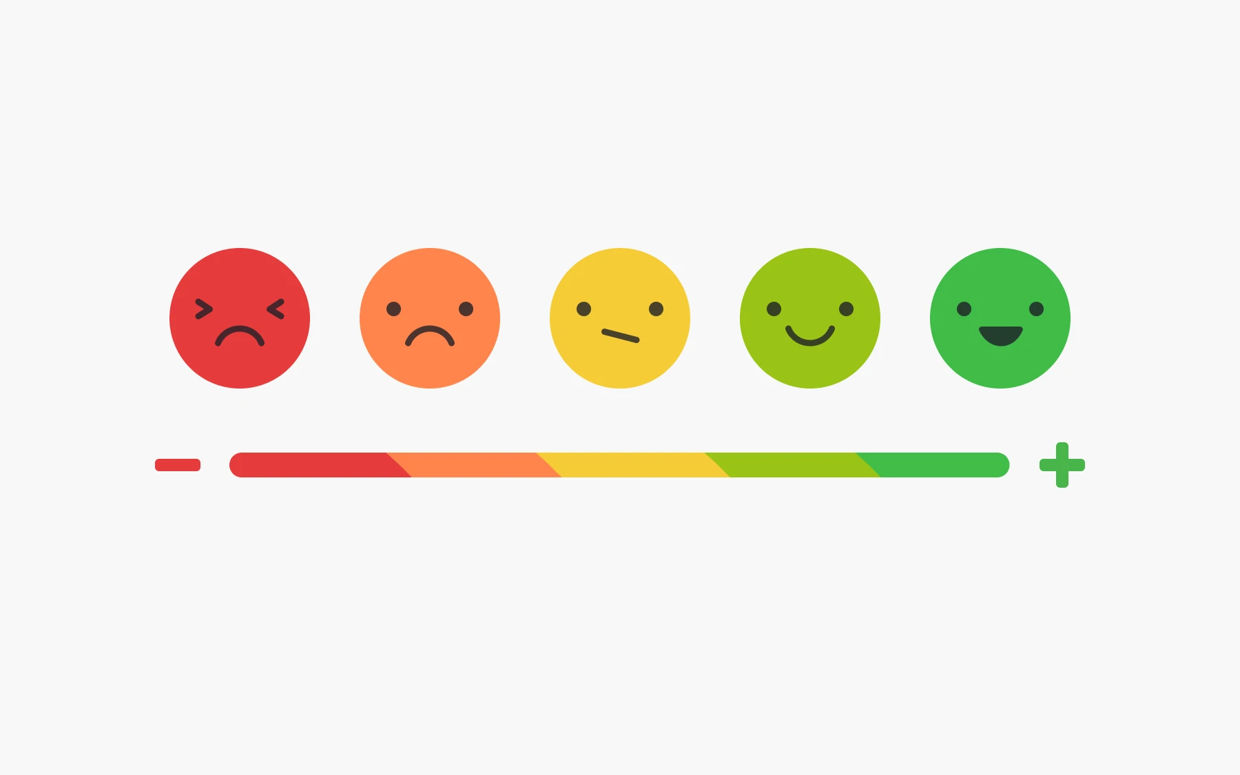
The designer behind the rating system UX redesign sought to solve issues with the 5-star rating system, which is commonly used in web applications and platforms. Highlighted issues included:
- the lack of subjective accuracy of a 5-point rating system
- the issue of calculating the average of a zero-star rating
- average ratings are misleading
Better alternatives include:
- 5-star emoticon rating that relates the user experience
- Like/dislike buttons that make approval/disapproval simple
The final design incorporated both these styles to make full use of the rating system. Including such redesigns in ux portfolios can effectively demonstrate a designer's initiative and problem-solving skills.
Key Learnings from Rating System UX
The UX case study stemmed from insight into the limitations of the existing rating system. The new design addressed old issues and incorporated better efficiencies.
13. Intuit
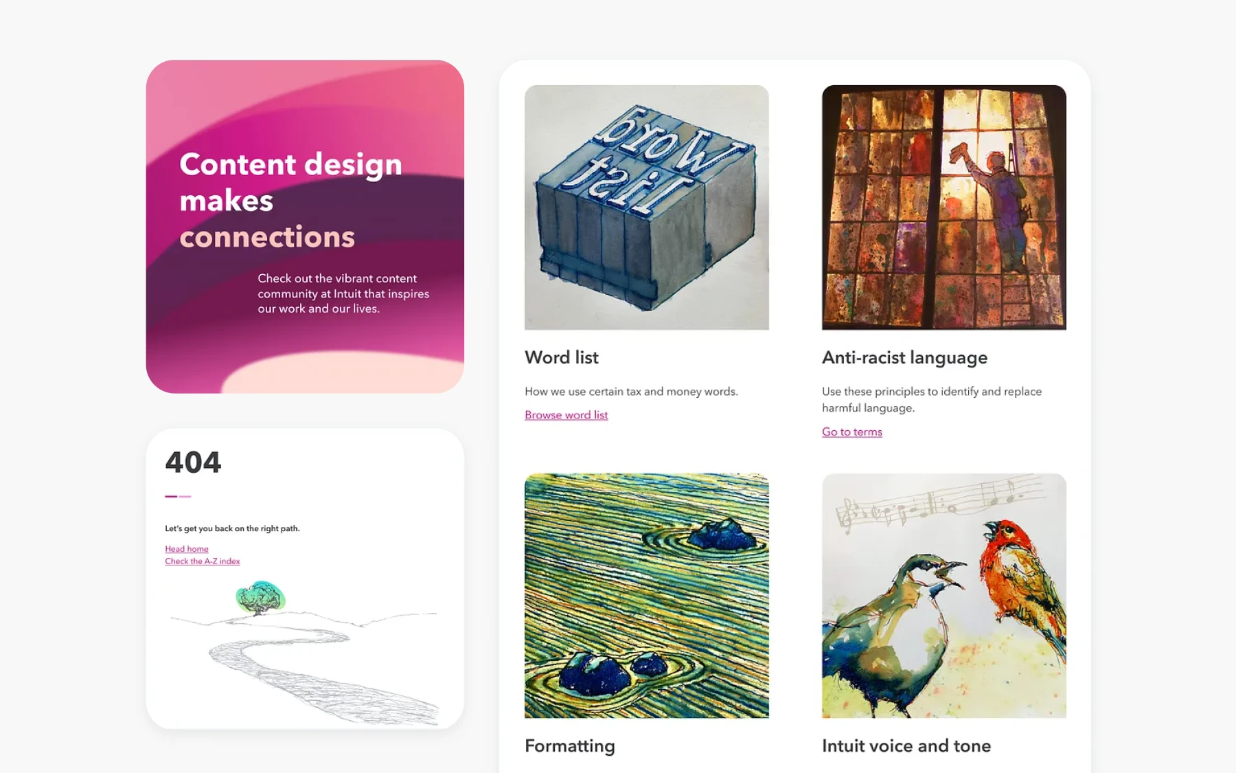
The Intuit redesign was focused on making content readable, more engaging, and accessible. Looking into product personalization, the content was found to be lacking aesthetic value, as well as being hard to find. The goal was to create content that was easy to find, clear, and consistent.
The implemented solutions included:
- increased readability with increased body text and header spacing
- table of contents on the sidebar for easier navigation
- visible and prominent search bar
- illustrations and designs for pretty visuals
The designer's work played a crucial role in the success of the Intuit redesign, ensuring the final product was both user-friendly and visually appealing.
Key Learnings from Intuit
The Intuit case study approaches the problem from a practical point of view. It begins with isolating problems with the interface, in particular with the content. This is an example of a case study that breaks down problems into broader categories, and solves each problem with a practical solution.
14. Jambb
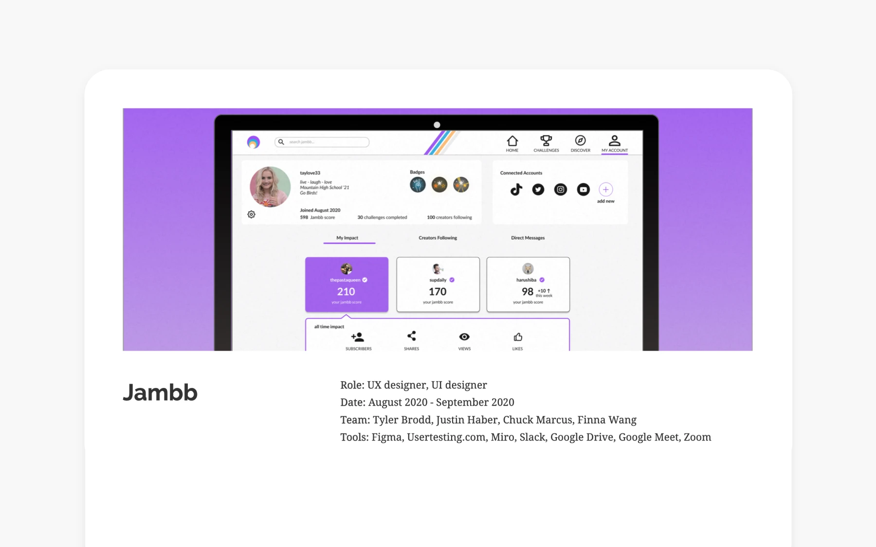
This UX case study about a social platform tackles a commonly-faced problem from existing platforms. It addresses the issue of recognizing non-monetary user engagement, to help creators identify their user base.
The case study addresses the problem statement and establishes the design process (building wireframes and prototypes) as well as conducting user testing. Throughout the design and development of the platform, close collaboration between team members ensured that ideas were shared and refined, leading to more effective solutions. The final result is to develop “Discover” pages, engaging layouts, and animated interactions to increase usability.
Key Learnings from Jambb
The study goes into detail regarding problem identification, then moves on to propose solutions that take into account the perspective of all stakeholders involved. It then explains why each design decision was made, and proves its efficacy through testing and prototyping.
Case Study Analysis
A case study is a powerful tool for learning and growth in the field of UX design. By providing a detailed analysis of a specific project, a case study offers valuable insights into the design process, the UX skills checklist required, and the solutions implemented. For UX designers, studying case studies is an opportunity to learn from real-world examples, understand best practices, and gain new perspectives on problem solving.
A well-crafted case study includes a clear problem statement, a thorough description of the design process, and an honest evaluation of the outcomes. It highlights both successes and setbacks, offering recommendations for future improvements. By analyzing case studies, UX designers can identify effective strategies, avoid common pitfalls, and deepen their understanding of how to create products that meet user needs and achieve business goals. Ultimately, case studies serve as a vital resource for building expertise, expanding knowledge, and continuously improving the craft of UX design.
Key Takeaways
Developing good UX case studies examples is as much about the details you include as the ones you leave out. Going over UX design courses can give you a better understanding of what your case study should look like. A good case study should provide an overview of the problem, include numbers and statistics, and offer practical solutions that directly address the problem. The above-discussed UX case studies provide a good example of the dos and don’ts of a well-structured UX design case study that should be part of every UX portfolio. Including well-structured case studies in portfolios is essential, as they showcase a designer's skills, process, and creativity to potential employers or clients. To build such case studies, consider practicing UX design with real-world projects to gain hands-on experience.
Build real skills, get certified, and grow fast in the AI-powered product world. Ready to stand out?
Additional Resources
Check out these resources to learn more about UX case studies:
8 UX Case Studies to Read