

What is a hyperlink?
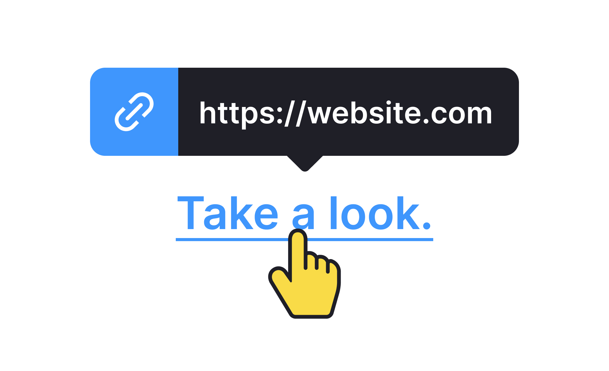
A hyperlink is a navigational element that connects one location to another. Activating it moves the user to the destination, which might be another page on the same site, an external URL, a specific section within the current page, a file to download, or a prompt to open another application like a mail client.
The concept is as old as the web itself. Tim Berners-Lee's original vision for the World Wide Web was built around linked documents, and hyperlinks were the mechanism that made that network of connections navigable. The term "World Wide Web" reflects the linked, interconnected nature of content that hyperlinks make possible.
In HTML, hyperlinks are created with the <a> (anchor) tag and an href attribute that specifies the destination. In visual terms, they're most commonly styled as underlined text in a distinctive color, though they can also take the form of buttons, icons, images, or any other interactive element.
For designers, hyperlinks aren't just a technical implementation detail. They're primary navigation tools, and the way they're labeled, styled, and placed shapes how confidently users can move through an interface.
What makes a hyperlink effective?
The effectiveness of a hyperlink depends on three things: whether users recognize it as interactive, whether its label tells them where it goes, and whether it reliably delivers what it promised.
Recognition requires visual distinction. A link that is visually indistinguishable from surrounding non-interactive text creates uncertainty. Users who aren't sure whether something is a link typically either avoid clicking it or hover over it to check, both of which introduce friction. The conventional signals of interactivity for text links are color differentiation from surrounding text and underlining. Removing underlining while relying on color alone is a common design decision that creates accessibility problems for users who can't perceive color differences.
Label quality is the factor that most directly affects user confidence and navigation efficiency. "Click here," "learn more," and "read more" tell a user nothing about where the link leads. "View the 2026 salary guide for product designers," "read our accessibility checklist," or "compare pricing plans" give users enough context to decide whether following the link serves their current goal. Descriptive links also significantly improve the experience for screen reader users, who can navigate a page by hearing a list of all links read aloud, and for search engine indexing, where link text provides context about the destination's content.
Reliability means the link goes where it says it will, opens in the expected context, and doesn't produce an error. Broken links, links that open unexpected applications, and links that behave differently than their label suggests all erode trust in navigation.
How do hyperlinks relate to accessibility?
Hyperlink accessibility has several distinct dimensions, each addressing a different aspect of how users encounter and use links.
Color contrast applies to link text the same way it applies to all text: the link color must meet WCAG minimum contrast ratios against the background. When links are distinguished from surrounding text only by color (no underline), they must also have sufficient contrast against that surrounding text to be distinguishable for users with color vision differences. The safest approach is to retain underlining on inline text links, which makes them distinguishable regardless of color perception.
Keyboard navigation is a core accessibility requirement for links. Users who navigate by keyboard rather than mouse use the Tab key to move focus between interactive elements. Links must have visible focus indicators so keyboard users can see where they are on the page. The default browser focus ring achieves this, and removing it without providing an equivalent alternative (a common practice in CSS resets) is an accessibility failure.
Focus order should follow a logical sequence through the page, typically matching the visual reading order. Links that appear early in the visual layout should receive focus before links that appear later.
Screen reader support depends on descriptive link text. Screen readers can present users with a list of all links on a page to facilitate navigation; links labeled "click here" or "read more" are useless in this context. Each link should make sense when read in isolation, out of the surrounding content context.
What are common hyperlink design mistakes?
Several recurring hyperlink patterns create friction or confusion that could be avoided.
Vague link labels are the most common. "Click here" and "read more" provide no destination information and force users to read surrounding context to understand what the link does. Replacing them with descriptive labels is a straightforward improvement that benefits all users and improves SEO simultaneously.
Opening links in new tabs without warning is disorienting, particularly for users who weren't expecting it. The browser back button doesn't work to return from a new tab, and the unexpected context switch can leave users confused about their navigation state. When a link must open in a new tab (for example, when leaving a checkout flow would cause a loss of progress), providing visible indication of this behavior, such as a small external link icon, sets accurate expectations.
Overloading content with hyperlinks dilutes the importance of each one and creates decision fatigue. When every sentence contains multiple links, users have to evaluate each one actively rather than reading fluently. Prioritizing which links are genuinely necessary reduces cognitive load and makes the important links more likely to be followed.
Broken links undermine trust. A 404 error in response to a link the user followed in good faith signals that the site is not well-maintained, and repeated broken link experiences damage the confidence users have in the overall product.
How have hyperlinks evolved as interfaces have changed?
The anchor tag has been part of the web since its beginning, but how hyperlinks are implemented and experienced has changed considerably as interaction patterns have diversified.
In single-page applications, client-side routing allows links to load content without full page refreshes, making navigation faster and more fluid. This requires careful implementation to ensure that URL state, browser history, and accessibility announcements (so screen readers know content has changed) are handled correctly.
In mobile interfaces, tap targets are a significant consideration. A link in body text is sized for the text, which may be significantly smaller than the 44x44 point minimum touch target recommended by Apple's HIG. Inline links in dense text are genuinely harder to tap on a phone than on a desktop, which is one reason mobile interfaces tend to convert many navigation links into buttons with larger tap areas.
Voice interfaces introduce a different model entirely. Navigation in a voice context doesn't involve clicking or tapping a link; it involves speaking a command. The relationship between traditional hyperlink design and voice navigation is mediated by the label: a voice assistant needs something meaningful to read out for each navigable destination, which reinforces the case for descriptive link text in visual interfaces too.


