If you're searching job boards for UX designer positions, you're probably aware that having a professional portfolio is essential to demonstrate your UI design skills and persuade hiring managers to invite you to an interview.
A UX portfolio is just another UX project — treat it as you would work for a client, and you’ll present yourself as a professional, credible UX designer.
In this article, we dive into our 11 top UX portfolio examples, as well as why you need a portfolio and what you should include.
Want to jump straight to the examples?
- The Fresh Portfolio
- The Eye-Catching Portfolio
- The Straightforward Portfolio
- The Entry-Level Portfolio
- The Bold Portfolio
- The Organized Portfolio
- The Simple Portfolio
- The Innovative Portfolio
- The Friendly Portfolio
- The Animated Portfolio
- The Dramatic Portfolio
Still here? Cool, let’s look at why you need a UX design portfolio and what should be included in yours.
Do you even need a UX design portfolio?
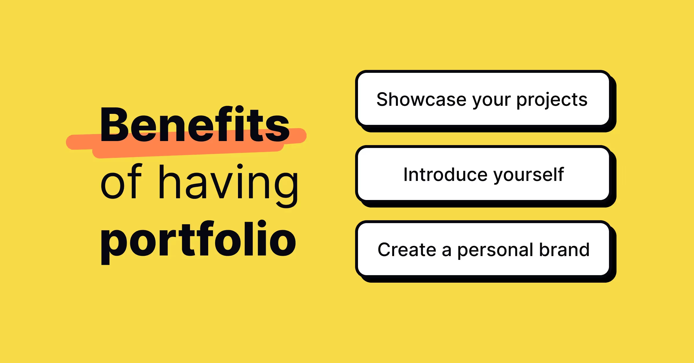
In short, yes. All designers everywhere benefit from having a portfolio, regardless of their professional background or level. Here’s why:
- A portfolio showcases your skills and experience as a UX designer and builds your personal brand
- A portfolio helps you apply for UX roles
Let’s take a closer look at these reasons.
Firstly, your portfolio helps you establish yourself in the UX design community by giving others the chance to view your work and design process. A good UX portfolio should evolve over time, reflecting your development as a UX designer; it’s there to showcase your skills, so will need updating as you learn and upskill.
Secondly, your UX design portfolio is essential when looking for UX roles — be they full-time positions or freelance projects. A strong UX design portfolio shows hiring managers and prospective clients that you’ve got the walk to match the talk. It enables you to highlight the relevant skills and experience for the role or project in question.
So, what should yours include?
What should be included in a UX designer portfolio?
Creating a successful UX designer portfolio involves carefully writing case studies in order to demonstrate your UX design skills.
A strong UX portfolio communicates your UX design process and results. A very common mistake that UX designers make is focusing solely on their design results—i.e. the finished designs—and not enough on the process—how they got there.
Put simply, your UX design portfolio needs to communicate two fundamental points:
- How you work, the process, and
- What you’ve been working on, the results.
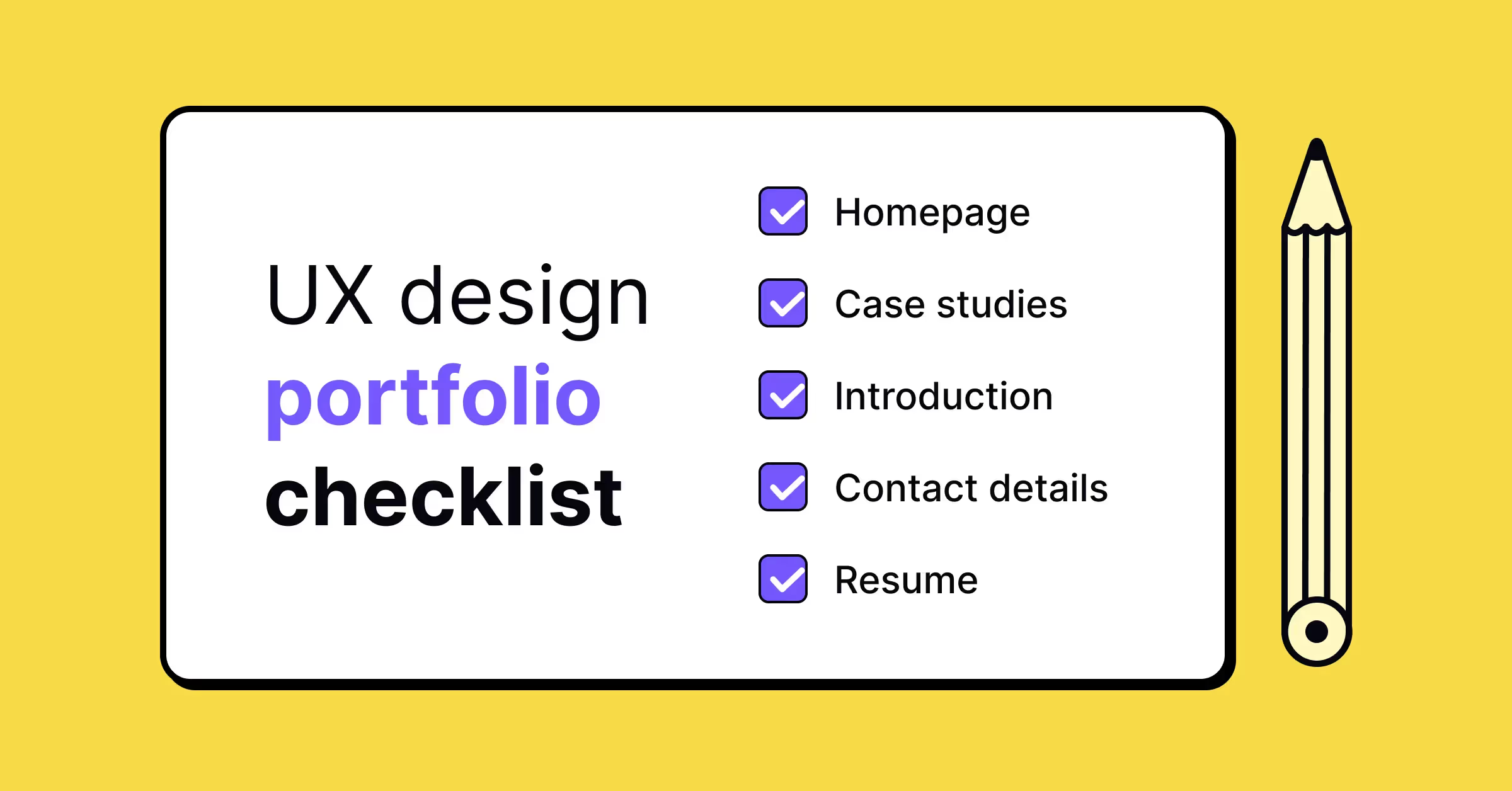
So, here’s what you should be including in your UX designer portfolio:
- An eye-catching homepage that briefly introduces you and your work
- 3-5 relevant, high-quality case studies, from initial concept to final product
- An ‘about me’ section which touches on your education and work experience
- Clearly visible contact details and optional links to social media profiles
- A link to your resume in PDF format
A UX designer resume contains much more varied and wide-ranging information, but a portfolio is about quality, not quantity. Don’t overcomplicate it, and make sure you’re producing the best content possible.
If you don't have enough enterprise work experience and lack projects to showcase, consider participating in design challenges, volunteering for design projects, or offering your assistance to friends who need help with design services. These activities can help you build a robust portfolio even without extensive job experience.
Looking to build case studies for your UX portfolio? Try Uxcel’s UX challenges, based on common real-life design issues and scenarios.
Now, let’s see how other designers share their process and designs with these 11 examples of high-quality UX design portfolios.
11 of the best UX design portfolios & why they work
Creating a killer UX design portfolio is no simple task—sometimes some inspiration can help you on your way. We’ve compiled a list of some of the best stand-out UX design portfolios around. Each website is completely original, showcasing each designer’s strengths and personal brand.
1. The Fresh Portfolio, by Bianca Oliveira
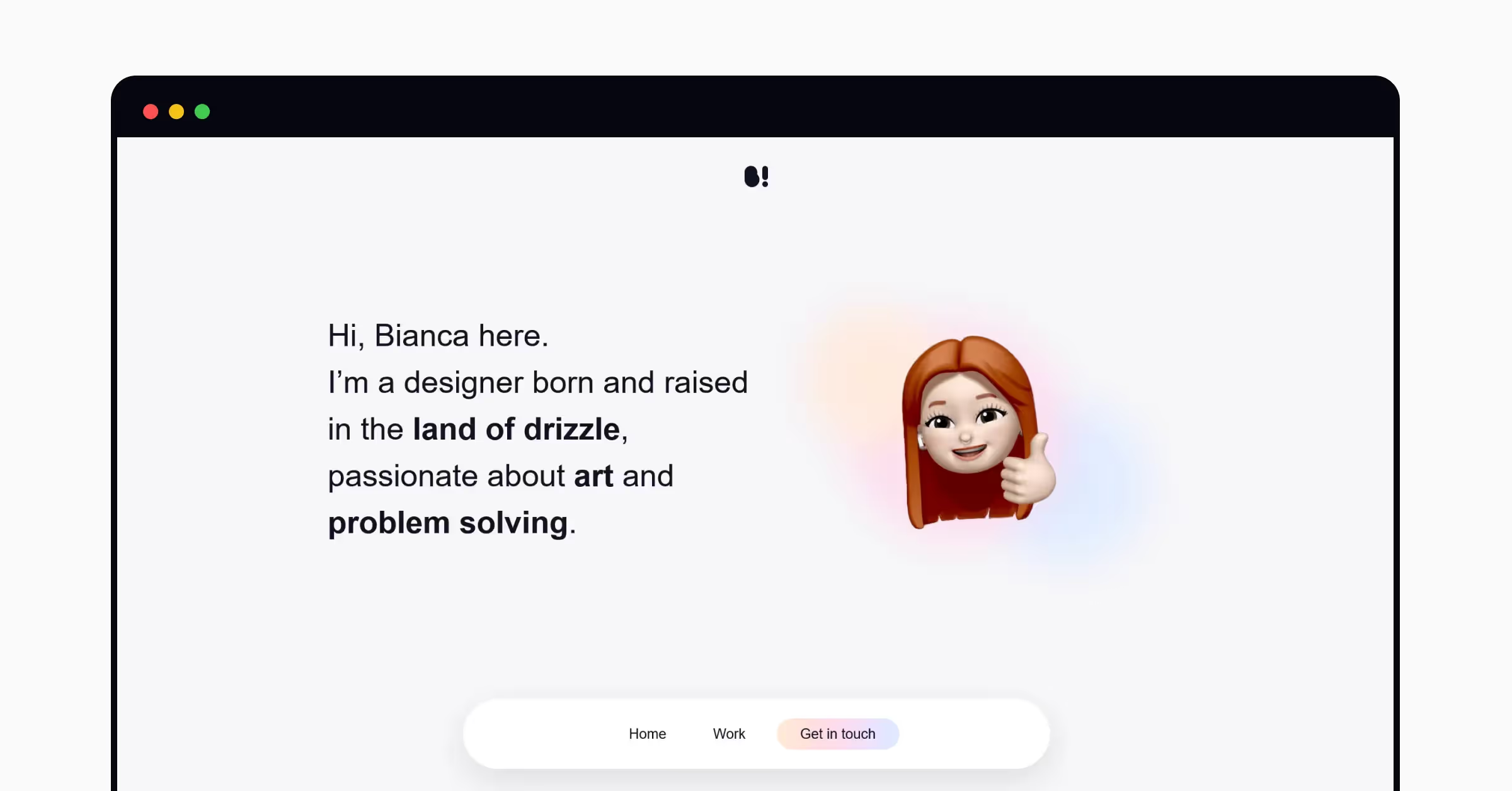
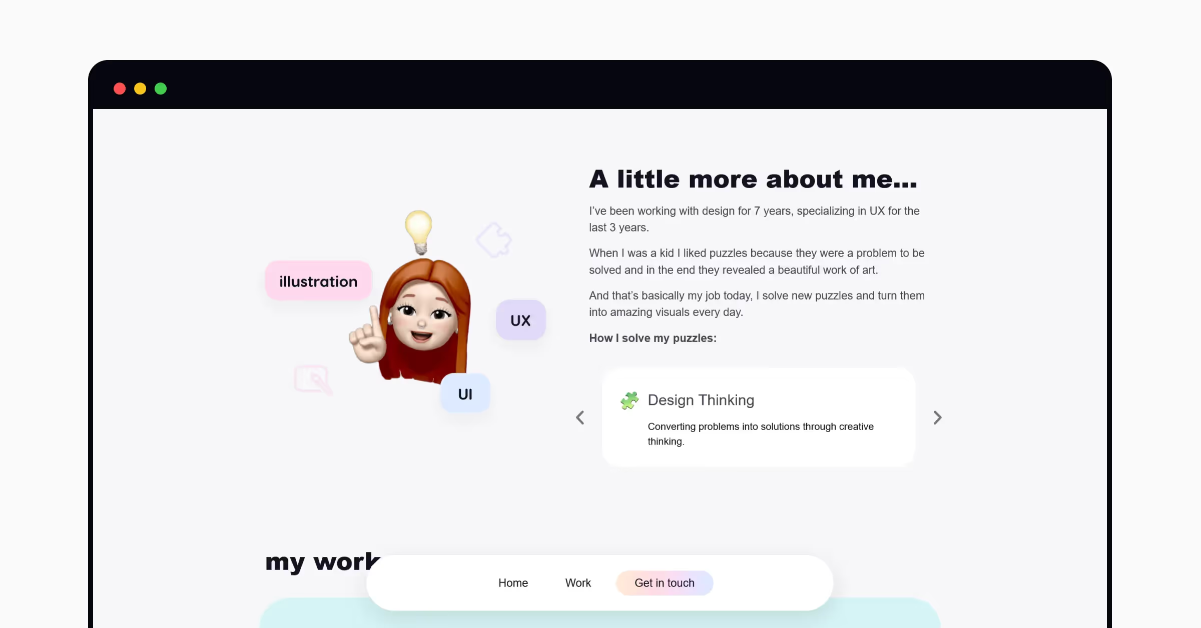
Bianca’s portfolio is simple but effective. The menu at the bottom of the screen is ever-present, meaning the portfolio is easy to navigate and predict. There are three main sections—Home, Work, and Get in touch—each with convincing copy and visuals. It’s an enjoyable scroll that provides a look into Bianca’s design ethos and approach.
Why this portfolio works
This portfolio is fresh — the off-white background works well with pops of color throughout.
The use of a memoji feels modern—something hiring managers and prospective clients are likely looking for from a UX designer. Bianca also includes a click-through carousel titled ‘How I solve my puzzles’—which gives an insight into their UX design process.
2. The Eye-Catching Portfolio, by Jennifer Etsuko Higa
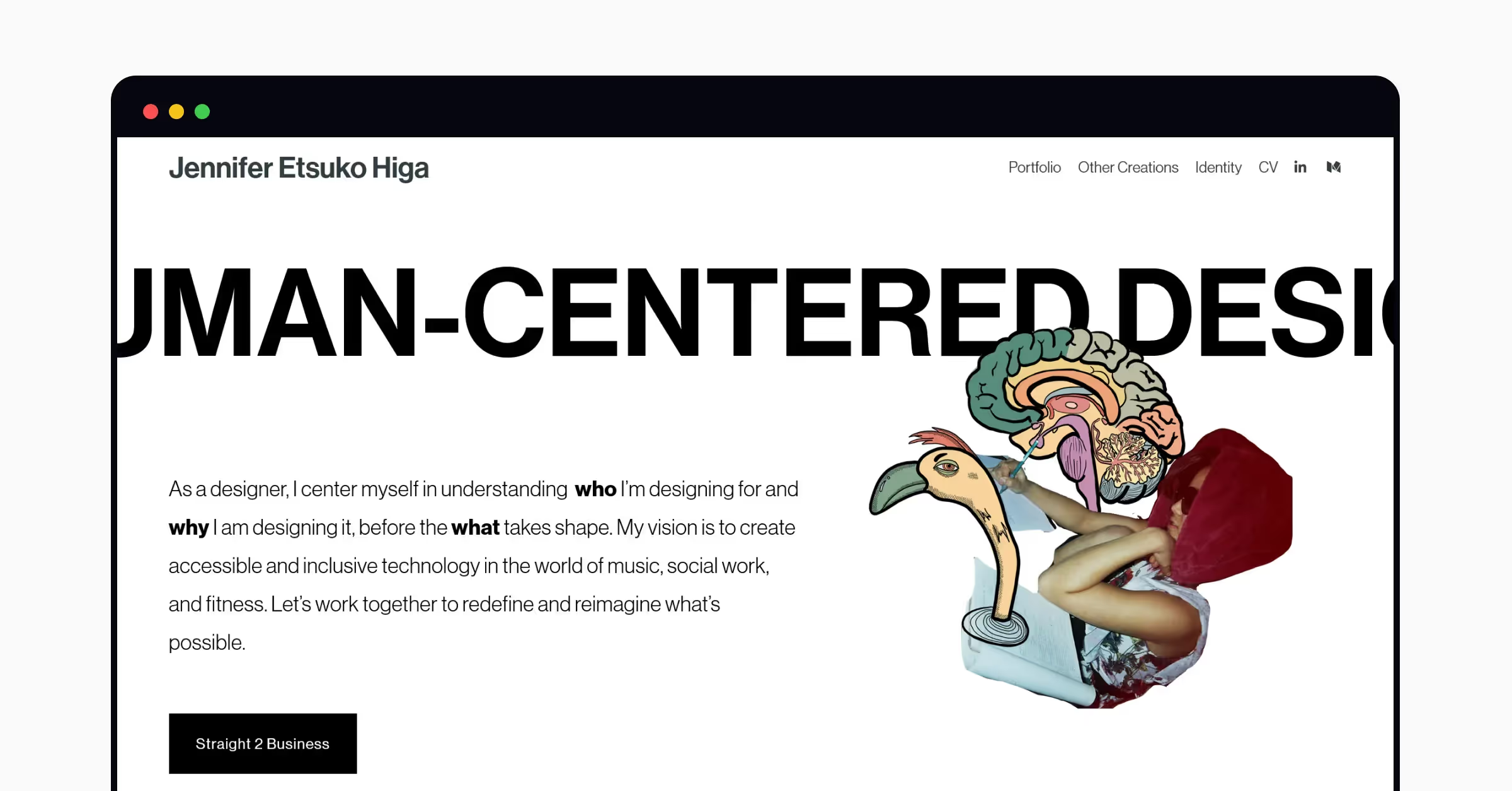
Jennifer’s UX portfolio is immediately eye-catching; their personal brand as a UX designer comes across strongly with an abstract design and custom cursor (check it out!).
Why this portfolio works
Jennifer’s homepage is a perfect example of an effective bio. They make good use of white space—key to UX design—and include no more than the necessary details. The site is easy to navigate and consistent, with comprehensive case studies and a link to their CV (which includes similar branding).
Interested in UX design courses to boost your design skills and employability? Have a look at our options, from color psychology to typography.
3. The Straightforward Portfolio, by Pratibha Joshi
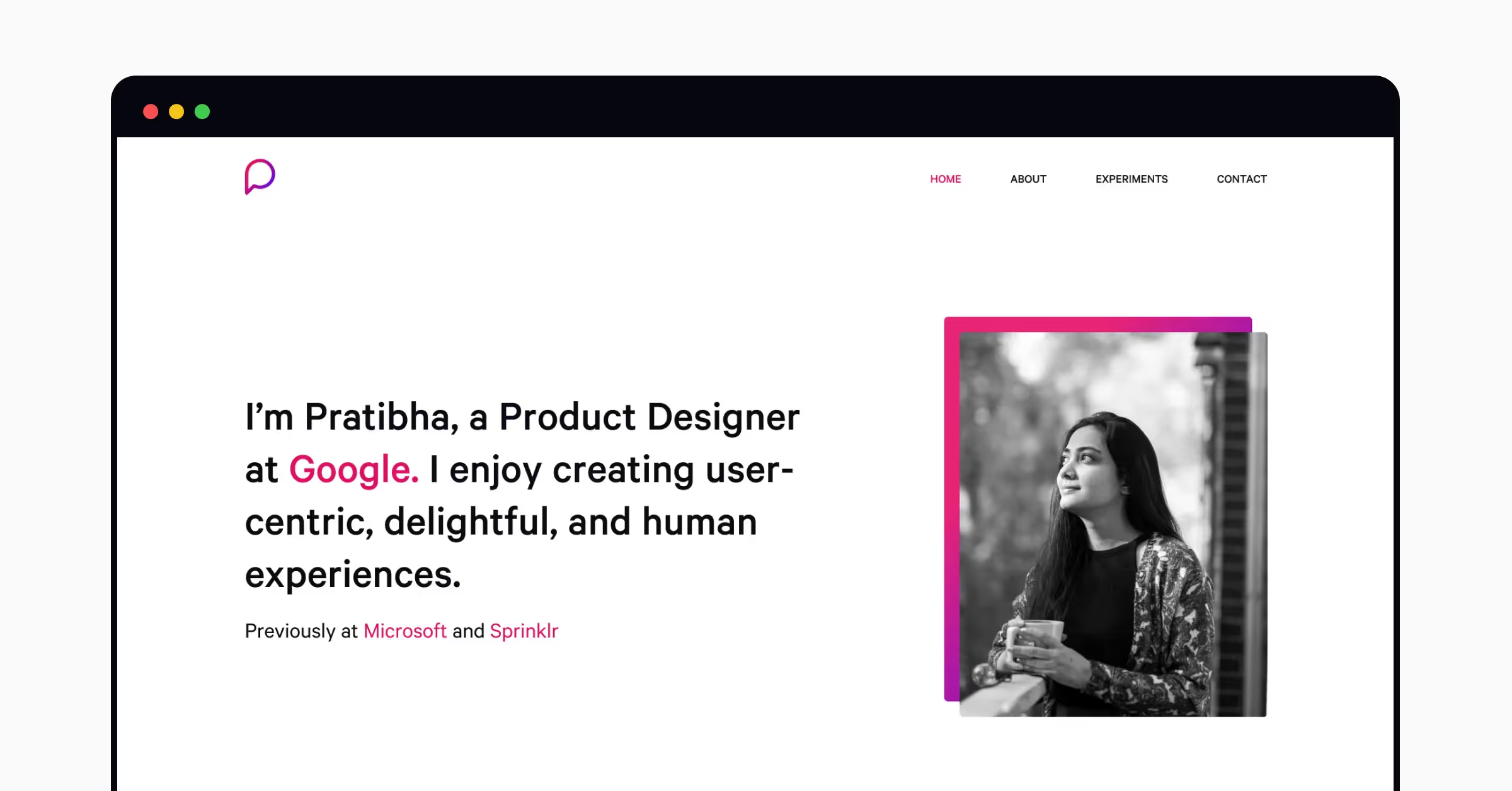
Created using WordPress, this is an excellent example of a simple UX portfolio site that gets straight to the point. Pratibha highlights their sought-after experience at Google, Microsoft, and Sprinklr using pink, which stands out from the otherwise monochrome color palette.
🧠 Uxcel's top tip: Use the same color palette and font for both your UX resume and portfolio to come across as extra professional.
Why this portfolio works
This portfolio site’s stand-out feature is the extra Experiments page, where Pratibha outlines the UX projects they complete in their own time. In addition to demonstrating a passion for UX design, this addition shows a curious nature and innovative drive—attractive qualities to hiring managers.
4. The Entry-Level Portfolio, by Jeff Shibasaski
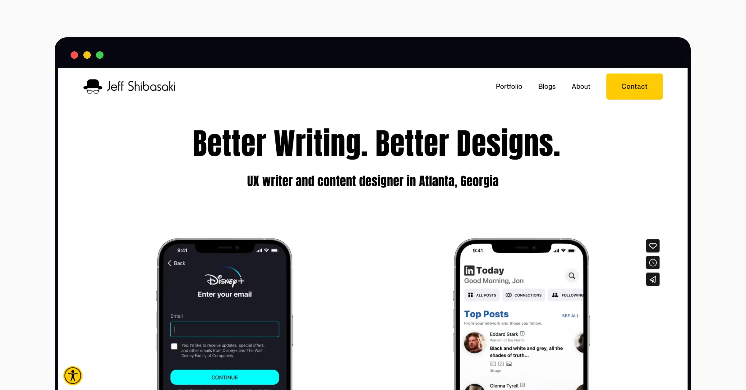
This UX portfolio was created using Squarespace, a very popular platform for building portfolios. Jeff’s site uses two main colors, which complement each other and ensure the site is easy to navigate.
Why this portfolio works
This is a great portfolio example for those who are starting out their UX design careers. Many of the designs included in Jeff’s portfolio are unsolicited—meaning they were completed voluntarily and without pay.
These various unsolicited redesign projects for brands such as Disney+ and LinkedIn offer a look into Jeff’s design process. Some case studies even include videos of the design in action—and engaging addition to their portfolio.
{CTA}
5. The Bold Portfolio, by Sophie Brittain
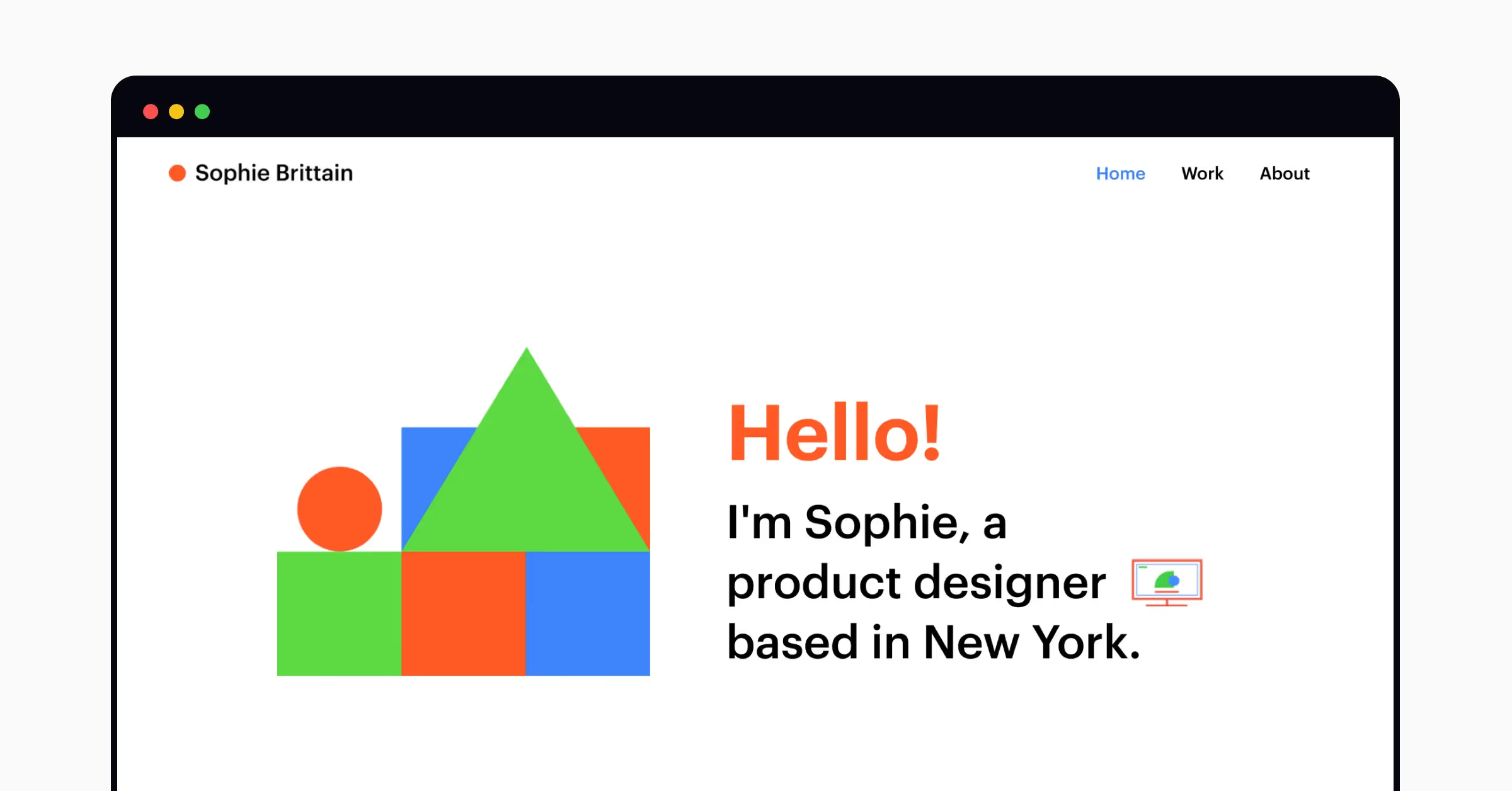
Sophie has created their portfolio with Wix, another popular tool for UX portfolio creation. It’s bold and bright, making for an eye-catching home page and first impression. You’ll see many portfolios using a big, bold greeting such as “Hi”, “Hello”, or “Welcome!”, but whether you include one of these is totally up to you, and what fits with your personal brand.
Why this portfolio works
Sophie’s portfolio is to-the-point with an original design. They use the colorful triangles, squares, and circles throughout their portfolio to bring the site together and include case studies directly on the home page.
6. The Organized Portfolio, by Victoria P
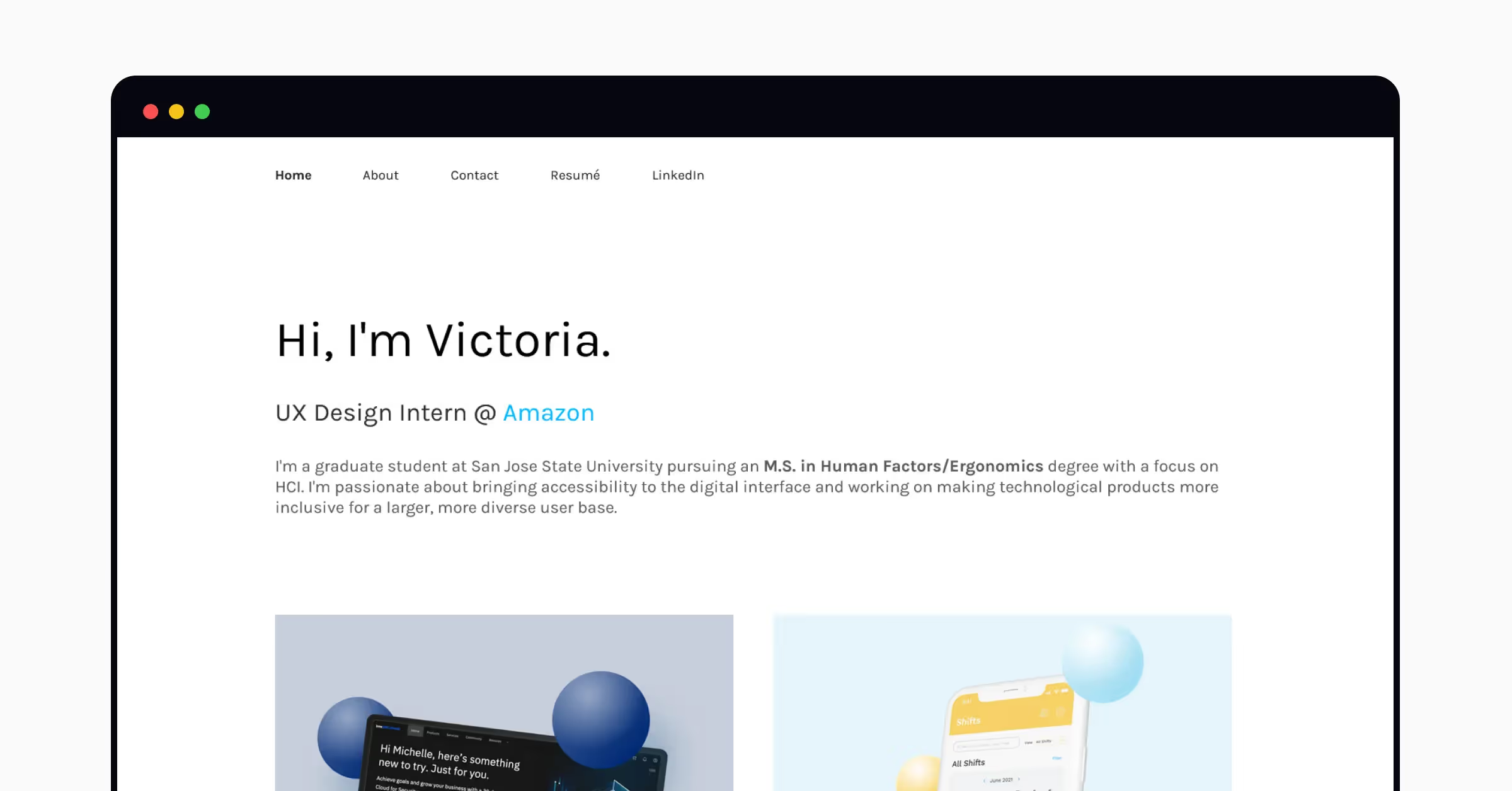
Victoria’s portfolio is straight to the point. It includes details on their current role, education, and passion for UX—and then jumps straight into case studies. There aren’t too many case studies, which avoids any decision paralysis from hiring managers or potential clients.
Why this portfolio works
Victoria’s portfolio is a masterclass in demonstrating how to include all the details without ending up with an over-engineered mess. The project thumbnails lead to in-depth case studies Victoria has created—some of which are password protected, a great feature if some designs are confidential.
7. The Simple Portfolio, by Natalie Kyle
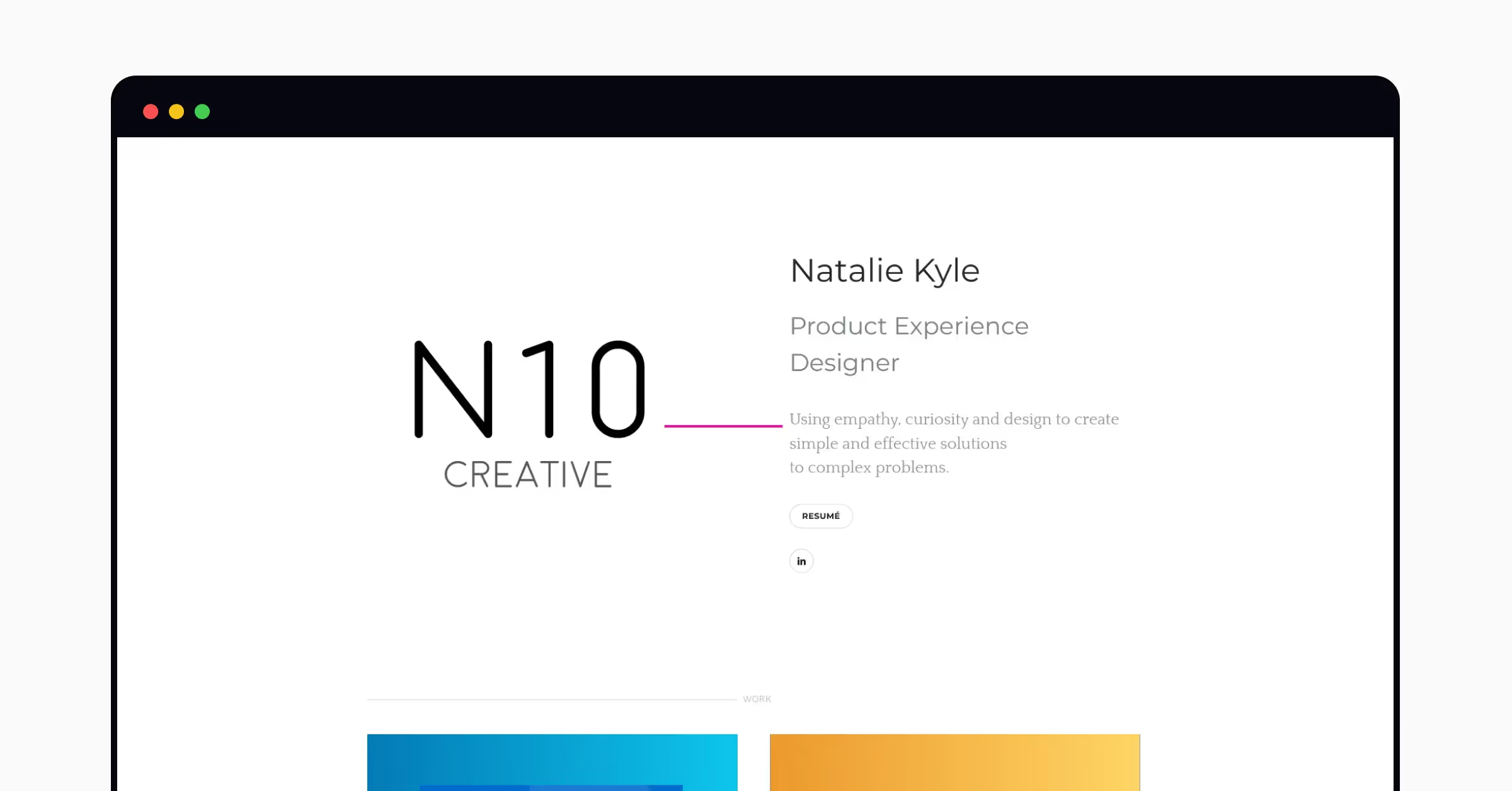
This UX portfolio keeps things simple. Natalie shares their approach to designing product experiences with an effective one-liner, then links out to a resume and LinkedIn page. Hovering over case studies gives a little extra info, and the case studies themselves are comprehensive and standardized—a best practice when writing case studies.
Why this portfolio works
This portfolio works because it gives readers exactly what they’re looking for instantly. Role? Check. Design approach? Check. Demonstrable experience? Check.
The case studies included are also impressive — they include all the key details on the project, Natalie’s role, and even some design artifacts from the project. It gives a great insight into Natalie’s work and design approach — a huge box to tick when it comes to creating a professional design portfolio.
8. The Innovative Portfolio, by Wendy Schorr
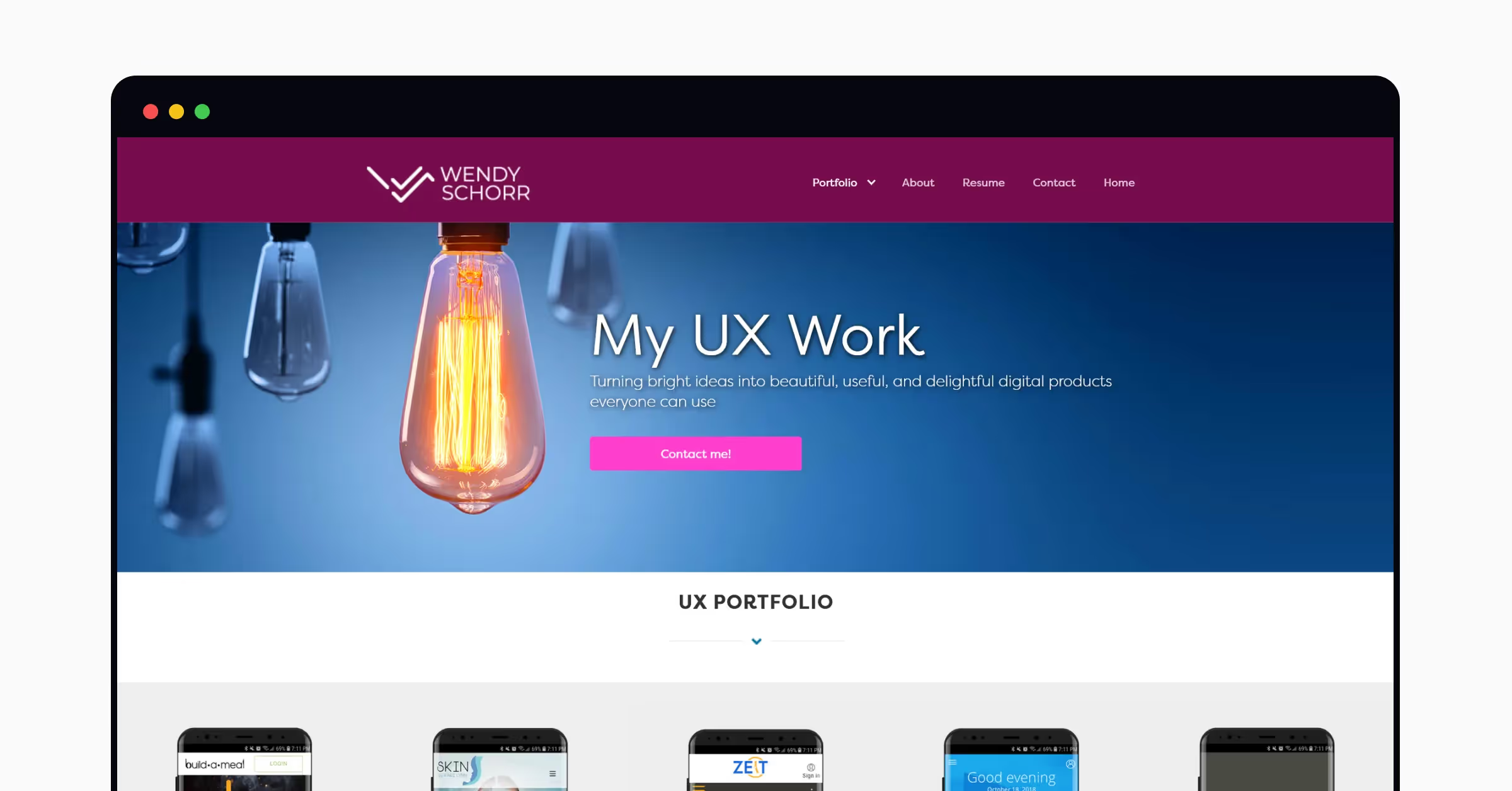
Wendy takes a different approach to their UX portfolio — veering away from the popular minimalist design that many portfolios adopt. The portfolio button reveals a drop down menu of UX designs that Wendy has created — making the portfolio easy to navigate. They’ve also got a prominent ‘Contact me!’ CTA on the homepage, giving readers a quick and easy way to reach out from the get-go.
Why this portfolio works
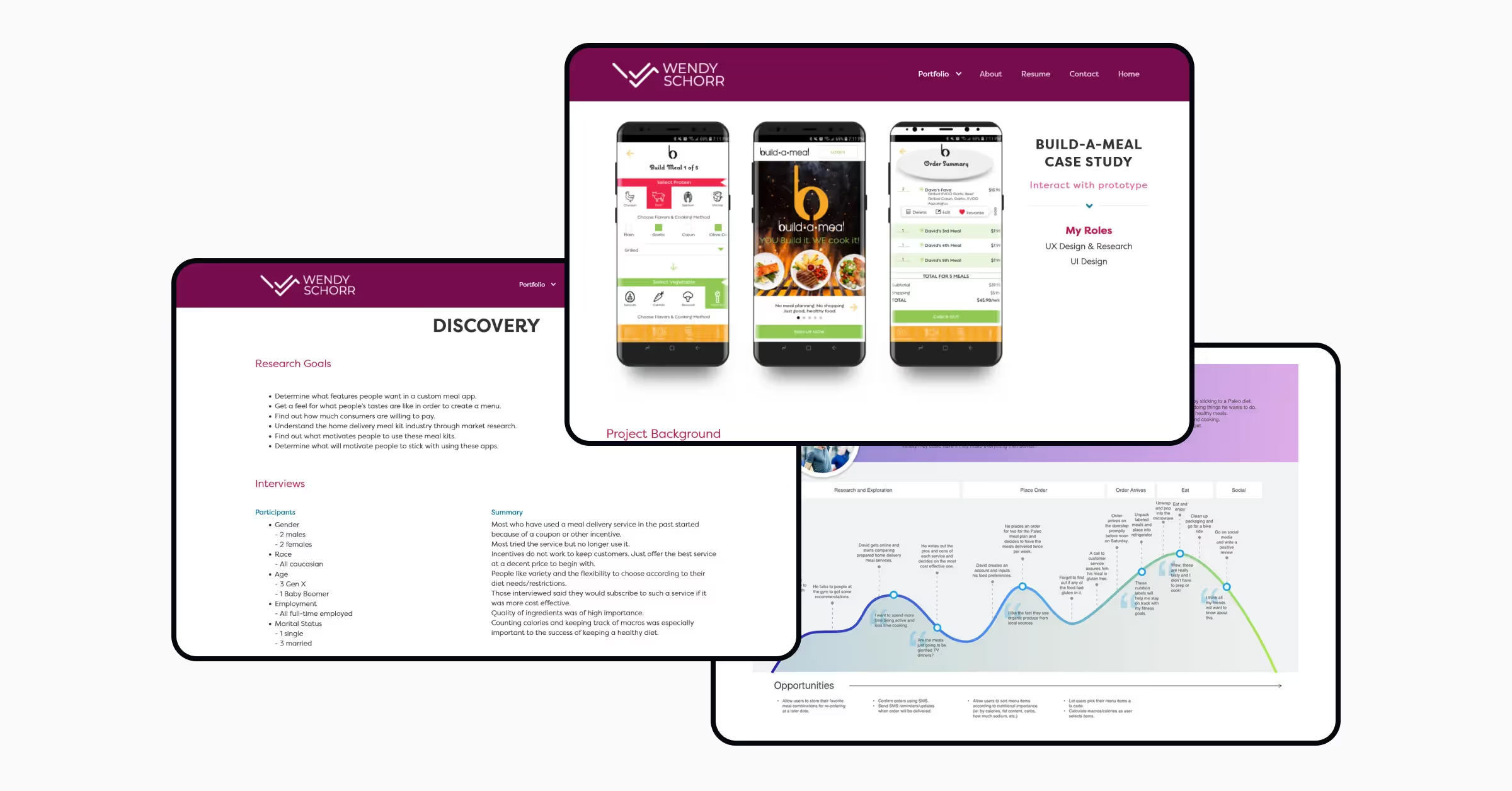
A stand-out feature of Wendy’s portfolio is the comprehensive case studies, complete with links to ‘Interact with the Prototype' and in-depth descriptions of the project background. They go into more detail about the process further down the page, detailing everything from research goals to task flows.
9. The Friendly Portfolio, by Vicky Marchenko
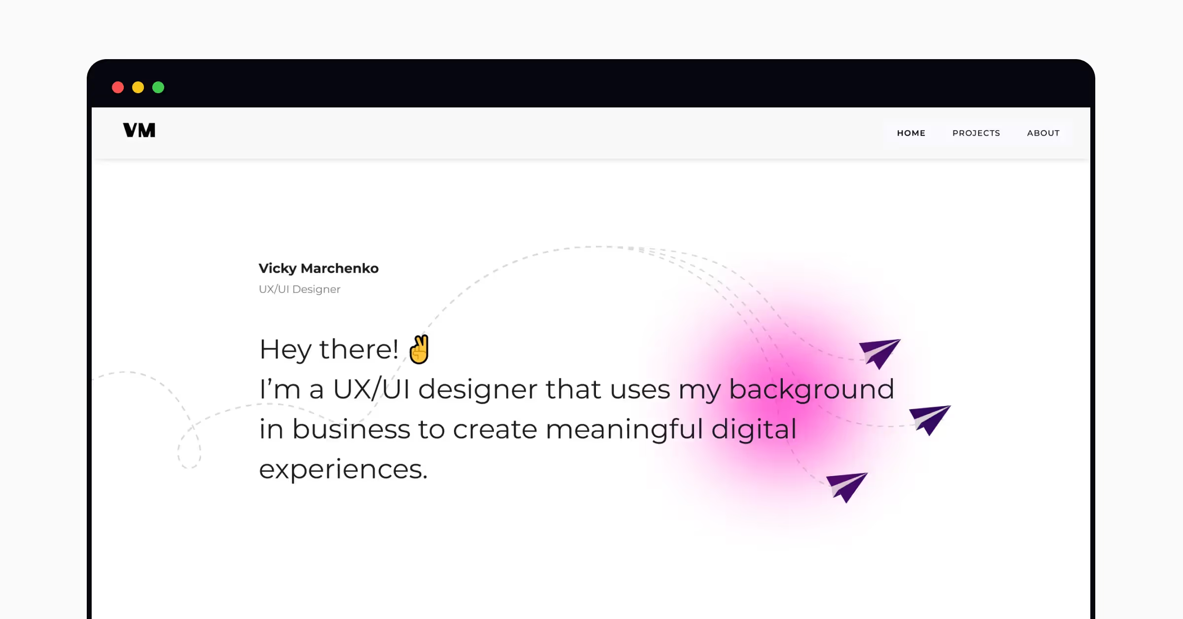
This is a great example of a portfolio that uses a casual tone to welcome visitors. The paper planes you can see are actually animations, and glide across the homepage when you land on it.
Why this portfolio works
Vicky demonstrates that you don’t have to sacrifice a casual tone to be professional, if you feel that that best reflects your personal brand. It can be a strength.
The case studies are all well-presented, and the ‘About’ page details their extensive experience. It’s all about balance.
Want to bulk up your UX designer application with professional UX certifications? Get started today with Uxcel.
10. The Animated Portfolio, by Daniel Novykov
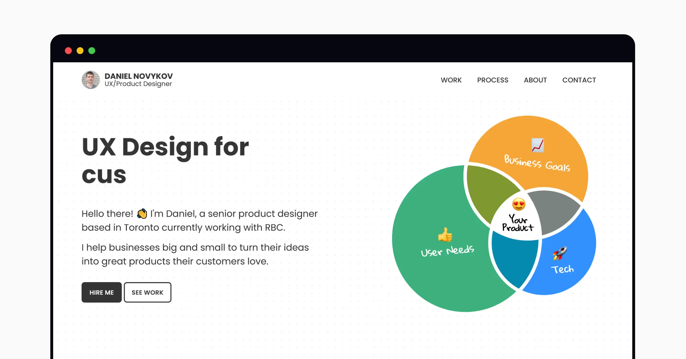
Daniel’s portfolio website is formatted similarly to the homepage of any other business — it’s high-quality, familiar, and professional. The eye-catching UX design for customer delight rotates to include how else Daniel’s UX design is impactful, such as for business impact, start-ups, and more.
Why this portfolio works
Daniel’s creative use of a Venn diagram is an original way to demonstrate the user needs, business needs, and tech considerations when designing ‘your product’. It’s personal from the get-go, and uses colors that pop against the black and white color palette.
11. The Dramatic Portfolio, by Aaron Rudyk
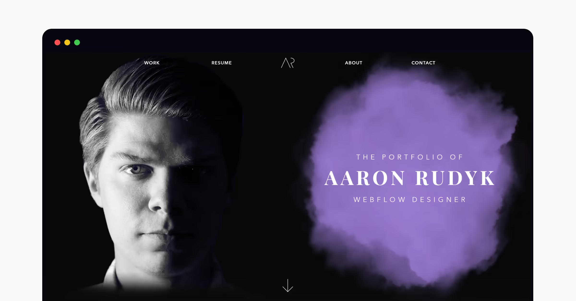
Our final portfolio example—we’re closing out with a bang! Aaron’s portfolio is certainly looking to grab attention with its bold color scheme and dramatic layout.
Why this portfolio works
Aaron’s portfolio is striking and attention-grabbing, with a large portrait on the homepage. It’s certainly not compulsory to add an image of yourself, but there are benefits: the picture puts a face to a name from the get-go, and helps the recruiter or client establish a relationship with the designer. Aaron also has their own logo, top center, which adds a professional touch.
Find your ideal UX role with Uxcel
So, there you have it! Some inspiration to bear in mind when creating UX portfolios.
It really is worth putting in the hours and ensuring strong attention to detail throughout. 80% of recruiters say they spend 3 minutes or less on a candidate’s portfolio: their attention is limited, so ensure your portfolio is as eye-catching, engaging, and professional as possible.
Once you’ve finished creating a design resume, cover letter, and portfolio — you’re ready to start applying for positions. Uxcel’s Job Board is a great place to find UX roles with top businesses — such as Lululemon, Siemens, and more.
Uxcel is also great for bulking up your portfolio with UX design challenges, skill assessments, and UX certifications. The intuitive online platform is the ideal resource for UX designers at all levels, and is perfect for getting the knowledge and experience you need to build a top-notch UX design portfolio.
Then, all that’s left is to prepare for the UX designer interview stage—nice job.
Ready to join the world’s biggest design community and start honing your skills? Get started with Uxcel today.


