

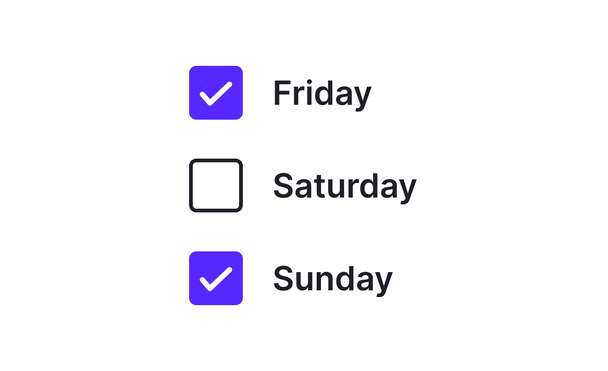
Checkboxes are one of the most widely recognized user interface elements. They consist of a small square box that can be checked or unchecked, allowing users to make selections. Unlike radio buttons, which only permit one choice from a group, checkboxes provide flexibility by enabling multiple selections at once. Their simplicity and recognizability make them indispensable in digital design across both web and mobile environments.
From a UX perspective, checkboxes contribute to clarity and control. They give users the freedom to pick more than one option without worrying about losing context. Designers rely on them in scenarios like survey questions, preference settings, or bulk actions in product dashboards. Their visual design must strike a balance: large enough to be easily tapped or clicked, with clear states for selected and unselected. Labels must always be direct and unambiguous to avoid user error.
Checkboxes also play a key role in accessibility. They must be compatible with screen readers, support keyboard navigation, and be large enough for users with motor impairments. Accessible design practices include ensuring sufficient contrast between states and providing descriptive text labels linked to each box. Without these considerations, checkboxes can become exclusionary, creating friction for certain user groups.
Real-world examples demonstrate their versatility. Gmail uses checkboxes for bulk email selection, allowing users to archive, delete, or label multiple messages at once. Survey tools like Google Forms and Typeform depend heavily on checkboxes to collect multiple-choice feedback. In system settings, such as privacy preferences or notification toggles, they provide a straightforward way for users to control their environment.
Designers often customize checkboxes to match brand aesthetics, but usability must always come first. Over-stylized boxes that are hard to recognize or interact with can harm the user experience. Successful design maintains the standard square form while introducing subtle branding elements such as color or animation.
Learn more about this in the Checkboxes Exercise from the Common UI Components Lesson, a part of the Design Terminology Course.
Key Takeaways
- Checkboxes let users select multiple options at once.
- Designers use them for surveys, filters, and task completion.
- Product managers leverage them to enhance usability and workflows.
- Accessibility requires clear labels, contrast, and compatibility.
- Customization should never compromise usability and recognition.


