

TL;DR
- Interactive components for making choices.
- Include radio buttons, checkboxes, and switches.
- Ensure clarity in single vs. multiple selection.
- Core to forms, settings, and decision-making.
Definition
Selection controls are user interface components that allow users to indicate choices or set states by interacting with elements such as checkboxes, radio buttons, or toggle switches.
Detailed Overview
Selection controls are foundational in digital interfaces because they enable interaction and decision-making. They appear wherever users must choose between options, confirm preferences, or adjust settings. Their design affects usability directly, since unclear controls often lead to errors, frustration, or abandonment.
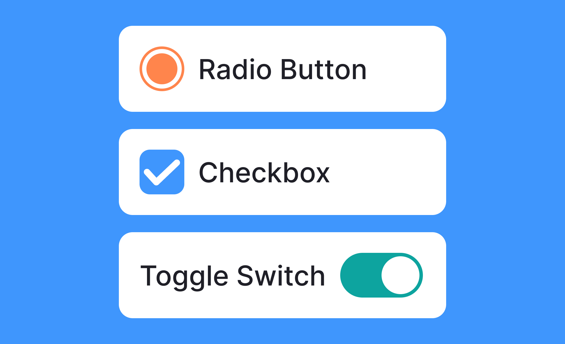
A frequent question is what types of selection controls exist. The three most common are checkboxes, radio buttons, and switches. Checkboxes allow users to select multiple options at once. Radio buttons restrict selection to a single option within a group. Switches toggle a setting between two states, such as on and off. Designers choose based on the exclusivity or flexibility of the decision being presented.
Another common query concerns when to use each type. Radio buttons are ideal for mutually exclusive choices like delivery speed, while checkboxes are best for tasks like filtering multiple product categories. Switches are most effective for binary states, such as enabling notifications. Using the wrong control confuses users and increases the chance of incorrect input.
Teams often ask about consistency. Selection controls must be predictable and behave the same across contexts. For instance, a checkbox should never be used to toggle a single binary state if switches are used elsewhere for that purpose. Design systems standardize these patterns to ensure familiarity and trust.
Accessibility is another frequent topic. Proper coding and labeling are critical so screen readers can communicate the available options. Keyboard navigation must allow users to move between controls and toggle them without difficulty. Clear labels and sufficient touch targets also ensure usability for people with motor or visual impairments.
Another important consideration is feedback. Selection controls must provide immediate, visible confirmation when a choice is made. This could be a filled checkbox, a selected radio button, or a switch sliding to a new position. Without feedback, users may doubt whether their input was recorded correctly.
Learn more about this in the Intro to UI Selection Controls Lesson, a part of the UI Components I Course.


