

Forms are interactive elements that allow users to submit information in digital products. They are among the most common interface patterns, appearing in sign-ups, logins, surveys, checkouts, and feedback systems. Despite their ubiquity, forms are often points of friction, as users must invest time and effort to provide information. Good form design reduces this friction, guiding users smoothly while ensuring data is collected accurately.
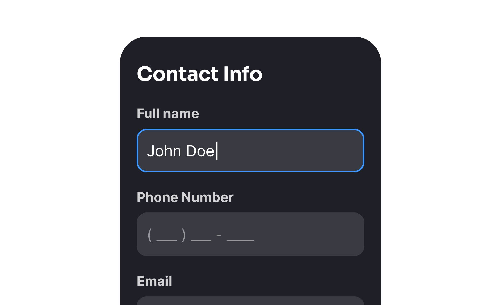
For UX designers, forms represent a delicate balance between simplicity and completeness. Every field added increases cognitive load and reduces the likelihood of completion. Designers use strategies like progressive disclosure, autofill, and inline validation to streamline input. Clear labels, logical grouping, and visible error prevention also reduce frustration, making forms less of a barrier and more of a seamless step in the experience.
Accessibility in form design is essential. Labels must be properly linked to input fields, placeholders should not replace labels, and error messages need to be descriptive for screen readers. Keyboard navigation and logical tab order are equally important. Without these considerations, users with disabilities may struggle to complete forms, effectively excluding them from essential interactions like account creation or purchases.
Real-world examples highlight how impactful good form design can be. Airbnb simplified its sign-up flow by allowing users to register through existing accounts, dramatically reducing friction. E-commerce leaders like Amazon streamline checkout by storing and pre-filling user data, minimizing input effort. Government websites, often criticized for poor usability, have begun investing in accessible, mobile-friendly forms that improve trust and compliance.
Forms also influence trust and credibility. Users are wary of providing personal data, particularly when forms request sensitive information. Transparency about why data is collected, how it will be used, and how it will be protected reassures users. Including progress indicators in longer forms also reduces abandonment by setting expectations clearly.
Learn more about this in the Best Practices for Designing Forms Lesson, a part of the UI Components I Course.
Key Takeaways
- Forms are critical interaction points for input and data collection.
- UX design focuses on reducing friction and improving clarity.
- Accessibility requires proper labels, error handling, and keyboard support.
- Good examples include simplified sign-ups, autofill, and mobile optimization.
- Trust, transparency, and evolving tech shape effective forms.


