<?xml version="1.0" encoding="utf-8"?>

Recommended resources

Courses

UX Design Foundations Course
Popular
Course

UX Design Foundations

Gene Kamenez
Gene Kamenez
Learn UX design basics to acquire a solid foundation in UX design principles. Acquire the skills needed for product development and improving user experience.
Design Terminology Course
Course

Design Terminology

Alesya Dzenga
Alesya Dzenga
Learn UX terminology and key UX/UI terms that boost collaboration between designers, developers, and stakeholders for smoother, clearer communication.
UI Components I Course
Course

UI Components I

Colin Michael Pace
Colin Michael Pace
Learn to create user-friendly interfaces using core UI components, building a solid foundation for designing intuitive and efficient digital products.
Color Psychology Course
Course

Color Psychology

Cameron Chapman
Cameron Chapman
Learn how color influences perception, emotion, and behavior. Discover how to apply color psychology to design more impactful and engaging experiences.
Common Design Patterns Course
Course

Common Design Patterns

Gene Kamenez
Gene Kamenez
Learn design patterns most valued in product development to create intuitive, visually compelling experiences that seamlessly blend form and function.
Accessibility Foundations Course
Course

Accessibility Foundations

Ljubisa Kukulj
Ljubisa Kukulj
Learn the fundamentals of digital accessibility and how to create inclusive experiences for all users. Explore key principles, tools, and best practices.
Wireframing Course
Course

Wireframing

Colin Michael Pace
Colin Michael Pace
Learn to create effective wireframes that seamlessly integrate into your design workflows, improving communication and driving better design outcomes.
UI Components II Course
Course

UI Components II

Colin Michael Pace
Colin Michael Pace
Learn advanced techniques to design dynamic, scalable interfaces using optimized UI components and streamlined navigation for better user experiences.
UX Writing Course
Course

UX Writing

Alesya Dzenga
Alesya Dzenga
Learn to write microcopy that communicates clearly and concisely to improve user experience, build trust, and boost conversions across digital products.
Design Composition Course
Course

Design Composition

Gene Kamenez
Gene Kamenez
Learn the fundamental principles of visual layout, balance, and structure to create compelling and effective design compositions that engage and intrigue users.
Mobile Design Course
Course

Mobile Design

Denis Jeliazkov
Denis Jeliazkov
Learn mobile UI/UX patterns, workflows, and platform-specific strategies to create exceptional, user-friendly mobile experiences across different devices.
Typography Course
Course

Typography

Cameron Chapman
Cameron Chapman
Learn typography fundamentals, from typeface and font selection to layout and spatial arrangement, to create captivating designs that communicate powerfully.
UX Design Patterns with Checklist Design Course
Course

UX Design Patterns with Checklist Design

George Hatzis
George Hatzis
Learn common UX design patterns and how to apply them with practical checklists, ensuring the creation of intuitive, user-friendly, and exceptional interfaces.
HTML Foundations Course
Course

HTML Foundations

Yan Sokalau
Yan Sokalau
Learn the fundamentals of HTML, from basic formatting and structure to advanced elements and best practices, to create accessible and responsive web pages.
Enhancing UX Workflow with AI Course
Course

Enhancing UX Workflow with AI

Colin Michael Pace
Colin Michael Pace
Learn how to integrate AI into UX design to create smarter, more personalized user experiences. Explore tools, trends, and best practices in AI-driven design.
CSS Foundations Course
Course

CSS Foundations

Yan Sokalau
Yan Sokalau
Learn the basics of CSS, including the box model, element style, and content positioning, to improve communication, design handoff, and web decision-making.
Introduction to Figma Course
Updated
Course

Introduction to Figma

Gene Kamenez
Gene Kamenez
Learn essential Figma tools like layers, styling, typography, and images. Master the basics every UX designer needs to create clean, user-friendly designs.
3D Design Foundations Course
Course

3D Design Foundations

Learn essential 3D design principles, from spatial thinking and dimensional relationships to form, lighting, and texture, for a solid foundation in the field.
Information Architecture Course
Course

Information Architecture

Colin Michael Pace
Colin Michael Pace
Learn the basics of organizing, structuring, and labeling content to design clear, user-friendly information systems that enhance usability and navigation.
Apple Human Interface Guidelines Course
Course

Apple Human Interface Guidelines

Denis Jeliazkov
Denis Jeliazkov
Learn Apple’s Human Interface Guidelines to design modern, high-performing apps, focusing on UI principles and best practices for creating effective interfaces.
Introduction to Design Audits Course
Course

Introduction to Design Audits

Romina Kavcic
Romina Kavcic
Learn the art of systematic design evaluation to improve consistency, effectiveness, and create more user-centered products that meet user expectations.
AI Fundamentals for UX Course
Course

AI Fundamentals for UX

Dr. Slava Polonski
Dr. Slava Polonski
Explore AI concepts, principles, and practices essential for creating human-centered, trustworthy AI-powered experiences.
Government Design Foundations Course
Course

Government Design Foundations

Fouad Jallouli
Fouad Jallouli
Learn best practices and core principles for government design to create impactful, user-centered digital services that improve accessibility and efficiency.
Improve your UX & Product skills with interactive courses that actually work

FAQs

What is a radio button?

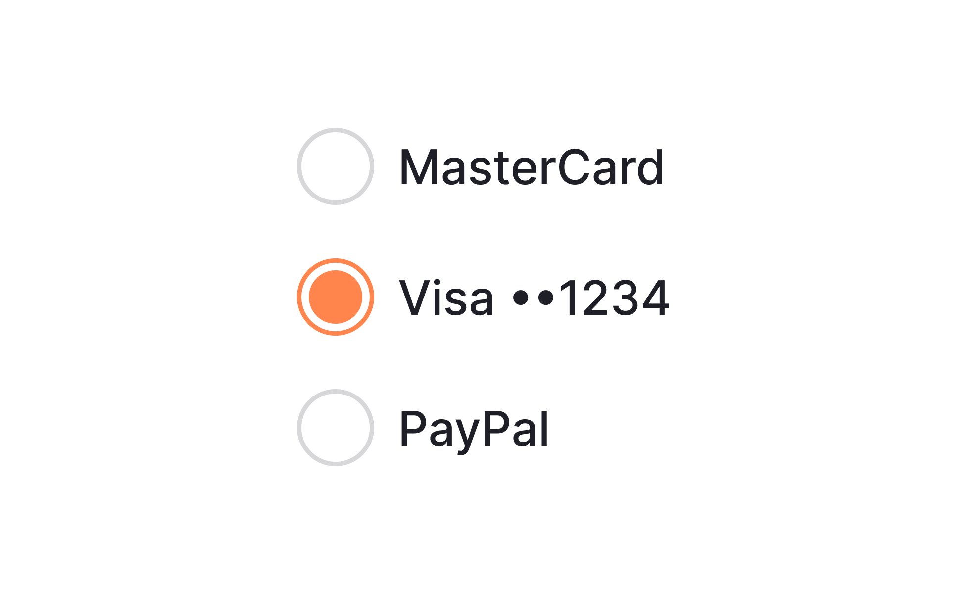
A radio button is a graphical user interface element that allows users to make a single choice from a group of options. It is typically represented by a small circle that can be selected by clicking on it. When a radio button is selected, a small dot or marker appears inside the circle to indicate the user's choice.

In a group of radio buttons, only one option can be selected at a time. When a user selects one radio button, any previously selected radio button in the group becomes deselected. This is in contrast to a checkbox, which allows multiple options to be selected simultaneously.

Radio buttons are commonly used in forms and surveys to present a list of mutually exclusive options to the user. They are also used in settings and preferences menus to allow users to make a single choice from a list of options.

In web development, radio buttons are typically implemented using HTML and CSS, and can be made interactive using JavaScript or a scripting language like PHP.


What’s the difference between a radio button and a checkbox?

A radio button and a checkbox are both graphical user interface elements that allow users to make selections, but they function in different ways.

A radio button is used to present a list of mutually exclusive options to the user, where only one option can be selected at a time. When a user selects one radio button, any previously selected radio button in the group becomes deselected. They are typically represented by a small circle that can be selected by clicking on it, and when selected a small dot or marker appears inside the circle.

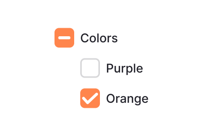
On the other hand, a checkbox is used to present a list of options where multiple selections can be made. They are typically represented by a square box that can be selected or deselected by clicking on it, and when selected a small tick mark appears inside the box.

In summary, the main difference between a radio button and a checkbox is that radio buttons are used for mutually exclusive options, where only one option can be selected at a time, whereas checkboxes are used for multiple selections.


How are radio buttons used in UX design?

Radio buttons are used in UX design to present a list of mutually exclusive options to the user, where only one option can be selected at a time. They are commonly used in forms, surveys, settings and preferences menus.

Some examples of how radio buttons are used in UX design include:

  • In a survey or questionnaire, radio buttons can be used to present a list of predefined options for a question, allowing the user to select one and only one answer.
  • In a form, radio buttons can be used to present a list of options for a field, such as gender or marital status, allowing the user to select one and only one answer.
  • In settings or preferences menus, radio buttons can be used to allow users to make a single choice from a list of options, such as selecting a default language or theme.
  • In e-commerce, radio buttons can be used in the product page, to allow the user to select one and only one option from different colors, sizes or materials of the product.

When using radio buttons in UX design, it's important to make sure that the options are clearly labeled and easy to understand, and that the selected option is clearly indicated. Additionally, the radio buttons should be placed in a logical and consistent order, and the group of radio buttons should be clearly separated from other groups of radio buttons or checkboxes.

Furthermore, it is important to consider the accessibility of the radio buttons. They should be designed in a way that can be used by users with visual impairments, and should be compatible with keyboard navigation and screen readers.