

What are design principles?
Design principles are guidelines that shape how design decisions get made. They give teams a shared reference point for evaluating whether a design is working and for resolving disagreements when two options seem equally valid on the surface.
Some design principles are broadly applicable across design disciplines: the Gestalt principles of perception, for instance, describe how people visually group and organize information, and these apply whether you're designing a mobile app or a wayfinding system. Others are specific to UI and UX design: Nielsen's ten usability heuristics, for example, were developed specifically to evaluate interactive systems and have become one of the most referenced frameworks in the field.
Teams also develop their own product-specific principles. A fintech company might articulate principles around clarity and trust that reflect both their users' anxieties and their business context. A social platform might prioritize delight and expressiveness. These aren't universal truths; they're deliberate choices about what the product should optimize for, made explicit so that everyone on the team can apply them consistently.
The value of having principles explicitly articulated is that they make design reasoning transparent. When a team can point to a shared principle rather than personal preference, design conversations become more productive and decisions become more defensible.
What are the core visual design principles?
Visual design principles describe how elements should be arranged and styled to create clear, effective interfaces. Several of them appear across nearly every framework and course:
- Contrast is the difference in visual properties between elements: color, size, weight, shape. Contrast creates emphasis and guides attention. High-contrast elements stand out; low-contrast elements recede. The principle applies to readability (text must contrast sufficiently against its background) and to hierarchy (the most important element should have the most visual contrast relative to its surroundings).
- Alignment keeps elements visually connected and organized. Elements aligned to a common edge or grid feel intentional and coherent. Misalignment, even by a few pixels, can make a layout feel sloppy and difficult to scan.
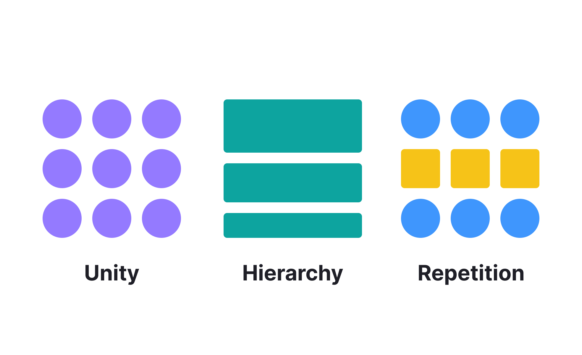
- Repetition reinforces visual patterns. When the same visual treatment is used consistently for the same type of element (all primary buttons look the same, all section headers share the same typographic style), users learn the pattern and can apply that knowledge as they navigate new screens.
- Proximity signals relationship. Elements placed close together are perceived as related. Elements with space between them are perceived as distinct. Used deliberately, proximity communicates information organization without requiring explicit labels or dividers.
- Hierarchy establishes priority. Not all content is equally important, and visual hierarchy communicates which elements users should notice first, which are supporting, and which are secondary. Size, weight, color, and position all contribute to hierarchy.
- Balance creates visual stability. Symmetrical balance distributes equal visual weight on both sides of a layout. Asymmetrical balance achieves stability through the careful placement of unequal elements, and is often more dynamic and interesting while still feeling grounded.
What are usability and interaction design principles?
Beyond visual arrangement, a distinct set of principles addresses how interfaces should behave and how users should experience interacting with them.
- Clarity means interfaces should be self-explanatory without requiring instruction. Users should be able to understand what a control does, what state the system is in, and what their options are from what's visible on screen.
- Consistency allows users to transfer knowledge across a product. When the same action always works the same way, and the same visual treatment always means the same thing, users build a reliable mental model that makes navigation faster and more confident.
- Feedback ensures users know their actions have been registered and what happened as a result. A button that does nothing visible when pressed creates uncertainty. A form submission that confirms success or clearly explains an error gives users the information they need to continue.
- Forgiveness allows users to recover from mistakes without significant penalty. This includes undo functionality, confirmation dialogs for destructive actions, and error messages that explain what went wrong and how to fix it, rather than simply flagging that something failed.
- Affordance describes how an element's visual design signals what it can do. A raised button with a label looks clickable. A flat text block doesn't. When affordances are clear, users don't have to wonder whether something is interactive.
What's the difference between design principles and design guidelines?
The terms are often used interchangeably, but they describe different levels of abstraction.
Design principles are high-level values or approaches: "prioritize clarity," "reduce cognitive load," "design for the user's context, not the designer's assumptions." They're directional rather than prescriptive. They help a team reason about unfamiliar situations.
Design guidelines are more specific and actionable: "buttons must meet a 4.5:1 contrast ratio," "touch targets should be at least 44x44 pixels," "error messages must specify what went wrong and how to resolve it." Guidelines operationalize principles into concrete rules that can be followed consistently.
Both are valuable. Principles without guidelines are hard to apply consistently across a large team. Guidelines without principles become rigid rules that teams follow without understanding why, which makes them brittle in edge cases.
How are design principles applied in practice?
Design principles have become increasingly integrated into design systems rather than sitting as standalone documentation.
In well-maintained design systems, principles are embedded into component behavior, accessibility standards, and review criteria rather than existing as a separate document that teams may or may not consult. A principle like "always provide feedback for user actions" manifests as a component library that includes loading states, success states, and error states for every interactive component, rather than as a guideline designers need to remember to apply individually.
AI-assisted design tools have introduced new complexity around principles. Tools that generate layouts, copy, or visual directions automatically may produce outputs that satisfy surface-level aesthetic principles but violate deeper usability principles. Teams working with AI-generated starting points need to evaluate generated outputs against their principles explicitly, rather than assuming that a plausible-looking design is necessarily a principled one.
The most durable design principles are grounded in how people actually perceive and process information. Gestalt principles, cognitive load theory, and mental models are consistent because they reflect how human cognition works rather than aesthetic trends that shift over time.

.svg)


