Inputs
Inputs are interactive elements or controls through which users provide information or perform actions within a digital interface. They include various types of form fields, checkboxes, radio buttons, dropdown menus, sliders, buttons, and other interactive elements.


Input fields (or just "inputs") allow users to provide information to a system, process, or program. It comes in many forms, such as text, numbers, images, audio, or video. Usually, users provide inputs through a keyboard or mouse, by touching the screen, pronouncing voice commands, or uploading a file.
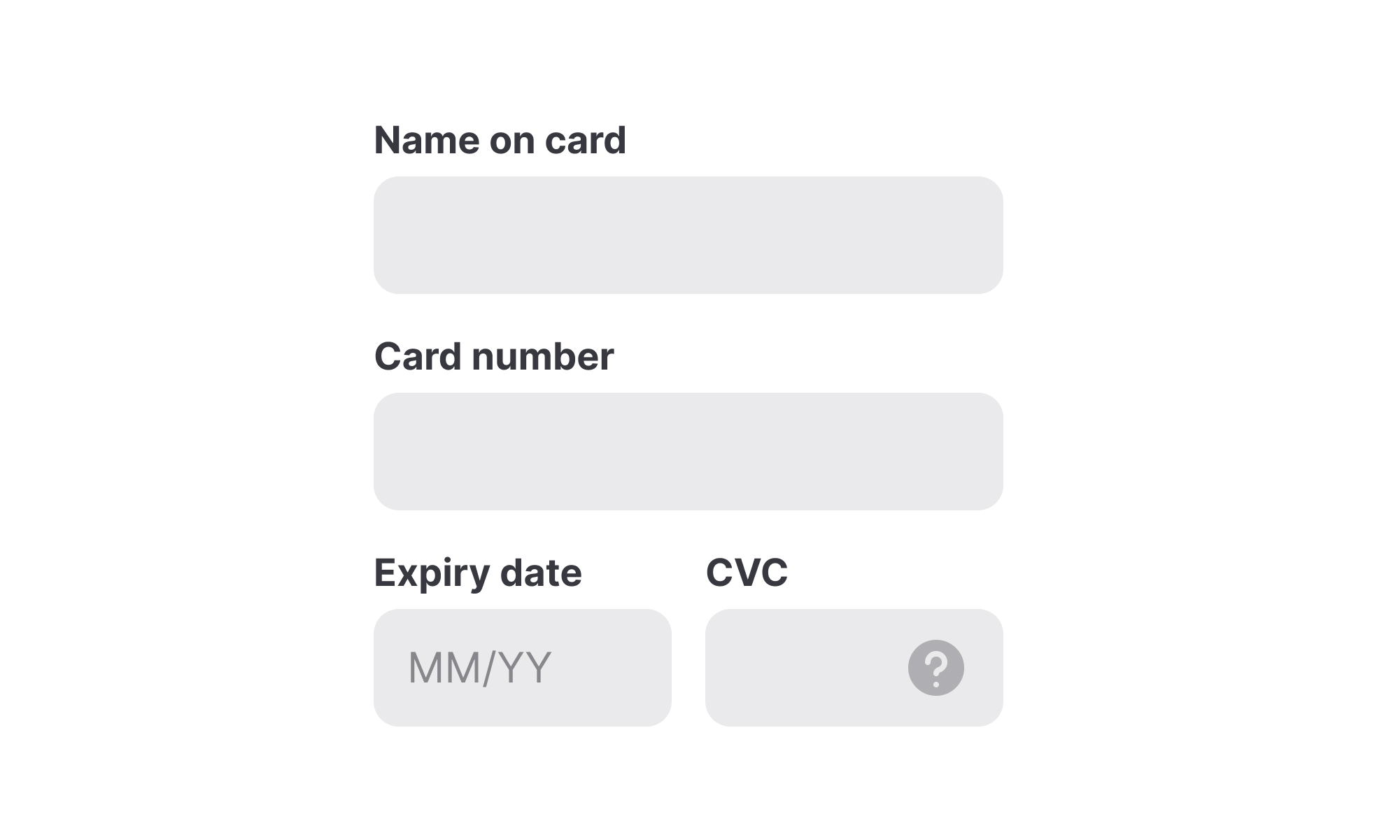
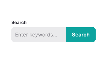
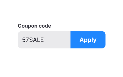
Text inputs are most common and typically appear in forms and dialogs. Explore the intricacies of designing text inputs with the Input Best Practices lesson from our UI Components I course.
Systems use inputs for collecting information about users, and knowing the best practices for input design reduces the risk of failing this task. The most common best practices for input design include:
- Simplicity: Inputs should be simple and intuitive to understand and use, with clear instructions and labels.
- Accessibility: Inputs should have enough contrast and be easily reached via a keyboard.
- Minimum user effort: Whenever possible, use autocomplete or provide pre-populated options to minimize effort and cognitive load.
- Appropriate input types: Choose the most appropriate input type for the data being collected, such as a date picker for date inputs, or a slider for numerical inputs.
- Relevant feedback: Provide immediate feedback to users and indicate whether an input is active or disabled or whether the input was successful or contains errors.
For more best practices explore the Inputs Best Practices lesson within the UI Components I course.
In UI design, input states provide feedback to users and communicate to users how to interact with an input and whether this interaction is successful.
Input states include:
- Enabled: An enabled state signals to users that an element is ready to be interacted with.
- Disabled: A disabled state indicates that an input cannot be interacted with.
- Hover: A hover state provides a visual indication that users move the mouse cursor over an input.
- Focused: A focused state appears when users activate an input with a click or tap. It indicates the input’s readiness.
- Error: An error state indicates the input contains an error such as an invalid format or value that is outside the acceptable range.
- Success: This state indicates that the data has been validated and is ready for submission or collection.
Input types vary depending on the data type required and accepted by an input in a form. The most common input types include text, password, number, email, or file.
Recommended resources
Courses

UI Components I


Mobile Design


UX Design Foundations
Lessons

Anatomy of UI Components

Intro to Forms in UI

Inputs Usage in UI

Projects

Imagine: Checkout Page for E-Commerce Platform

![LG.com -Development Research -[Landing Page]](https://users-content.uxcel.com/2f452993-4417-4aec-88b2-6f963a51eaf7/briefs/lg-development-research-landing-page-thubmnail-0763-1724791094463.jpeg)
LG.com -Development Research -[Landing Page]

![Accessible Signup & Login Flow [Mossy App]](https://users-content.uxcel.com/4b7d4a6f-9cd9-4533-9bc7-8bb621033bc8/briefs/accessible-signup-login-flow-mossy-app-thubmnail-0044-1756114618435.jpeg)
Accessible Signup & Login Flow [Mossy App]