

What is a keyboard?
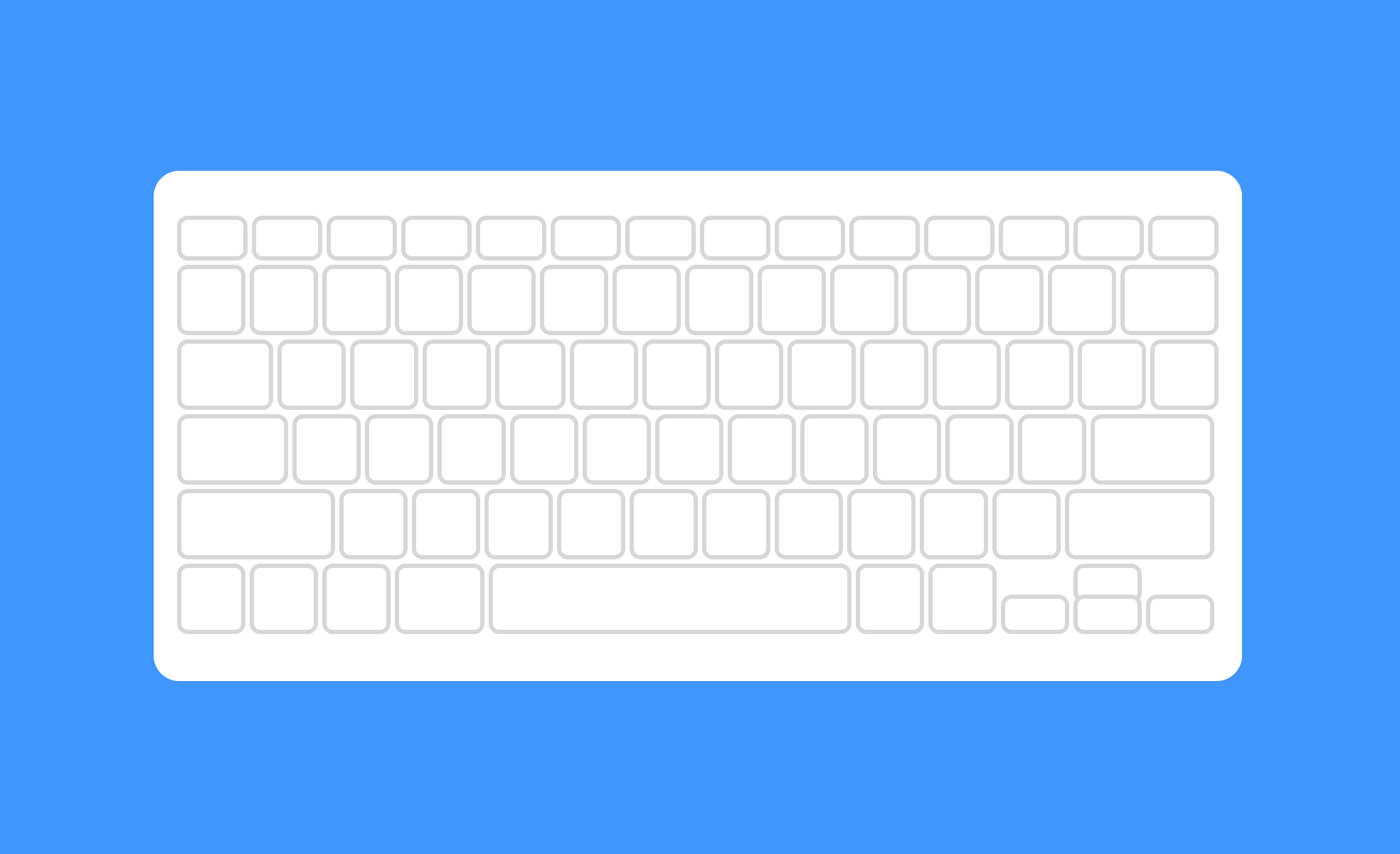
A keyboard is the primary text-entry device for most digital systems. It consists of keys arranged in a defined layout, allowing users to input characters, trigger commands, and navigate interfaces. Keyboards exist in two main forms: physical hardware peripherals connected to computers and consoles, and virtual on-screen keyboards that appear on touchscreen devices.
For designers and product teams, the keyboard matters in two distinct ways. First, as the physical input method most users rely on for sustained text entry. Second, as the navigation mechanism for users who cannot or choose not to use a pointer device. These two roles have different implications: the first shapes decisions about form fields, text inputs, and input handling; the second is a foundational accessibility requirement that affects every interactive element in a product.
What are the main keyboard layouts?
The keyboard layout most people in Western markets encounter is QWERTY, named for the first six keys on the top letter row. It was developed for typewriters in the 1870s and became the default layout for computers through historical momentum rather than typing efficiency.
Alternative layouts exist for specific purposes. AZERTY is standard in France and Belgium, reflecting different letter-frequency patterns in French. QWERTZ is common in Germany and Central Europe. Dvorak and Colemak were designed to improve typing efficiency by placing the most commonly used letters on the home row, reducing finger travel. Adoption of these alternatives has been limited despite their ergonomic claims, largely because the cost of relearning outweighs the benefit for most users.
For product teams building multilingual or global products, keyboard layout is a practical consideration. Users typing in Arabic, Hebrew, Chinese, Japanese, Korean, or other languages with non-Latin scripts require either hardware keyboards designed for those scripts or input method editors (IMEs) that translate keystroke sequences into the correct characters. Designing forms and text input fields that behave correctly for users across these input methods requires testing that goes beyond the Latin-script defaults most teams design against.
Why does keyboard navigation matter for accessibility?
Keyboard navigation is a foundational accessibility requirement. Users with motor impairments who cannot operate a mouse, users who rely on screen readers, and users who simply prefer keyboard-driven workflows all depend on being able to navigate a product entirely through keyboard input.
WCAG 2.1 specifies that all functionality available through a mouse must also be available through a keyboard. This means every interactive element: links, buttons, form fields, dropdowns, modals, tabs, and custom components, must be reachable by pressing Tab, operable with Enter or Space, and navigable with arrow keys where appropriate. The focus indicator, the visible outline that appears on the currently focused element, must be visible so keyboard users know where they are at any given moment.
Common keyboard navigation failures include focus traps, where pressing Tab moves focus into a component like a modal but provides no way to exit without a mouse. Another is focus order that doesn't match the visual layout, so a user tabbing through a page encounters elements in a sequence that doesn't correspond to their visual position. Custom interactive components like date pickers, sliders, and autocomplete fields require explicit keyboard interaction design because they don't automatically inherit the keyboard behavior of native HTML elements.
What are keyboard shortcuts and why do they matter?
Keyboard shortcuts are key combinations that trigger actions without requiring the user to navigate through menus or interface elements. They're one of the most significant factors in the efficiency of power users in any software product.
In design tools like Figma, keyboard shortcuts are central to the workflow. Experienced designers rarely lift their hands from the keyboard to reach for menu items when they can press a key combination instead. The same is true in code editors, project management tools, and any product where users perform repeated actions frequently. Well-implemented shortcuts compress multi-step actions into single inputs and significantly reduce task time.
Discoverability is the challenge with shortcuts. Users who don't know a shortcut exists won't use it. Products address this through shortcut reference panels, tooltips that display the shortcut alongside the action name, and keyboard shortcut hints in menus. An onboarding approach that progressively surfaces shortcuts as users become more familiar with core workflows is more effective than front-loading all shortcuts at first use.
For product managers and designers evaluating whether to invest in keyboard shortcuts, the case is strongest in tools where users perform high-frequency, repeatable actions: editing, navigation, applying formatting, and similar tasks. Adding shortcuts to actions that are rare or non-repeatable has less impact and adds cognitive overhead for users who have to learn which shortcuts exist.
How do virtual keyboards on mobile differ from physical keyboards?
Virtual keyboards on mobile touchscreens present a distinct set of design considerations from physical keyboards.
The most significant is screen real estate. A virtual keyboard on a phone occupies roughly half the screen when open, covering the lower portion of the interface. Form fields, labels, and error messages that appear near the bottom of the screen may be hidden when the keyboard is open, and interfaces that don't account for this behavior can trap users with partially obscured forms. On iOS, the keyboard dismisses on a downward swipe or a tap outside the field; on Android, the back button dismisses it. Designing for the keyboard-open state requires explicitly considering which elements remain visible and accessible.
Mobile keyboards also offer context-specific layouts that physical keyboards don't. Setting inputmode or type attributes on HTML form fields, or the equivalent in native app frameworks, tells the operating system which keyboard variant to show: a numeric keypad for phone number fields, an email-optimized keyboard for email fields, a URL keyboard for web address inputs. Using the wrong keyboard type for a field creates friction: presenting a full QWERTY keyboard to a user entering a five-digit ZIP code is a small but unnecessary obstacle.
Autocorrect, autocomplete, and predictive text on virtual keyboards reduce typing effort but can introduce unexpected changes to text users have entered. Form fields that contain proper nouns, identifiers, codes, or other text that shouldn't be altered need autocorrect disabled appropriately, since unexpected corrections to passwords, account numbers, or similar inputs are a meaningful usability problem.


