


Products accumulate friction the way houses accumulate clutter: gradually, invisibly, and mostly in the corners nobody owns. A UX audit is the scheduled walkthrough with fresh eyes and a checklist, before the clutter starts costing conversions. An audit finds the problems everyone has stopped seeing.
In this glossary topic:
What is a UX audit?
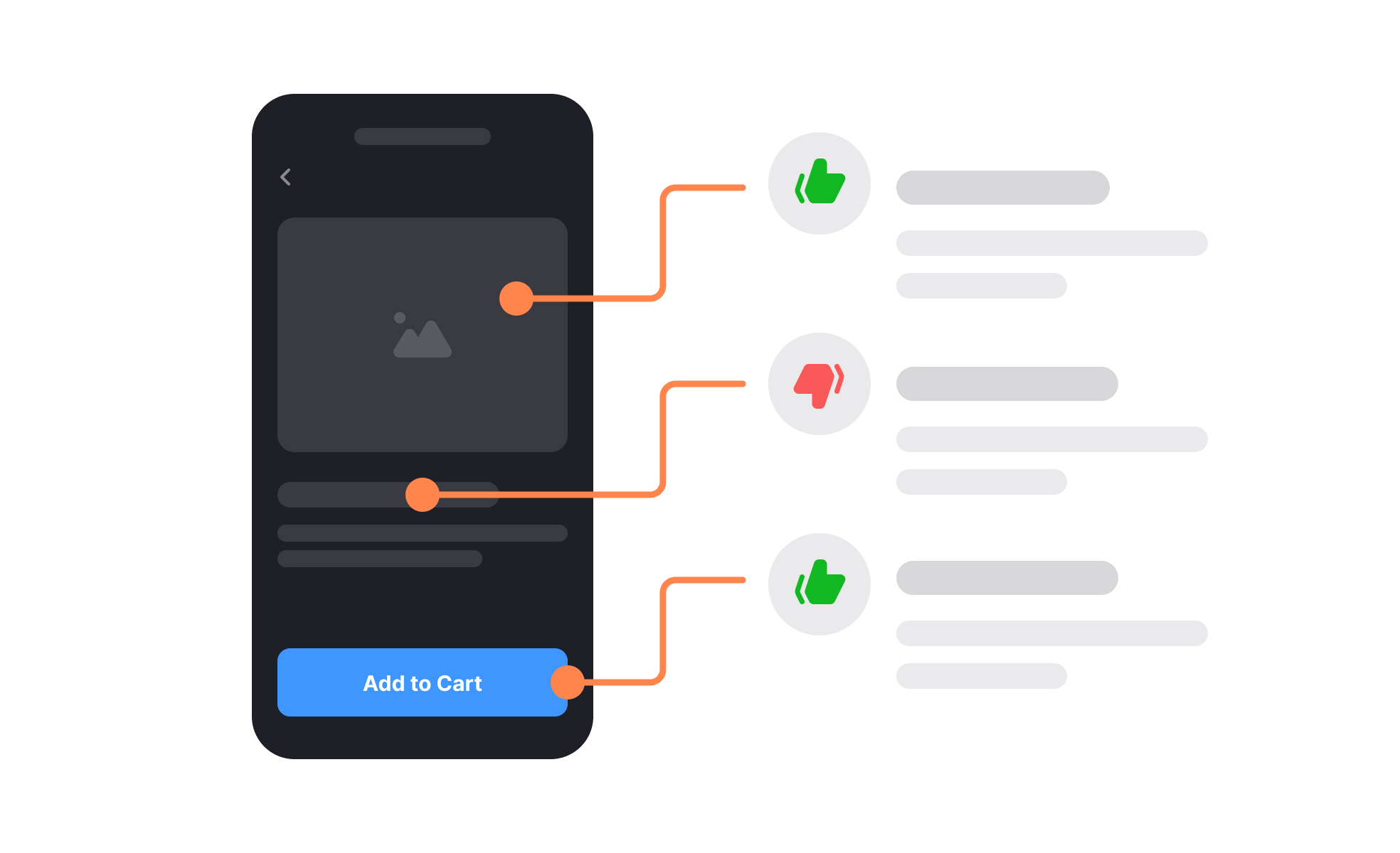
A UX audit is a structured evaluation of a product's user experience: usability, accessibility, consistency, and the friction hiding in key journeys. It combines expert review against established principles with whatever evidence the product already generates, from analytics funnels to support themes, and it ends in a prioritized list of problems and recommendations rather than a redesign.
What does a UX audit examine?
The scope typically covers 4 layers. Journeys: whether core flows, from signup to the money moment, complete without friction, and where analytics show users stalling. Interface quality: heuristic evaluation of screens against usability principles, plus consistency across the product's surfaces. Accessibility: contrast, keyboard paths, and assistive-technology support, checked against standards. And evidence: the audit cross-references what expert review predicts with what analytics and support tickets prove, since the strongest findings appear on both lists. The Design Processes lesson places the audit inside the wider process toolkit.
Why do UX audits matter?
Teams normalize their own product's problems; an audit reintroduces the outsider's confusion, systematically. Run before a redesign, it separates what needs rethinking from what needs fixing, which regularly shrinks the redesign itself. Run periodically, it catches the slow decay that no single release caused, and its prioritized output gives product planning a defensible backlog of experience debt, costed and ranked instead of anecdotal.


