


Every screen already has UX writing on it. The question is whether someone chose the words or whether they arrived as defaults from an engineer's first commit. A button that says Submit, an error that says Something went wrong, and an empty screen that says nothing at all are each a decision made by omission. Interface copy is the part of a product people read at the exact moment they are unsure what to do, which makes it the cheapest place to remove friction and the most expensive place to leave it.
In this glossary topic:
What is UX writing?
UX writing is the practice of writing the words inside a digital product: button labels, error messages, empty states, form hints, confirmation dialogs, onboarding steps, notifications, and tooltips. Its job is functional. Where marketing copy earns attention, UX copy earns completion: it tells a person what will happen, what went wrong, and what to do next, in the language they already use for the task.
The term microcopy covers the smallest units of that work, the placeholder in a form field, the label under an icon, the one-line confirmation after an action. UX writing includes microcopy and the longer forms around it: onboarding sequences, in-product guidance, help text, and the recovery instructions that follow an error. The title UX writer spread after Google brought the discipline to public attention in 2017; many teams now use content designer for the same work plus the strategy around it. Every interface has UX writing whether or not anyone wrote it; the only choice is whether it is deliberate.
Why does UX writing matter for usability?
The link between text and usability is more direct than it looks from outside the discipline. A button labeled "Submit" says what will happen mechanically; a button labeled "Create account" says what will happen meaningfully, and the person no longer has to infer whether submitting means finishing, saving a draft, or something else. The specificity removes the pause.
Error messages are the highest-stakes copy in most products. "Something went wrong" and "Invalid input" give no information about what happened or how to fix it. A well-written error names the problem, says what to do, and does it in a tone that does not blame the person: the difference between "Password must be at least 8 characters" and "Invalid password" is the difference between someone who corrects the field and someone who leaves. Empty states are the most neglected. A first screen with nothing on it and no explanation reads as a failure; the same screen with one sentence about what to do next keeps momentum. Many usability problems logged as design problems are copy problems with a screenshot attached.
How does UX writing differ from content design and content strategy?
The three terms sit at different altitudes. UX writing is the words: the strings a person reads on a given screen, chosen for that moment. Content design is the design of the content itself, decided before the words: what information a screen needs, in what order, in what form, whether a paragraph, a table, a progress indicator, or nothing at all. A content designer might conclude that the best copy for a confusing step is a diagram. Content strategy is the planning and governance layer across the whole product or organization: what content exists, who owns it, how the voice is defined, how it is maintained and retired, and how it serves business and user goals.
On a small team one person does all three and calls it whatever the job title says. In larger product organizations the roles split, with strategists setting voice and governance, content designers shaping the experience, and UX writers producing and testing the copy. Strategy decides what the product should say, content design decides how a screen should say it, and UX writing decides the words. The confusion between them is mostly a confusion of scale, and it matters when hiring: a team that needs a governance model will not get one by hiring a microcopy specialist.
What makes UX writing effective?
A few properties separate copy that helps from copy that gets in the way.
- Clarity comes first. Copy says exactly what it needs to in the fewest words that still say it.
- Specificity beats brevity alone. "Continue" and "Save and continue to shipping" are both short, but only one tells the person what is about to happen, and in checkout, payment, and deletion flows that certainty carries people through.
- Consistency makes the product feel like one author wrote it. Onboarding that is warm and errors that are curt read as two products; voice and tone guidelines exist so that many contributors produce copy that feels unified.
- Empathy in error states is where trust is won or lost. When something fails, the wording decides whether the person feels supported or blamed.
Good UX copy is judged by what the person does next, not by how it reads in isolation. That standard is why testing belongs to the craft as much as writing does.
How has UX writing changed with AI?
Two changes have had a real effect on the daily work. The first is drafting. Large language models generate five candidate versions of an error message in seconds, which has moved the writer's effort from producing options to judging them: which version is accurate, which fits the voice, which the person in that moment can act on. Generated copy tends toward the generic, so that judgment has become more valuable rather than less.
The second is the surface being written for. Conversational products, assistants, and voice interfaces have no buttons or layout to carry meaning, so the words carry all of it: the opening prompt that explains what the assistant can do, the suggested questions in an empty chat, the notice that the model can make mistakes, the way it recovers from an input it did not expect. Writing for these products means designing a dialogue rather than labeling a screen, and it has pulled UX writers into closer work with interaction designers and AI product teams. AI made first drafts cheap and made the decision about which draft ships more consequential.
What does UX writing look like in practice?
The clearest demonstration of the craft is an error message written twice. The first version reports a system state; the second tells a person what happened and what to do, in words they would use themselves. The lesson behind the example treats problem messages as a genre with its own rules: name the problem, offer the fix, keep the tone human, and never make the person feel at fault.
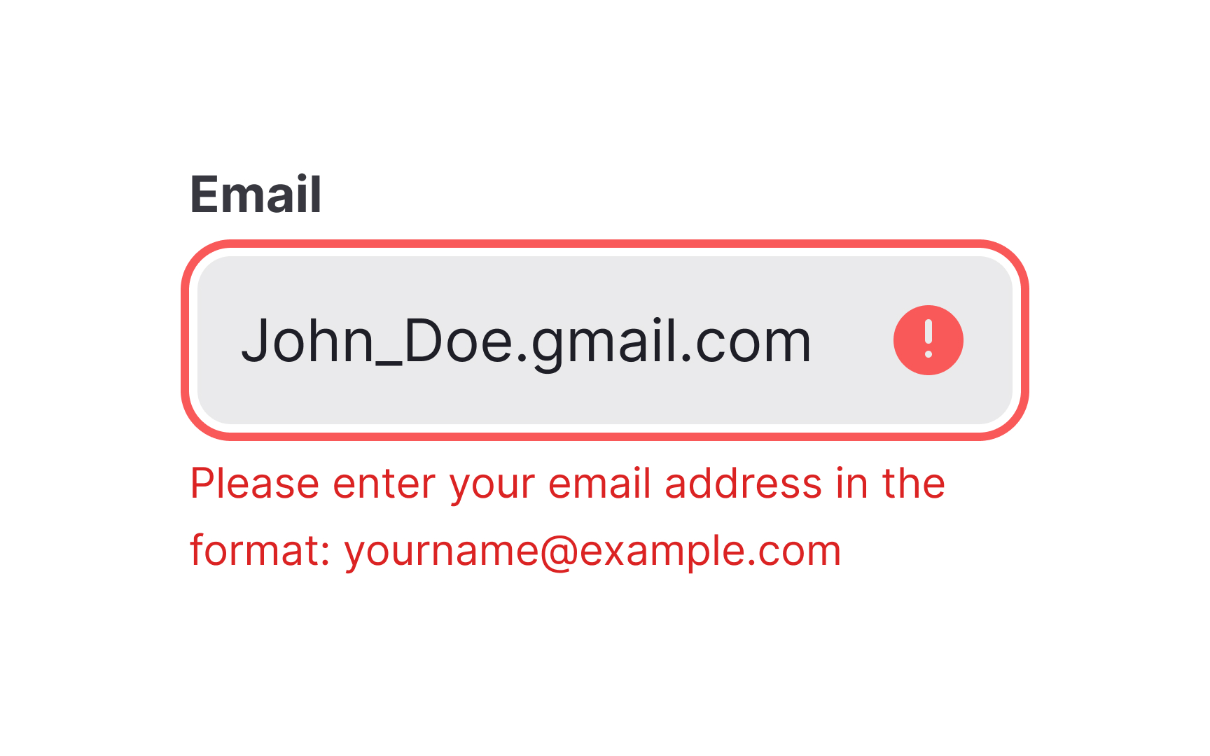
The message names what is wrong and shows the fix in the same breath, which is what turns an error into a recovery instead of a dead end. From the lesson Writing Problem Messages.
The second artifact is the distinction that governs every other decision: voice against tone. Voice is the personality that stays constant across the product; tone is how that voice adapts to the moment, calmer in an error, lighter in a success state. Teams that define voice once and let tone flex by context produce copy that stays recognizable without sounding the same everywhere.
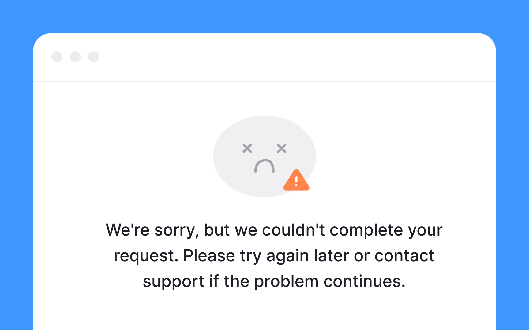
Tone chosen for the moment. The product's voice stays the same everywhere, but at a failure it slows down, apologizes once, and offers a next step.
How to learn UX writing
Foundations: what UX writing is and how people read interfaces
The craft starts with what interface text is for and how people actually take it in. The What is UX Writing? lesson covers the scope of the work, what it is not, and who a UX writer works with, and the Psychology of UX Writing lesson covers how attention, memory, and reading behavior shape what a label or message can do. It is also where content design enters as the wider frame the words sit inside.
Voice and tone
A product needs one voice before it can have many messages. The Brand Voice in UX Writing lesson covers defining voice, mapping tone to the person's emotional state, and writing the guidelines that let a whole team use it, and the User Engagement Through UX Writing lesson covers keeping copy alive without letting personality get in the way of the task. The resulting rules usually live in the product's style guide; for the long form on choosing tone, the article on mastering UX writing tones is the deep guide.
Researching the people being written for
Copy that matches user vocabulary comes from listening, not guessing. The Researching User Needs lesson covers turning UX research findings, from user interviews to support logs, into the words a screen should use, and the Learning From Users lesson covers conversation mining: reading reviews, tickets, and community threads for the phrases people already use to describe the task.
Strategy and content audits
Individual strings improve fastest when the whole is planned. The UX Writing Strategy lesson covers setting goals for copy across a product and the governance that keeps it consistent, the ground shared with content strategy, and the Content Audits for UX Writing lesson covers cataloging existing copy, finding contradictions and dead ends, and deciding what to rewrite first.
Writing the patterns: actions, problems, and disclosure
Most interface copy falls into a small set of recurring situations. The Patterns in UX Writing lesson covers the conventions for buttons, placeholders, tooltips, forms, and notifications, and the Writing Action-Based Messages lesson covers the call to action, destructive-action confirmations, and the deceptive patterns to refuse. The Progressive Disclosure in UX lesson covers deciding how much to say now and how much to hold back until the person asks, the same principle described under progressive disclosure. Problem messages, the third pattern, have a lesson of their own, linked from the first figure above.
Consistency, testing, accessibility, and documentation
The last stretch of the arc is what makes copy hold up at scale. The Ensuring Consistency in UX Copy lesson covers terminology lists and the review habits that stop the same action being called three things, and the Testing UX Copy lesson covers the methods for checking copy against real people, from A/B testing of a single label to reading copy findings out of usability testing sessions. The Accessibility in UX Microcopy lesson covers writing that works with screen readers, plain language, and cognitive load, the copy side of accessibility, and the Deliverables and Documentation in UX Writing lesson covers handing copy to designers and engineers so that it ships as written.


