
.svg)


You spent weeks on a case study. Late nights, rewriting the story, polishing every mockup. Then a recruiter spent ninety seconds on it and moved on. No interview, no reply.
It is tempting to read that as a verdict on your work. Usually it is not. In a recent Uxcel session, Réka Nagy, Product Designer at UXfolio, sat down with me to pull apart why this keeps happening to strong designers. Réka has reviewed thousands of portfolios at UXfolio and has been on the hiring side herself. I have reviewed thousands more, first as a designer mapping my own product design career roadmap, later as a founder hiring for Uxcel. We kept landing on the same answer
There is a gap between what designers build their case studies to do and what the people doing the hiring need them to do. You build to showcase your work. The recruiter is skimming to answer one question: should I hire this person? Close that gap and the rest takes care of itself.
Here is the part that makes it concrete. When UXfolio was hiring a product designer, Réka said, they had hundreds of applicants and rejected about 80% of them on their portfolios alone. In most cases it was not about talent or effort. It was the gap.
"It wasn't because the person wasn't talented or hadn't put in the effort. It was the gap between what they thought they should show and what we, on the hiring side, were actually looking for." — Réka Nagy
So we walked the whole case study, section by section. For each part, the trap designers fall into, the question the recruiter is really asking, and what to do instead.
Start with the cards: your case study thumbnails
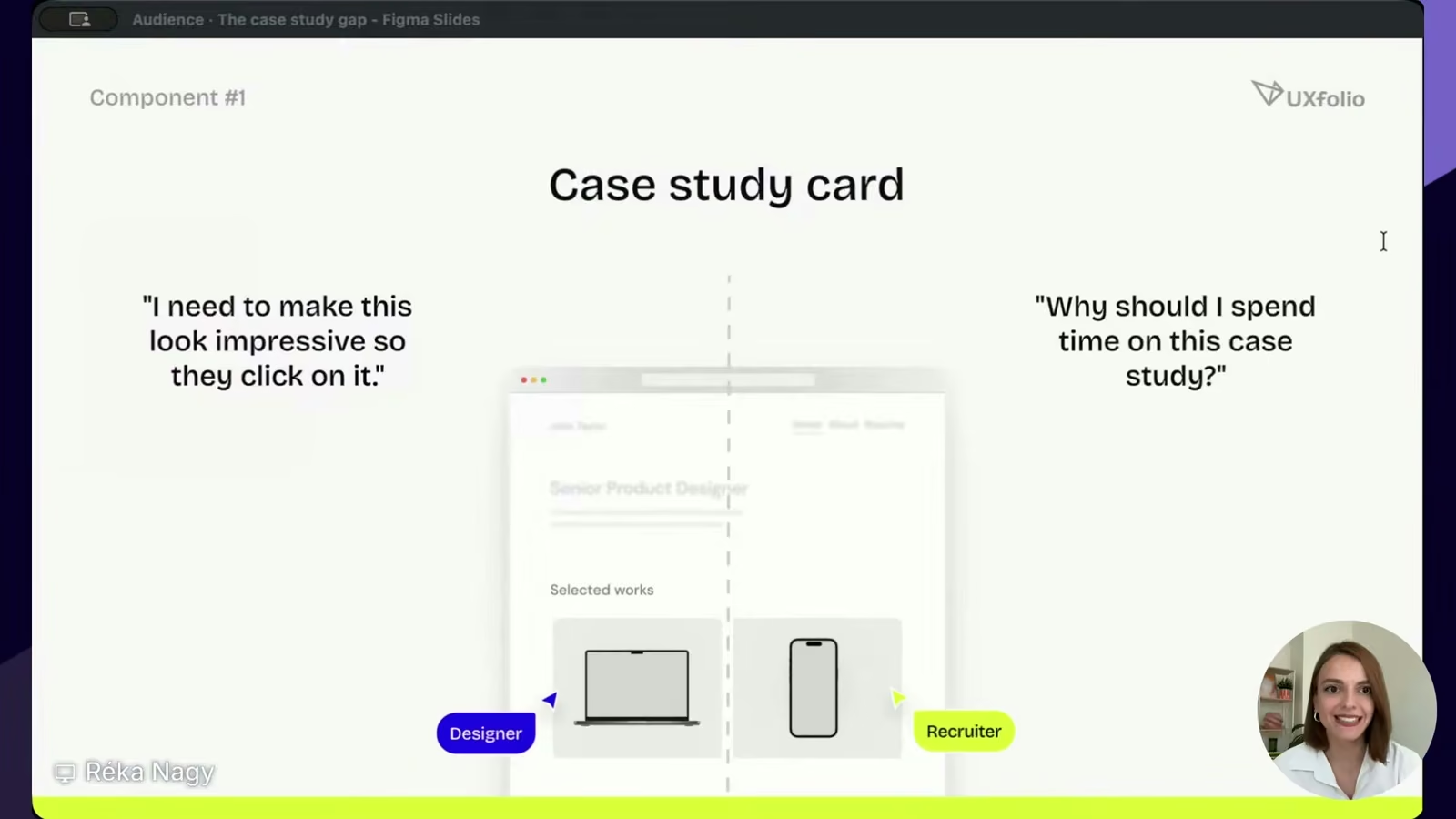
The first real thing a recruiter sees after your hero is the row of case study cards. Think of them as book covers. The designer instinct is to make them look impressive, so the card gets busy with a dozen screens crammed in.
The recruiter is thinking something far more practical: which one should I open, and why this one? If the cards do not answer that, they tend to just click the first card and judge you by it.
Four fixes from Réka:
- Put the case studies most relevant to the role at the top. Do not make anyone hunt for your best work.
- Show one or two key screens that hint at what is inside, not the whole flow.
- Present those screens in clean mockups. It signals attention to detail and helps people picture the work on a real device.
- Keep the layout consistent across every card. A matching set reads as a designer with a system, not someone who threw things together.
Titles that say what the project was
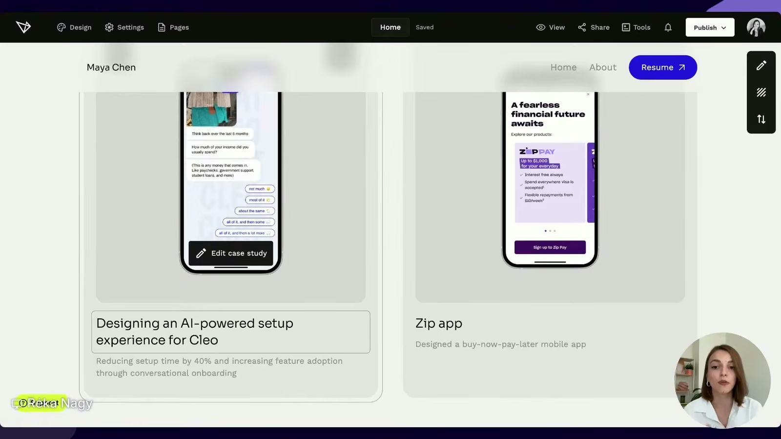
Most designers title a case study with the product name. "Revolut." "Checkout redesign." Unless you worked on something everyone recognizes, the name tells a reviewer nothing. It came up again in our live UX portfolio review with Réka, where an otherwise clean portfolio titled every project with the app's name.
The recruiter is asking whether this project is relevant to the role they are filling. A bare product name does not answer that. An informative title does. Réka's live example said it well: "Designing an AI-powered setup experience for Cleo," with a subtitle that carried the impact, "reducing setup time by 40% through conversational onboarding." Now a hiring manager knows what you did and can match it to the role in a glance. Add a few labels for role, year, and platform so the card scans fast.
The intro: lead with the outcome
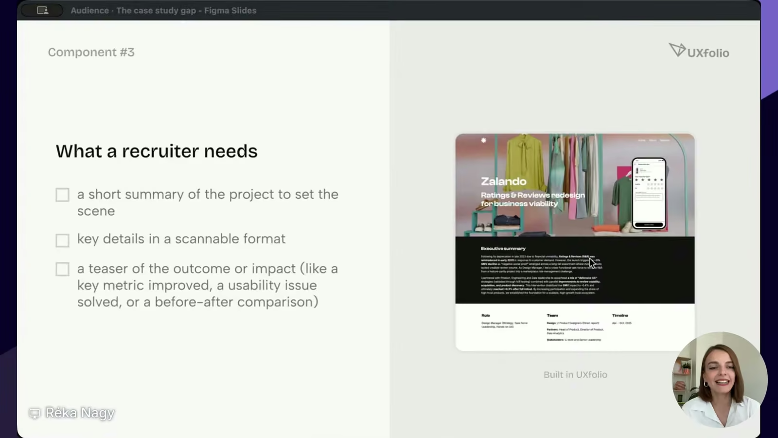
The intro is the part designers most often get backwards. The instinct is to explain the company and the product first, so the case study opens with three paragraphs of background nobody asked for.
A recruiter wants the gist, then decides whether to read on. Give them a short summary that sets the scene, the key details in a scannable format, and a hint of the outcome right at the top. A metric you moved, a usability problem you solved, a before and after. Most visitors never scroll to the end, so the strongest result cannot live there.
The problem: this is where thinking beats pixels
Plenty of designers skip the problem and jump to the solution. But the problem section is exactly where a reviewer decides whether you think like a designer or just move pixels around.
That distinction matters more every month. As Réka put it, anyone can produce screens now, especially with AI. What stays valuable is the designer who can find and frame the right problem — design thinking in practice, not decoration. So state the user or business problem you set out to solve, who it affected, and why it mattered. Then say how you knew it was a problem: the data, the research, the support tickets. That is the difference between "I assumed" and "I investigated." State your solution here too, but only as a teaser.
The process: show how you think, not every step
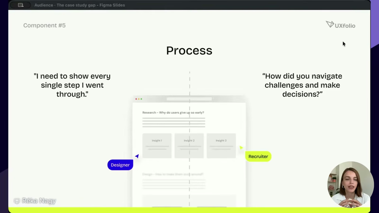
This is where Réka sees the most damage. The instinct is to show every step: the full double diamond, every workshop, every sticky note. A recruiter does not want the methodology tour. They want to know whether you can navigate a hard call and make a good decision.
So treat the case study as a story, not a report. Focus on the turning points, the insights that moved the project, and the reasoning behind your decisions. Show iterations and the paths you explored, including the ones that failed.
"Showing a path that you abandoned and explaining why is one of the most senior things you can do in a case study." — Réka Nagy
Visuals: every image earns its place
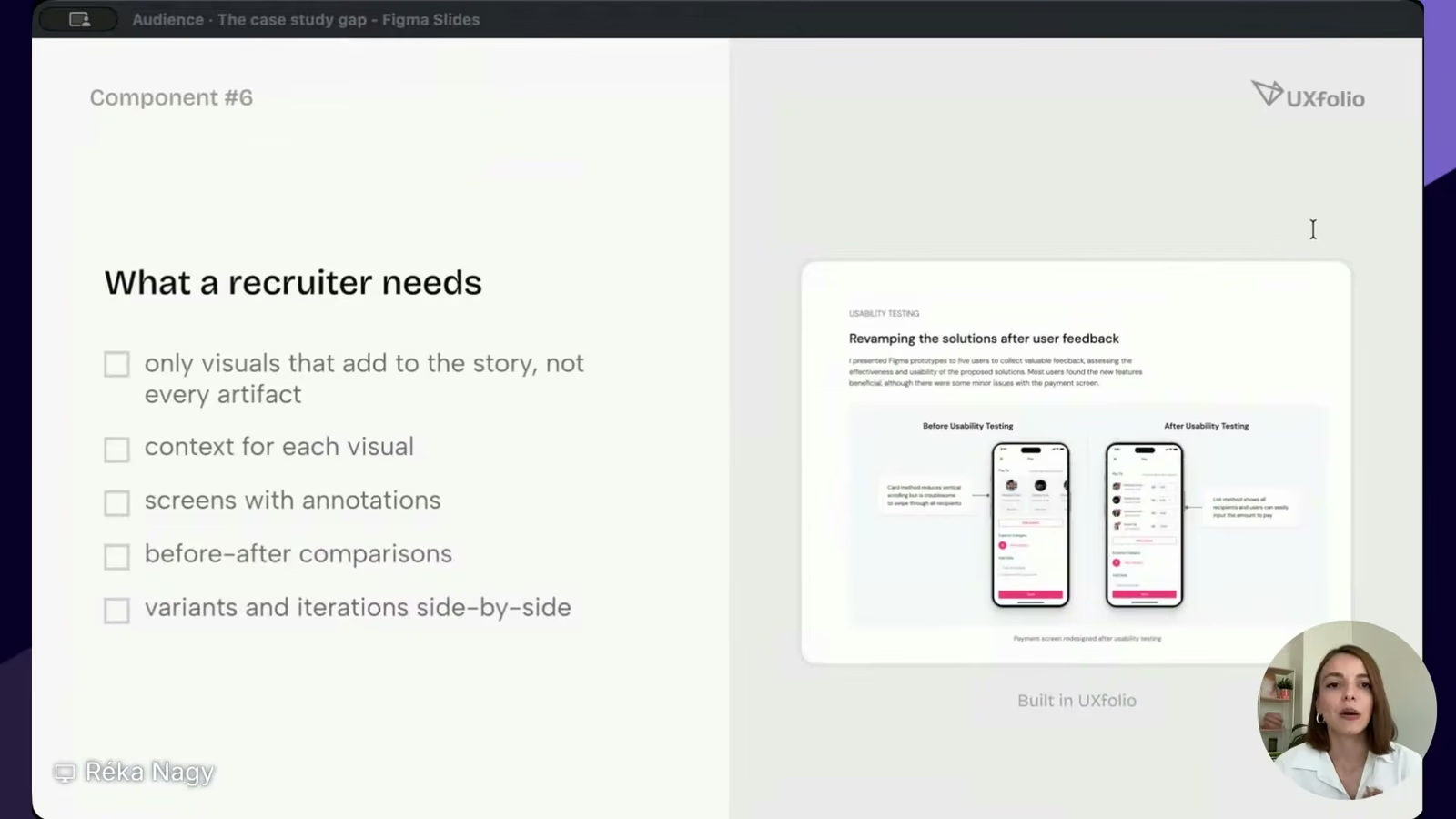
A wall of beautiful screens with no context is a Dribbble move. It works there because the audience is other designers looking for inspiration. A recruiter is not browsing for inspiration. They are deciding whether to hire you for a specific role.
The rule is simple: only include visuals that add to the story. Annotate screens to point out what you changed and why. Use before and after comparisons with explanations. If you show a workshop board or survey, design it to highlight the one insight you want to reference, not a zoomed-out artifact no one will read.
Outcomes: the section designers forget
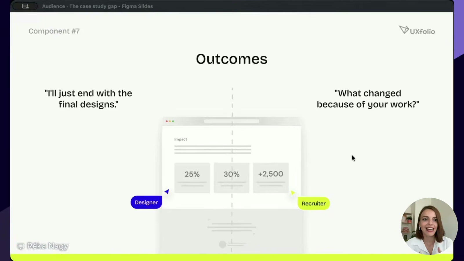
Many case studies end at the final designs. The story just stops, with no resolution. The recruiter is left asking the one thing that matters most: did this actually make a difference?
Close with impact. Use metrics where you have them, whether that is conversion, retention, or task completion. Where you do not have numbers, qualitative results still count: user quotes from a usability test, stakeholder feedback, app store reviews, fewer support tickets after your change. Then go one step further and say what you learned and what you would do differently. That self-awareness is what separates a junior portfolio from a senior one.
Quick wins that punch above their weight
When you are up against hundreds of candidates, small things add up:
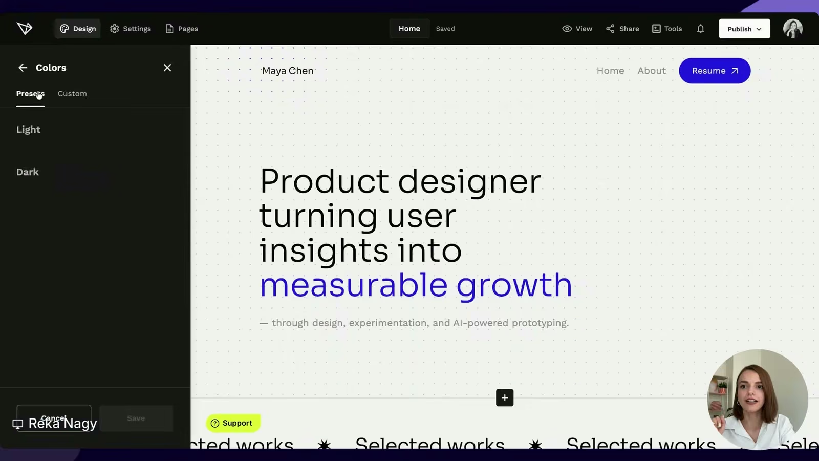
- Make the whole portfolio feel like one product. A site where every page looks like a different person made it works against you. Keep your case studies as pages inside your portfolio, not links out to Behance or a raw Figma file.
- Make it easy to scan. Short paragraphs, clear headings, and visuals that carry the story. Réka's rule of thumb: about 70% visual, 30% text per section.
- Use descriptive headings. "Users want the benefit of AI without giving up privacy" tells the story. "User interviews" does not.
- Make it engaging. An embedded prototype or a short narrated screen recording stands out from a stack of flat case studies.
- Link to your other case studies at the end of each one. You earned the interest, so give it a next step.
The one idea to take with you
If you remember nothing else, remember this from Réka:
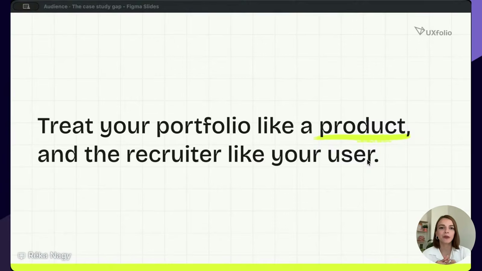
"Treat your portfolio like a product and the recruiter like your user. The gap exists because most designers don't do this."
I framed the same idea from the hiring seat during the Q&A. Picture the recruiter doing 150 miles an hour down a highway, and your portfolio is a billboard. You do not put a paragraph on a billboard. You give them one clear, relevant hook that makes them slow down. For a designer, that hook is rarely a fancy visual. It is relevance: the keyword, the role, the result that matches what they are hiring for.
Answers to the questions everyone asked
The room had a lot of "but what about my situation" questions. The short version:
- No metrics yet (new grads, student work)? Impact does not have to be a number. Name the problem, show what you improved, and run a quick usability test with friends to gather real feedback.
- NDA or B2B work you cannot show? Never share what you cannot share. Abstract the project, describe the role and the problem solving, and turn a niche domain into your differentiator. Put that industry in your headline so the right team finds you.
- UX researcher worried about UI craft? Your portfolio can look clean without pretending you are a visual designer. Inside the case studies, lead with insights and storytelling instead of screens — every UX research career guide will tell you those are the signals hiring teams look for.
- UX/UI designer vs. product designer in 2026? Use the title that matches your actual scope. Do not call yourself a product designer if the work was pure UI. The portfolio will give you away, and broken trust is the worst first impression.
- How many projects? As few as tell your story well. For each section, ask: does this add to my story? If not, cut it.
Watch the full session
This is the short version. The full webinar has the live UXfolio walkthrough, the side-by-side examples, and the complete Q&A.
Watch the recording: https://youtube.com/live/iQ7Uxx-hoS8
And if you want to build the cross-functional skills that make your thinking obvious to a hiring team, that is what we do at Uxcel. Short, practical courses in UX, product, and AI, with real-world project briefs you can turn into portfolio work. Start at uxcel.com.
Ready to rebuild your case studies? To see what strong ones look like, browse UXfolio's roundup of UX portfolio examples. And Réka's team at UXfolio is giving readers 30% off a yearly plan: start for free and redeem code UXCEL30-YEARLY when you go live at uxfol.io.