

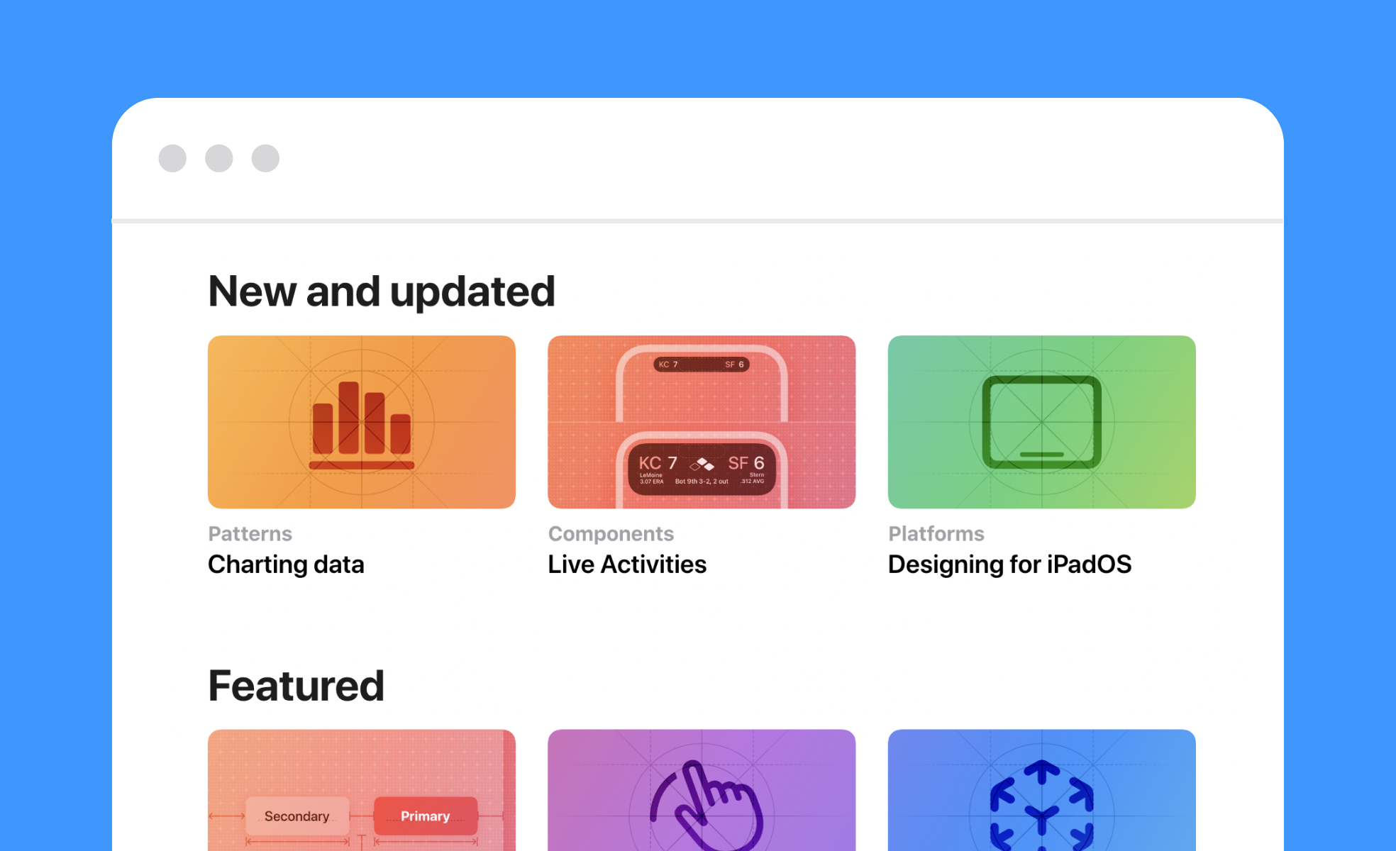
What are Human Interface Guidelines (HIG)?
Human Interface Guidelines (HIG) are official documentation sets published by platform providers that define how digital products should look, behave, and interact. Apple publishes HIG for iOS, macOS, watchOS, tvOS, and visionOS. Google publishes Material Design for Android and cross-platform products. Microsoft publishes Fluent Design System guidelines for Windows.
These documents give designers and developers a shared standard for building products that feel native to their platform. They cover layout and spacing, navigation patterns, typography, iconography, color use, interaction behavior, animation, and accessibility requirements, all in one place.
The core idea is that users develop mental models through repeated exposure to a platform. When every app on iOS handles navigation the same way, users don't have to relearn how to get around. HIG protect that familiarity by giving every team building for that platform the same rulebook.
What do Human Interface Guidelines typically cover?
HIG documents are comprehensive by design. Most cover several overlapping areas:
- Visual design includes guidance on color palettes, typography, iconography, spacing, and layout grids. Apple's HIG specifies how apps should use its San Francisco typeface system and when to use SF Symbols. Material Design provides a full type scale with Display, Headline, Title, Body, and Label styles across multiple sizes.
- Navigation and information architecture defines how users should move through an application. Apple's HIG distinguishes between tab bars, navigation controllers, and modal presentations, each with specific use cases. Material Design specifies when to use bottom navigation bars, navigation drawers, and top app bars.
- Interaction and motion covers how elements should respond to input. Gestures, transitions, feedback states, and animation timing all fall here. Motion guidelines have become significantly more detailed in recent years. Apple's Liquid Glass design language, introduced in 2025, reshapes how interface elements interact with content and each other across all Apple platforms. Google's Material 3 Expressive update, announced at Google I/O 2025, introduced a spring-like motion system backed by 46 user studies with over 18,000 participants, showing that expressive interactions help users locate key interface elements faster.
- Accessibility is embedded throughout rather than treated as a separate concern. Apple's HIG includes guidance on Dynamic Type, VoiceOver support, color contrast, and touch target sizing. Following these standards doesn't just improve usability for people with disabilities: it improves usability for everyone.
Why do HIG matter for designers and developers?
Products that ignore platform guidelines often feel disjointed. Users may hesitate, get confused, or abandon the app, not because the underlying design is bad, but because it doesn't behave the way they expect it to on that platform.
Following HIG means tapping into patterns users already know. Back-swipe navigation on iOS, bottom navigation bars on Android, destructive action confirmation dialogs: these aren't arbitrary conventions. They're behaviors millions of users have internalized through daily use. When an app deviates from them without good reason, it creates friction.
There's also a practical dimension. Platform providers enforce their guidelines through app review processes. Apple's App Store review and Google Play both evaluate apps against design and interaction standards. Significant departures from platform norms can be flagged during review, especially when they affect usability or accessibility.
How strictly should you follow HIG?
This is where judgment comes in, and the answer isn't all-or-nothing.
Core interaction models should stay close to the guidelines. Navigation structures, gesture behaviors, and system-level patterns are where users' expectations are strongest. Deviating here creates the most friction and the most risk of a confused or frustrated user.
Visual treatment and branding have more flexibility. HIG typically provide a system and a set of defaults, not a mandate that every app look identical. You can apply custom colors, custom iconography, and distinctive typography within the platform's structure. Companies that do this well, like Spotify or Duolingo on iOS, create apps that feel unique but still instantly familiar to iPhone users.
The question to ask is: does this deviation serve the user, or does it serve the product team? If a custom interaction pattern genuinely improves the experience for your specific use case, and you've tested it with real users, that's a reasonable argument. If it exists primarily because the team wanted to do something different, it's worth reconsidering.
What's the difference between HIG and a design system?
They operate at different levels and serve different purposes.
HIG are set by the platform provider. They define universal rules for every application built on that platform. No single product team writes or controls them.
A design system is created by a company for their own products. It defines how that company's specific brand, components, and patterns are expressed. It takes platform-level guidance from HIG and applies it to a specific product context: the company's color palette, their component library, their tone and interaction patterns.
The two work together rather than in competition. HIG might specify that a primary button on iOS should follow certain sizing and placement conventions. A company's design system then specifies that the primary button is teal, uses a particular typeface weight, and has a specific border radius. Platform rules govern the behavior and structure. The design system governs the brand expression within that structure.
How are HIG evolving lately?
Both Apple and Google made significant updates to their guidelines in 2025, and those changes are actively shaping how apps are built in 2026.
Apple's most significant change was Liquid Glass, described as the most extensive software design update Apple has made, reshaping how interface elements relate to content across iOS 26, iPadOS 26, macOS 26, watchOS 26, and tvOS 26. The new design language introduces translucency, depth, and fluid responsiveness across all platforms. The HIG has been updated accordingly, with new guidance on how to implement Liquid Glass materials, updated icon specifications supporting light, dark, and tinted appearances, and revised navigation component documentation.
Google's Material 3 Expressive, announced at Google I/O 2025, introduced a new motion physics system, updated color theming tools, a revised type scale, and five levels of shape roundedness. It built on Material You's dynamic color system and added more expressive, emotionally resonant interactions. Google backed the update with rigorous user research, running 46 studies with over 18,000 participants to ensure the changes improved usability rather than just aesthetics. Both updates signal the same broader direction: platform guidelines are moving away from flat, minimal defaults toward richer, more physically-informed interactions, while keeping accessibility and usability at the center.


