


Most people now meet a product for the first time on a phone, often one-handed, on a moving train, with 30 seconds to spare. Mobile design is the discipline of making that encounter work: fitting the job onto a small touchscreen without making it feel small. The constraints that make mobile hard, limited space, imprecise fingers, and divided attention, are also what force the clearest thinking about what a product is for. As phones absorb more of banking, health, and work, that clarity has become a baseline expectation rather than a differentiator.
In this glossary topic:
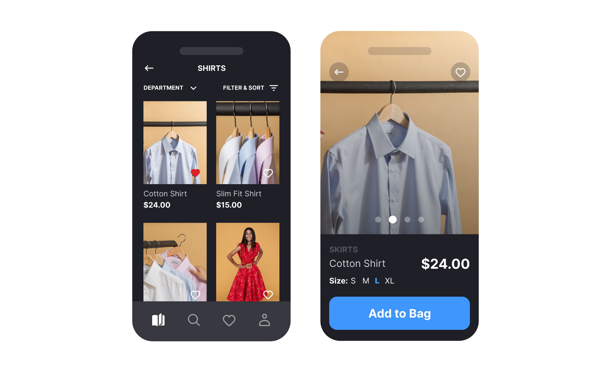
What is mobile design?
Mobile design is the practice of designing interfaces and experiences for smartphones, tablets, and other handheld devices, shaping layout, navigation, input, and content around small touchscreens and the situations in which people use them. It covers native apps built for iOS and Android, hybrid apps, and websites viewed on a phone, and it draws on interaction design, visual design, and platform conventions in roughly equal measure.
The defining fact of mobile design is that the finger replaces the cursor. A fingertip is far less precise than a mouse pointer, it hides the thing it touches, and it can only reach part of the screen comfortably when the device is held in one hand. Every other mobile pattern, from bottom navigation to oversized buttons to swipe gestures, follows from that fact plus the small screen and the interrupted context of use.
How does mobile design differ from desktop design?
Screen space is the obvious difference, but not the most important one. A desktop layout can show navigation, content, and secondary actions at once; a phone can show one primary thing, so mobile design is largely the discipline of deciding what that one thing is on each screen and pushing everything else a tap away. Hover states, tooltips, and right-click menus do not exist, so affordances have to be visible or discoverable through gesture.
Input changes too. Typing on a glass keyboard is slow and error-prone, so mobile forms lean on autofill, the right keyboard type for each field, selection controls instead of free text, and as few fields as the task allows. Hardware is a resource rather than a given: the camera, GPS, biometrics, and notifications open interactions that desktops never had. Mobile design succeeds when it removes work from the person and moves it onto the device, whether that means scanning a card instead of typing its number or unlocking with a face instead of a password.
Context is the third difference. Desktop use tends to be seated and sustained; mobile use happens in short bursts, in bright sunlight, with one hand, while doing something else. Readable type sizes, high contrast, large touch targets, and forgiving error handling are not polish on mobile; they decide whether the task gets finished.
What does mobile design cover?
The field spans several platforms and form factors, and the choice among them is itself a design decision.
- Native apps are built for one platform, iOS or Android, and can follow that platform's conventions and use its hardware fully.
- Hybrid apps wrap web code in a native shell, trading some platform fidelity for a single codebase.
- Mobile web covers websites viewed in a phone browser, usually built with responsive or adaptive layouts.
- Tablets sit between phone and desktop and reward layouts that use the extra width rather than stretching a phone screen.
- Wearables such as smartwatches push the constraints further: glanceable information, one or two actions, and interaction measured in seconds.
Within any of those, mobile design covers a recurring set of components: information and container components such as cards and lists, navigation components such as tab bars and hamburger menus, input and selection controls, forms for login and signup, onboarding flows, settings, and the notifications and dialogs that interrupt the flow. Platform guidelines settle most component-level questions before a designer opens a file; Apple's Human Interface Guidelines and Google's Material Design each specify sizes, spacing, and behavior for the standard set.
How does mobile app design differ from mobile web design?
Both target the same screen, but they answer to different rules. A mobile app is installed, launches from the home screen, runs in full screen, and can use the platform's navigation patterns, gestures, notifications, and hardware directly. The platform reviews it before publication and its users expect it to behave like the other apps on their device. Mobile web design works inside a browser: the URL bar and browser controls take space, deep hardware access is limited, and nothing is installed, so a page has to earn attention immediately and cannot assume a return visit.
The tradeoff is reach against depth. A mobile website is one link away for anyone and needs no store approval; an app can offer richer interaction, offline use, and a persistent presence on the device. Teams choose mobile web when the job is occasional and content-led, and an app when the job is frequent and interaction-heavy, which is why a restaurant's menu belongs on the web and its loyalty program belongs in an app. Responsive design, which adapts one layout fluidly to any width, and adaptive design, which serves distinct layouts at set breakpoints, are the two main strategies for the web side.
Why does mobile design matter for product teams?
For many products the phone is the primary interface, not a companion to the desktop version. Banking, ride-hailing, food delivery, and messaging live on mobile first, with the web version as the afterthought. A team that designs for desktop and then squeezes the result onto a phone ships its worst experience to its largest audience.
Mobile also has the harshest feedback loop. App store reviews are public, uninstalls are one long-press away, and a form that fails on a phone loses the customer rather than sending them to a help page. The cost of a mobile design mistake is measured in abandonment, not in support tickets. Getting the fundamentals right, from tap target size to onboarding length to notification restraint, is where retention is won or lost for a mobile-first product.
What does mobile design look like in practice?
The clearest mobile-specific idea is the thumb zone. When a phone is held in one hand, the thumb reaches the bottom and center of the screen easily, the middle edges with a stretch, and the top corners barely at all. Steven Hoober's 2013 observation study of people using phones in public found about half of them holding the device one-handed, and layout has followed that finding ever since.

Hand position decides layout. Primary actions and navigation belong where the thumb rests; destructive or rare actions can live in the hard-to-reach corners. From the lesson Designing Mobile Layout.
Bottom navigation is the thumb zone applied to a component. A bar of 3 to 5 top-level destinations along the bottom edge keeps the most-used sections under the thumb and always visible, at the cost of screen height. The pattern works only when the destinations are few, equal in importance, and stable; the moment a sixth item has to be squeezed in, the design is asking for a different navigation model.

A bottom navigation bar puts top-level sections in the easiest reach zone and shows where the person is at all times.
How to learn mobile design
Foundations: devices, platforms, and layout strategies
Mobile design starts with the hardware and what it changes. The Designing for Mobile Interfaces lesson covers device types, screen sizes and pixel density, orientation, keyboards, and gestures, and the Responsive vs. Adaptive Design lesson compares the two layout strategies for the mobile web, including what each costs to build and maintain. The Basics of Native Mobile Design lesson then sets out native, hybrid, and web apps and when each is the right call.
Components: containers, navigation, and selection controls
Most of a mobile screen is built from a standard component set. The Mobile Information and Container Components lesson covers cards, lists, and the containers that group content, the Mobile Navigation and Input Components lesson covers bars, menus, and text inputs, and the Designing Mobile Selection Controls lesson covers switches, checkboxes, pickers, and sliders. For the single most tapped component, the article with 11 tips for designing mobile buttons is the practical companion.
Layout, accessibility, and mobile-specific interactions
With the parts known, the work is arranging them for a hand and an eye. The Designing Mobile Layout lesson, credited under the first figure above, covers hand positions, tap target sizes, clutter, contrast, and consistency with the desktop version, and the Ensuring Mobile Accessibility lesson covers screen reader support, text scaling, and motor accessibility across native and web apps. The Mobile-Specific Functions and Interactions lesson covers the camera, location, biometrics, and the gestures that have no desktop equivalent. Accessibility on mobile is a layout question as much as a semantics question, since target size and contrast do most of the work.
Flows: forms, onboarding, navigation, settings, and interruptions
The screens people remember are the ones that stood between them and their goal. The Designing Mobile Logins, Signups, and Other Forms lesson covers reducing input and recovering from errors at the first hurdle, and the Basics of Mobile Onboarding lesson covers introducing an app without a wall of tutorial screens. The Mobile Navigation Design lesson compares top bars, bottom bars, tabs, hamburger menus, cards, and gesture navigation, the Mobile Settings Design lesson covers the screen every app has and few design well, and the Designing Mobile Notifications and Dialogs lesson covers interrupting people without losing them. Onboarding and notifications are the two places where restraint pays off most.
Process: from app flow to wireframe, prototype, and test
Mobile work follows the same arc as any product design, with device-specific checks at each step. The Planning the Mobile App Flow lesson covers turning an idea into screens and paths, the Mobile Wireframing lesson covers testing structure cheaply before visual design, and the Mobile Prototyping lesson covers interactive models that can be tried on a real device. The Mobile Testing lesson covers the functional and usability checks across devices that decide adoption, and usability testing on a phone in the participant's own hand reveals reach and readability problems that a desktop preview hides. A user flow drawn before wireframing keeps the screen count honest.
Platforms and launch: iOS, Android, tablets, wearables, and store review
Each platform has its own conventions, and users notice when an app ignores them. The iOS App Design lesson covers Apple's navigation and interaction patterns and the Android App Design lesson covers Material Design and the Android ecosystem; the Human Interface Guidelines and Material Design glossary entries define the two rulebooks. The Designing for Tablets lesson and the Designing for Wearables lesson extend the discipline to larger and much smaller screens, and the How to Prepare for the App Store and Google Play Store Review lesson covers the submission requirements that can stall a launch.


