

What is a tab bar?
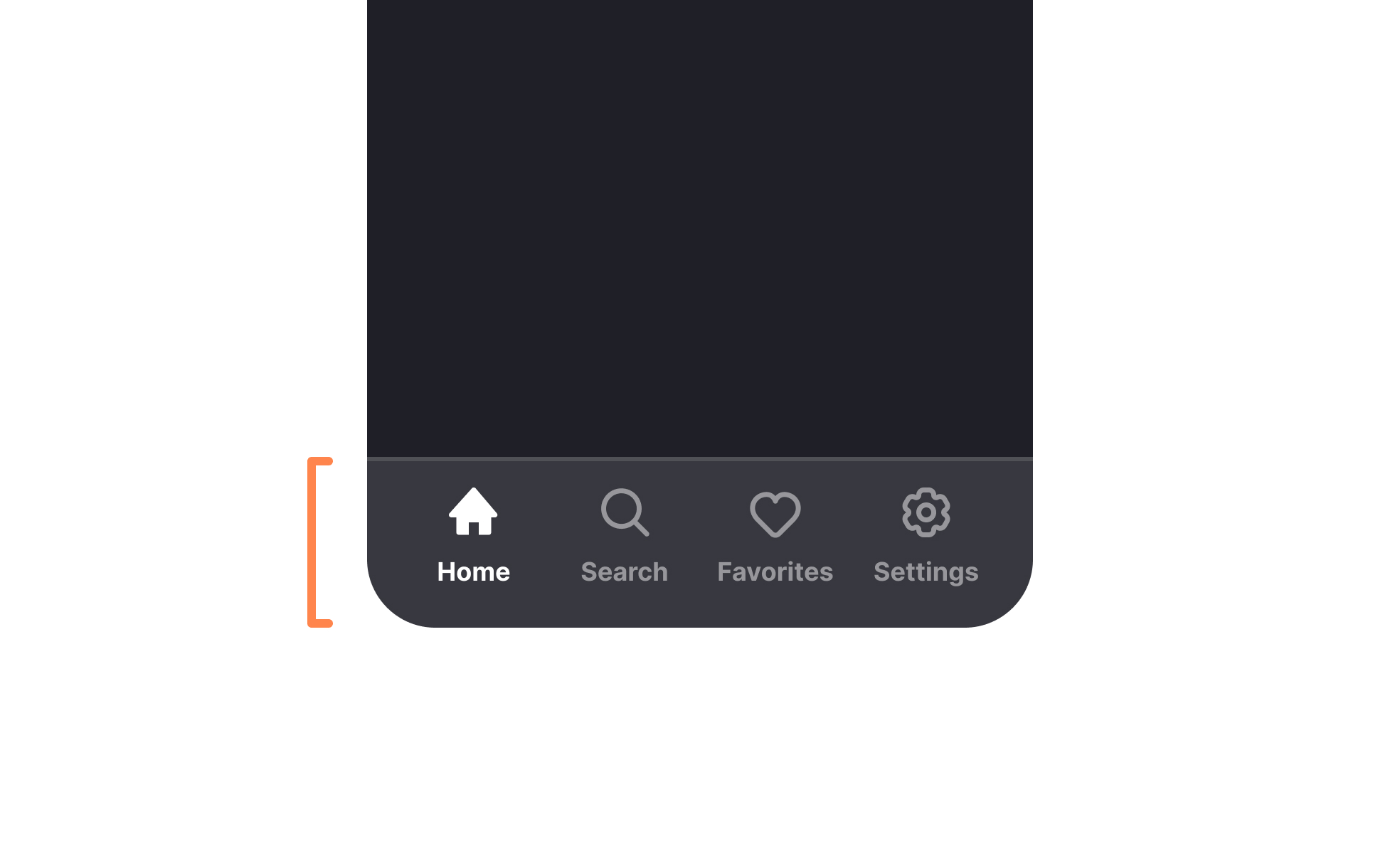
A tab bar is a navigation component that gives users direct, persistent access to the primary sections of an application. It displays a small set of destinations, typically represented by icons, labels, or both, and keeps them visible at all times so users can move between sections without first returning to a home screen or navigating through a menu hierarchy.
Tab bars are most closely associated with mobile apps, where they sit at the bottom of the screen in the thumb-friendly zone that's easily reachable without repositioning the hand. Instagram, Spotify, Twitter, and most major mobile apps use this pattern for their top-level navigation. Apple's Human Interface Guidelines explicitly recommend the tab bar as the primary navigation pattern for iOS apps with multiple top-level sections. Google's Material Design uses a similar component called the bottom navigation bar on Android.
On web and desktop, tabs are a familiar pattern too, but they typically sit at the top of the interface rather than the bottom, and the interaction model is driven by mouse and keyboard rather than touch.
Why are tab bars preferred over hamburger menus for primary navigation?
The case for tab bars over hamburger menus has been made consistently by usability research over the past decade, and the evidence has shaped how most major apps are built.
A hamburger menu, the 3-line icon that reveals a navigation drawer, requires an extra step: the user must first open the menu before they can see what navigation options exist. This creates two problems. First, it slows navigation because every destination requires two taps rather than one. Second, and more significantly, it hides the navigation structure from users who haven't yet explored it. Items buried in a hidden menu are discovered less often, used less frequently, and drive less engagement than the same items visible in a persistent tab bar.
When Redbooth switched from a hamburger menu to a bottom tab bar, it saw a 65% increase in daily active users and a 70% increase in session time. Research from multiple mobile usability studies shows navigation is 20 to 30% faster with a persistent bottom bar than with a hidden menu. The tab bar wins not because it's aesthetically better but because it makes the product's structure legible and reduces the cost of switching between sections.
Hamburger menus remain appropriate for secondary navigation, settings, and less-frequently used destinations that don't warrant a primary tab bar slot. The issue is using them for primary navigation, where the extra interaction step meaningfully reduces engagement with the features they contain.
How many tabs should a tab bar include?
3-5 is the standard recommendation, and 5 is generally the maximum for mobile.
The minimum of 3 reflects the point at which a tab bar becomes useful: with only two destinations, a simpler navigation pattern usually works better. The maximum of 5 reflects practical constraints: more than 5 items creates crowding, reduces tap target size, and forces users to evaluate more options per navigation decision.
Apple's HIG specifies a maximum of f5 tabs on iPhone. Material Design similarly recommends 3-5 destinations for the bottom navigation bar. These aren't arbitrary limits; they reflect the physical constraints of a phone screen and the cognitive limits of working memory. Users should be able to glance at the tab bar and immediately understand what each option represents without having to read and evaluate each label carefully.
When a product has more than 5 top-level sections, some prioritization is required. The most frequently used and highest-value destinations take the tab bar slots. Secondary or less frequent destinations move to a "More" or overflow menu, or to a navigation drawer. The trade-off is reduced discoverability for those secondary sections, which is acceptable if they're genuinely less important but problematic if they're sections users need to access regularly.
What goes inside each tab?
Each tab in a tab bar represents a distinct, non-hierarchical section of the application. The contents of each tab are independent from the others, and switching between tabs should not lose or reset the user's state in any of them.
- Icons are the dominant element in most tab bars. They should be universally recognizable (a house for Home, a magnifying glass for Search, a person silhouette for Profile) or made clear through pairing with labels. Icons without labels work when the icons are well-established conventions; less familiar icons need labels to be understood.
- Labels add clarity and should be short, ideally a single word. "Explore," "Inbox," "Cart," "Profile" are effective labels. Multi-word labels create visual crowding and are harder to read at the small size of a tab bar item.
- Active state indicators tell users which tab they're currently in. This is typically achieved through a color change on the icon and label, a filled versus outlined icon variant, or an underline or highlight above or below the active item. The visual distinction needs to be clear enough to identify at a glance without needing to read the labels.
- Notification badges on tab bar items indicate unread content or pending actions in a section. These should be used selectively: a badge on every tab at once defeats the purpose of any individual badge and creates visual noise.
How do tab bars behave differently on iOS and Android?
Tab bars follow the same conceptual pattern on both platforms but differ in implementation details that affect both design and user expectation.
- On iOS, the tab bar sits above the home indicator and safe area at the bottom of the screen. It uses Apple's SF Symbols iconography by default and follows the Liquid Glass translucent aesthetic introduced in iOS 26. When a user switches tabs, iOS typically preserves the scroll position and navigation state of each tab, so returning to a tab lands the user in the same place they left.
- On Android, the bottom navigation bar serves the same function. Material Design 3 specifies a container height of 56dp. Android's behavior on tab switch is to reset the tab's state by default, which is a meaningful behavioral difference from iOS that can affect how users understand what to expect when switching tabs and returning.
- On tablet-sized screens, both platforms recommend moving away from a bottom tab bar toward a navigation rail, a narrower vertical navigation strip on the left side of the screen. This makes better use of the wider screen real estate and aligns navigation with the left-to-right reading pattern. Designing for tab bar to navigation rail adaptation is part of building apps that work correctly across the range of device sizes in each platform's ecosystem.


