


.svg)
Navigation architecture forms the backbone of intuitive app experiences across Apple platforms. Effective navigation systems guide users through content hierarchies while maintaining their sense of place and direction. This architectural framework encompasses various navigation patterns - from tab bars and navigation bars to sidebars and split views - each serving specific use cases and interaction models. The careful selection and implementation of these patterns creates predictable paths through an app's information space, reduces cognitive load, and builds user confidence.
Navigation architecture also considers state preservation, deep linking, and seamless transitions between different sections of an app. Understanding these foundational patterns helps create experiences that feel natural and effortless on Apple platforms.
Navigation hierarchies
Navigation architecture in iOS apps consists of different structural approaches that determine how users move through content. The choice of structure influences discoverability, access patterns, and overall user experience.
- Tab-based navigation presents primary categories of functionality as peers. This structure works well for apps with distinct, standalone features. Each tab serves as an entry point to a specific section, letting users switch between main areas quickly. Examples include Settings, App Store, and Phone apps.
- Hierarchical navigation presents content in a linear path from general to specific. Users make one choice at a time, moving forward to more detailed information or backward to previous levels. This appears in apps like Mail, where users navigate from mailboxes to message lists to individual messages.
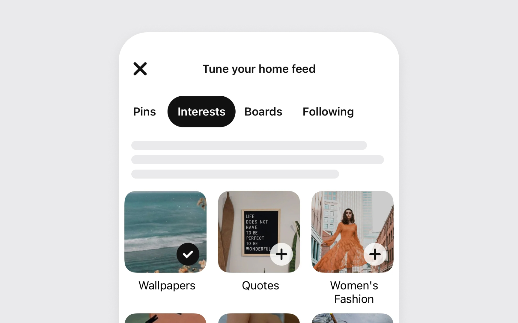
- Content-driven navigation combines different patterns based on content types and relationships. Notes and Files apps demonstrate this by using both hierarchical lists and collections, allowing flexible organization and multiple ways to access content.[1]
Pro Tip! Map out your app's structure on paper first. Use sticky notes to experiment with different organizational approaches — they're easy to move around and reorganize.
Tab bar essentials
Tab bars help users understand and navigate between different types of information or functionality within an iOS app. They preserve the navigation state within each section, maintaining context as users switch between areas.
- Navigation purpose defines the core role of tab bars. They help users move between different sections of an app, like in the Clock app with its Alarm, Stopwatch, and Timer tabs. Tab bars are not meant for actions — those belong in toolbars instead.
- Visibility requirements emphasize consistent presence. The tab bar should remain visible throughout the app navigation, helping users maintain their sense of location. Modal views may temporarily cover the tab bar during specific focused tasks.
- Content organization requires careful consideration of tab quantity. Each tab should represent a distinct section of your app that users need to access frequently. While fewer tabs generally make navigation easier, the exact number should reflect your app's information hierarchy needs.[2]
On Mac, similar functionality appears as tab views, which present multiple panes of related content that users switch between. Unlike iOS tab bars, Mac tab views should not exceed six tabs and can be positioned on any side of the content area.[3]
Navigation bar design
Navigation bars help users understand where they are in an app while providing essential navigation controls and content-related actions.
- Title clarity focuses on meaningful context. Titles confirm user location but aren't always needed — like in Notes, where the content itself provides enough context. Keep titles short (around 15 characters) to leave space for other controls.
- The back button maintains consistent navigation. Use the standard back button design that users recognize for moving up through content hierarchies. While custom back buttons are possible, they must remain clear, familiar, and consistent throughout the app.
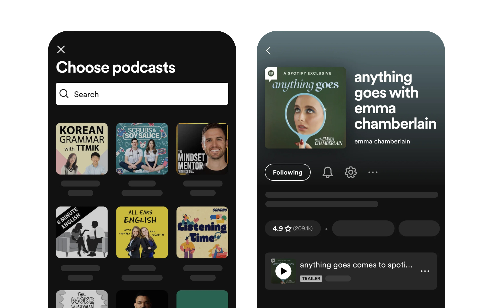
- Large titles improve orientation on iOS and iPadOS. Apps like Spotify use them to highlight main sections. These titles shrink when scrolling and expand again at the top, helping users track their location.
- Visual adjustments balance function and focus. While navigation bars can hide during immersive experiences like full-screen photos or a podcast page, ensure users can bring them back with familiar gestures like tapping or swiping down.[4]
Modal view types
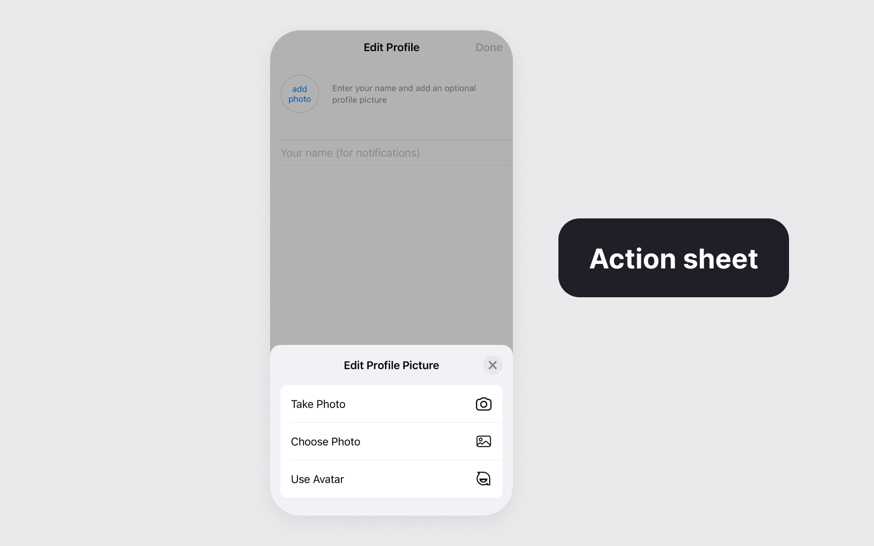
Modal views temporarily shift users' focus to complete specific tasks or receive important information while preserving their previous context.
Modal views come in several forms, each serving different scenarios:
- Alerts deliver important app-related information that often requires user action
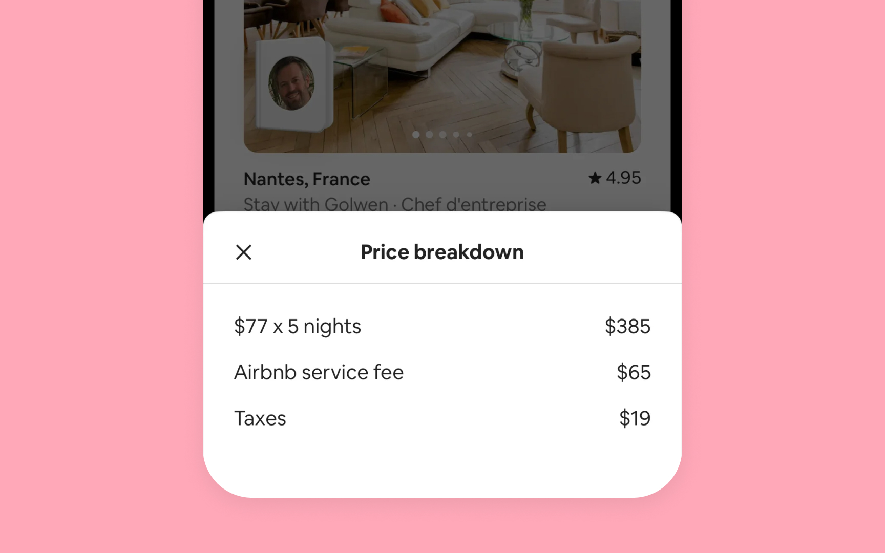
- Sheets and popovers help with distinct tasks like composing messages or adjusting settings
- Action sheets present context-specific options for immediate user choices
- Full-screen modals support immersive experiences or complex tasks like editing content or viewing media
The key to effective modal implementation lies in their purpose. They excel at:
- Delivering critical information requiring immediate attention
- Confirming or modifying users' recent actions
- Completing focused, self-contained tasks
- Creating immersive experiences for complex interactions[5]
Pro Tip! Match the modal type to your task's complexity – use simpler formats like action sheets for quick decisions and full-screen modals for involved tasks.
Modal design best practices


Effective modal design maintains clarity and prevents user confusion while supporting task completion.
Best practices for modal implementation focus on key areas:
- Simple task managing. Design each modal for a single focused task. For instance, in Mail, composing a message is a single task modal, while adding attachments uses a separate modal to keep each step clear. Complex tasks should be split into smaller parts that users can easily understand and complete. Avoid creating deep navigation within modals – they shouldn't feel like separate apps.
- Visual clarity. Every modal needs a clear title that shows its purpose. Size modals based on their content – sheets for forms, full-screen for immersive tasks. Keep dismissal methods consistent and show only one modal at a time.
- User control. Make it obvious how to exit modals through buttons or familiar gestures. If users might lose their work, ask before closing. When users dismiss by accident, save their progress and let them continue.
Drill-down navigation
Drill-down navigation creates clear paths through hierarchical content, helping users discover information through progressive disclosure.
The content organization follows key principles:
- General to specific: Start with broad categories that lead to more detailed content
- Progressive disclosure: Show only relevant information at each level
- Logical grouping: Group related items within each level
- Predictable depth: Help users anticipate how deep the hierarchy goes
For example, the Settings app organizes content in clear levels:
- Level 1: Main categories (for example, General or Display&Brightness)
- Level 2: Category-specific settings
- Level 3: Detailed configuration options
Best practices for hierarchy:
- Limit depth to 3-4 levels when possible
- Preview content at each level to guide decisions
- Maintain consistent patterns across similar content types
- Preserve state when users return to previous levels[6]
Split view structure
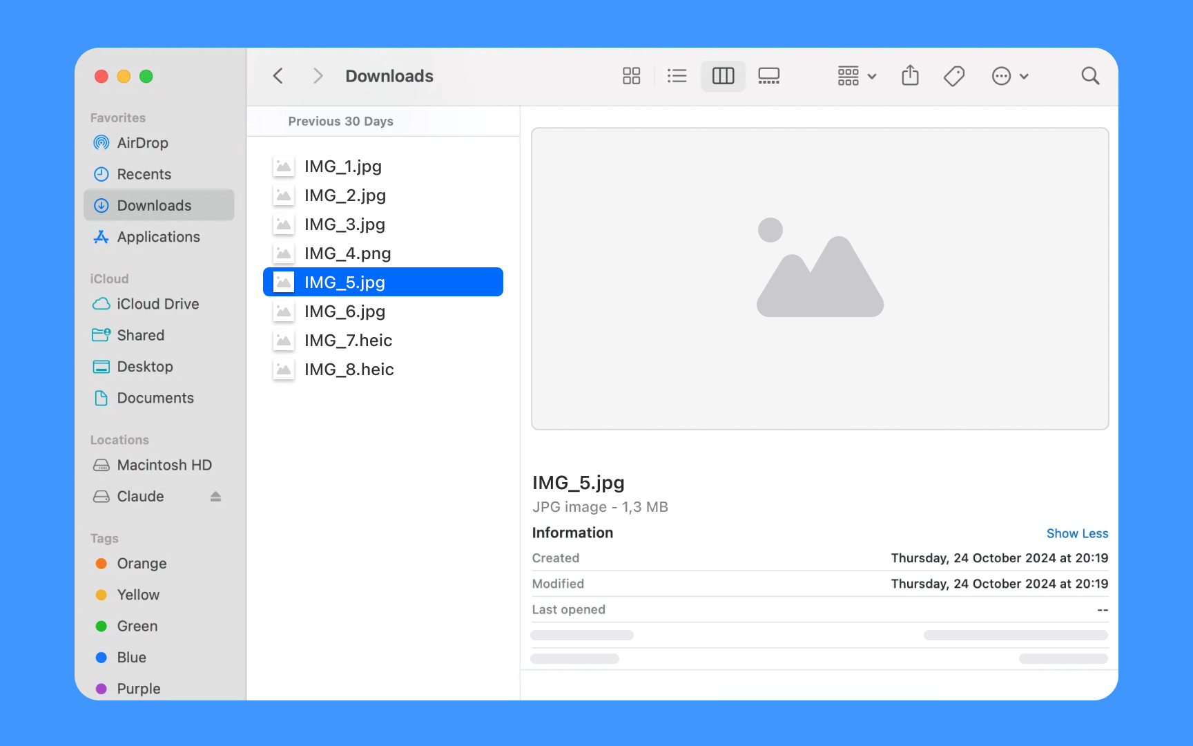
Split views support navigation through information hierarchies by displaying multiple panes of related content. This pattern works best in regular (not compact) environments that provide sufficient horizontal space.
Split views organize information in connected panes
- The leading pane lists top-level items or collections
- The secondary pane shows the selected item contents
- The optional tertiary pane displays additional details, like inspectors or previews
On iPad, split views adapt to different contexts:
- In landscape, panes appear side by side
- In portrait, the app might hide the primary pane but keep it accessible through a button
- On iPhone, apps typically use standard navigation instead of split views[7]
For instance, the Finder app shown above illustrates this pane hierarchy: the leading pane presents top-level collections like Favorites and Locations, the secondary pane shows the contents of the selected Downloads folder, and the tertiary pane displays additional details with file information and preview.
Sidebar patterns
Sidebars organize app navigation and provide quick access to key content areas. They're especially effective in iPad and Mac apps where screen space allows for persistent navigation.
Sidebars present structured navigation options
- Top level shows primary destinations or categories
- Nested groups organize related items logically
- System-wide sections like Favorites or Recents appear at the top
- Custom sections follow platform patterns for grouping
Best practices for sidebar implementation:
- Use clear, recognizable section names
- Allow item selection and multi-selection when appropriate
- Support collapsible sections for content organization
- Enable drag and drop for content management
- Provide consistent disclosure indicators for expandable items
Apps like Files and Notes demonstrate effective sidebar patterns. Files app uses system sections like Recents and Shared at the top, followed by locations and tags, making navigation intuitive and efficient.
Pro Tip! When users reopen your app, preserve their previous sidebar customizations like expanded or collapsed sections.
State preservation
State preservation helps users return to their exact location and context when navigating through apps. This pattern creates continuity and efficiency in the app experience.
Navigation maintains context across views
- Active selections remain highlighted
- Scroll positions stay unchanged
- Content filters remain active
- Form data persists
- Search terms continue showing
- Previously expanded sections stay open
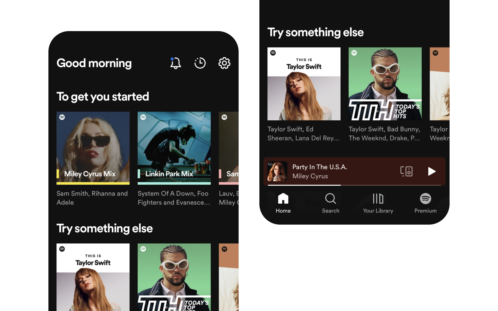
When users switch between apps or return to a previous view, they expect to find everything exactly as they left it — from selected items to entered data. This behavior supports natural app exploration without fear of losing work or place.[8]
Spotify keeps your place in the app by remembering what song is playing and where you were in your playlist, making it easy to resume listening.
Wayfinding elements
Navigation cues help users understand their current location and available paths through an app's content hierarchy.
Visual elements guide user orientation
- Breadcrumbs show the navigation path
- Selected states highlight the current location
- Back buttons indicate previous views
- Section titles confirm the current context
- Progress indicators show navigation depth
Wayfinding becomes essential when apps contain deep hierarchies or complex navigation paths, like Dropbox which shows folder paths clearly at each level.
Clear wayfinding prevents disorientation and reduces cognitive load. Users should always understand where they are, how they got there, and how to move forward or back through content.
Deep linking

Deep links let users navigate directly to specific content within apps, creating efficient paths to relevant information and features.
Deep links serve multiple purposes
- Open specific views or features
- Navigate to particular content items
- Resume previous app states
- Handle notifications effectively
- Support cross-app workflows
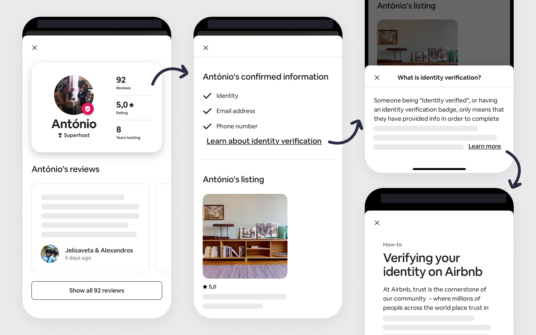
Deep linking improves app accessibility and workflow efficiency. Slack opens specific channels from notifications, while Airbnb takes users directly to saved listings from emails — showing how deep links create seamless experiences across different entry points.
Apps should maintain a proper navigation stack when handling deep links. Users need clear context about their location and easy ways to navigate to parent levels, regardless of how they entered the app.[9]
Pro Tip! Design deep links to work consistently whether users arrive from notifications, spotlight search, or other apps.
Responsive navigation
Navigation adapts to different screen sizes and orientations while maintaining content relationships and user context.
Navigation adjusts based on space:
- iPad shows persistent navigation in sidebars
- iPhone collapses navigation into tabs or menus
- Landscape orientation reveals more navigation options
- Portrait mode prioritizes content while keeping navigation accessible[10]
Responsive navigation puts content first while ensuring easy access to navigation controls. Trello shifts between a spacious board layout with visible lists on iPad to a scrollable single-column view on iPhone, maintaining project organization while adapting to screen constraints.
Topics
References
- Explore navigation design for iOS - WWDC22 - Videos - Apple Developer | Apple Developer
- Tab bars | Apple Developer Documentation | Apple Developer Documentation
- Tab views | Apple Developer Documentation | Apple Developer Documentation
- Navigation bars | Apple Developer Documentation | Apple Developer Documentation
- Modality | Apple Developer Documentation | Apple Developer Documentation
- Navigation - Interaction - iOS Human Interface Guidelines
- Split views | Apple Developer Documentation | Apple Developer Documentation
- Preserving your app’s UI across launches | Apple Developer Documentation | Apple Developer Documentation
- Extend Your App’s Presence with Deep Linking - WWDC17 - Videos - Apple Developer | Apple Developer
- Designed for iPad - WWDC20 - Videos - Apple Developer | Apple Developer


