

What is a tag?
A tag is a label attached to a piece of content, data, or interface element to help identify, categorize, or connect it with related items. Tags can be applied by users, by systems, or by content creators, depending on the product's model. Their core function is to create navigable connections across content that might otherwise be isolated from each other.
The term covers two related but distinct uses. In content and knowledge management, a tag is metadata: a keyword like "accessibility," "typography," or "prototyping" that connects related articles, resources, or records. In UI component design, a tag (sometimes called a chip or badge) is a visible, often interactive element that displays a label, represents a selection, or allows filtering. A filter interface where users click labeled chips to narrow results is a tag component. A blog article with "accessibility" listed as a topic uses tags as metadata.
Both uses share the same underlying logic: a tag creates a named association between an item and a category, concept, or value, enabling retrieval and navigation by that association.
How do tags differ from categories?
Tags and categories are both organizational tools, but they work differently and serve different user needs.
Categories are hierarchical. An item belongs to one (or a small number of) designated positions in a tree structure. A blog article might belong to the "UX Research" category. That category might sit under a broader "User Experience" parent. The structure is defined by the publisher and is typically fixed.
Tags are flat and additive. An article can have as many tags as are relevant: "usability testing," "qualitative research," "remote research," "participant recruitment." Each tag creates a navigable connection to every other article with the same tag, without requiring those articles to share a category. The result is a web of cross-connections that categories can't create.
The practical implication is that tags and categories serve different browsing behaviors. Categories work well when users are navigating from broad to narrow, looking for a topic area and then browsing within it. Tags work well when users want to find everything related to a specific concept across multiple topic areas, regardless of how those items are formally categorized.
Most content-rich products use both: categories for primary navigation structure and tags for granular cross-linking and filtering.
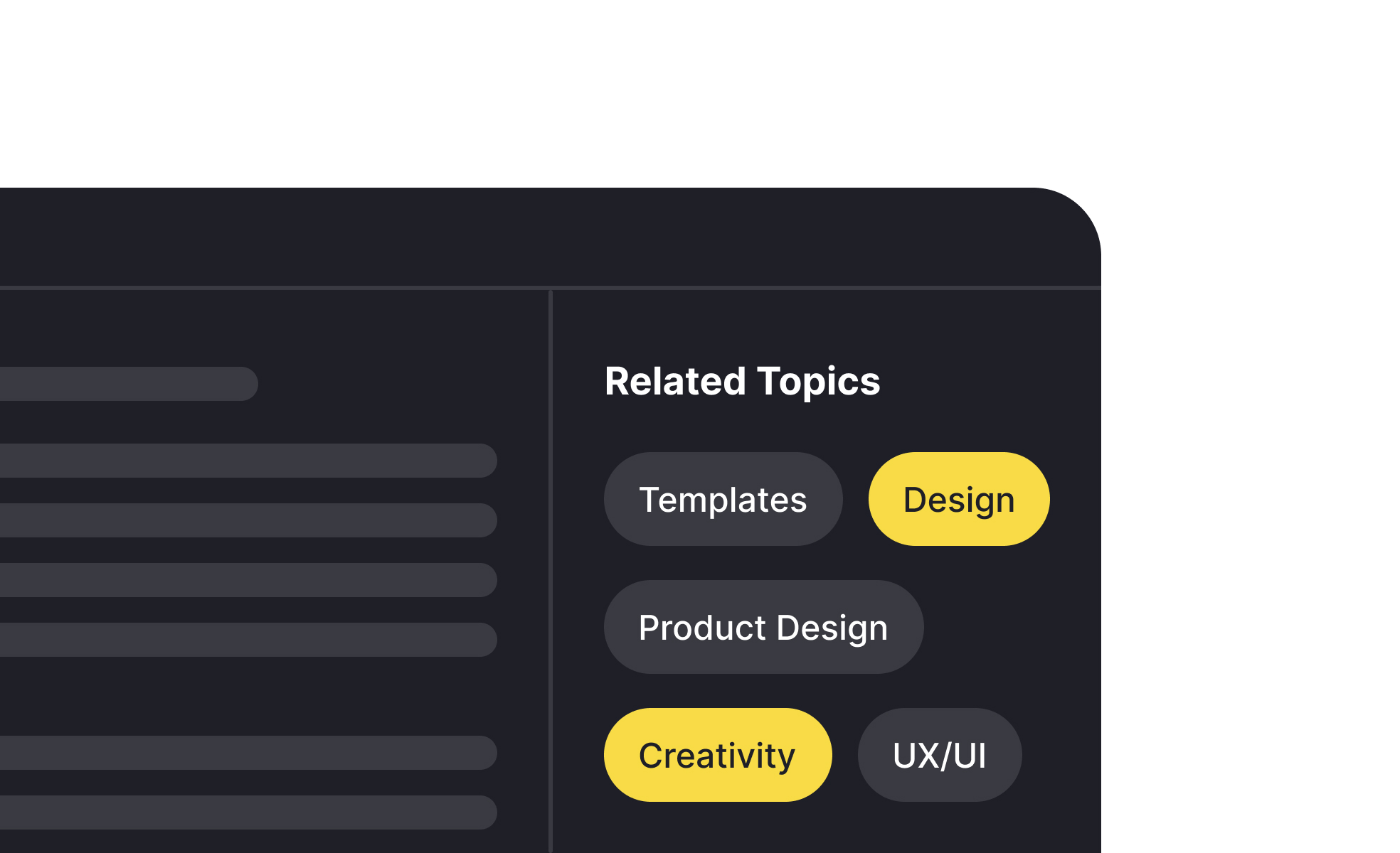
How are tags used as UI components?
As visual components, tags (or chips) serve several distinct functions in interfaces, and the design varies based on which function they're serving.
Filter chips allow users to narrow a set of results by clicking a label to add it as an active filter. The chip is typically styled differently when active to signal that it's been selected. Clicking it again removes the filter. This pattern is common in e-commerce faceted navigation, content libraries, and search results.
Input chips appear in form fields to represent selections the user has made. A multi-select input for assigning categories to a project might show each selected category as a chip inside the field, with an X icon to remove individual selections. This gives users a compact, scannable view of their current selections without requiring a list of checkboxes.
Status chips display categorical attributes of items in a list or card: a "Draft" chip on an unpublished article, a "High priority" chip on a task, an "In review" chip on a pull request. These are informational rather than interactive, and their color coding typically carries semantic meaning.
Suggestion chips present pre-defined options for a user to accept or dismiss, often in conversational or search interfaces where the system is offering options based on context.
What does good tag design look like?
Tags as components follow several design principles that affect both their usability and their scannability.
Label quality is the most important factor. A tag is only as useful as its label is clear and precise. "Accessibility" is a useful tag. "Stuff" or "Miscellaneous" are not. Tags used for filtering should be written to match the language users actually use when searching for content, not internal vocabulary.
Visual design should make tags easy to scan and distinguish. Tags in a list or applied to a card should be compact but legible, with enough padding that each tag is clearly a distinct element and large enough to be tapped comfortably on mobile. Color coding can add meaning (status tags in particular benefit from consistent color conventions) but should be paired with text labels so the meaning is accessible to color-blind users.
Interactive tags should have clear affordance: they should look clickable and respond to hover and focus states. Tags that look static but are actually clickable buttons create confusion when users don't discover the interactivity.
What are the risks of poorly managed tags?
Tags are easy to create and hard to govern, which leads to a common set of degradation problems in products where tagging is user-generated or unmoderated.
Tag proliferation occurs when similar concepts acquire multiple tag names: "UX" and "user experience," "color" and "colour," "mobile design" and "mobile UI." Each variant fragments the content that should be connected under a single tag, reducing the usefulness of tag-based navigation.
Over-tagging, applying every potentially relevant tag to an item, dilutes the precision of tags as a filtering tool. If everything is tagged with "design," the tag stops being a useful signal.
Controlled vocabularies, predefined lists of approved tag names that content contributors must use, prevent these problems but require ongoing maintenance as the content domain evolves. Autocomplete suggestions that surface existing tags when a contributor starts typing a new one reduce accidental duplication without requiring strict enforcement.


