

TL;DR
- Overlay windows for focused interaction.
- Used for alerts, confirmations, or forms.
- Temporarily block background content.
- Must balance urgency and usability.
Definition
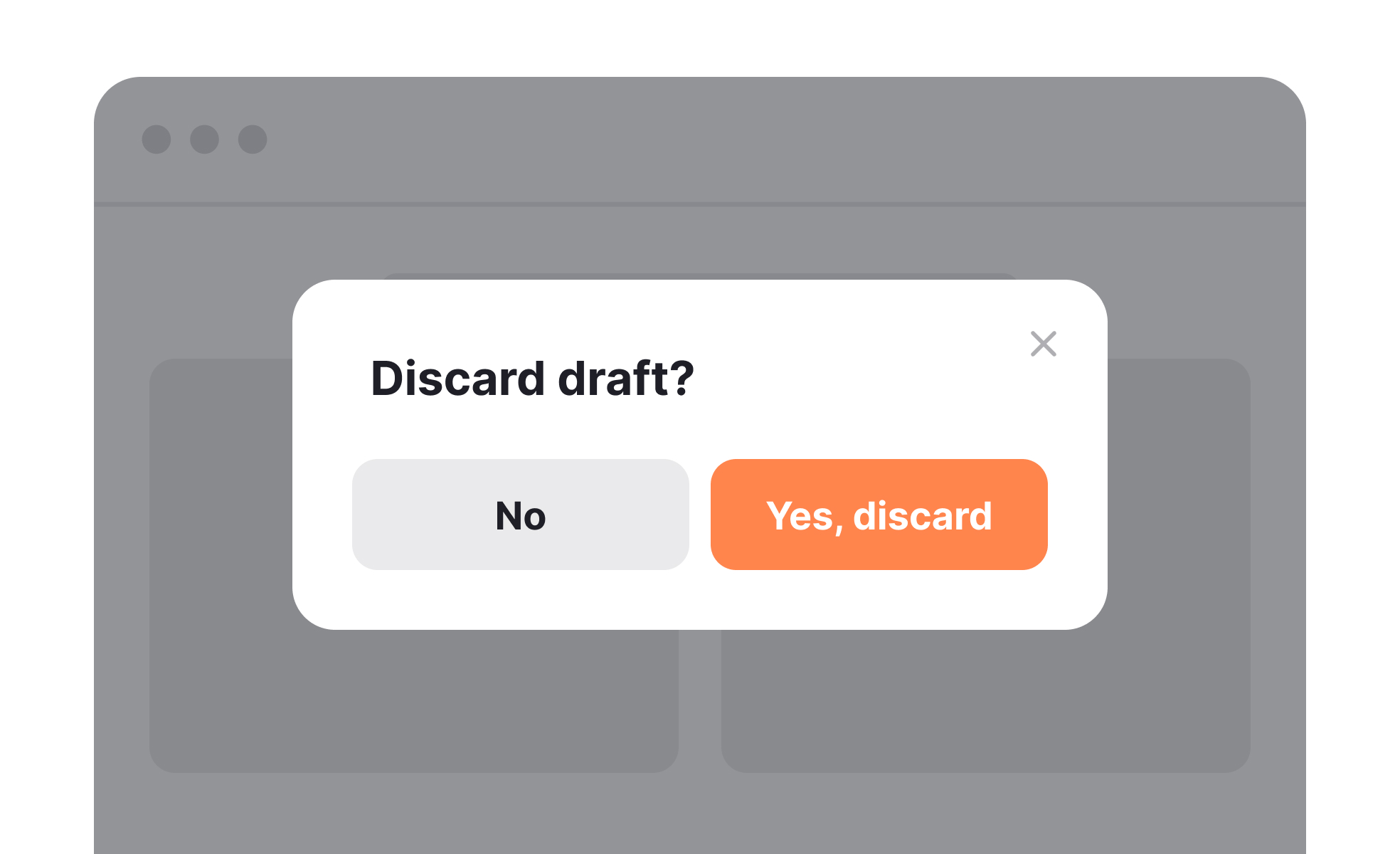
A modal is a user interface element that appears as an overlay above existing content, requiring users to interact with it before returning to the main workflow.
Detailed Overview
Modals are among the most widely recognized patterns in interface design. They provide a way to capture attention and prompt immediate action without redirecting users to a new page. Common uses include login prompts, confirmation dialogs, forms, and critical system alerts.
A frequent question is why designers use modals instead of inline elements. Modals are powerful because they reduce distraction, creating a focused environment for tasks that require acknowledgment. For example, a confirmation modal ensures users do not accidentally delete important data without double-checking the action.
Another recurring question is about potential drawbacks. Modals interrupt workflow by design. If used excessively or triggered unnecessarily, they frustrate users and harm engagement. Poorly timed modals, such as subscription pop-ups during browsing, often create negative experiences. Effective use requires restraint and clarity.
Accessibility concerns often arise with modals. Without proper coding, screen readers may fail to detect modal content, leaving users stranded. Designers and developers must ensure keyboard navigation, focus trapping, and clear exit options are implemented. This ensures all users can interact with modals effectively.
Teams also ask about mobile considerations. On smaller screens, modals must be responsive and avoid covering too much of the interface. Alternatives such as bottom sheets or inline alerts may sometimes work better. The decision depends on context, importance of the message, and available screen space.
Finally, modals can enhance clarity when applied responsibly. They are best reserved for moments requiring explicit input or confirmation. When aligned with user expectations, modals improve accuracy, prevent errors, and support more controlled interactions.
Learn more about this in the Best Practices for Designing UI Modals Lesson, a part of the UI Components I Course.


