

What is a toolbar?
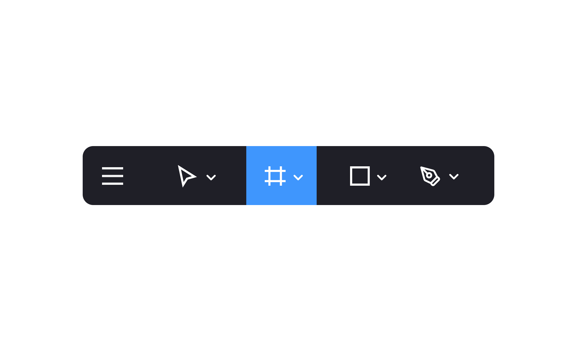
A toolbar is a collection of controls grouped together in a compact, persistent area of an interface, giving users quick access to the actions they use most. Each item in a toolbar typically represents a single action or a group of related controls: a bold button, a color picker, a view toggle, an undo control, a share button.
The defining characteristic of a toolbar is that it makes actions visible and immediately operable, removing the steps required to find those same actions through a menu hierarchy. A text editor where bold, italic, and link insertion are accessible from a toolbar requires one click. The same actions found only in a Format menu require two clicks and scanning through a list. For high-frequency actions, this difference accumulates meaningfully across a session.
Toolbars appear in almost every category of software that involves sustained interaction with content: document editors, image editors, design tools, code editors, email clients, and mobile apps with dense functionality. Their form adapts to context: a horizontal strip across the top of a desktop application, a floating panel in a design tool, a bottom bar in a mobile editing app, or a contextual toolbar that appears in proximity to selected content.
How do toolbars differ from menus?
Menus and toolbars serve complementary roles in an interface, and the distinction is about depth versus immediacy.
Menus provide access to the full range of available actions, including infrequent and advanced ones, organized into labeled groups. They're appropriate for features that users access occasionally and can afford to discover through navigation. The depth of a menu system allows it to contain many more actions than a toolbar without overwhelming the primary interface.
Toolbars surface a curated subset of those actions: the ones users need most often, placed where they're always visible and reachable with a single interaction. They're optimized for speed on the most-used tasks, not for comprehensiveness.
The relationship between the two is intentional. A well-designed toolbar contains only the actions that genuinely warrant permanent visibility. Everything else lives in a menu. When a toolbar contains too many items, its speed advantage erodes: users have to scan the toolbar to find what they need, which takes as long as navigating a simple menu. The selection discipline required to build a good toolbar is often more work than it appears.
What are the different types of toolbars?
Toolbars take several forms depending on where they appear and how they're triggered.
- Application toolbars sit at the top or bottom of an application window and contain the primary set of tools or actions for the application's main workflow. Figma's top toolbar contains selection tools, frame tools, shape tools, and the prototype/development mode toggles. Google Docs' toolbar contains formatting controls. These toolbars are persistent: they're always visible regardless of what content is selected or what the user is doing.
- Contextual toolbars appear in response to a specific selection or action. Selecting text in a rich text editor might surface a contextual toolbar with formatting options directly above or near the selection. Selecting an object in a design tool might surface alignment and size controls. These toolbars are only shown when relevant, which keeps the persistent interface cleaner while still surfacing options precisely when needed.
- Bottom toolbars in mobile interfaces function similarly to contextual toolbars but are positioned at the bottom of the screen for thumb reachability. A photo editing app might display a set of editing tools at the bottom of the screen when a photo is open.
- Floating toolbars follow the user's cursor or the selected object, providing actions in close proximity to the content being worked on. These are common in rich text editors and collaborative documents, where positioning formatting controls near the selection reduces pointer travel.
What makes a toolbar well-designed?
Several principles determine whether a toolbar helps users or adds cognitive overhead.
- Content selection is the most important variable. A toolbar should contain only the actions that the specific user group uses frequently and benefits from having immediately accessible. The temptation to add "just one more" useful action is consistent and usually counterproductive. Research or usage data showing which actions users trigger most often is the most reliable basis for toolbar content decisions.
- Visual grouping within the toolbar signals logical relationships. Related actions (undo and redo, bold and italic, align left and align center) should be grouped together, either through proximity or a visual separator. Ungrouped toolbars that mix unrelated controls create scanning difficulty.
- Icons need tooltips. Most toolbar items are represented by icons for compactness. Icons that represent universally standard actions (undo, save, search) can stand alone. Icons for less universal functions need tooltips that appear on hover and provide a text label. Relying on icon recognition alone for non-standard actions excludes users who are unfamiliar with a specific product's iconography.
- Overflow handling matters when a toolbar has more items than the available space can show. Truncating items without indication hides functionality without explanation. A clearly labeled overflow menu or "more" control that surfaces the remaining items maintains discoverability.
How should toolbars be designed for accessibility?
Toolbar accessibility involves several specific requirements beyond general interactive element standards.
- ARIA roles communicate the toolbar's structure to assistive technologies. A toolbar container should have
role="toolbar"so screen readers can announce it and allow users to navigate within it as a group. Arrow keys should navigate between toolbar items; Tab should move focus out of the toolbar and to the next focusable element in the page. - All toolbar items must have accessible names. An icon button with no visible text needs an
aria-labeloraria-labelledbyattribute that provides a text description. Screen readers announce this label when the button receives focus. Without it, the button has no meaningful name for a screen reader user to understand its purpose. - Keyboard shortcuts for toolbar actions should be documented and consistent with platform conventions. Many power users navigate toolbars primarily through keyboard shortcuts rather than clicking toolbar items, particularly in productivity applications where keeping hands on the keyboard matters for efficiency. Tooltips that show the keyboard shortcut alongside the action name surface this information to users who haven't learned the shortcuts yet.
- Touch target sizes on mobile toolbars must meet minimum dimensions: 44x44pt on iOS and 48x48dp on Android. Toolbar items are often visually compact, which makes it tempting to make touch targets smaller than they should be. Using padding to extend the interactive area beyond the visible icon is the standard approach.


