


Every touchscreen app ships with a hidden instruction set. Pull down to refresh, swipe a message to archive it, pinch a map to zoom: none of these are labeled, and users perform them because other apps taught them first. A gesture is a feature nobody can see, so the design job is making it findable, comfortable, and optional, and that job gets harder as phones grow taller and system gestures claim more of the screen's edges.
In this glossary topic:
- What is mobile gesture design?
- What gestures make up the mobile vocabulary?
- How do platform conventions shape gesture design?
- How does mobile gesture design differ from a button and tap interface?
- Why are hidden gestures hard to discover?
- How do ergonomics and feedback shape gesture design?
- What does mobile gesture design look like in practice?
- How does mobile gesture design handle accessibility?
- FAQ

What is mobile gesture design?
Mobile gesture design is the practice of deciding which touch gestures an app recognizes, what each one does, and how the interface invites, confirms, and tolerates them. It covers the mapping from movement to result (a swipe archives, a long press selects, a pinch zooms), the feedback that connects the movement to the screen, and the fallbacks for people who cannot or do not perform the gesture. A gesture has no pixels of its own, so the designed object is behavior rather than appearance.
Operating systems define a shared vocabulary that users carry from app to app, and most gesture design is honoring it so an app feels native on first launch. The smaller, riskier part is deciding where a product adds a gesture of its own, such as Instagram's double tap to like. Most gesture design is inheritance; the design decisions are in the exceptions.
What gestures make up the mobile vocabulary?
The core set is small and shared across platforms. Tap activates or selects. Double tap zooms or triggers a shortcut. Long press opens a contextual menu, starts a drag, or enters selection mode. Swipe moves quickly between pages, through a carousel, or across a list row to reveal actions. Drag moves an object with the finger and tracks it continuously, which separates it from a swipe. Pinch and spread zoom, and a two-finger rotate turns a map or a photo.
A second layer is built from those primitives. Pull to refresh is a drag past a threshold on a list already at its top. Edge swipes start from the bezel and are mostly reserved by the operating system for navigation. The Selection & Input Methods lesson covers how long press, drag, and selection combine on Apple platforms. An app rarely needs more than the core set, and those that add to it usually do so for one action at the center of the product.
How do platform conventions shape gesture design?
Each platform reserves part of the vocabulary for itself. On iOS since the iPhone X, a swipe up from the bottom edge goes home, a swipe down from the top opens Notification Center or Control Center, and a swipe from the left edge goes back. On Android, the gesture navigation introduced in Android 10 uses a swipe from either side edge for back and a swipe up from the bottom for home, so an app's own edge gestures, such as a left-edge drawer, collide with the system unless the app declares exclusion areas.
Apple's Human Interface Guidelines and Google's Material Design each document their platform's gestures and expected feedback, and the conventions differ in small ways users notice, such as where back lives and how a sheet is dismissed. A gesture that works against the platform's version of itself feels broken even when it is implemented perfectly, so cross-platform apps keep the action constant and let the gesture follow the platform.
How does mobile gesture design differ from a button and tap interface?
A button interface is explicit: every action is visible, labeled, and a tap away, at the cost of screen space and a longer path to frequent actions. A gesture interface is implicit: actions live in the content itself, faster once learned and invisible until then. An app built only from buttons feels slow and crowded on a phone; one built only from gestures leaves new users with no obvious way in.
The working compromise is redundancy. Frequent actions get a gesture and a visible control, so a message can be archived by swiping or by tapping an icon, and the tab bar stays even where a swipe between sections exists. Rare or destructive actions keep a button, because an accidental gesture is harder to notice than a tap. Gestures are shortcuts for people who already know the way, not the only road, and an app's broader interaction patterns decide which actions earn one.
Why are hidden gestures hard to discover?
A button announces itself; a gesture does not. Nothing on a flat list row says it can be swiped, so users find gestures by trying what worked elsewhere, by accident, or by being told. The design response is to give the gesture an affordance it lacks: a card that peeks from the screen edge so the stack looks swipeable, a handle on a sheet that suggests it drags, a row that bounces on first view to reveal the action beneath it, or a coach mark that names the gesture once.
The second response is to make the gesture optional: if the only way to reach an action is a gesture nobody can see, some users never will. Teams measure discoverability by watching whether usability participants perform the gesture unprompted and by checking how many users ever trigger it. A gesture only the design team knows about is not a shortcut; it is a missing feature, and the fix is usually a visible control rather than a longer tutorial.
How do ergonomics and feedback shape gesture design?
Phones are held in one hand more often than designers assume, and the thumb reaches the lower and middle of the screen comfortably while the far upper corner needs a shift in grip; Steven Hoober's research on how people hold phones is the usual reference for these thumb zones. Gestures should begin where the thumb already is, which argues for action rows, sheets, and primary controls in the lower half of the screen.
Target size matters because every gesture begins with a touch. Apple's guidelines recommend a touch target of at least 44 by 44 points, Material Design specifies 48 by 48 density-independent pixels, and WCAG 2.2 sets a level AA minimum of 24 by 24 CSS pixels. A swipe on a row that is too short, or a drag handle too small, fails before the gesture starts.
Feedback closes the loop. A gesture should track the finger, show its threshold (the row's action revealed, the spinner stretching), and stay cancelable until release, so a user who changes their mind mid-swipe can slide back without consequence. A haptic tick at the threshold and a short animation on completion confirm that it registered. A gesture without continuous feedback feels like a gamble, because the user cannot tell whether it was recognized until something happens.
What does mobile gesture design look like in practice?
The vocabulary is easiest to see drawn one gesture at a time: a single finger touching the screen for a tap, a thumb and forefinger pulling apart for a spread or closing for a pinch. The drawing's job is not to teach the gesture, which users already know, but to show a team the set it inherits before it decides which actions get one. A product that starts from the platform's gesture vocabulary spends its invention on one gesture rather than ten.
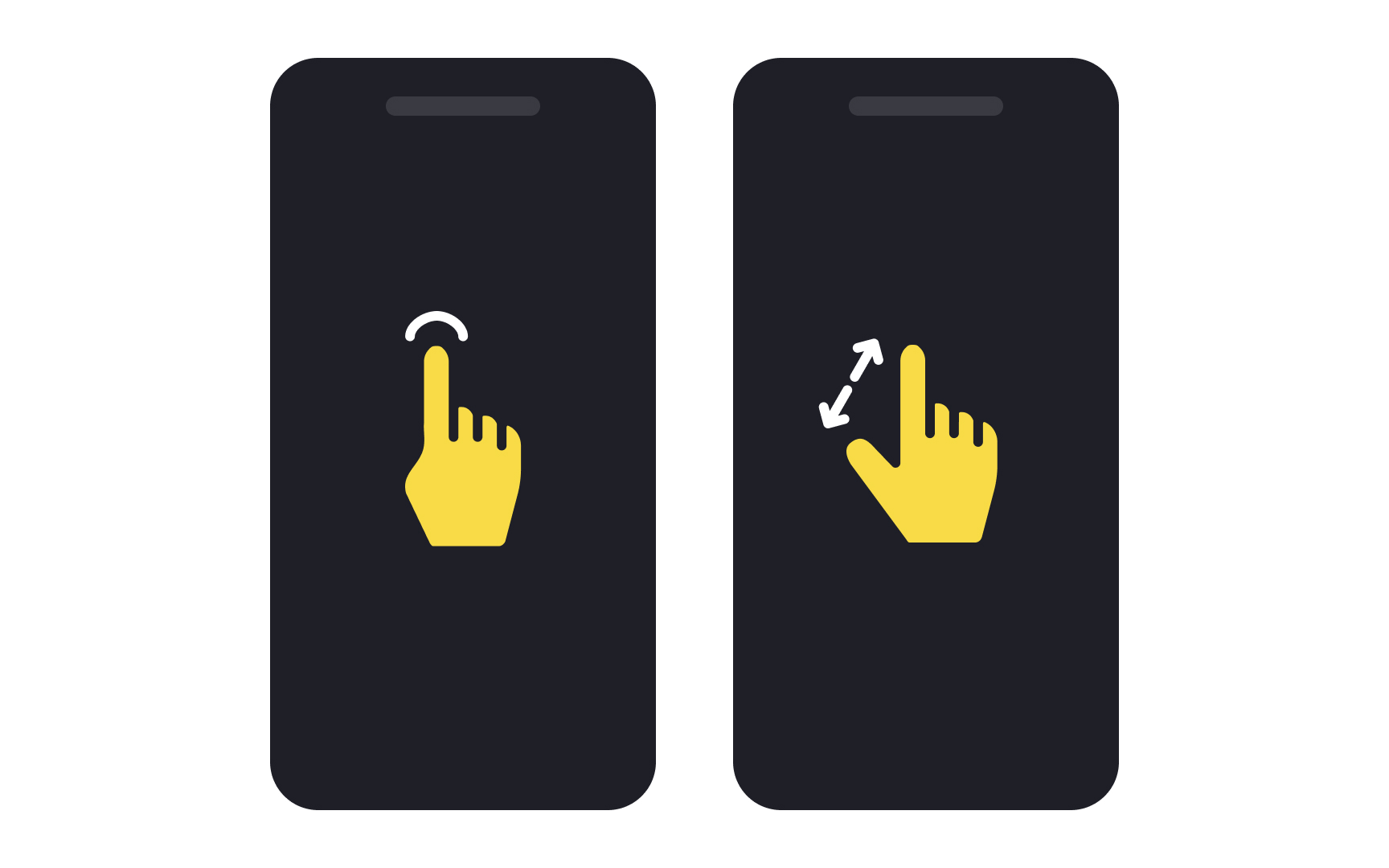
Two of the inherited gestures: a tap, the one every control already answers, and a pinch or spread, the one most apps reserve for zoom. Each carries an expectation the platform set before the app was installed. From the lesson Designing for Mobile Interfaces.
How does mobile gesture design handle accessibility?
Every gesture needs a non-gesture equivalent. WCAG's Pointer Gestures criterion requires that anything operable with a multipoint or path-based gesture also work with a single pointer, which in practice means a visible control for every action a gesture reaches. Screen readers go further: with VoiceOver on iOS or TalkBack on Android active, a swipe moves focus and a double tap activates, so an app's custom swipe actions never arrive as the app expects and have to be exposed as named actions instead. The Mobile Design course's Accessibility lesson covers the gesture rules, and the accessibility entry covers the standards behind them.
Both platforms also provide settings that replace multi-finger gestures with an on-screen menu and extend the long-press delay, and an app should respect them. WCAG's Pointer Cancellation criterion asks that an action complete on release rather than on first touch, so a user who touches the wrong target can slide off without triggering anything. A gesture is accessible when the same action can be reached by tapping, by keyboard or switch, and by a screen reader's own commands, and an app that meets that bar has usually solved its discoverability problem too, since the visible alternative is the signifier.


