

TL;DR
- Defines the positioning of elements or devices.
- Influences layout and interaction design.
- Includes portrait and landscape modes.
- Impacts usability across screen types.
Definition
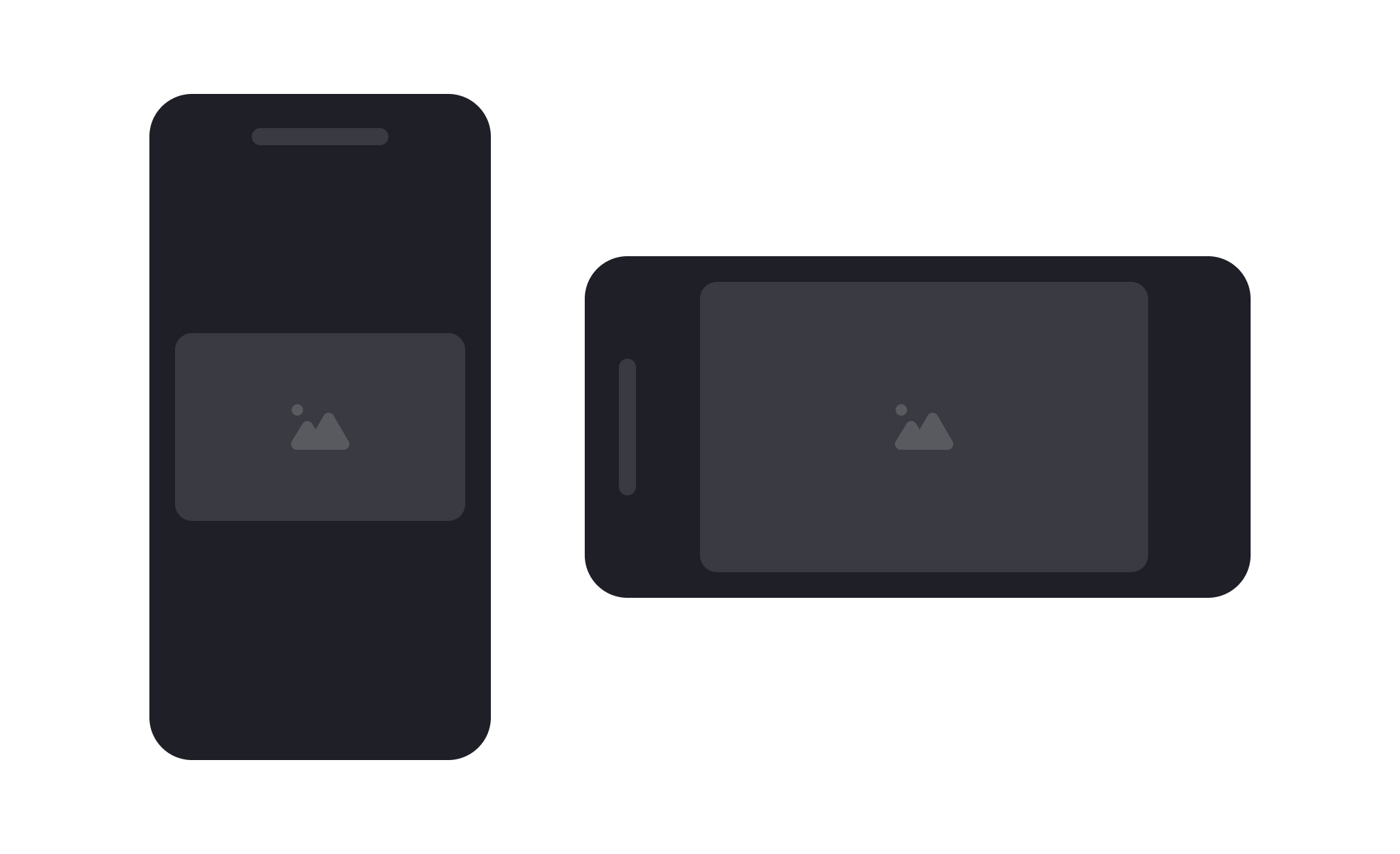
Orientation is the arrangement or positioning of content or devices, typically described as portrait or landscape, shaping how interfaces are designed and how users experience digital products.
Detailed Overview
Orientation plays a crucial role in digital design because it determines how users perceive and interact with content. In device contexts, orientation refers to whether a screen is viewed vertically (portrait) or horizontally (landscape). In design, orientation also describes the positioning of elements relative to one another, influencing balance, flow, and readability.
A frequent question is how orientation affects layout. Designers must account for different device orientations, ensuring content adapts seamlessly whether viewed on a phone held upright or rotated sideways. For example, reading apps often default to portrait for comfort, while video players are optimized for landscape to maximize screen space. Interfaces that ignore these variations risk poor usability.
Another common query relates to responsive design. Orientation is a critical part of responsive strategies, as layouts must adjust not just to screen size but also to rotation. Breakpoints, grids, and flexible components ensure that content remains functional and visually coherent regardless of how the device is held.
Teams also ask about orientation in relation to user behavior. Certain tasks lend themselves to specific orientations. Writing, scrolling, and reading often work best in portrait, while collaboration boards, dashboards, or games may benefit from landscape. Understanding context helps designers choose which orientation to prioritize and how to signal shifts effectively.
Accessibility often enters the discussion. People with mobility limitations may not easily rotate devices, so designs must not assume that all orientations are equally accessible. Ensuring core features remain usable in both modes is key to inclusivity.
Finally, orientation has implications beyond devices. In graphic and print design, orientation choices shape composition and storytelling. A horizontal poster communicates differently from a vertical one, guiding the eye in distinct patterns.
Learn more about this in the Orientation Exercise, taken from the Mobile-Specific Functions & Interactions Lesson, a part of the Mobile Design Course.

.svg)


