


Most products are designed for an imagined typical user, and the gap between that person and everyone else is where products fail. Inclusive design starts from that gap instead of from the average, treating difference in ability, language, culture, age, and circumstance as the brief rather than as an exception to it. The people a product excludes are a research sample, not an edge case, and the teams that study them find features the rest of the market later copies. With accessibility law widening and AI features inheriting the gaps in their training data, the method has moved from a specialist concern to a product one.
In this glossary topic:

What is inclusive design?
Inclusive design is a design methodology that works with and for the full range of human diversity, in ability, language, culture, gender, age, and the devices and connections people have, and treats that range as the starting constraint rather than as a late adjustment. The phrase grew out of UK design research, and the British Standards Institution's 2005 definition, mainstream products usable by as many people as reasonably possible without special adaptation, is still the one most often cited.
Two ideas sit underneath the method. The first is that exclusion is designed: a person is not disabled by their body alone but by a mismatch between their body and the thing in front of them, a framing the World Health Organization adopted in 2001 and inclusive design borrows. The second is that the people most excluded by a design are the best teachers about how to fix it. Inclusive design is less a set of features than a way of choosing whom to design with, and the features follow from that choice.
How does inclusive design work?
The most widely used working model is the one Microsoft published in its Inclusive Design toolkit in 2016, with Kat Holmes leading the work, and it has three principles. Recognize exclusion: find where the current design creates a mismatch, with whom, and why. Learn from diversity: people who adapt to the world differently are the clearest source of insight about where a product fails. Solve for one, extend to many: design first for a person with a specific permanent constraint, then notice how many others share that constraint some of the time.
The third principle rests on the persona spectrum. Any limitation can be permanent, temporary, or situational: a person with one arm, a person with an arm in a cast, and a new parent holding a baby all operate a phone one-handed. Someone who is blind, someone recovering from eye surgery, and a driver whose eyes are on the road all need an interface that works without looking. A constraint that affects a small group permanently affects almost everyone sometimes, which is what turns an accessibility requirement into a mainstream feature.
The IDRC, the inclusive design research institute at OCAD University in Toronto, frames the same method as three dimensions: design for human uniqueness and variability, co-design openly with the people who cannot use the current design, and remember that any design sits inside a larger system. The vocabulary differs; the moves are the same.
What does inclusive design typically cover?
Ability is the dimension most teams start with, and the one a typical persona leaves out, but the method treats it as one of several. Language covers plain wording, reading level, and localization for people reading in a second language or a different script. Culture covers names, dates, addresses, color meanings, and imagery that assume one country's defaults. Age covers older adults, who are more likely to have reduced vision or dexterity, and children. Gender covers forms, pronouns, and avatars. Device and connectivity cover the older phone, the small screen, and the metered or intermittent connection.
Each dimension changes a different part of the work. Research recruits at the edges: people who struggle with the current product, not only the customer the segmentation describes. Content gets plain language and a translation pass. Interfaces gain more than one way to do each thing: touch, keyboard, and voice as alternative input modes; captions and transcripts beside audio; text size, contrast, and motion the person can adjust. The common thread is choice: the product offers several ways to participate instead of one correct way.
How does inclusive design differ from accessibility?
Accessibility is an outcome: a product that people with disabilities can perceive, operate, and understand, measured against a standard such as WCAG, the W3C's Web Content Accessibility Guidelines, which laws and procurement rules in many countries reference. It has testable success criteria, a conformance level, and a pass or fail. Inclusive design is a process: how a team decides whom to involve, which mismatches to look for, and which solutions to generalize. It has no conformance level.
The two are confused because they share examples. Captions, keyboard operation, and sufficient contrast appear in both. The difference is direction. Accessibility starts from the standard and asks whether the product meets it; inclusive design starts from excluded people and asks what the product should become, and it may arrive at features no standard requires, such as a one-handed mode or a plain-language rewrite. Accessibility is the floor a product has to clear, and inclusive design is the method for deciding what to build above it. A team can pass an audit while excluding people the audit never asked about, and a team can run an inclusive process and still ship a focus order that fails the audit.
Why does inclusive design matter for product teams?
The practical case rests on the curb cut effect. Curb cuts were introduced for wheelchair users and ended up serving parents with strollers, delivery workers with carts, and travelers with luggage. The digital equivalents are familiar: captions, built for deaf users, are watched by commuters on silent phones and by people learning the language; voice control, built for people with motor disabilities, is used by anyone whose hands are busy; high-contrast modes help in sunlight. In each case the feature outgrew the group it was built for. The Designing for Hearing Impairments lesson follows the captions example from requirement to everyday feature.
That pattern changes how a team should read its own edge cases. A limitation that affects a few users permanently usually affects many users occasionally, so the fix is rarely a niche investment. It also lowers the cost of compliance, since a product designed with excluded people from the start has fewer retrofits to make. Teams that treat inclusion as a research question rather than as a checklist find the features their competitors' audits never surface.
What does inclusive design look like in practice?
Picture a banking app opened one-handed by someone holding a sleeping baby in the other arm. Nothing about that person counts as disabled, and for as long as the baby is held they have one usable hand, divided attention, and no appetite for sound. An app designed only for the two-handed case fails them in the same ways it fails a person with one arm, and the fixes are the same fixes: large targets within thumb reach, no action that needs two fingers, a layout that does not depend on hearing a chime. Situational limits are where inclusive design is easiest to see, because they happen to everyone.
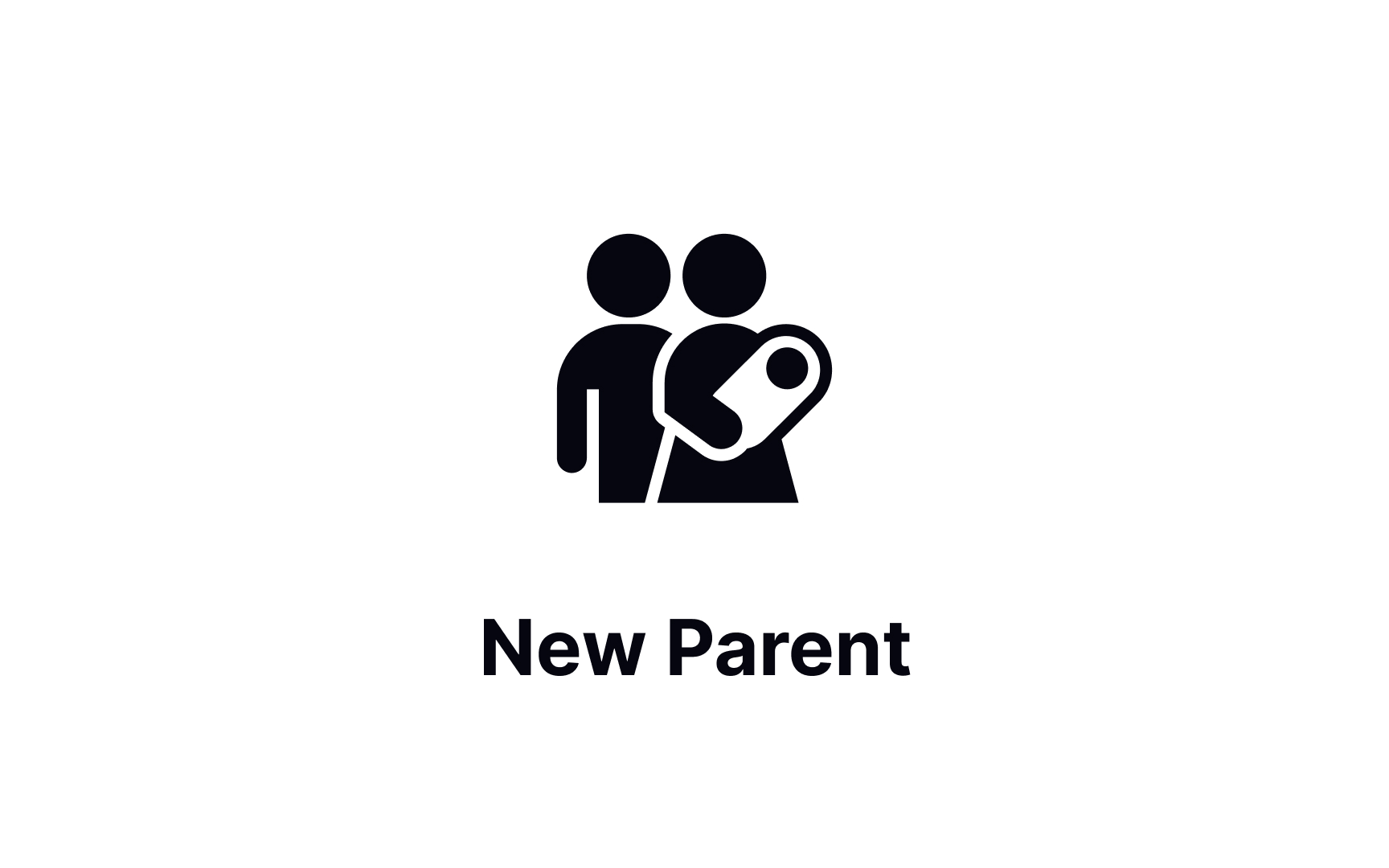
The situational end of the persona spectrum: a new parent has one hand free for as long as the baby is held, and whatever was designed for a person with one arm serves them too. From the lesson Inclusive Design Basics.
What are the limits of inclusive design?
The method does not replace accessibility testing. Involving excluded people early improves the questions, but conformance still has to be checked against the standard, with assistive technology, by people who use that technology every day. Nor does it mean designing for everyone at once; the Microsoft framing is explicit that solving for one specific person comes first and the extension follows, because a design that tries to average all users serves none of them well.
There are also tensions inside the method. More input modes and more settings mean more surface to maintain and more ways for a product to drift out of consistency, which is why the inclusive decisions that last are usually pushed into a design system rather than made screen by screen; the Accessibility in Design Systems lesson shows how one decision about color, spacing, or focus state then propagates through every screen built on it. Recruiting at the edges takes research time a schedule has to allow for, and usability testing with those participants belongs on their own devices and assistive setups, not a lab configuration. Inclusive design is a way of finding the right problems, and it still leaves the team to solve them well.


