

What is a design system?
A design system is a centralized library of the decisions, components, and rules that govern how a product looks and behaves. It includes the visual design foundations (colors, typography, spacing, icons), the reusable UI components built from those foundations (buttons, forms, cards, navigation patterns), the documentation that explains how and when to use each element, and increasingly, the underlying code that implements them.
The practical purpose is consistency at scale. Without a shared system, each designer and developer makes independent decisions about how to build common interface patterns. The result is visual drift: buttons that look slightly different across screens, spacing that varies without rationale, interaction behaviors that don't match user expectations built in other parts of the product. Design systems replace those individual decisions with shared ones, so teams can focus on solving problems specific to each feature rather than rebuilding foundational elements from scratch.
Well-known examples include Google's Material Design, Apple's Human Interface Guidelines paired with its component frameworks, IBM's Carbon, and Shopify's Polaris. Each of these systems documents not just what components look like but how they should behave, when they should be used, and what accessibility requirements they carry.
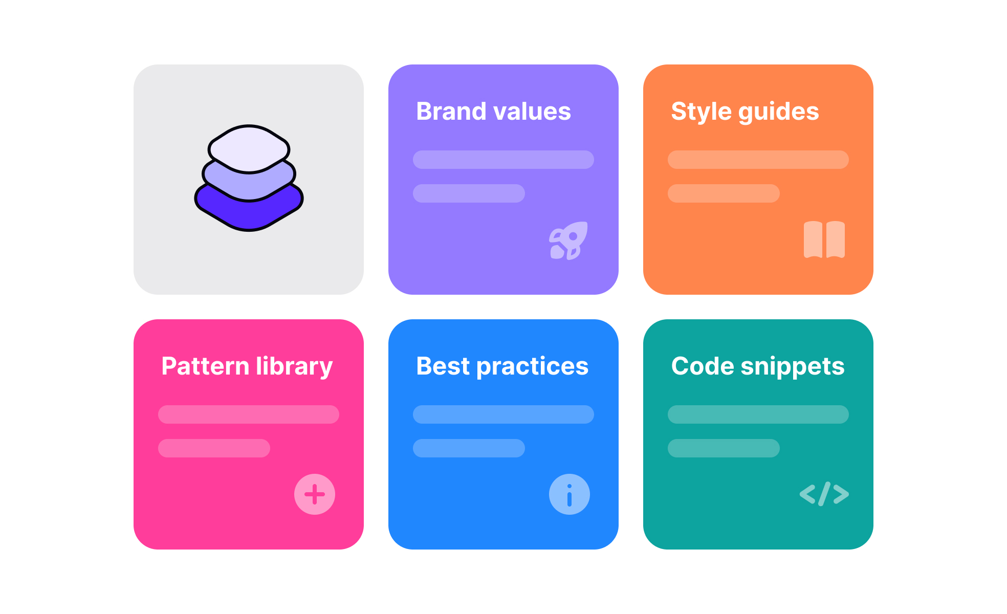
What does a design system include?
A design system is more than a component library, though a component library is often the most visible part of it.
- Design tokens are the foundational layer: named variables that store values for colors, typography, spacing, border radii, shadow definitions, and motion timing. Rather than specifying hex codes or pixel values directly in components, tokens give those values semantic names like
color-interactive-primaryorspace-4. When a token value changes, that change propagates automatically to every component that references it, which makes system-wide updates like a rebrand or a shift in spacing scale practical without manual rework across every screen. - The component library is built on top of tokens. It contains the specific UI elements used to build interfaces: buttons, input fields, checkboxes, dropdowns, modals, navigation bars, tooltips, and so on. Each component in a well-maintained system includes the component itself, documentation on its usage, a specification of its variants and states, accessibility notes, and ideally a code implementation that matches the design exactly.
- Pattern documentation goes a level above components, describing how components work together to solve recurring design problems. A pattern might describe the recommended approach to progressive disclosure, pagination, or form validation, drawing on multiple components and explaining the logic behind the recommended approach.
Why do product teams invest in design systems?
The business case for design systems is strongest in two situations: when a product is being built by multiple teams simultaneously, and when the product is expected to grow significantly in complexity or feature scope over time.
Without a system, teams working in parallel make independent decisions that accumulate into inconsistency. Users encounter different interaction patterns, visual treatments, and terminology in different parts of the product, which increases cognitive load and erodes trust. A design system enforces a shared baseline that makes the product feel coherent regardless of which team built which part.
The efficiency argument is also significant. Developers building on a shared component library don't have to rebuild common elements for each feature. Designers working within a defined system spend less time on foundational decisions and more time on the specific problems each screen needs to solve. When accessibility requirements are built into system components from the start, every feature built on those components inherits those requirements automatically rather than requiring separate accessibility work per feature.
What is the relationship between a design system and design tokens?
Design tokens are the implementation mechanism that makes design systems maintainable at scale. Understanding how they work explains why modern design systems are significantly more robust than earlier component libraries.
A token like color-surface-primary stores a value, say a specific shade of white in light mode. That token is referenced by every component that uses a primary surface color: cards, modals, page backgrounds. In dark mode, the same token resolves to a deep grey instead. The components don't change; only the token's resolved value changes. This means theming, dark mode support, and brand updates can be managed at the token level rather than requiring changes to each individual component.
Teams now frequently maintain token files as code, versioned in the same repositories as their product code. When a token changes, it generates updated outputs for whatever platforms the system supports, web, iOS, Android, and the change flows through to every component automatically.
How have design systems evolved with AI?
Design systems have matured from primarily visual libraries into more comprehensive engineering infrastructure, and AI tooling has begun to change both how they're built and how they're used.
On the tooling side, AI features within design tools like Figma can now flag inconsistencies between a design and the design system automatically, suggest the closest existing component when a designer starts building something new, and help document component behavior. Some teams are using AI to generate component documentation from existing code, a task that has historically been neglected because it's time-consuming and unsexy.
The role of design systems within product organizations has also shifted. They've moved from being owned by a small design team to being recognized as shared infrastructure owned jointly by design and engineering. System teams now think about governance, contribution models, and adoption metrics in ways that weren't common in earlier system-building efforts. The question is no longer just "what components are in the system" but "how do we make sure the system is actually used consistently across teams."
Accessibility has become more deeply integrated into system work. Rather than accessibility being a separate audit process, well-maintained design systems now build WCAG compliance into components directly, with documented minimum contrast ratios, keyboard navigation behavior, screen reader support, and touch target specifications as part of each component's specification.

.svg)


