

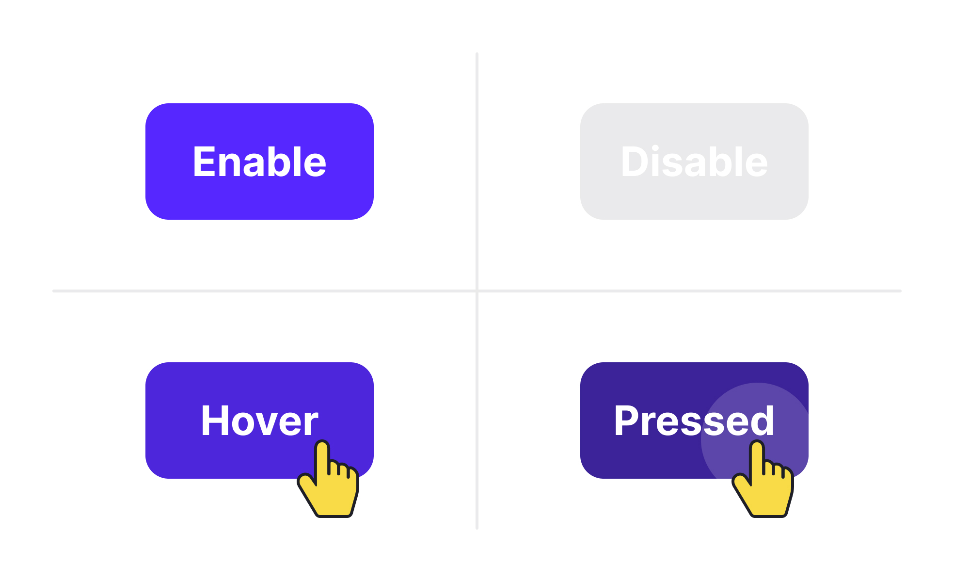
Element states represent the different appearances and behaviors of user interface components depending on user interaction or system status. Common states include default, hover, active, disabled, and error. Designing these states thoughtfully provides users with feedback that reinforces control and clarity within a product.
For UX and UI designers, element states act as signposts guiding user actions. A button that changes color when hovered or clicked reassures users that their input is registered. Without such feedback, users may repeat actions, leading to errors or frustration.
In product management, element states play a role in defining functional requirements and consistency across a platform. Product managers ensure that design teams and developers align on state definitions so that every button, form field, or navigation item responds predictably. This consistency reduces user confusion and simplifies development.
Accessibility also intersects with element states. Disabled elements must be visually distinct but not so faint that they exclude users with vision impairments. Error states should use clear, descriptive messages alongside visual indicators. Following accessibility standards ensures that all states are perceivable and usable.
Real-world examples emphasize their value. Google’s Material Design library includes extensive guidelines for element states, ensuring that buttons, toggles, and forms communicate effectively across devices. E-commerce websites like Shopify use clear states for checkout buttons, reducing errors in critical flows and improving conversion rates.
When teams fail to design clear states, products suffer from usability issues. Users may abandon tasks if they cannot tell whether an action succeeded or why a field failed validation. Well-defined states improve trust and flow within digital experiences.
Learn more about this in the UI Component States Lesson, a part of the UI Components I Course.
Key Takeaways
- Element states represent component behavior across interactions.
- Clear states provide feedback and improve user confidence.
- Product managers ensure consistency across platforms and teams.
- Accessibility requires thoughtful contrast and messaging in states.
- Real-world platforms rely on states to improve conversions.


