

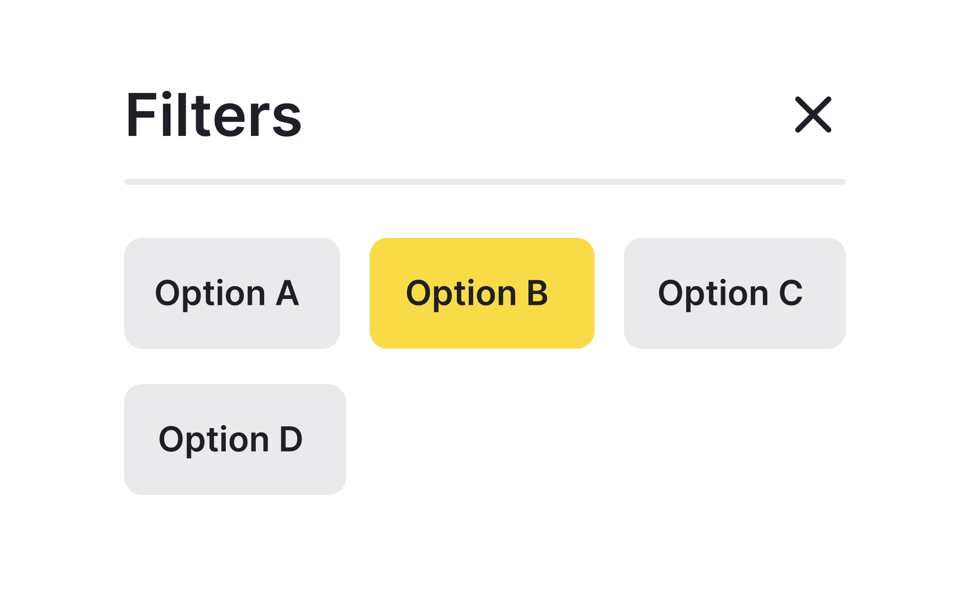
Chips are small, rounded interface components that encapsulate discrete pieces of information or actions in a compact format. They are often used in filters, tags, selections, or quick actions, giving users an efficient way to interact with content without overwhelming the screen. Their size and shape make them versatile for both desktop and mobile environments, where conserving space is essential.
In UX design, chips offer clarity by grouping related options or representing user choices in a simple visual format. For example, when users select multiple filters in an e-commerce app, those selections can appear as chips at the top of the results page, reminding them of their active filters. This reduces confusion and gives users direct control to remove or adjust their preferences.
Real-world examples demonstrate their utility. Gmail uses chips for email search filters, helping users refine results quickly. In design platforms like Figma, chips can show active properties or applied effects, making complex interfaces more navigable. Social media platforms like Twitter use hashtag-style chips to highlight trends or topics users can engage with instantly.
Accessibility plays a key role in chip design. Each chip must be clearly labeled, focusable by keyboard navigation, and compatible with screen readers. Since chips often include actions like “remove” or “edit,” designers must ensure these are announced properly to assistive technologies. Clear visual indicators, like an “x” for removal, provide immediate affordance for all users.
Customizability adds further value. Chips can carry different states, such as selected, unselected, or disabled, and can include icons for additional clarity. For example, a chip with a calendar icon might indicate a date filter, while one with a profile icon shows user assignment. Designers balance aesthetics and functionality, ensuring that chips are visually distinct but not overly decorative.
Chips also influence scalability. As products grow in complexity, chips provide a scalable way to manage options without cluttering interfaces.
Learn more about this in the Intro to UI Chips Lesson, a part of the UI Components II Course.
Key Takeaways
- Chips are small UI elements for actions, filters, or information.
- They improve clarity by showing user selections or states.
- Product managers use chips to simplify complex workflows.
- Real-world examples include Gmail filters and e-commerce tags.
- Accessibility requires clear labeling, focus states, and screen reader support.


