


Design and research work reaches its decision makers in a meeting far more often than in a document, and that meeting is where projects get funded, redirected, or quietly shelved. The same findings that convince a product team can lose an executive in the first three slides if the room is asked the wrong question. A stakeholder presentation exists to get a decision made, and everything in it is there to make that decision easy to take. Teams that treat it as a checkpoint rather than a performance tend to leave with clearer answers.
In this glossary topic:
- What are stakeholder presentations?
- Who is the audience for a stakeholder presentation?
- How is a stakeholder presentation structured?
- How does a stakeholder presentation differ from a design critique or a handoff?
- What counts as good evidence in a stakeholder presentation?
- What does a stakeholder presentation look like in practice?
- Where do stakeholder presentations sit in the product process?
- FAQ

What are stakeholder presentations?
Stakeholder presentations are structured briefings in which a designer, researcher, or product manager brings work to the people who can act on it, usually to get a decision made. The term covers both the artifact, a deck or document built for the meeting, and the event itself: a research readout, a design review with leadership, a roadmap update, or a report on what a launch achieved. What unites these is the audience. A stakeholder is anyone with a stake in the outcome who is not doing the work day to day: the executive who funds it, the head of engineering who staffs it, the sales leader who will sell it, the compliance partner who can block it.
That audience separates the presentation from the rest of a team's communication. Inside the team, work is shown constantly and informally, in file comments, standups, and crits. A stakeholder presentation gathers that work into a form someone outside the team can follow in 20 minutes and act on without having been in the room for the previous six weeks. The purpose is a decision, not a demonstration: approval, a change of direction, resources, or an agreed next step. The practice sits inside stakeholder management, the broader work of knowing who those people are and what each of them cares about.
Who is the audience for a stakeholder presentation?
Picture the same checkout redesign presented three times in one week. To the executive sponsor, the question is whether to keep funding it, so the presentation leads with the outcome it promises, the risk, and the cost, with the designs shown only as proof of competence. To engineering leadership, the question is scope and sequence: what ships first, what the tradeoffs are, what the unknowns will cost. To marketing, sales, or support, the question is what changes for their work and when, so the presentation covers timing and what to tell customers.
Each audience needs a different decision, and the content follows from it. Executives make go, no-go, and funding decisions and want the recommendation first. Cross-functional peers make coordination decisions and want detail where their work touches the change. Clients, in agency settings, make approval decisions and want to see the options considered. A presentation built for the wrong audience fails even when every slide is accurate, because the people in the room are not being asked a question they can answer. The UX Research Reporting lesson covers how a report changes shape for each reader.
How is a stakeholder presentation structured?
Most presentations that work share four parts, whatever the format. Context states the problem, why it matters now, and what was decided last time, so that someone who missed the previous update can follow. Evidence shows what the team learned: research findings, usage data, prototypes tested, options explored and rejected. The recommendation says what the team proposes and why, in one or two sentences a stakeholder could repeat to someone else. The ask names the decision the meeting needs to produce, who needs to make it, and the date after which not deciding becomes a decision.
The order can change. Executive audiences often get the recommendation and the ask before the evidence, with the detail held in an appendix for questions. Peer audiences usually need the evidence first, because they will test the recommendation against it. What does not change is that all four parts are present. A presentation that ends without a named decision has been an update, not a presentation. The Gaining Buy-In, Commitment, and Sign-Off lesson treats the ask as the part teams most often leave implicit.
How does a stakeholder presentation differ from a design critique or a handoff?
A design critique is a working session among practitioners. The work is unfinished, the audience is peers, and the goal is to improve the design through questions and alternatives; nothing is decided, and the designer leaves with notes rather than approval. A stakeholder presentation shows work that is far enough along to be judged, to people who will not improve it but will decide what happens to it. Bringing critique habits into a stakeholder room, such as showing five unresolved options and asking which the executive prefers, hands the design decision to the person least equipped to make it; the reverse, defending one polished answer in a critique, closes the conversation the critique exists to open.
A handoff differs on the other side. It is the transfer of finished designs, specifications, and assets to the engineers who will build them, and its audience already agrees with the direction; what it needs is completeness and precision. A stakeholder presentation comes earlier in the sequence and is sparser by design. Critique improves the work, presentation decides its fate, and handoff transfers it, and the three call for different levels of finish and different kinds of feedback.
What counts as good evidence in a stakeholder presentation?
Evidence is whatever lets a stakeholder trust the recommendation without redoing the work. For research, that means findings tied to what was observed, with the method and the number of participants stated, a representative quote or clip for each finding, and a clear line between what people did and what the team infers from it. For design, it means the options considered, the reason the recommendation won, and a prototype or a before-and-after pair that makes the change concrete. For outcomes, it means the metric that was supposed to move, whether it moved, and what else might explain the movement.
The weakest evidence in these rooms is the kind that cannot be checked: a percentage without a denominator, a claim that users want something without saying which users, a benchmark from an unnamed study. Stakeholders who have been burned by one such claim discount every later one. A single well-sourced finding carries more weight than ten unsourced ones, because it survives the first question. Data visualization earns its place for the same reason: a chart that shows the before and after in one glance beats a table that has to be read aloud.
What does a stakeholder presentation look like in practice?
The clearest example is the findings presentation that closes a design audit. The team has reviewed a product against usability, accessibility, and consistency criteria and has to persuade stakeholders to fund the fixes. The strongest slides in that deck are rarely the ones that list issues. They are the before-and-after comparisons: the current screen next to the proposed one, with the problem and the fix visible without a narrator. The pair lets an executive who will never read the audit see what the money buys, and lets an engineering lead size the work. A comparison stakeholders can see does the persuading that a bulleted list only asserts.
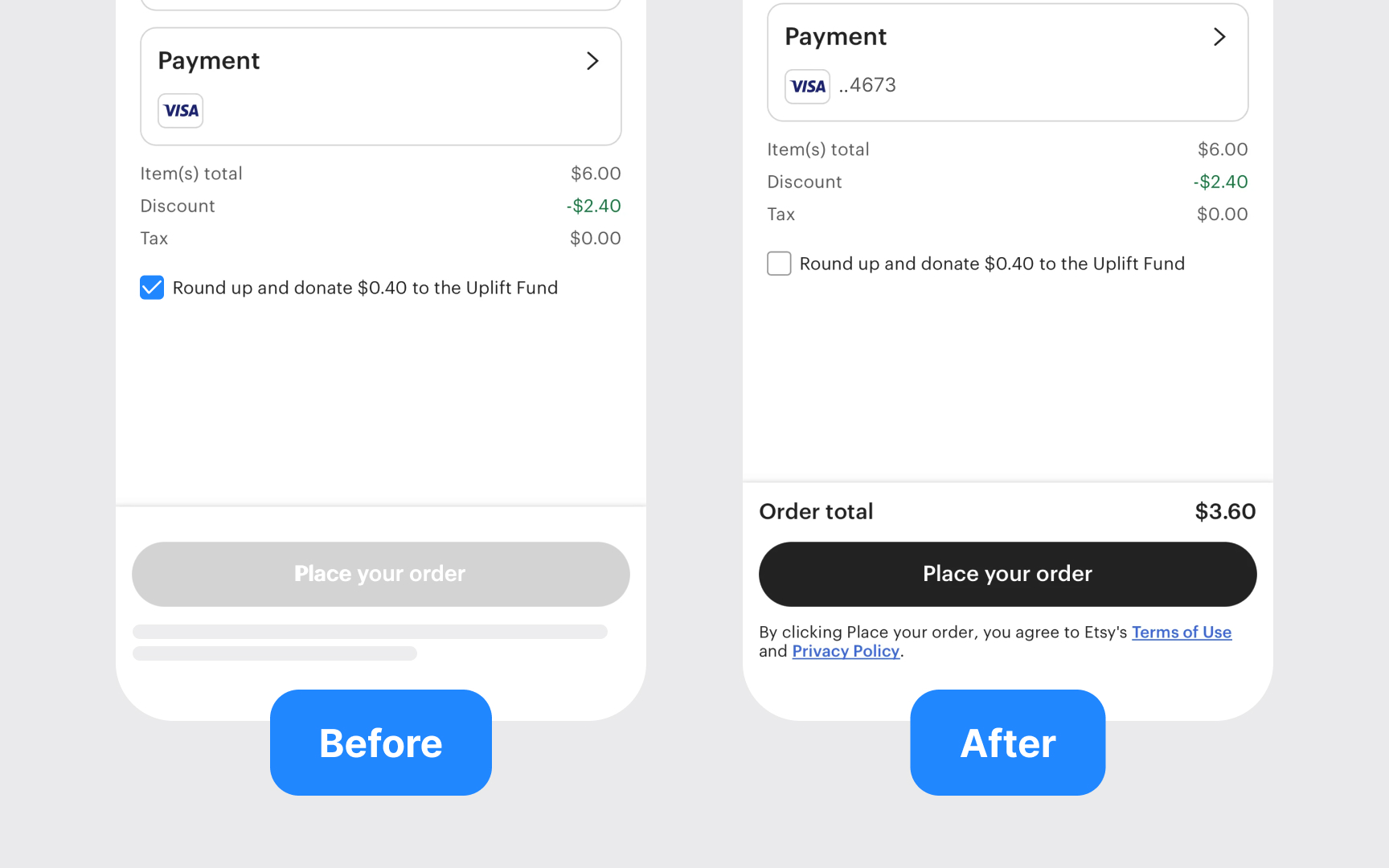
A before-and-after pair as it appears in a findings deck: the same checkout step shown as it is and as proposed, so a stakeholder sees the missing total and the inactive button on the left and the fix on the right without either being described. From the lesson Findings Presentation.
Where do stakeholder presentations sit in the product process?
They mark the points where work leaves the team. Discovery ends with a research readout that turns findings into direction. Design ends with a review in which leadership approves a direction before engineering commits to it. Planning produces a roadmap presentation that aligns departments on sequence. Delivery ends with an outcome review that reports what shipped and what it changed. Between these milestones the work is shown constantly but informally; the presentation is the formal checkpoint that produces a record.
That record is the part most often skipped. A decision made in a meeting and never written down gets reopened at the next one, which is why experienced teams close each presentation by restating the decision, the owner, and the date, and send it out the same day. The presentation is finished when the decision is written down, not when the last slide is shown. The checkpoints then recur with every cycle, from the user research readout that opens one to the product roadmap review that schedules the next.


