


A research report is the primary artifact through which UX findings reach the people who need to act on them. A well-structured report does not just document what happened in a study. It gives stakeholders a clear understanding of what was found, why it matters, and what should happen next. A poorly structured one, regardless of the research quality, often gets skimmed or ignored.
Effective reporting requires different thinking than research itself. Analysis is about finding patterns. Reporting is about communication: deciding what level of detail the audience needs, structuring findings so the most important points land first, writing recommendations that are specific enough to act on, and presenting evidence in a way that builds confidence in the conclusions.
The format matters too. A written report structured by theme works differently from a slide deck in a stakeholder meeting. This lesson covers the components of a strong research report, how to write each section, how to frame recommendations with evidence, and how to present findings in a live setting that supports discussion rather than just broadcasting results.
Parts of a research report
Great research can fall flat if the findings don't reach the people who need to act on them. The report is what makes that handoff possible. It captures what you did, what you found, and where the product should go next in a format stakeholders can actually use.
A complete research report includes 6 components:
- Research goals. The questions the study set out to answer and why the research was commissioned in the first place.
- Product context. The metrics or signals that flagged a problem and triggered the research.
- Methodology. The research method used, including why it was the right fit for the goals.
- Participant sample. The size and profile of participants, so readers can assess how representative the findings are.
- Insights and findings. The key takeaways drawn from the data supported by evidence.
- Recommendations. A prioritized direction for what the team should do next.
Without research goals, findings have no frame of reference. Without methodology, stakeholders can't assess the credibility of what you found. And without recommendations, the report ends with insights but no direction, which leaves the most important work undone.[1]
Pro Tip! Lead with recommendations, not methodology. Stakeholders care most about what to do next, so put the "so what" at the front.
How to write the study overview section

The study overview is where you set the stage for everything that follows. Before stakeholders can trust your findings, they need to understand why the research happened, who was behind it, and how it was conducted.
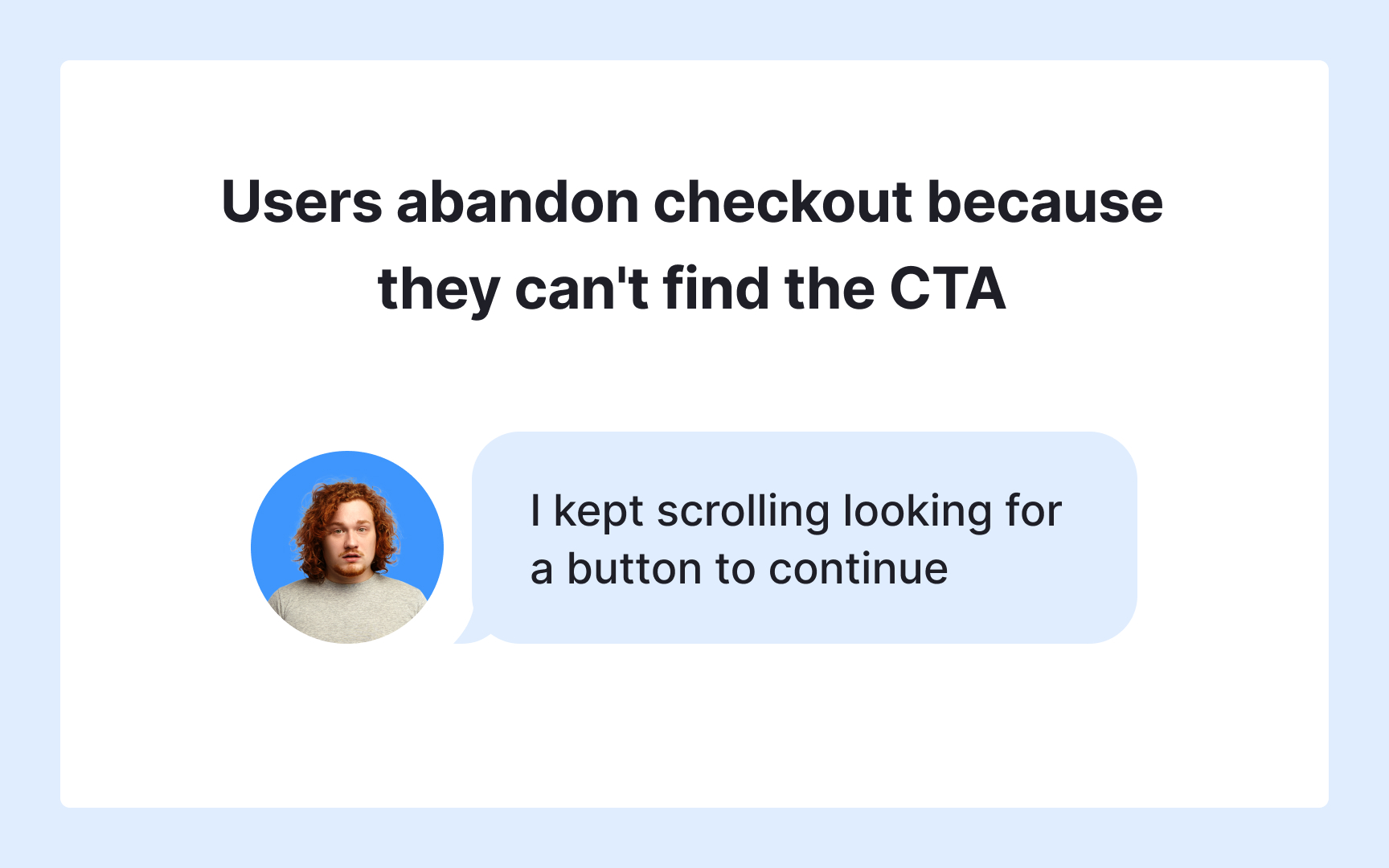
Start with your research goals and back them up with data. A goal stated without context is easy to dismiss. A goal tied to a real metric is much harder to ignore. If you commissioned a study to understand why users were abandoning their carts on the checkout page, say so and include the drop-off rate that made it a priority. That number gives stakeholders an immediate sense of what was at stake. Use this section to also outline what the research aimed to achieve and which teams were involved, so readers know who owns the outcomes.
Then cover the mechanics of the study. Describe the data collection method you used, whether that was a user interview, survey, usability test, or card sort, and briefly explain why it suited your goals. Follow that with your participant details: how many people took part, how they were selected, and what their profile looked like. These details help stakeholders assess how representative the findings are before they reach the insights section.[2]
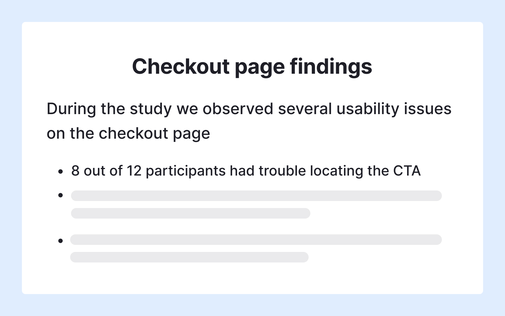
How to structure the insights section


Not everyone reading your report needs the same level of detail. A VP wants to know what the research means and what to do next. A designer needs the data behind each takeaway. Splitting the insights section into two parts lets you serve both audiences without losing either.
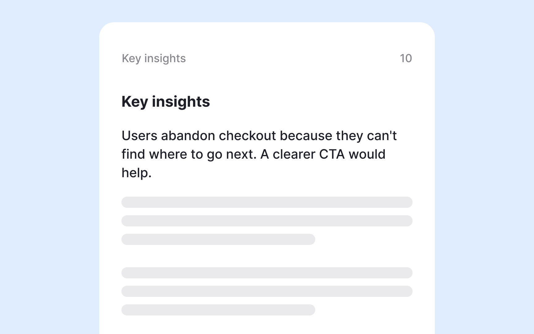
Key insights give busy stakeholders a short, scannable summary of the most important takeaways from your study. Keep this section focused on conclusions, not process. The goal is for someone who reads nothing else to still walk away knowing what matters most.
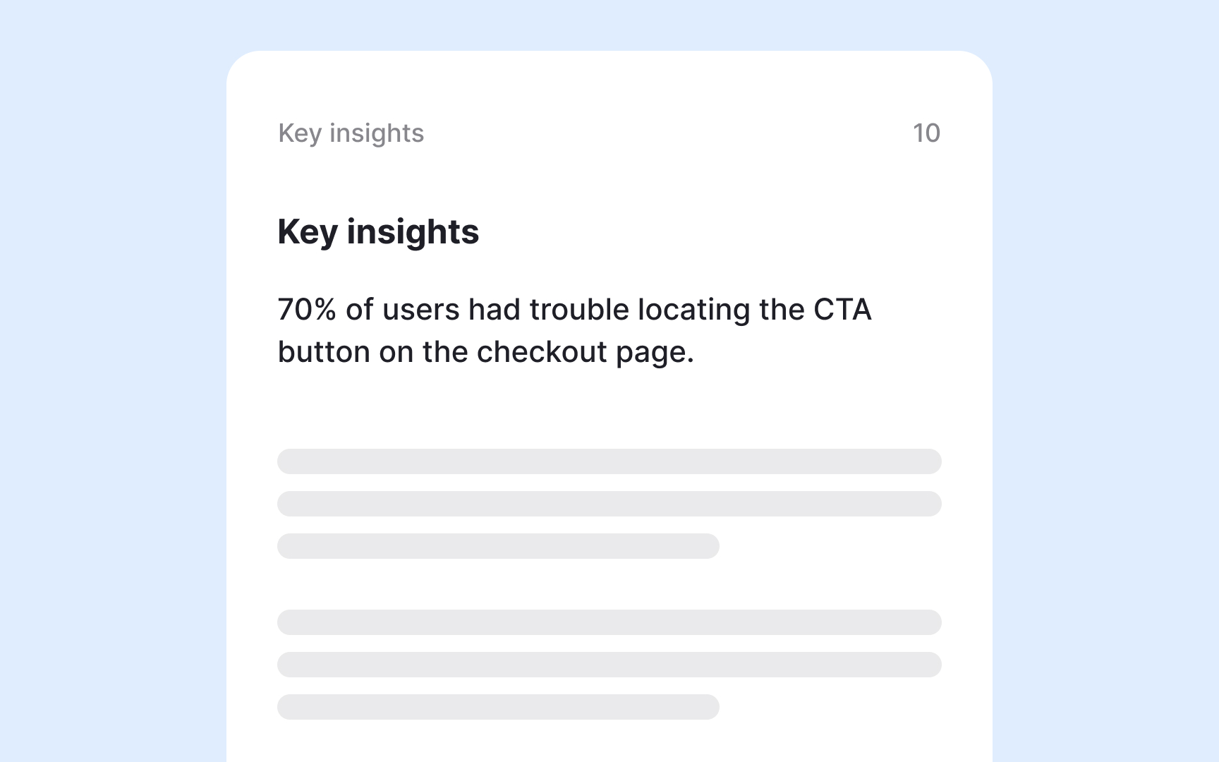
Detailed insights follow with the data and analysis that led to each takeaway. This is where you show the work: the patterns you identified, how you interpreted them, and what evidence supports your conclusions. Include a link to your research repository for anyone who needs to go even deeper into the raw data.
Throughout both sections, lean on visuals. Charts, heatmaps, and flow diagrams make patterns easier to spot, especially for readers with limited UX background. Direct participant quotes and video clips add another layer of credibility, grounding your interpretations in real user voices rather than researcher judgment alone.
Pro Tip! Write key insights in plain language. If a stakeholder outside your team can't grasp it in one read, it needs to be clearer.
How to write data-backed recommendations
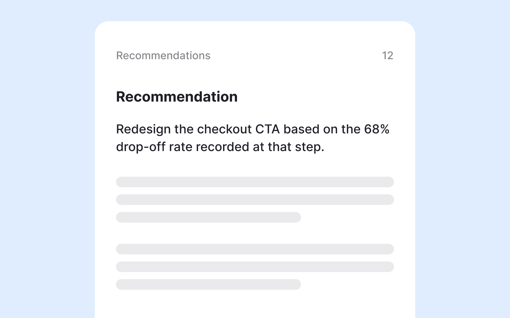

The recommendations section is where research earns its place in the product roadmap. Every recommendation must tie back to your data. If your study revealed that users abandon checkout because they cannot find the CTA, recommend a redesign of that specific element and reference the numbers that support it. That link between evidence and action is what makes a recommendation credible rather than a guess.
Prioritize your recommendations so teams know where to start. Not every issue carries the same weight, and stakeholders need a clear sense of what to tackle first. When multiple problems compete for attention, ordering them by impact helps product and design teams allocate their effort where it matters most.
If the data is not yet strong enough to support a definitive call, say so and recommend further research as the next step. That is still a useful output. What to avoid is letting personal judgment fill the gaps. Recommendations that reflect the researcher's preference rather than user data undermine the objectivity on which the entire report was built.
How to structure a report by research themes
When your research spans multiple topics, structuring the report by themes makes it easier for stakeholders to follow and act on what they find. Rather than presenting a flat list of observations, a theme-based structure shows how insights cluster around the issues that matter most.
If you ran an affinity mapping session during analysis, your themes are likely already defined. Pick the 3-5 that had the strongest influence on your recommendations and lead with those. Themes that surfaced repeatedly across participants carry more weight than isolated observations, so the order in which you present them sends a clear signal about priority.
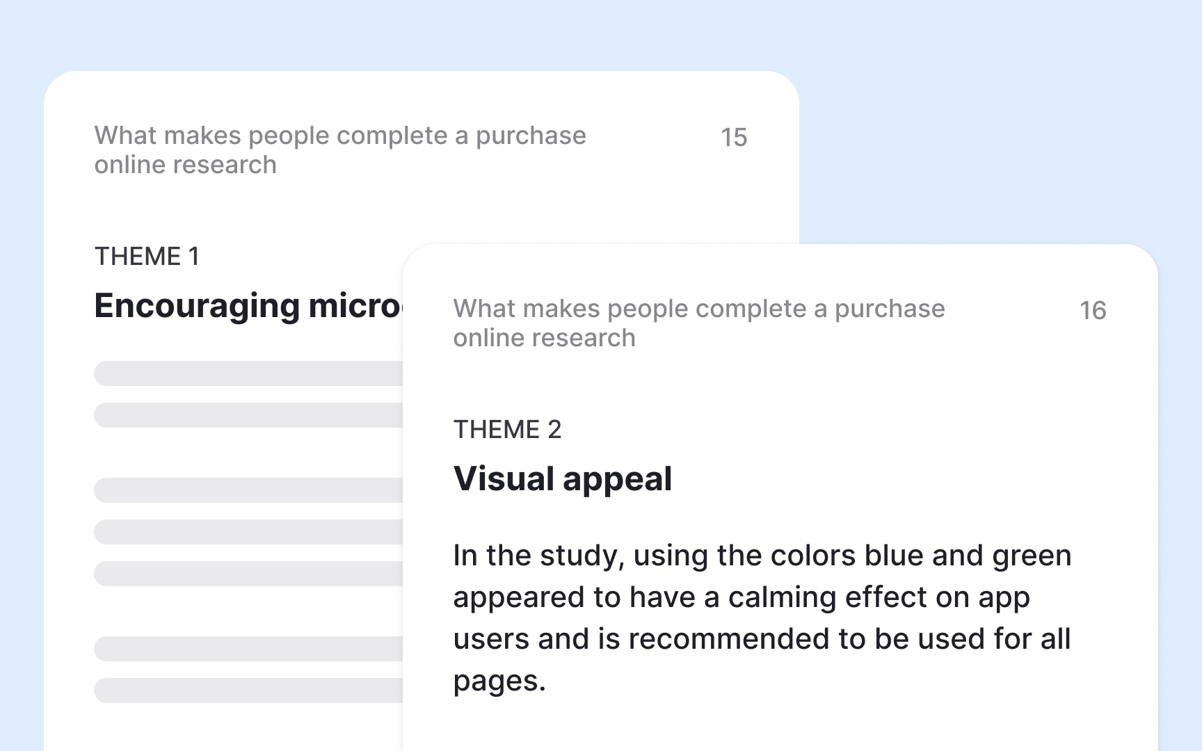
For each theme, include a title, a short summary for readers who want the key takeaway fast, and a deeper section for those who want to understand the supporting data.[3]
Pro Tip! Themes that don't connect to your research goals or recommendations are better left out. Breadth is not a virtue in a research report.
Present a research report as a slideshow
A slide deck is often a better fit than a written report when presenting research live to a room of stakeholders. Slides force you to break information into focused chunks rather than long paragraphs, which makes findings easier to follow and discuss in real time. They also work well for async sharing when paired with a short recorded walkthrough.
The structure of a slideshow should mirror that of a written report. Open with the study overview, move through insights, and close with recommendations. What changes is density: each slide should carry one idea, supported by a visual, a participant quote, or a key data point. Anything that needs more context belongs in the appendix or a linked repository, not on the slide itself.
Presentation choices shape how findings land. A clear visual hierarchy, legible typography, and consistent slide design reduce the cognitive load on your audience and keep attention on the content. Slides that are cluttered or visually inconsistent pull focus away from the insights. A well-designed deck signals that the research behind it was handled with the same level of care and intention.[4]
How to deliver a research presentation effectively
How you present research matters as much as what you present. Data alone rarely moves people to act. A narrative does.
Frame your research as a story. Open with the problem that triggered the study, walk your audience through what you found and why it matters, and close with a clear direction forward. Grounding abstract data in a concrete user scenario helps too. Saying that 70% of users abandon checkout lands differently when the audience can picture a specific user hitting that wall.
A few things to keep in mind when presenting:
- Lead with insights, not process. Stakeholders want to know what you found and what to do next, not how you got there. Save the methodology details for those who ask.
- Stay concise. Cut anything that does not directly support your recommendations. If a finding matters but does not fit the main narrative, it belongs in the appendix.
- Prepare for questions. Think about where your methodology or sample size might invite scrutiny and have honest, concise answers ready. Anticipating pushback shows confidence and keeps the conversation focused on the insights.
Pro Tip! Rehearse with someone outside your team. If they can follow the story and understand the recommendations, your stakeholders will too.


