

What is a banner?
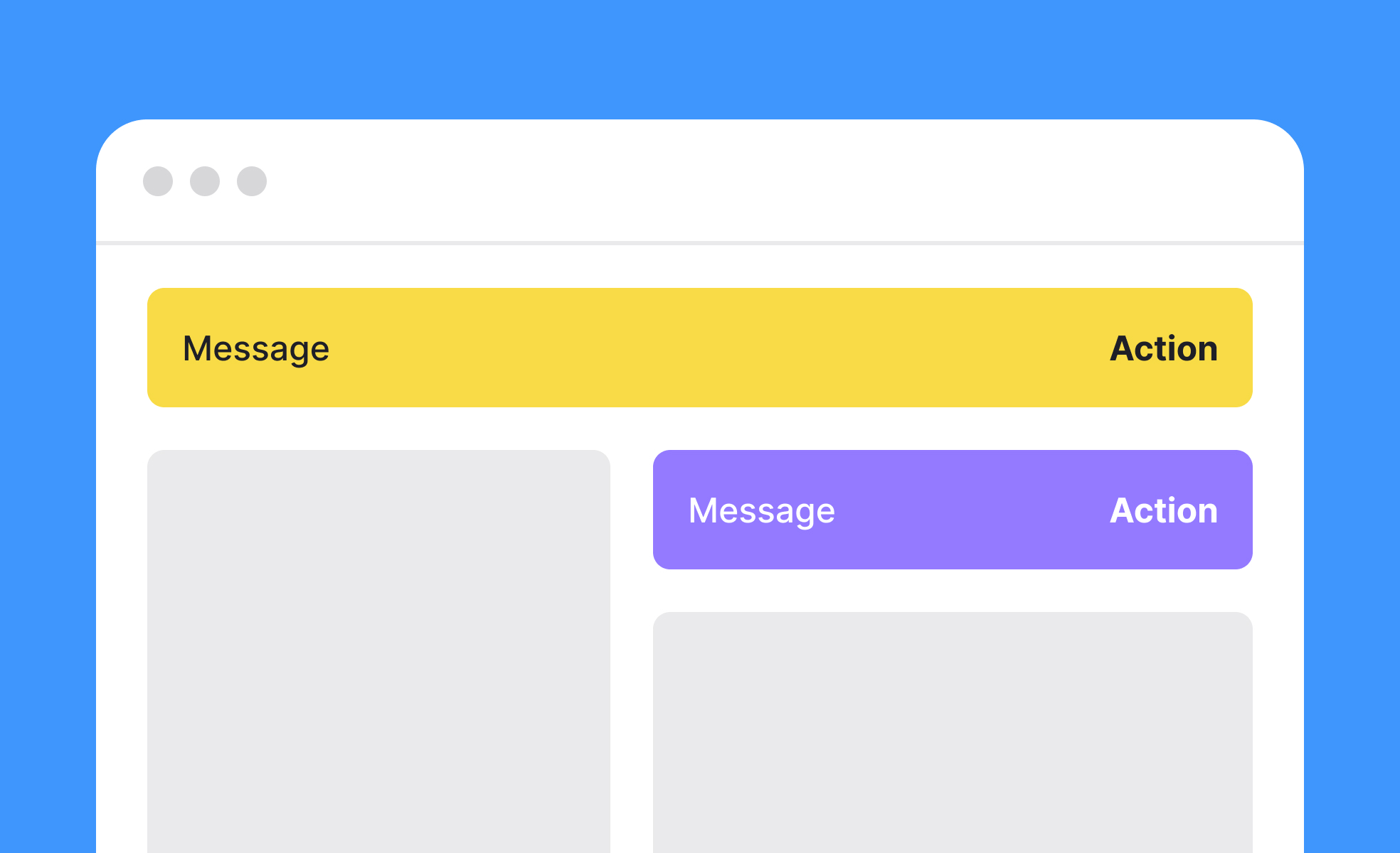
A banner is a UI component that surfaces a message to the user within the interface itself, rather than through an external channel like email or push notification. It occupies a defined area of the screen, usually a horizontal strip at the top or bottom of a page, and communicates something the user needs to see at that moment in their session.
The category covers a wide range of use cases. A system alert banner might tell a user that their session is about to expire or that a service is experiencing degraded performance. A feature announcement banner might introduce a new capability users haven't yet discovered. A promotional banner might offer a discount or highlight a time-limited offer. An informational banner might explain an important change to how a product works.
What these have in common is that they inject a message into the user's experience without taking them away from it. The user can read the banner and continue what they were doing, dismiss it, or act on it, all without navigating away from the current screen.
What are the different types of banners?
Not all banners serve the same function, and the distinctions between types have practical design implications.
Informational or system banners communicate status, changes, or conditions relevant to how the product is working. A maintenance warning, an account security alert, or a notice that a feature has been deprecated all fall into this category. These banners typically cannot be dismissed until the user has taken an action or the condition has resolved.
Feature and announcement banners introduce users to new functionality or changes to existing behavior. They're most useful when users are likely to encounter the new feature in their current session and would benefit from immediate awareness. Google Workspace and Spotify regularly use this pattern when rolling out updates or new capabilities.
Promotional and marketing banners surface offers, trials, or upsell opportunities. They're common in e-commerce and SaaS products and are typically dismissible. The design tension here is between commercial visibility and the risk of training users to ignore in-product messaging.
Cookie consent and compliance banners are a distinct category, required by regulation in many jurisdictions. Their design is governed as much by legal requirements as by UX preferences, and they often need to persist until the user has made an explicit choice.
What makes a banner effective?
Several factors separate banners that users engage with from banners that get ignored or cause frustration.
Relevance is the most important factor. A banner shown to a user at a moment when it directly addresses what they're trying to do, or a significant condition affecting their session, has a high chance of being read and acted on. A promotional banner shown to a user in the middle of a critical task competes with their attention rather than supporting it.
Timing and trigger logic determine whether a banner appears in the right context. Banners triggered by specific user actions, session states, or account conditions are more relevant than banners shown to all users at all times. A banner that appears only when a user's free trial is within three days of expiring is more likely to be read and acted on than one shown from the start of every session.
Clarity and brevity are essential. A banner has limited screen real estate and competes with the rest of the interface for attention. The message should communicate its core point in one or two sentences, with a clear call to action where one is needed.
Dismissibility signals respect for the user's attention. Most banners should be dismissible, and the dismissal should be remembered so the same banner doesn't reappear immediately. Banners that return on every page load or session even after dismissal erode user trust and contribute to banner blindness.
What is banner blindness?
Banner blindness is the phenomenon where users learn to ignore certain areas of a screen because those areas have historically contained low-value or repetitive content. It was first documented in the context of display advertising, but it applies equally to in-product banners.
It develops through repetition. If a user dismisses the same announcement banner every day for a week, they stop reading it and start reflexively closing it. If a product consistently surfaces banners that aren't relevant to what the user is doing, users learn to treat all banners as low-priority noise and stop processing their content.
The practical implication is that banner effectiveness is not just a function of individual banner design but of how banners are used across the product over time. Overusing the channel, or using it for low-relevance messages, degrades its effectiveness for high-importance messages. Teams that treat the in-product banner as a low-effort communication channel eventually find it stops working.
How should banners be designed for accessibility?
Banners carry specific accessibility requirements that are sometimes overlooked when they're treated as secondary interface elements.
Color should not be the sole indicator of a banner's type or urgency. An error banner that is red and nothing else conveys no information to users with color blindness. Pairing color with an icon (a warning triangle, an information circle, a checkmark) and a text label that explicitly states the type of message ensures all users receive the same information.
Contrast between the banner's text and its background must meet WCAG minimum ratios regardless of the banner's color or tone. Light text on a medium-saturation color is a common failure point.
Screen readers should announce the presence of new banners. Using role="alert" for urgent messages ensures that assistive technologies announce banner content to users who are navigating the page non-visually. Less urgent banners can use role="status" for a less intrusive announcement.


