

What is a carousel?
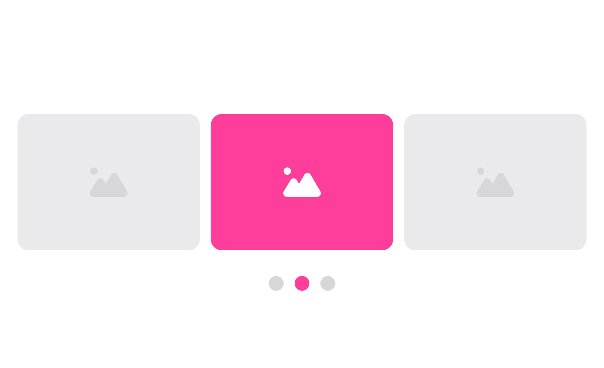
A carousel is a UI component that cycles through a set of content items within a fixed display area. Users move between items by clicking arrows, swiping, or tapping navigation dots, or the carousel advances automatically on a timer. Each item, whether an image, card, or slide, occupies the full display area while the others are hidden or partially visible.
Carousels are most commonly found on e-commerce homepages showing seasonal promotions, product pages displaying multiple angles of an item, streaming platforms organizing content into horizontal rows, and portfolio or media sites presenting visual work. Netflix's category rows are carousels. Amazon's product recommendation sections are carousels. Most large consumer products use the pattern in some form.
The appeal for product and marketing teams is clear: a carousel allows multiple pieces of content to occupy a single prime location, which is particularly useful when stakeholders need multiple promotions or messages to appear above the fold. The usability evidence around carousels is more complicated.
When do carousels actually work?
Carousels are not universally bad: the context and content type matter significantly.
They work well for product image galleries, where a user has already selected an item and wants to browse multiple views. The user's intent is exploratory and the content is homogeneous (all images of the same product), so sequential navigation makes sense. This is the carousel use case with the strongest usability evidence.
They work well for horizontal content rows in applications like Netflix, where users expect to scroll sideways through a category and the pattern is familiar from heavy prior use. In this context, the carousel isn't a hero placement competing with other content; it's the primary navigation mechanism for a category.
They work for review or testimonial sequences where users are expected to read one item at a time and may want to browse through several. The content is naturally sequential and the quantity makes a grid impractical.
They work less well as homepage hero promotions where content varies across slides and the team is relying on users scrolling through multiple items to see all their messages. The research is clearest here: most users see only the first slide.
What are the most important design requirements for a carousel?
If a carousel is the right choice for a given context, several design decisions determine whether it serves users well.
- Navigation controls must be visible, large enough to tap comfortably, and grouped logically. Progress indicators that replace small dots with labels or thumbnails give users a meaningful sense of what's coming rather than a count of undifferentiated items. Arrows should be grouped together above or below the carousel, not on opposite edges of the display area, so users can move in either direction without large pointer movements.
- Autoplay, if used at all, should run at a slow interval (5 to 7 seconds per slide), should pause when the user hovers or focuses on any element within the carousel, and must include visible pause and stop controls. The W3C's WCAG 2.1 requires that any moving content that lasts more than 5 seconds can be paused, stopped, or hidden by the user.
- Each slide must be independently meaningful. A carousel where the second slide's content only makes sense in the context of the first creates an accessibility problem for users who arrive mid-cycle, and a general comprehension problem for users who don't see all slides.
What accessibility requirements apply to carousels?
Carousels are one of the most accessibility-challenged patterns in common use, and the failures are predictable enough to warrant explicit attention.
- Autoplay carousels fail WCAG 2.1 Success Criterion 2.2.2 (Pause, Stop, Hide) if they don't provide pause and stop controls. This is a Level A requirement, the most foundational tier.
- Keyboard navigation must be fully supported. Users who navigate by keyboard should be able to reach the carousel, move between slides using arrow keys or Tab, and activate navigation controls using Enter or Space. Without this, the pattern is effectively inaccessible to keyboard users.
- ARIA attributes are required for screen reader support. Each slide should have a meaningful label. The carousel container should be marked as a region with a descriptive name. The current slide number and total count should be announced programmatically so screen reader users know their position in the sequence without having to count manually.
- Focus management when a slide changes automatically requires careful implementation. If the keyboard focus is inside the carousel when it auto-advances, the focus should not move unexpectedly, which would be disorienting.


