

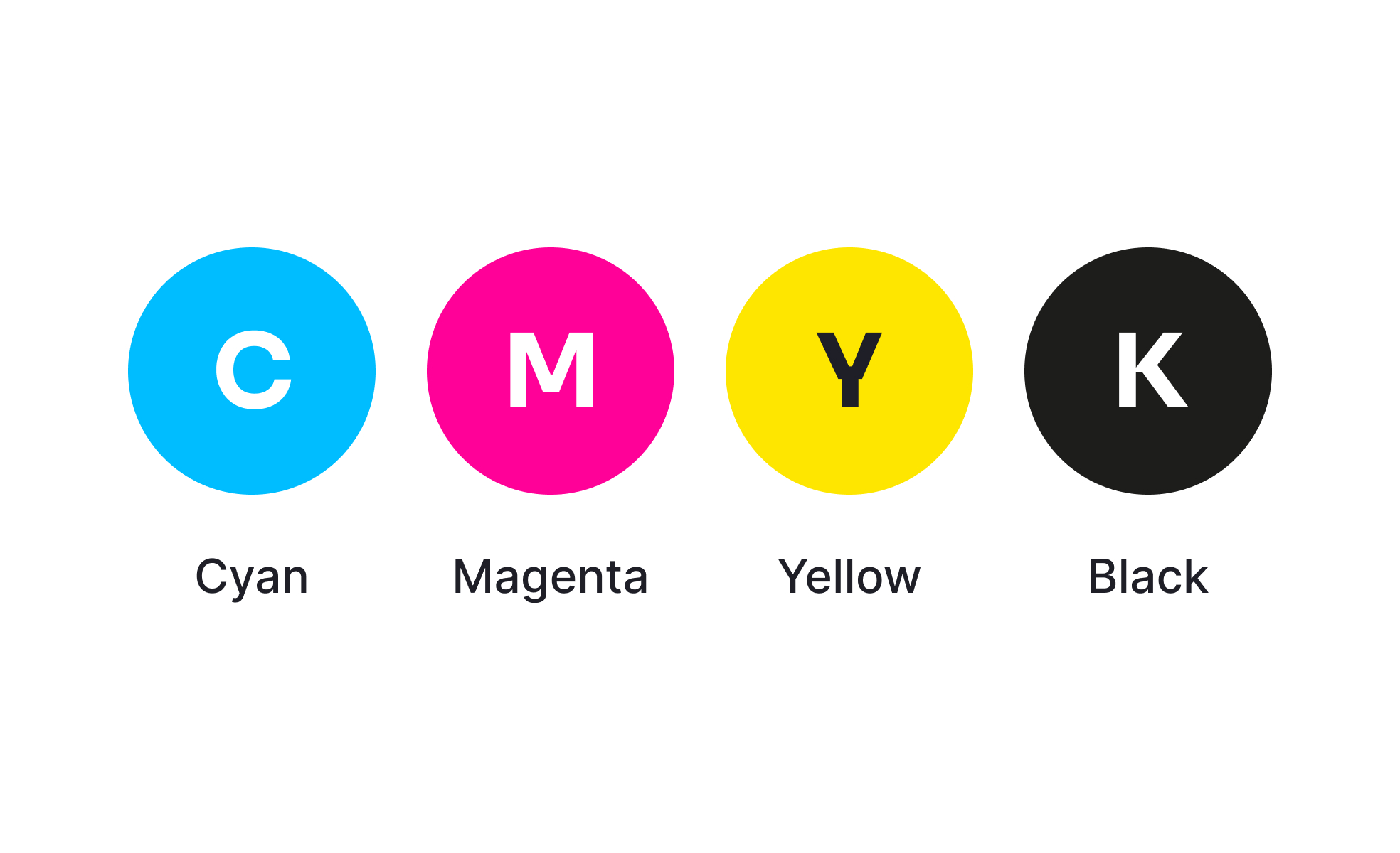
CMYK is the standard color model used for print production, relying on the subtractive mixing of four inks: cyan, magenta, yellow, and black. Each ink is layered in varying amounts to produce a wide range of colors on paper. Unlike the RGB model, which uses light to display color on screens, CMYK is based on pigment and absorption, making it the go-to method for printers, packaging, and other tangible materials.
For UX and UI designers, CMYK is not always part of everyday work, since most digital products rely on RGB. However, when designs transition from screen to print, for example, in branding materials, product packaging, or event collateral, the CMYK model becomes essential. Designers need to ensure that the colors they select in digital tools translate consistently when printed, which often requires adjustments or proofing.
A classic challenge is color shifting, where bright RGB colors lose vibrancy when converted to CMYK. For instance, neon greens and vivid blues often appear dull in print because they cannot be reproduced exactly with CMYK inks. Designers must account for these limitations, often working with print specialists to select spot colors or Pantone alternatives when brand accuracy is critical.
Real-world examples highlight the importance of CMYK accuracy. Large consumer brands like Coca-Cola or Nike invest heavily in ensuring that their signature reds, blues, or other key colors appear consistently across billboards, packaging, and digital ads. This consistency builds brand recognition and trust, showing how technical details in color management influence global perception.
Tools like Adobe Illustrator, Photoshop, and InDesign provide features to switch between RGB and CMYK workspaces, previewing how designs will look when printed. Soft proofing, test prints, and calibration of monitors are common practices to minimize errors. Without these precautions, even minor discrepancies can cause costly reprints or off-brand visuals.
Learn more about this through the CMYK Exercise, within the Color Terminology Lesson, a part of the Design Terminology Course.
Key Takeaways
- CMYK is the standard color model for print design.
- It differs from RGB, which is used for digital displays.
- Designers must adjust colors to prevent shifts between digital and print.
- Consistency across print and digital is critical for branding.
- Tools like Adobe software help manage CMYK workflows.


