

What is a tint?
A tint is a lighter variation of a color, created by adding white to a pure hue. The more white is added, the lighter and less saturated the resulting color becomes. A deep navy blue becomes sky blue with enough white mixed in. A saturated red becomes a soft pink.
Tint is one of the ways to modify a hue in classical color theory. Adding white produces a tint. Adding black produces a shade, making the hue darker and deeper. Adding gray produces a tone, making the hue more muted without necessarily making it lighter or darker. Understanding the distinction is useful because tints, shades, and tones serve different design purposes and create different visual effects even when they derive from the same base color.
In digital design, tints are almost never created by literally mixing white with a color. Instead, they're achieved by adjusting the lightness value in HSL color space, increasing opacity over a white background, or defining percentage-based variations in a color scale.
How are tints used in interface design?
Tints do significant functional work in UI design by extending the expressive range of a single hue without requiring entirely separate colors.
In interactive components, tints create hover states, pressed states, and disabled states. A button in its primary color might shift to a lighter tint when hovered, communicating interactivity without changing color entirely. A disabled button using a tint of the primary color signals unavailability while maintaining the color family's visual presence.
In backgrounds and surfaces, tints allow a brand color to appear as a background without the intensity of the full color. A form section with a very light tint of the brand's primary color has more visual character than a plain white or grey background, while still being readable and not competing with the foreground content.
In status and feedback states, tints create the background for alert, success, warning, and error cards. A green success message with a light green tinted background uses color to reinforce meaning without the visual weight of a fully saturated green field. The same pattern is common for blue informational banners and yellow warning boxes.
In typography hierarchy, a tint of the primary text color creates secondary or tertiary text. Body text might be full black or very dark grey; supporting text, captions, or timestamps might use a lighter tint to signal lower hierarchy without introducing a different color.
How do tints relate to design systems and color tokens?
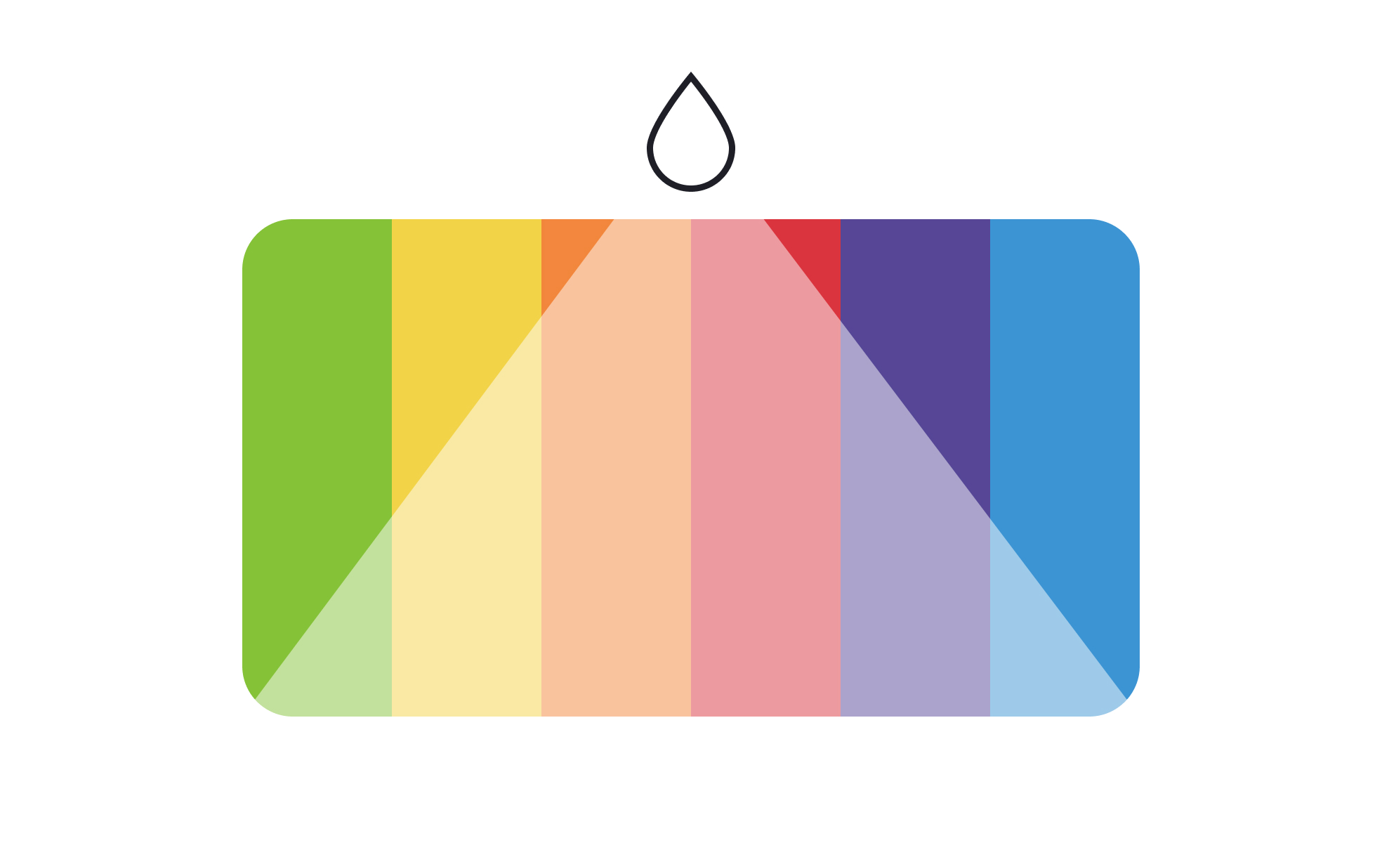
Modern design systems don't define single hex codes for brand colors; they define scales. A color scale is a range of tints and shades derived from a single hue, typically numbered from lightest to darkest: 50, 100, 200, 300, 400, 500, 600, 700, 800, 900 in many popular systems, where 500 is often close to the base color.
Tailwind CSS's color system, Material Design's color system, and most custom design tokens follow this pattern. Each step in the scale is a tint or shade of the base hue. Designers reference scale steps rather than specific hex codes: brand-200 for a very light tint, brand-600 for a darker shade. This naming convention separates the color value from its semantic role and makes it easier to maintain consistency as values change.
Semantic tokens sit on top of the scale: color-surface-brand might resolve to brand-100 in light mode and brand-900 in dark mode. This layered system means the same semantic purpose can map to different tints or shades depending on the active theme, without requiring separate component definitions for each mode.
What accessibility considerations apply to tints?
The accessibility risk with tints is contrast. As a color becomes lighter, its contrast against white or very light backgrounds decreases. Text in a light tint of the primary color placed on a white background can easily fall below WCAG minimum contrast ratios, even if the full-saturation version of that color would have passed.
WCAG 2.1 requires a minimum contrast ratio of 4.5:1 for normal text and 3:1 for large text (18pt or 14pt bold) against their background. Tinted colors used for text must be tested against these thresholds, not assumed to pass because they're derived from a primary color that passes at full saturation.
The same issue applies to interactive elements with visible boundaries. A button with a very light tint as its background color needs sufficient contrast between its label text and the tinted background, and between the button's visual boundary and the surrounding page background.
Tints used for purely decorative purposes, backgrounds that carry no meaning and have no text placed on them, have no WCAG contrast requirement. The requirement activates when content is placed on the tinted surface or when the tint itself is used to convey meaning.
How do tints contribute to brand identity?
A tint system is one of the most effective tools for extending a brand color across a product without overwhelming it.
Most brand colors are selected at a specific saturation and lightness that works well in a logo, a hero section, or a primary call-to-action. That same color applied as a page background or a card fill is often too intense for comfortable use at scale. Tints of the brand color give the design team a range of lower-intensity variations that maintain the brand's color family while being appropriate for larger surface areas.
Consistent use of tints from a defined scale creates visual cohesion: different sections, components, and states all draw from the same color family, which reinforces brand recognition even when no individual element is using the primary brand color at full intensity.


