

What is a shade?
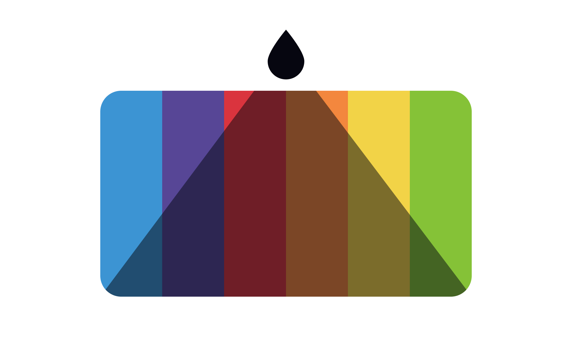
A shade is a darker variation of a color, created by adding black to a pure hue. Red becomes burgundy or maroon when shaded. Blue becomes navy. Green becomes forest green. The degree of darkening depends on how much black is introduced: a small amount produces a subtly deeper version of the original color, while a large amount produces a very dark color that may barely resemble the original hue.
Shade is one of 3 modifications defined in color theory. Adding white produces a tint, making the color lighter. Adding gray produces a tone, making the color more muted and neutral. Adding black produces a shade, making the color darker and more saturated in perceived weight. All three techniques start from the same base hue and produce colors that remain recognizably related, which is what makes them useful for building palettes with internal coherence.
In digital design, shades are produced by reducing the lightness value in HSL or HSB color space, or by defining specific steps in a color scale. The actual color property changed to produce a shade depends on the tool and color model in use.
How are shades used in interface design?
Shades serve several specific functions in UI design, primarily related to hierarchy, depth, and state communication.
- In typography, shades of the primary text color create hierarchy. The darkest version of a neutral or near-black serves as primary body text. A slightly lighter shade serves as secondary text, captions, or metadata. A lighter shade still serves as disabled or placeholder text. This system creates legible hierarchy within a single color family without introducing additional hues.
- In interactive components, shades communicate states. The default state of a button might use the primary brand color. The hover state might use a shade of that color, darker and slightly more intense, signaling that the element has responded to the interaction. The pressed or active state might use an even darker shade, giving a sense of physical depression. This progression from base to shade tracks the interaction states that users expect.
- In background surfaces and depth, shades create layering. A card on a page might have a slightly shaded background compared to the page surface behind it, creating visual separation through a darker variation of the same neutral rather than through an entirely different color. This is common in products that use a monochromatic depth system rather than shadows.
- In semantic color systems, shades provide the darker options for states that need additional weight. A success state might use the medium green of a scale for the background but the darkest green shade for the icon or text within it, ensuring readability and creating emphasis.
How do shades fit into color scales and design systems?
Modern design systems don't define colors as single values. They define them as scales that include both tints and shades of each color family, typically numbered from lightest to darkest.
A typical scale for a brand color might run from 50 (very light tint, nearly white) through 900 (very dark shade, nearly black), with the base color somewhere in the 400 to 600 range. Each step is a tint or shade of the base hue. Designers reference scale positions when specifying colors: blue-700 for a dark shade used in text, blue-100 for a light tint used as a background.
Design tokens give these scale positions semantic meaning: color-text-primary might resolve to neutral-900, a very dark shade used for primary body text. color-interactive-hover might resolve to brand-700, a dark shade of the brand color used for hover states. This separation of semantic purpose from specific color value means that changing the scale value of brand-700 updates every component that uses color-interactive-hover automatically.
In dark mode, shades and tints are typically remapped. Colors that appear as dark shades in light mode (heavy text colors, deep backgrounds) are replaced by lighter tints in dark mode, because the visual logic reverses on a dark surface. Semantic tokens handle this mapping transparently, so components don't need separate dark mode implementations.
What accessibility considerations apply to shades?
Shades generally improve accessibility compared to their base colors when used for text on light backgrounds, because darker colors have more contrast against white or light-colored surfaces. Moving from a medium blue to a dark shade of that blue for text on a white background increases the contrast ratio and makes the text more readable.
The accessibility risk with shades appears when they're used on dark backgrounds. A dark shade on a dark background may have insufficient contrast, even though the same shade on white would be perfectly legible. This is the most common accessibility oversight in dark mode implementation: teams increase contrast for light mode by using darker shades, then fail to check that those shades have adequate contrast against the dark backgrounds used in dark mode.
WCAG 2.1 minimum contrast requirements apply regardless of whether the foreground or background color is a shade, tint, or base hue: 4.5:1 for normal text, 3:1 for large text, and 3:1 for UI component boundaries that convey information.


