

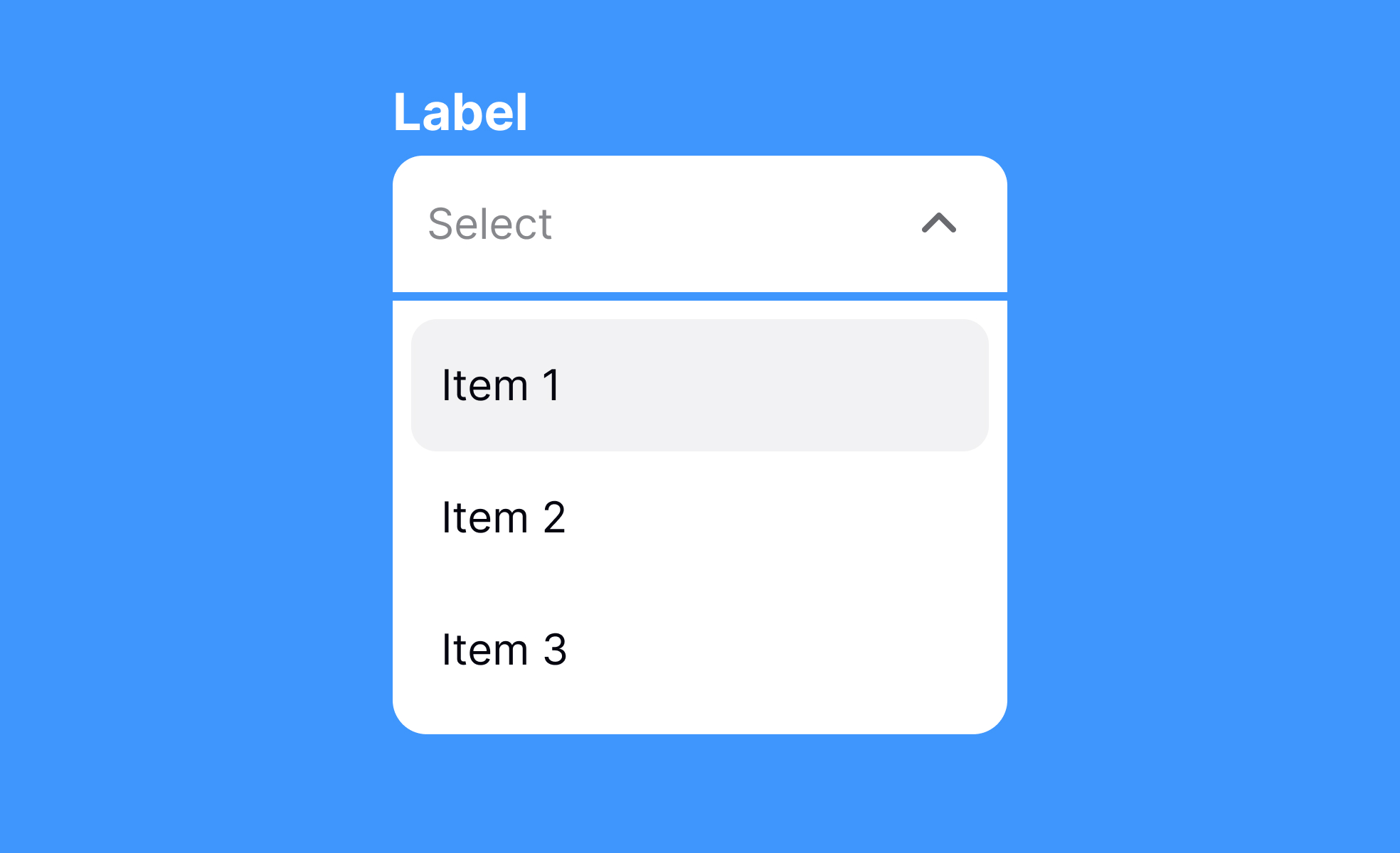
Dropdowns are one of the most common UI elements, used to present multiple choices without overwhelming screen real estate. They hide content until triggered, making interfaces cleaner and more efficient. From selecting a country in a form to filtering products in an e-commerce store, dropdowns balance functionality with space-saving design.
In UX, dropdowns reduce clutter but must be used carefully. Long lists can frustrate users, especially on mobile devices where scrolling through dozens of options is tedious. Designers often use autocomplete within dropdowns to improve usability. This hybrid approach, seen in Google’s search suggestions, makes selection faster and reduces errors.
From a product management perspective, dropdowns affect workflows and user experience metrics. Poorly designed dropdowns can lead to drop-offs in conversion funnels, while optimized versions can streamline task completion. A well-known example is Facebook’s privacy settings, where dropdowns were simplified after user feedback revealed that hidden complexity discouraged engagement.
Dropdowns also support contextual filtering. In dashboards, dropdowns help switch between time frames or data sets without cluttering the interface with multiple visible options. This keeps the design lightweight while giving users control.
However, dropdowns come with accessibility challenges. For screen reader users, improperly coded dropdowns can be confusing or even inaccessible. Adopting ARIA attributes and ensuring proper keyboard navigation helps mitigate these risks. Teams that prioritize accessibility often redesign dropdowns to behave more like native controls across devices.
Real-world design showcases how dropdowns can improve engagement. In booking systems, for example, carefully structured dropdowns let users select dates, times, or ticket types quickly. When tested against radio buttons, dropdowns often perform better in terms of space efficiency, but only when the options are limited and clearly defined.
Learn more about this in the Dropdowns Exercise, taken from the Designing Mobile Selection Controls Lesson, a part of the Mobile Design Course.
Key Takeaways
- Dropdowns save space by hiding multiple options.
- Useful for filtering, selection, and navigation tasks.
- Long lists require autocomplete to improve usability.
- Poor design can hurt conversions and task success.
- Accessibility requires semantic markup and ARIA attributes.


