

What is padding?
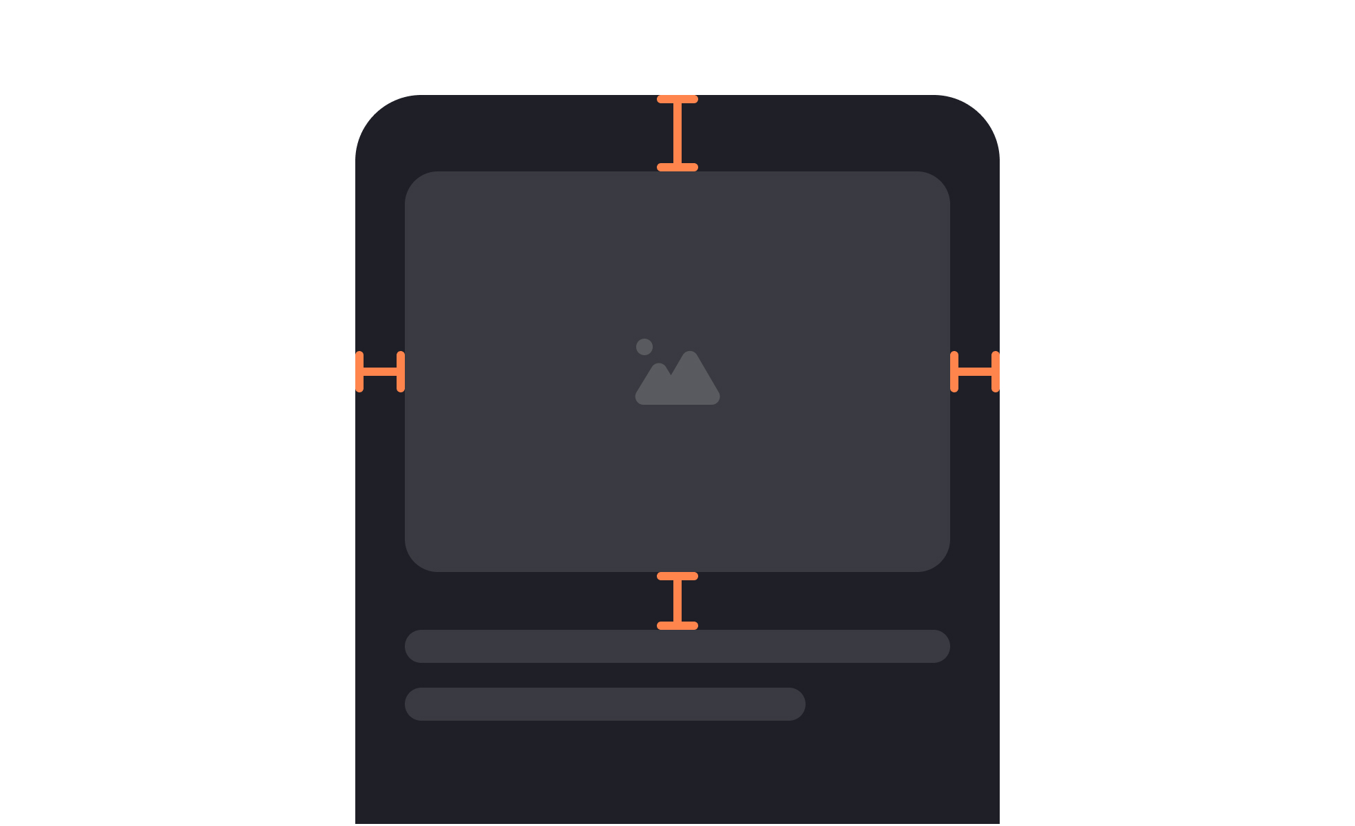
Padding is the internal space between the content of a UI element and its outer boundary. It's the gap between the label inside a button and the button's edge, between the text in a card and the card's border, between the text in a form field and the field's frame.
Unlike margin, which creates space between elements, padding creates space within an element. A button with generous padding has more distance between its label and its edges; a button with minimal padding has the label sitting close to the edge. The outside dimensions of the button may be the same if the container adjusts to the content, or may differ if the container has a fixed size.
Padding is one of the most consequential decisions in component design, precisely because it affects so many qualities at once: perceived size, visual weight, readability, touch target area, and the overall sense of a layout as open or compressed. Many of these effects are subtle, but they accumulate across every component and screen in a product.
How does padding affect readability and visual comfort?
When content is positioned close to the edges of its container, the eye has to work harder to parse it. Text that nearly touches the border of a card or field looks cramped and creates a visual tension that registers as uncomfortable before a user consciously identifies why.
Generous padding gives content room to exist within its container naturally. The eye can focus on the content without the container's edges competing for attention. This is particularly important for bodies of text: a paragraph in a card with tight padding is harder to read than the same paragraph with comfortable interior spacing, even if the font size and line height are identical.
The relationship between padding and perceived importance is also real. A call-to-action button with ample padding looks like something worthy of tapping. The same button with minimal padding can feel incidental or uncertain about its own importance. Padding communicates visual weight, and visual weight communicates priority.
How is padding different from margin?
Padding and margin are often confused, particularly by those newer to CSS and layout design. The distinction matters for understanding how spacing affects both individual elements and the relationships between them.
Padding is internal to an element. It creates space between the element's content and its border. It's the breathing room inside the container.
Margin is external to an element. It creates space between an element's border and whatever surrounds it: adjacent elements or the edge of the parent container. It's the gap between components.
A practical example: two buttons side by side in a toolbar each have padding (the space between their labels and their edges) and a margin between them (the gap from one button's edge to the next button's edge). Adjusting the padding changes how each button looks individually. Adjusting the margin changes the relationship between them.
In CSS, padding and margin are separate properties, but they're often used together. Most layout systems and design tokens define both as part of a shared spacing scale, ensuring that internal and external spacing decisions are consistent and proportional across a product.
How does padding relate to touch targets and accessibility?
Touch target size is one of the most direct accessibility implications of padding decisions. Minimum touch target dimensions recommended by Apple's HIG are 44x44pt. Android's Material Design specifies 48x48dp. These minimums exist because below these sizes, tap error rates increase meaningfully, and users with motor impairments experience higher rates of failure.
Padding is the mechanism that allows a visually small element to meet these minimums. A text link or a small icon button might have a 16px visual icon, but surrounding it with enough padding extends the tappable area to 44x44 points or larger, without visually changing the icon's apparent size. This pattern, increasing the interactive area through padding without changing the visual appearance, is one of the most common techniques for making mobile interfaces more accessible and forgiving.
The same logic applies to keyboard-navigated interfaces. Interactive elements that appear small due to tight padding have smaller visible focus indicators, making them harder to locate for keyboard users. More generous padding extends the visible element and the focus ring along with it.
How do design systems handle padding?
In design systems, padding is almost always defined as part of a spacing scale rather than specified as arbitrary pixel values on individual components.
A spacing scale is a set of named values that follow a consistent mathematical relationship, often a base unit multiplied by a sequence of multipliers. A common base-4 scale produces values of 4, 8, 12, 16, 24, 32, 48, 64px. Components are built using values from this scale rather than ad hoc numbers, which creates a consistent rhythm across the product and makes it easy for any designer or developer to make padding decisions that stay coherent with the broader system.
Padding values are typically stored as design tokens: named variables like space-2 (8px) or space-4 (16px) that both the design file and the codebase reference. When a spacing value needs to change, updating the token propagates the change to every component that uses it, rather than requiring manual updates across every instance.
Component-level padding decisions are also documented in design systems: a button uses space-3 (12px) vertical padding and space-4 (16px) horizontal padding, for example. This documentation ensures that every designer and developer building new screens or components uses the same padding values for the same component types.


