
.svg)


Most portfolios get judged before anyone looks at the designs. A hiring manager opens ten tabs, gives each one a quick scan, and closes the ones that don't look relevant. The case studies you spent weeks on never get a real read.
Réka Nagy sees this from the hiring side all the time. She's a Product Designer at UXfolio, talks to recruiters and hiring managers as part of her job, and has reviewed thousands of portfolios. I've reviewed thousands myself, many of them while hiring for Uxcel. In our latest session, we took four real portfolios from our community and reviewed them live, the way we would if we were hiring.
Here's what we saw, organized around the three levels Réka runs every portfolio through. If you're still building the skills your case studies need to show, the product designer career path is a structured way to get them.
How a UX portfolio gets reviewed
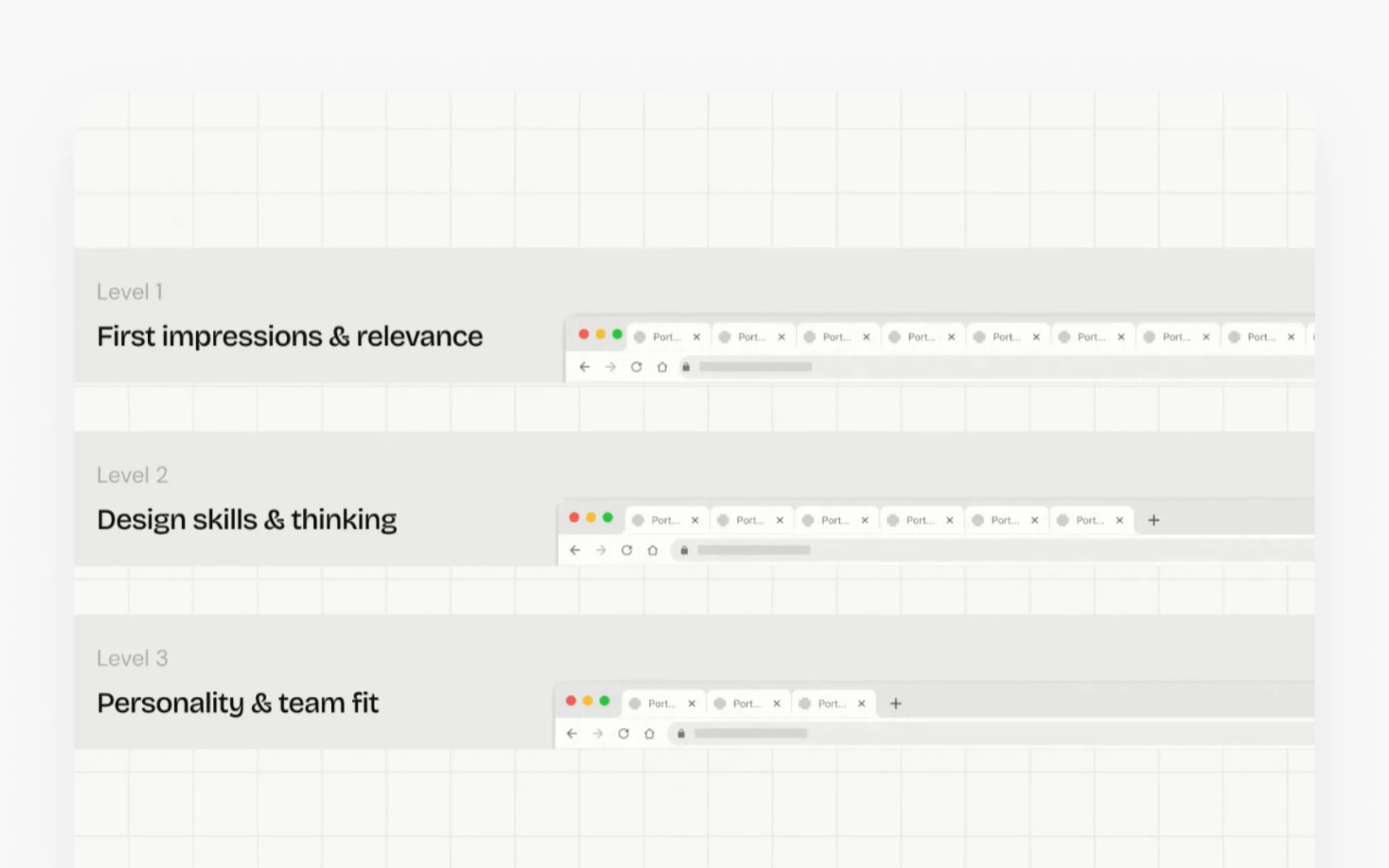
When Réka reviews for a role, each level asks a different question.
Level 1: First impressions and relevance. Is the portfolio easy to get around? Does it feel intentional? Who is this designer, how senior are they, and have they worked on anything close to this role? The match with the job description doesn't have to be perfect. She just needs to connect the dots.
Level 2: Design skills and thinking. Now she reads the case studies and asks whether you can do the work your homepage claims. What did you personally do, which decisions did you make, what changed along the way, and what happened because of your work?
Level 3: Personality and team fit. This is where the About page comes in. What would it be like to work with you, give you feedback, and get feedback from you?
Most designers underestimate how early the first cut happens. In Réka's words: "At this stage, I'm not evaluating your work yet. I'm not looking at your designs. I'm just deciding whether there is enough relevance and potential here to keep looking."
UXfolio has been studying this at scale. For its State of UX Portfolios 2026 report, the team surveyed more than 100 hiring managers and design leaders who reviewed over 5,000 portfolios this year, then interviewed several of them in depth. The full report is coming soon, and you can join the State of UX Portfolios waitlist.
Level 1: Give reviewers a reason to keep looking
Make a claim in your headline, then back it up
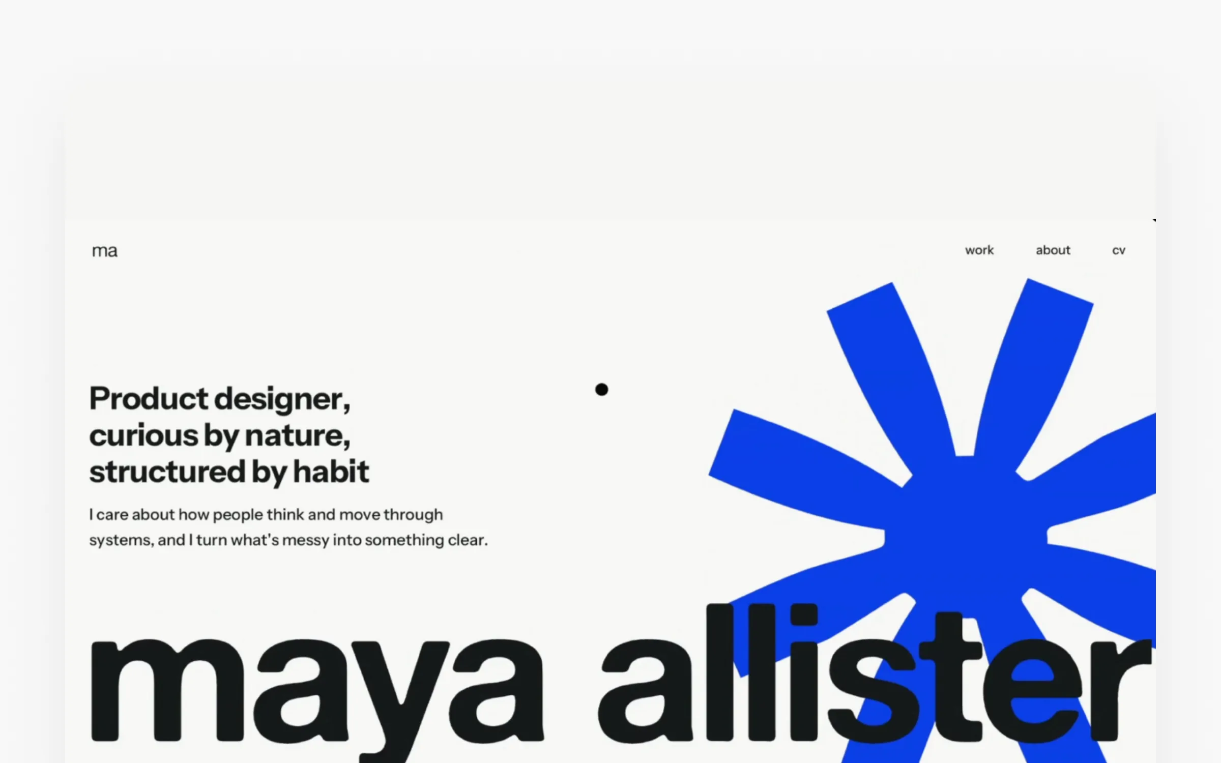
Maya Allister's portfolio opens with big, bold type and a memorable blue graphic. Her headline says something: "Product designer, curious by nature, structured by habit." Réka called it a green flag right away, with one question attached. Is there evidence for it in the case studies?
That question is the whole job of your hero section. It's where a reviewer decides if you're relevant, so make your headline specific, then make sure the work below proves it.
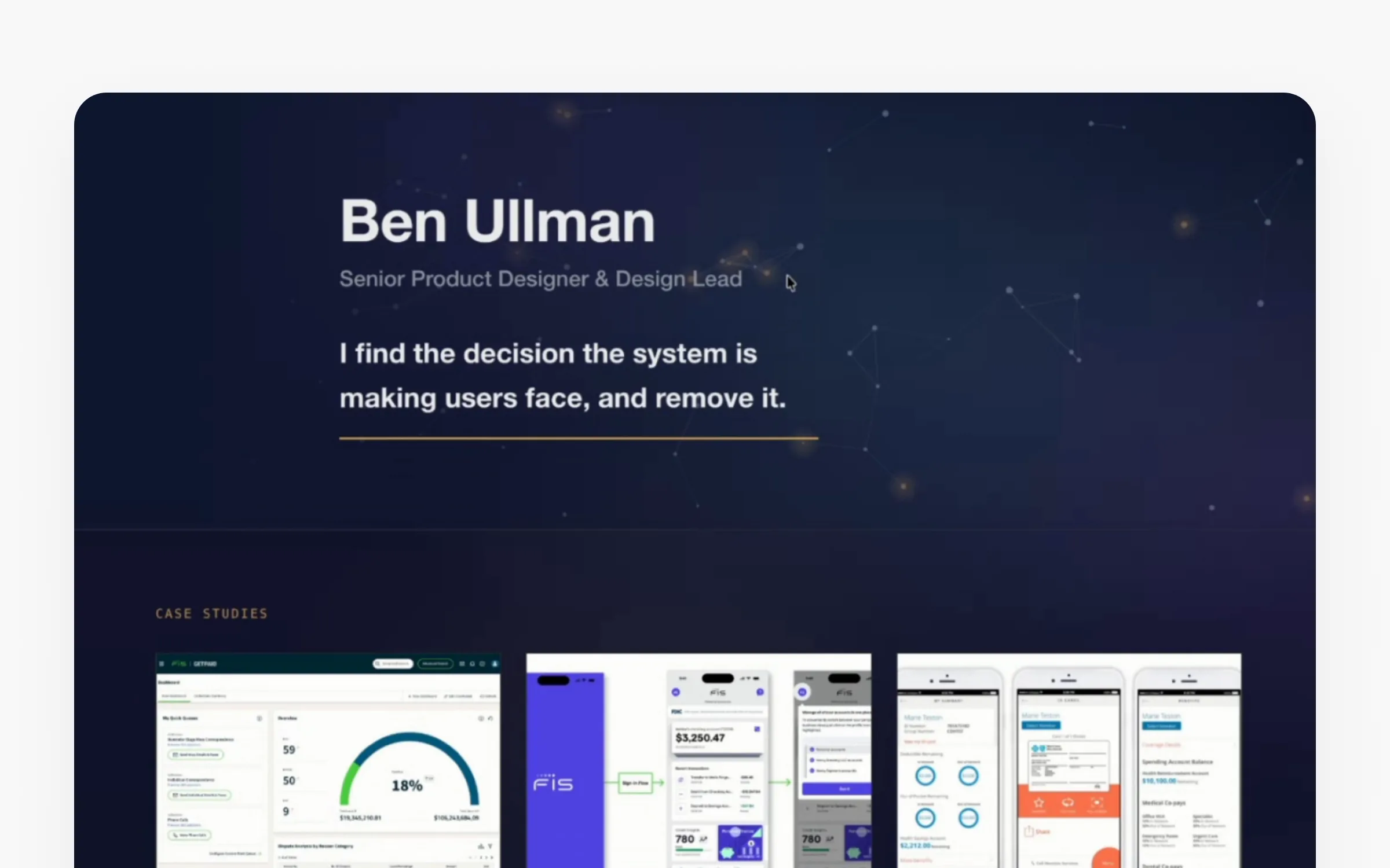
Ben Ullman's portfolio takes a quieter, more serious approach and gets the same result. He states his role up front, then makes a claim: "I find the decision the system is making users face, and remove it." His case study titles echo it. One of them reads "Removing a decision users never needed to make." A reviewer doesn't have to take his word for it, because the titles back it up.
Titles that say what you did, plus labels
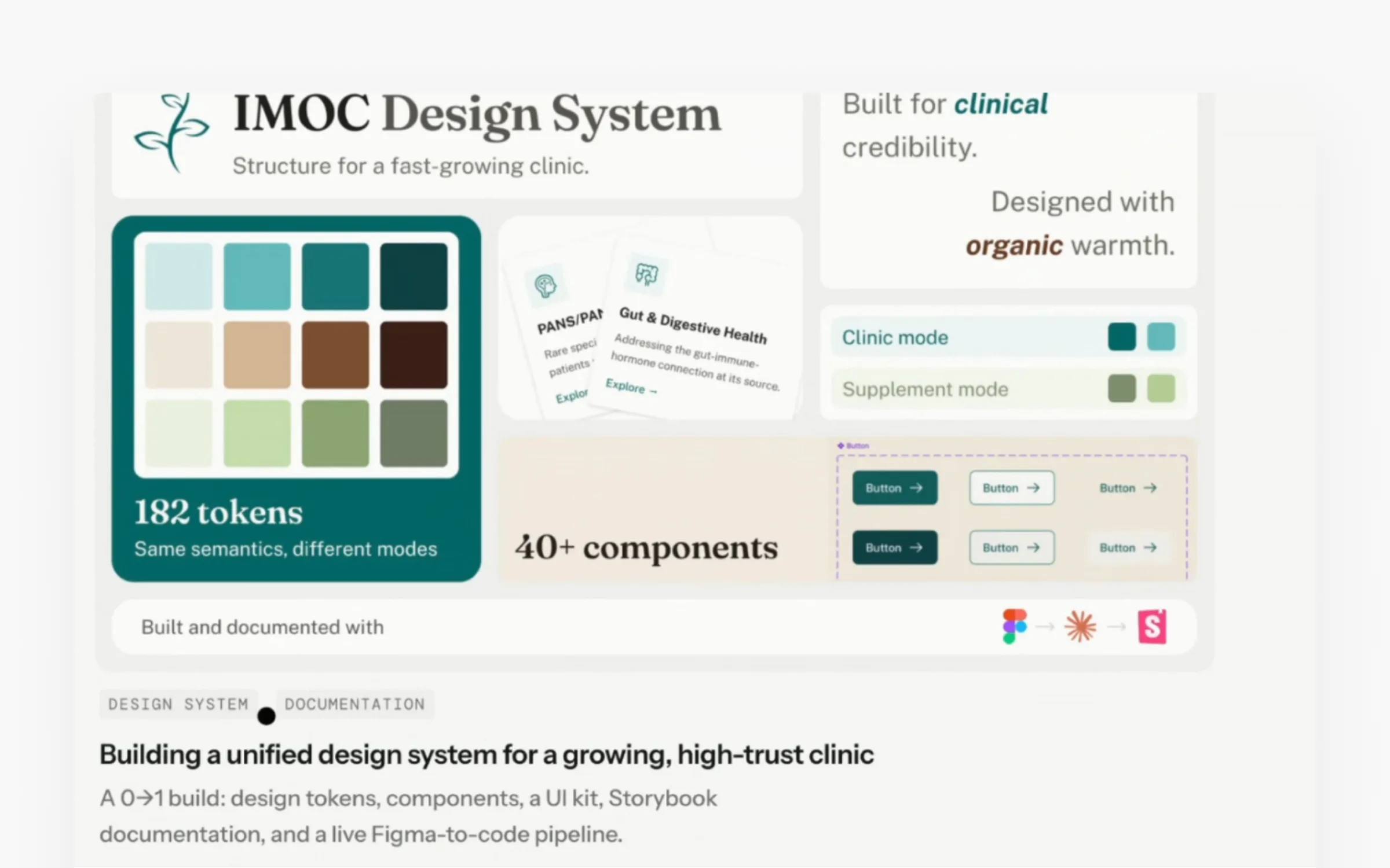
Maya's first case study is titled "Building a unified design system for a growing, high-trust clinic." Réka's point: the title goes past the deliverable or the company name. It tells her what Maya did and why the project mattered. Two labels sit above it, design system and documentation, so a reviewer knows the type of work without reading a description. Her second card does the same with industry and platform (education, mobile).
Labels make a portfolio easy to sort. If Réka is hiring for a mobile app, she opens the mobile project. If she's hiring a design systems designer, she opens the other one.
Compare that with Simay Mazmanoğlu Viara's portfolio. It's clean and modern, with a grid background, a recognizable accent color, and cohesive case study cards. The titles, though, are the apps' names, SmartShop and MoonAir, and there are no labels. The descriptions explain what the products are, but not what Simay did. As Réka pointed out, at that point the project could be UX research, UX design, or interaction design.
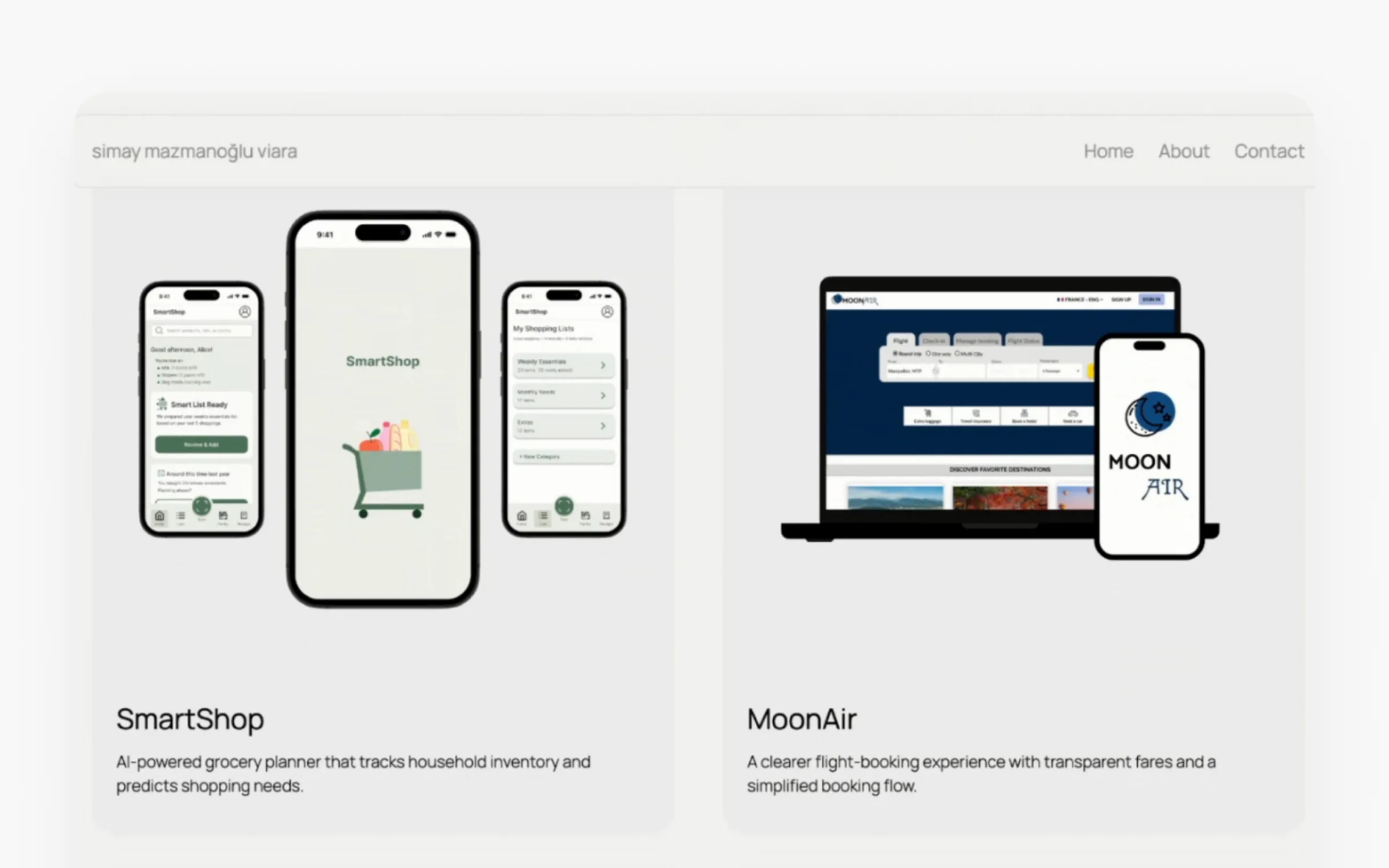
The fix takes a few minutes. Put your focus or your result in the title, and add labels for role, platform, and industry. If a project is personal, say so on the card. "It's okay to have personal projects," Réka said, "but it's very important to be honest about them."
Don't let your cover image fight your headline
My one note on Maya's homepage was about her first case study cover. It packs in component counts, text styles, and headlines of its own, and it brings in branding that competes with the bold look of her portfolio. A reviewer scanning for headlines runs into a second set of headlines. Her second thumbnail is much cleaner, and matching the first one to it would make the whole page feel more cohesive.
Level 2: Show you can do the work
Put results up front
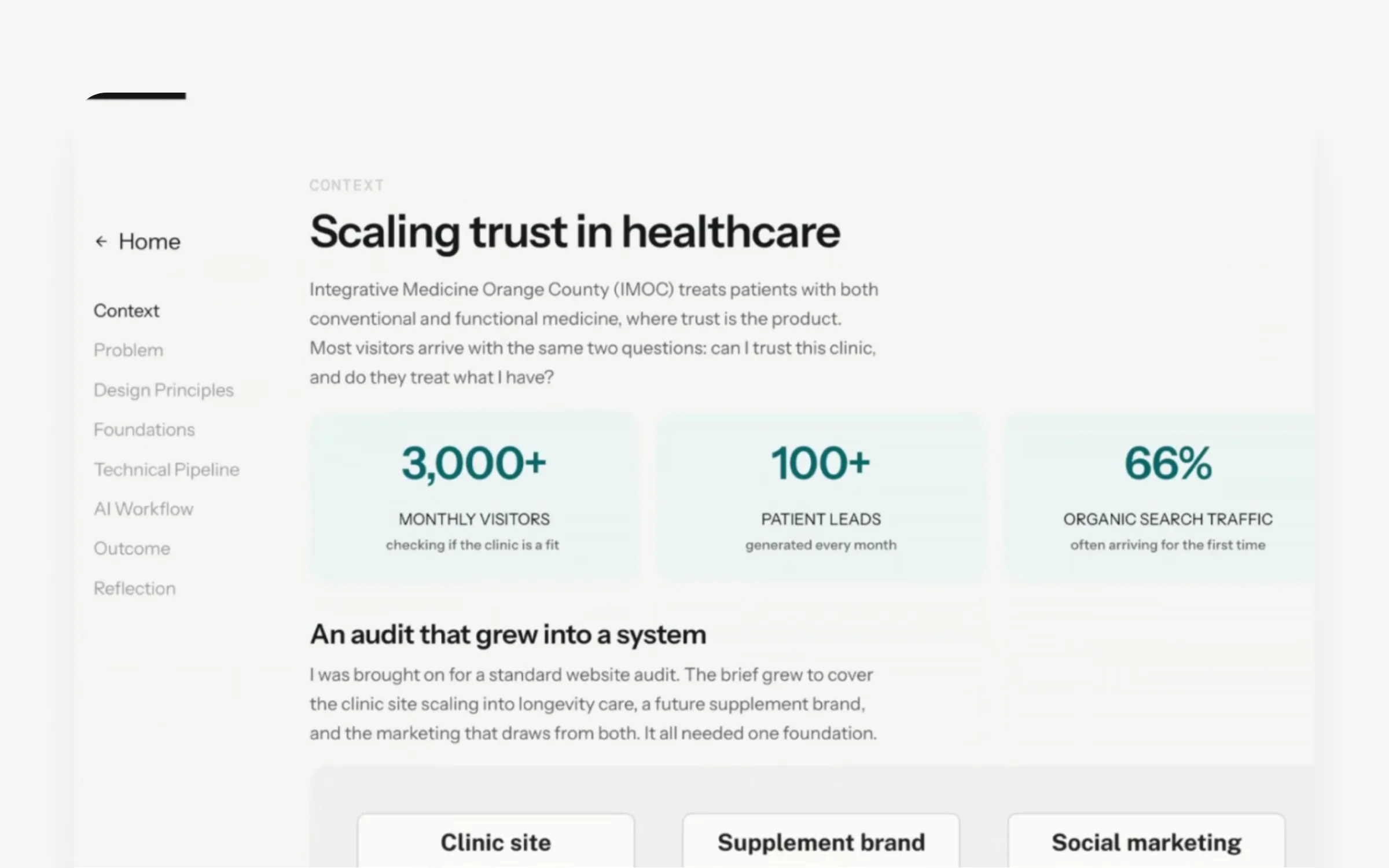
Inside Maya's case study, the intro lists her role, timeline, and skills, says the project shipped, and mentions how she used AI. Right after the context come three numbers: 3,000+ monthly visitors, 100+ patient leads, and 66% organic search traffic. Réka pointed out that these are the useful kind of numbers. They show the scale of the project, and they make you want to know how she got there.
No metrics? A before-and-after visual or a quote from a usability test works as a teaser too.
Design your visuals for the story
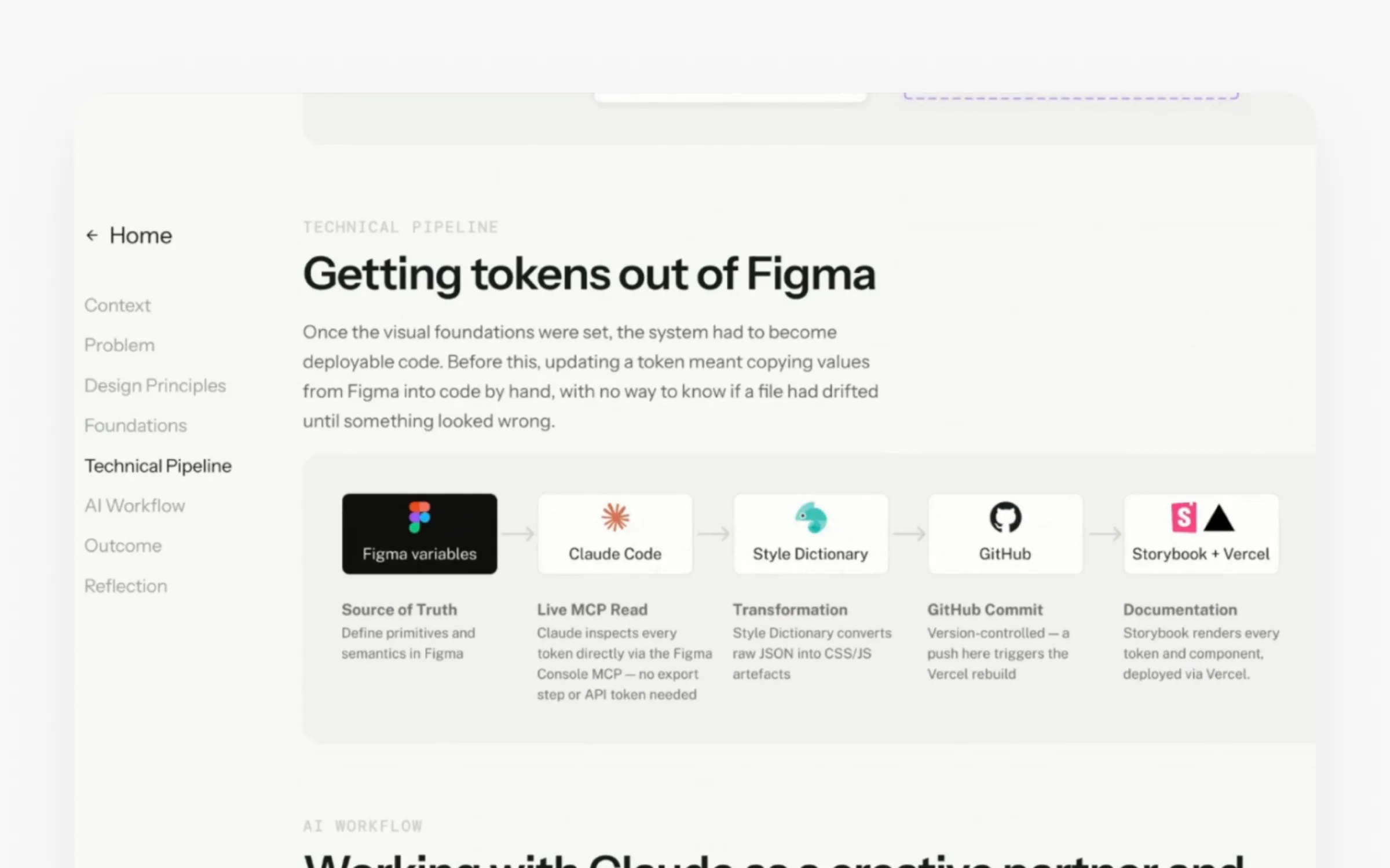
Maya designed her visuals specifically for this case study instead of dropping in raw screenshots or Miro boards. Her "Getting tokens out of Figma" diagram explains the process at a glance, so nobody has to dig through paragraphs to follow it. Add a table of contents and descriptive section headings, and a reviewer can skim just the headings and visuals and still get the gist.
Ben's case study shows the other half of the rule: every visual comes with context. "Never add a visual without any context," Réka said, "because then it will be just a decoration."
Break up walls of text
Ben's case study also had the most common red flag of the session: long walls of text. As I said during the review, it reads like a blog article. A reviewer skimming the page runs straight into the wall and stops.
Réka's rule of thumb is 30% text and 70% visual in each section. The visual doesn't have to be a screen. Cards with the main insights, a quote from a user interview, or a simple diagram all count. Shorten the text, and write section headings that tell the story on their own.
Keep it short, and lead with your biggest outcome
Maya's case study had one red flag of its own: it's long. Reading it top to bottom takes a while, so Réka suggested keeping only the phases and decisions that mattered. Our UX case study guide breaks down which parts earn their place.
I'd add one thing. The biggest outcome of that project was buried. She delivered a full design system with the code behind it, shipped using Claude Code and GitHub. For a product designer in 2026, that's the headline. Setting up a typography system is something most designers can do, and every time you put something on screen, you spend somebody's attention. Spend it on the result. You could even put it on the cover image.
Let reviewers try the work
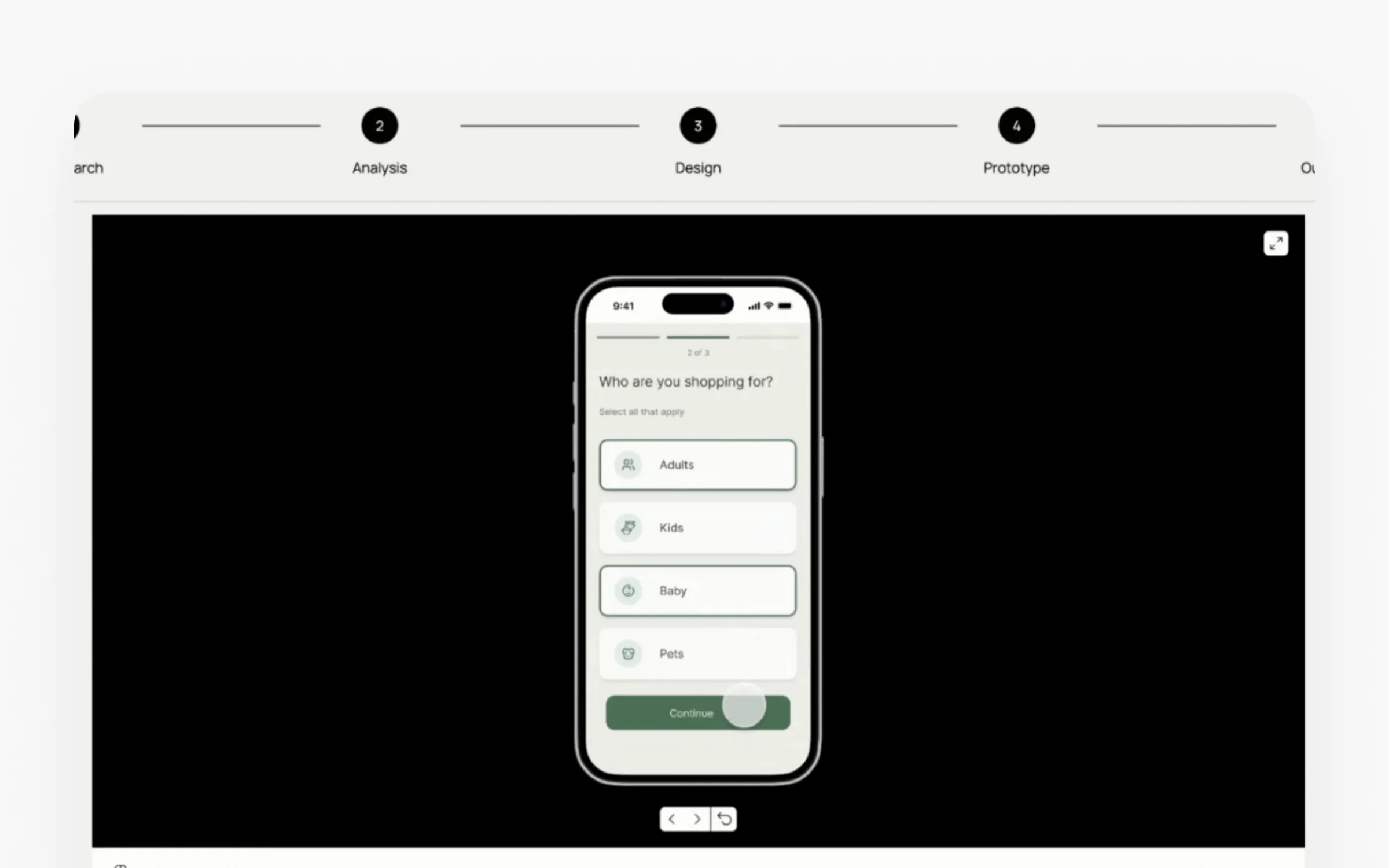
Simay's case study had what Ben's was missing: an embedded prototype that reviewers can click through without leaving the page. In UXfolio, you drop in a Figma prototype link and it shows up inline. Réka's tip is to add one line telling people what they can do inside it, so they know where to click.
Kim's case study embeds a video and includes a working prototype deployed on Vercel. My only note was that the prototype sat at the very end. If you've built something real, move it up where people will see it. The same goes for experienced designers like Ben. A design manager deciding whether to interview you will often want to click through a live product or prototype, so link to one whenever your NDA allows.
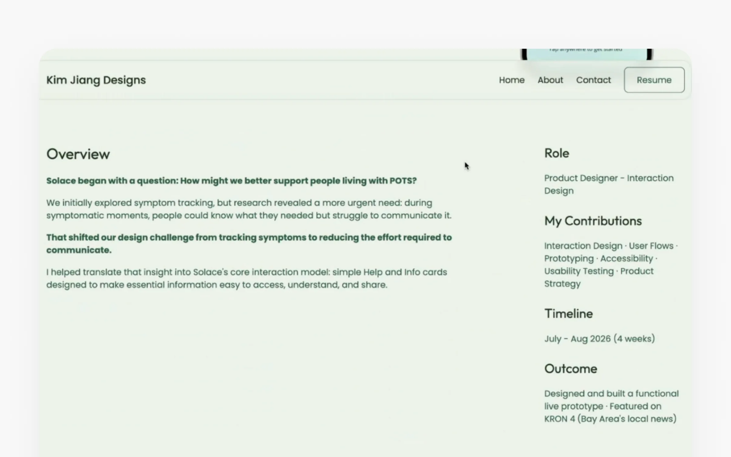
Kim also keeps her case study from running long with collapsible sections. The overview up front covers her role, contributions, timeline, and outcome, and a reviewer can open the details only if they want them.
End with what you learned, and where to go next
Simay's project is a personal one, and it closes with learnings and next steps, which Réka called out as a strength. Concept work is how junior designers learn, so show what you learned. If your next step is more usability testing, run it and add the results. That proves you can iterate based on research.
Ben's case study ends abruptly, with no conclusion, no learnings, and no footer linking to his other work. Simay's has a "Read more of my case studies" section at the bottom, which keeps reviewers moving through your work instead of sending them back to the homepage.
Level 3: Help reviewers picture working with you
The About page is where reviewers check culture fit, so show a bit of who you are beyond the work.
Maya balances her professional background with personal details, and her homepage has an "initiatives" section with three side projects she's proud of. Neither of us had seen anything like it in other portfolios. Ben's About page lays out his experience clearly without reading like a CV, but it has no photo. Réka doesn't recommend putting your face in the hero, but on the About page it helps, since that's where she's deciding whether she wants to work with you. Simay has a professional photo that matches her portfolio's style. The one thing missing is anything beyond design, like hobbies, awards, or articles you've written.
Kim Jiang's portfolio has a testimonial on her homepage. Réka's only suggestion was a label like "Testimonials," so it's clear who's speaking. Quotes from PMs and developers you've worked with build trust fast.
Small details help the first impression too. Maya's custom cursor changes when you hover over a case study, and after ten portfolios in a row, a touch like that makes one stick. In UXfolio, you can add custom cursors and animated hero backgrounds, like a glow or a grid that follows your cursor, without writing code. They adapt to your color palette.
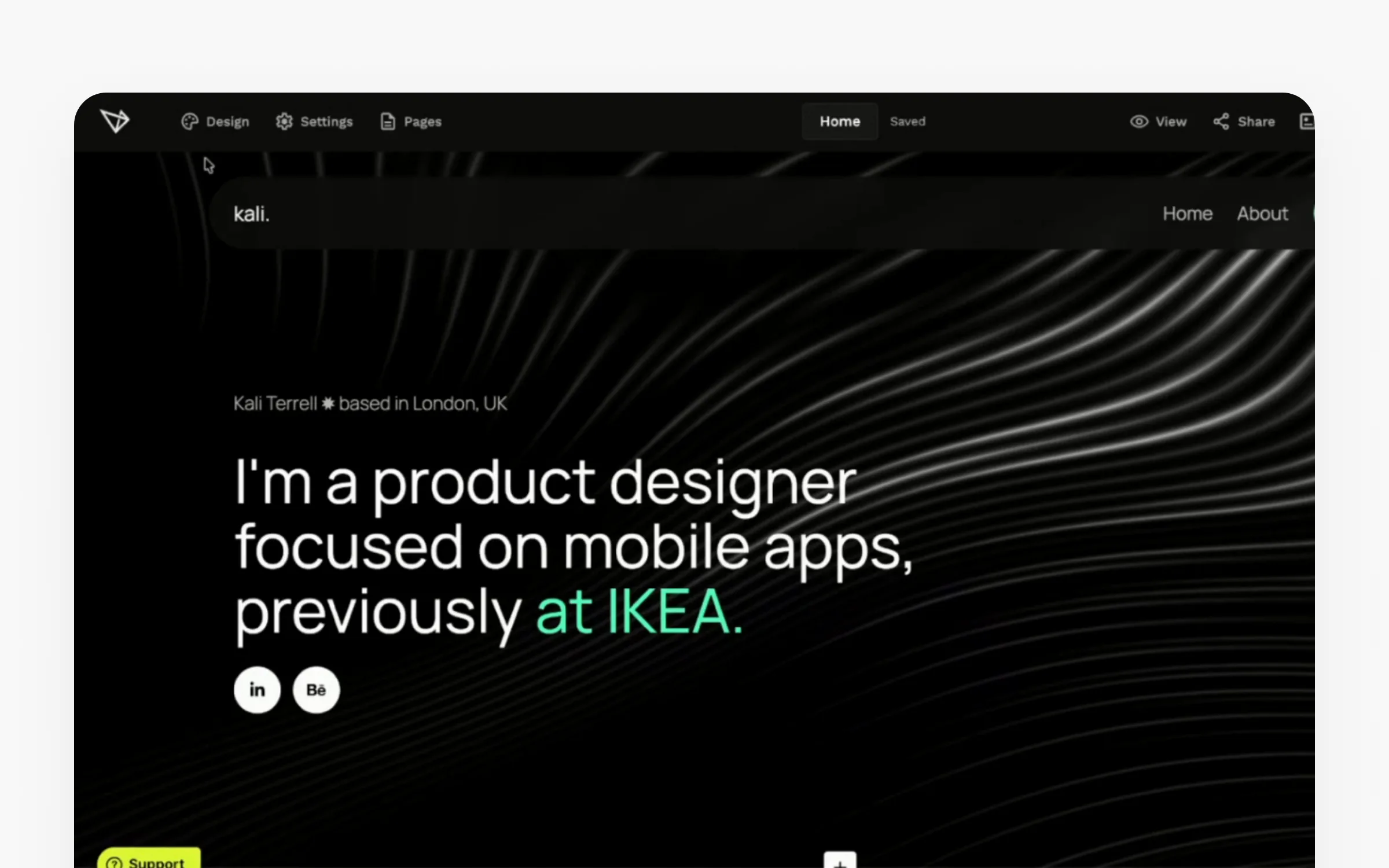
One more thing to fix while you're there: don't show your email as plain text in a scrolling banner. In Simay's contact section, it took me a moment to realize the email was clickable. A clear "Contact me" button is easier to spot and easier to use.
Where AI fits in your UX portfolio
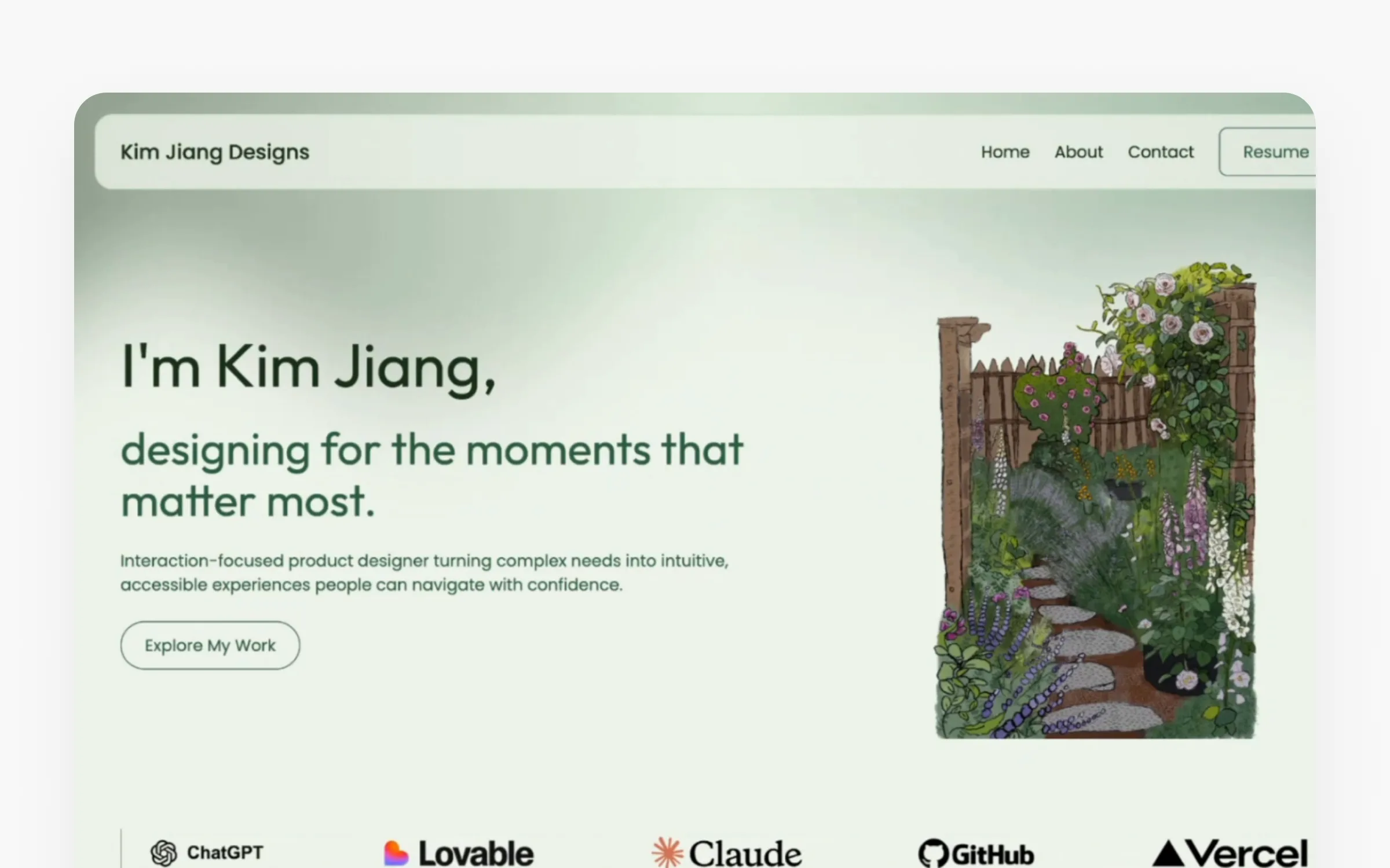
Kim's portfolio opens with a hand-drawn garden illustration that gives it a personal feel. Right below the hero, she lists the tools she works with: ChatGPT, Lovable, Claude, GitHub, and Vercel. Réka called that a nice reassurance for anyone hiring right now. It tells a reviewer you're comfortable with AI and vibe coding before they open a single case study. If you're not there yet, the AI in UX design course is a practical place to start.
We got a lot of questions about AI in the chat. Here's where we landed:
- Use AI to shape the story. Réka recommends it for turning a project into a narrative, and UXfolio has built-in tools that generate a case study's structure and content, plus a "boost storytelling" action. What she wouldn't do is generate the whole portfolio from one prompt, because your personality is a big part of what gets you hired.
- Make it yours. When you cut corners with AI and leave it generic, it shows. A generic portfolio looks average, and average ones get skipped. Treat AI as a tool, like Figma, and keep the thinking yours.
- Use it as a reviewer too. Ask it to review your portfolio the way a recruiter or hiring manager would.
- Show your vibe-coded side projects. Réka is seeing more portfolios with a "playground" or "explorations" page for small apps people built for themselves or their community. They show you're curious, you learn fast, and you can build things on your own.
Answers to the other questions
What if my work is under NDA? Read your NDA first. It might only restrict sharing with competitors, for example. You can often change or blur the data, password-protect the case study, or abstract the project and describe how you approached the problem. Diagrams of your process usually won't break anything. Don't drop a strong project just because of an NDA.
Which projects should I include? Decide which roles you're targeting, then pick the projects that match, down to the industry if you can. Réka's rule: "Your portfolio is as strong as your weakest case study in it." Reviewers usually open the first one, but you never know which they'll pick, so only include work you're proud of. I'd add: include the projects you're excited about. You'll talk about them with more energy in the interview, and if you list ten projects, only the first two or three get clicked anyway.
How do I show my thinking without writing a novel? Keep each section short, show the main findings with visuals and cards, and only include the stages where you made a decision that moved you closer to the solution. As Réka put it: "This is not the documentation. You don't have to report every step of the project."
It's the same design thinking you'd use on any product. The reviewer is your user, and they might be scanning 20 or 30 portfolios in an hour. Start by understanding that, then design for it.
Watch the full review
This is the short version. The recording has all four portfolios on screen, the UXfolio walkthrough, and the full Q&A: watch the portfolio review on YouTube.
If you want the section-by-section guide to writing a case study, our first session with Réka covers it in The Case Study Gap.
Ready to rebuild yours? Réka's team is giving readers 30% off UXfolio with code GETHIRED-YEARLY (yearly plan) or GETHIRED-MONTHLY (monthly plan). Start for free at uxfol.io and redeem the code when you're ready to go live.
Building the skills behind a strong portfolio is what we do at Uxcel. Our short, practical courses cover UX, product, and AI, with real-world project briefs you can turn into case studies.
Thanks to Maya, Ben, Simay, and Kim for sharing their portfolios. Co-hosted with UXfolio, the portfolio builder for UX designers and researchers.