

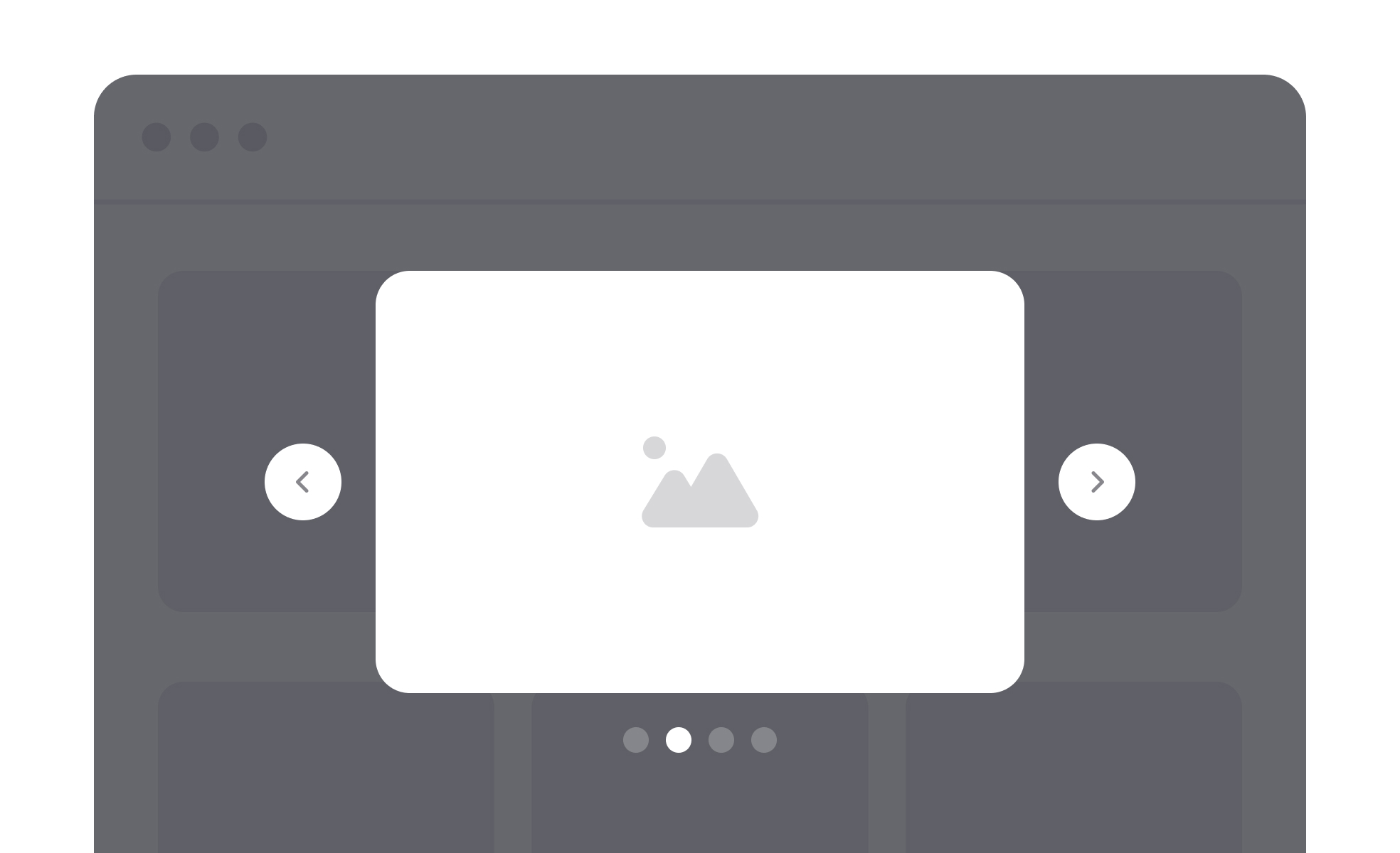
What is a lightbox?
A lightbox is an overlay that presents content, typically images, videos, or media galleries, in a focused layer above the current page. When triggered, it dims or blurs the background, draws attention to the content in the foreground, and allows the user to interact with that content without navigating away from the page they were on.
The name comes from the physical lightbox, a flat illuminated surface used by photographers and designers to view transparencies and slides against a bright, neutral background. The digital pattern borrows that quality of focused, isolated viewing and applies it to on-screen media.
Lightboxes are most commonly encountered in image galleries, e-commerce product photography, portfolios, and news sites where clicking a thumbnail opens a larger view. They also appear in other contexts, such as video previews, zoomable maps, and document viewers, wherever the goal is to surface a detailed view without disrupting the broader experience the user was engaged in.
How does a lightbox improve user experience?
The primary experience benefit of a lightbox is contextual continuity. When a user wants to examine an image more closely, the alternative to a lightbox is navigating to a dedicated image page. That navigation requires loading a new page, then using the browser's back button to return, which breaks the user's flow and can be disorienting, particularly if the originating page was partway through a list or scroll position.
A lightbox keeps the user in place. Opening and closing it feels like zooming in and out on a detail within the same experience, not leaving and returning. For product image galleries in e-commerce, this matters commercially: a user browsing a product can view multiple images in sequence without losing their place on the product page or feeling pulled away from the purchase decision.
The dimming of the background serves a cognitive function as well. By reducing the visual complexity of the background, the lightbox directs the user's full attention to the content in focus. Extraneous navigation, promotional content, and other page elements recede, creating a simpler visual environment for examining the content closely.
What are the key design requirements for a lightbox?
Several elements are essential to a lightbox that feels intuitive rather than frustrating.
- Exit paths need to be multiple and obvious. Users should be able to close a lightbox by clicking or tapping outside the overlay, pressing the Escape key on a keyboard, or activating a clearly visible close button (typically an X icon). A lightbox that can only be exited through one mechanism, particularly if that mechanism isn't immediately visible, creates the feeling of being trapped, which damages trust and raises anxiety in the interaction.
- Navigation controls within a gallery lightbox, arrows or swipe gestures to move between images, should be large enough to be tapped comfortably on mobile, respond correctly to keyboard input, and have clear visual affordance signaling what they do.
- The transition between the page and the lightbox should be fast and smooth. A slow-loading lightbox that shows a blank overlay before the content appears disrupts the sense of continuity the pattern is designed to create. Images should either be loaded in advance or display a lightweight loading state that signals progress without blocking the interaction.
- On mobile, lightboxes often need to occupy the full viewport rather than floating in the center of the screen. A centered overlay with margins on a phone-sized screen gives the media very little display space. Full-screen presentation on mobile is the more practical approach for visual content.
What accessibility requirements apply to lightboxes?
Lightboxes are one of the modal patterns most frequently implemented with accessibility gaps, and the consequences for users relying on assistive technology can be significant.
Focus management is the most critical requirement. When a lightbox opens, keyboard focus must move inside it. Without this, keyboard users who tab forward from the trigger element will find focus continuing through the dimmed background content, which is visually hidden but still accessible to keyboard navigation. When the lightbox closes, focus must return to the element that triggered it, so keyboard users can continue navigating from where they were.
ARIA roles and attributes communicate the lightbox's nature to screen readers. The overlay should be marked with role="dialog" and include an aria-label or aria-labelledby attribute describing its content. The background content should be made inert or given aria-hidden="true" while the lightbox is open, so screen reader users aren't presented with the full page content alongside the overlay content.
Keyboard navigation within the lightbox should follow the same conventions users expect from other modal patterns: Tab moves focus forward through interactive elements within the overlay, Shift+Tab moves backward, and Escape closes it. If the lightbox contains a gallery, arrow keys should navigate between images.
When shouldn't a lightbox be used?
The lightbox pattern is well-suited to focused content that benefits from an enlarged, distraction-free view: images, videos, maps, single-document previews. It's less appropriate in several situations.
Complex interactions that require extended user attention, like filling out a multi-step form, making a sequence of decisions, or working through a flow with multiple actions, are better served by a full page. A lightbox creates a sense of temporary interruption; complex tasks feel unfinished if presented in that context.
Content that users will need to refer back to while doing something else on the page doesn't work in a lightbox, which requires closing to access anything outside it.
Deeply nested content or flows where the user might want to navigate backward through several states are difficult to manage gracefully in a lightbox, which doesn't naturally support back navigation in the way a full page does.
The fundamental question is whether the interaction is focused and contained, or whether it requires the sustained attention and navigational flexibility that a full page better supports.


